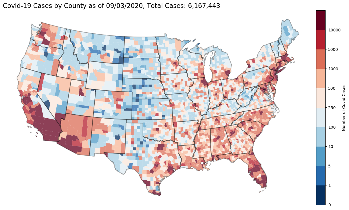
Interactive Map of Covid-19 US Cases by County
Creates a static and live/interactive html map (Click on the link!!!) using data from @nytimes that tracks the spread of Covid-19 by date and US counties. Please see @nytimes repository for information regarding the data and it's use.
A brief accounting of notebooks:
-
download_shapefiles.ipynbdownloads all the shapefiles to create the maps. Only need to do this once and then can run the mapping files as much as you want. -
county-by-time.ipynbgrabs the @nytimes data and creates.pngfigures for cases and deaths over time for every county in the data set. These figures are then used in the hover tool for the interactive map. -
us-covid-19-static-map.ipynbdownloads, basic cleaning, merges with US Census shapefiles and Census data. It then generates a static map (using GeoPandas). -
us-covid-19-interactive-map.ipynbdownloads, basic cleaning, merges with US Census shapefiles and Census data. It then generates a interactive map (using GeoPandas) and (from Bokeh). -
Data from: Nytimes github repo https://github.com/nytimes/covid-19-data Data from The New York Times is based on reports from state and local health agencies.
-
Interactive map with hover tool here:
