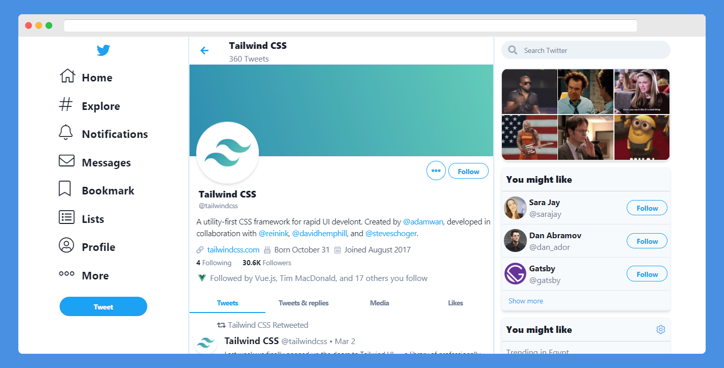
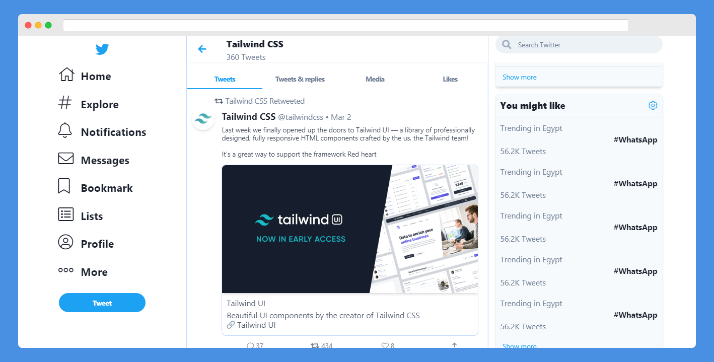
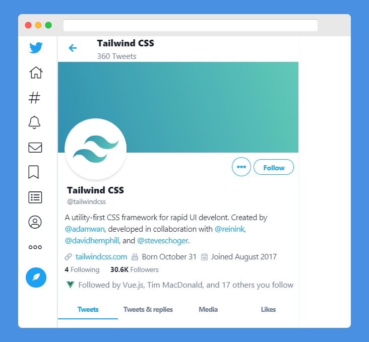
Clone of the current Twitter created with Tailwind CSS
Full screen
Small screen
This project aims to duplicate only the design and the responsive behavior of current Twitter design for educational and reference purposes aka just for fun. If you are intrested please read the Todo List section.
Contributing are welcome to complete this porject.
- Tailwind CSS
- Almost typical to twitter
- Font Awesome pro (experimental)
- Fully responsive
- Mobile friendly
I use yarn
-
For development
yarn buildOryarn build --watch -
For Production
yarn production
screens: {
			iphone5: '320px',
			xs: '320px',
			iphonex: '375px',
			iphonePlus: '414px',
			colbreak: '500px',
			sm: '640px',
			ipad: '768px',
			md: '768px',
			lg: '930px',
			ipadAir: '1024px',
			xl: '1024px',
			laptop: '1100px',
			'2xl': '1280px',
			'3xl': '1320px',
			laptopl: '1440px',
			colView: { min: '1px', max: '499px' },
			menubreak: { min: '931px', max: '1023px' },
			rightsidebreak: { min: '637px', max: '905px' },
			afterRightSideBreak: { min: '905px', max: '929px' },
		},
Note: Order of sizes matters
cat css/*.css | postcss > ./public/build/styles.css
Postcss will compile fontawsome (fa.css) and (tailwind.css) into one minified bundle (styles.css)
- In production
yarn production- PurgeCss
- cssnano
will minifiy the whole bundle into 12kb!
To get started...
- Take a quick look on Todo List
- Open issue to share and discuses new ideas or features.
-
Fork this repo!
-
Commit to the develop branch
-
Do your thing.
- Create a new pull request
- Add NPM support
- Edit the Readme.md
- Create community
- Unify screen sizes
- Move to Material Icons
- Fix button sizes
- Fix Mobile version
- Extract to vue components
- un-Spaghetti the code!
- Add setting page
- Add more tweet cards
- Add direct messages page


