Nassos Stylianou (@nassos_) & Will Dahlgreen (@willdahlgreen), BBC Data Journalism Team
NICAR 2019, 7-10 March, Newport Beach
This workshop should build on your existing knowledge of QGIS and show you how to filter and analyse geographic datasets using queries, before familiarising yourself with exporting the maps you have created using the print composer.
This class is ideal for those who attended the QGIS I workshop or already know the basics of visualising geographic data in QGIS. We will cover techniques like writing queries to filter your data, aggregating data for easier analysis, adding labels to your map before exporting as well as using Open Street Map data in QGIS.
This session is good for: People with some experience in plotting geographic data on a map and some experience with open source mapping software QGIS.
For this tutorial, we will go through the following:
- Filtering shapefiles
- Selecting data by location
- Adding labels to your map
- Tips and tricks when exporting your map
- Aggregating data: Points in polygons
- Add Open Street Map data to your map: Quick OSM
The data we are using in this workshop can be found and download here: https://www.dropbox.com/sh/tx1wpb5gr9znvxx/AABq53sdjrt4BArTUzn7WWh8a?dl=0
You can go through the introduction class, QGIS I, here: bit.ly/qgis1_nicar
You will find that there will be times when you only want to use a portion of the data included in your shapefile.
For example in our case, we have a shapefile with all counties in California (CA_Counties_TIGER2016.shp), but say we just want to look at Orange County, where we are currently located.
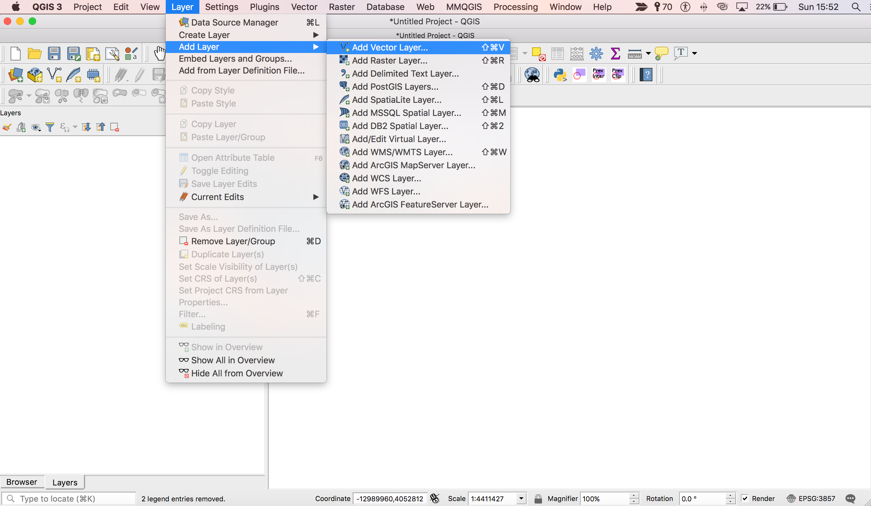
So first up you should load in our CA_Counties_TIGER2016.shp shapefile into QGIS. You can do this either by dragging the .shp file into QGIS or by going to Layer > Add Layer > Add Vector Layer from the QGIS Menu bar up top.
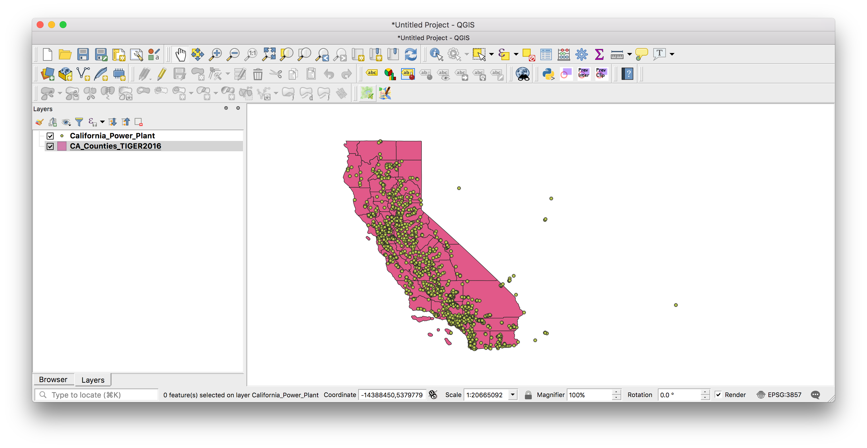
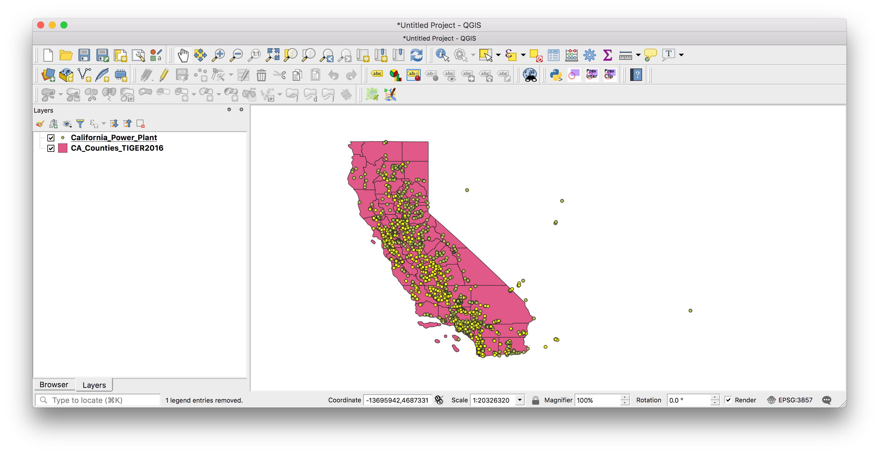
At this stage, you should also bring in your power plant dataset (California_Power_Plant.shp) that you worked with in the earlier QGIS I tutorial as well. This shapefile includes point data for each power plant in California.
As with most things in QGIS, there is more than one single way to filter your data, so if you come across another way or are used to working in a different process, then that completely fine.
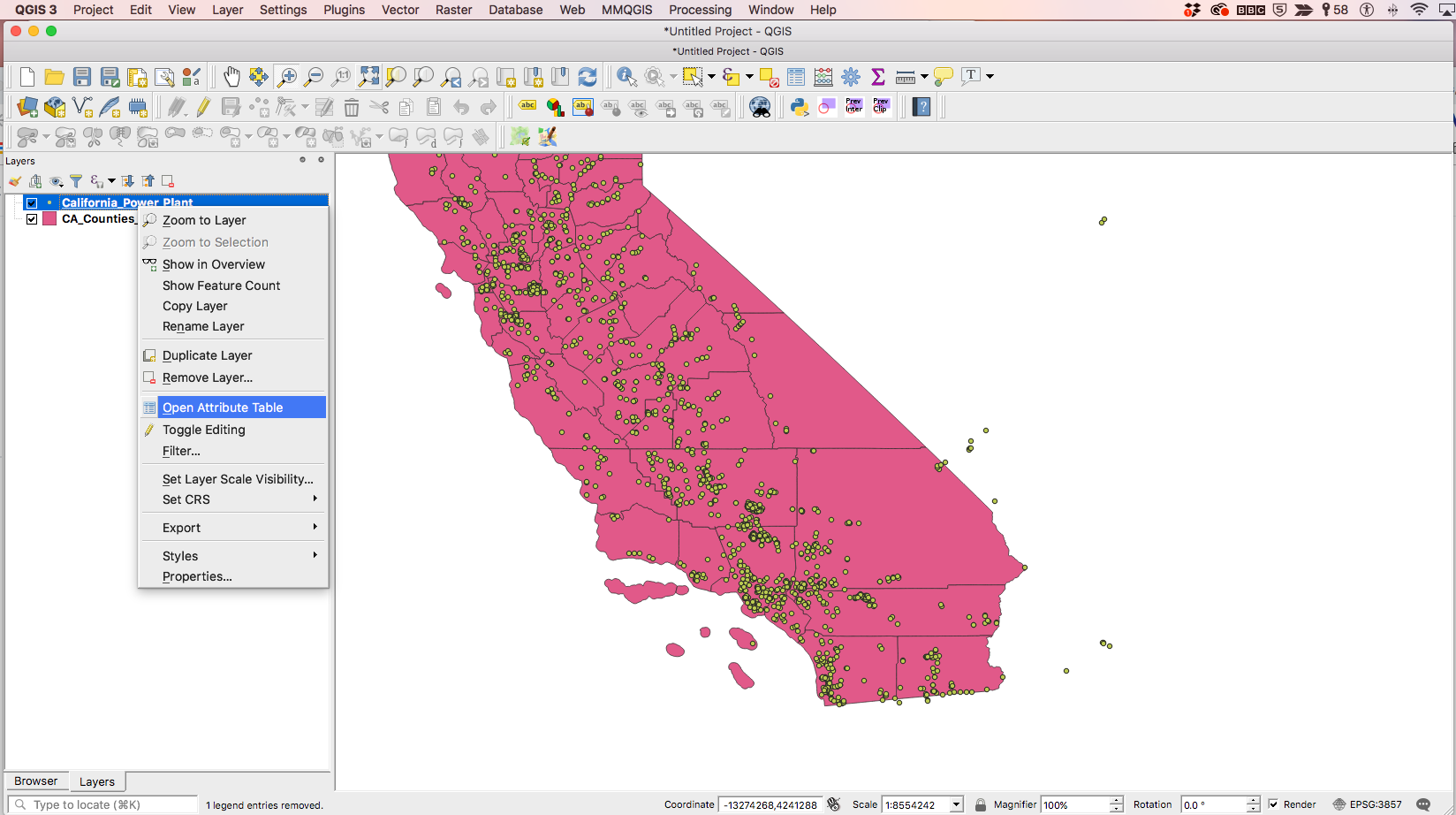
So make sure you have the counties shapefile selected in the Layers panel, as in the screenshot below.
Once you have that, then go to the Layer menu in the main QGIS menu bar and click on the Filter option.
The shortcut for this is (⌘)F in mac or Ctrl+F in Windows.
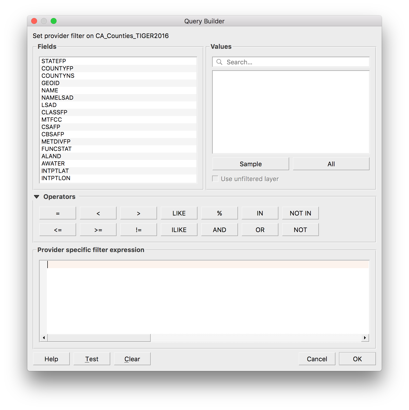
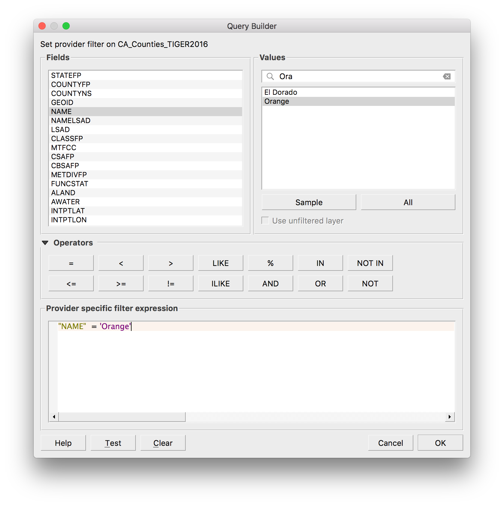
Once you select the Filter option, you should get a popup screen that looks something like this.
This Query Builder is a powerful tool and something experienced QGIS users will often use to query and filter as they explore their data before making a map.
The Fields column essentially displays all the columns in your shapefile data, if it helps to think about a shapefile as an Excel spreadsheet, which you can see if you right click on your layer and click Open Attribute table . This is the data that comes for each feature in your shapefile layer.
But you can look at the data that each Field contains directly in this Query Builder. As mentioned earlier, what we want to do is filter the counties shapefile so that we are seeing just ‘Orange’ county and disregard all others. So we want to find the field with the county names and select Orange county.
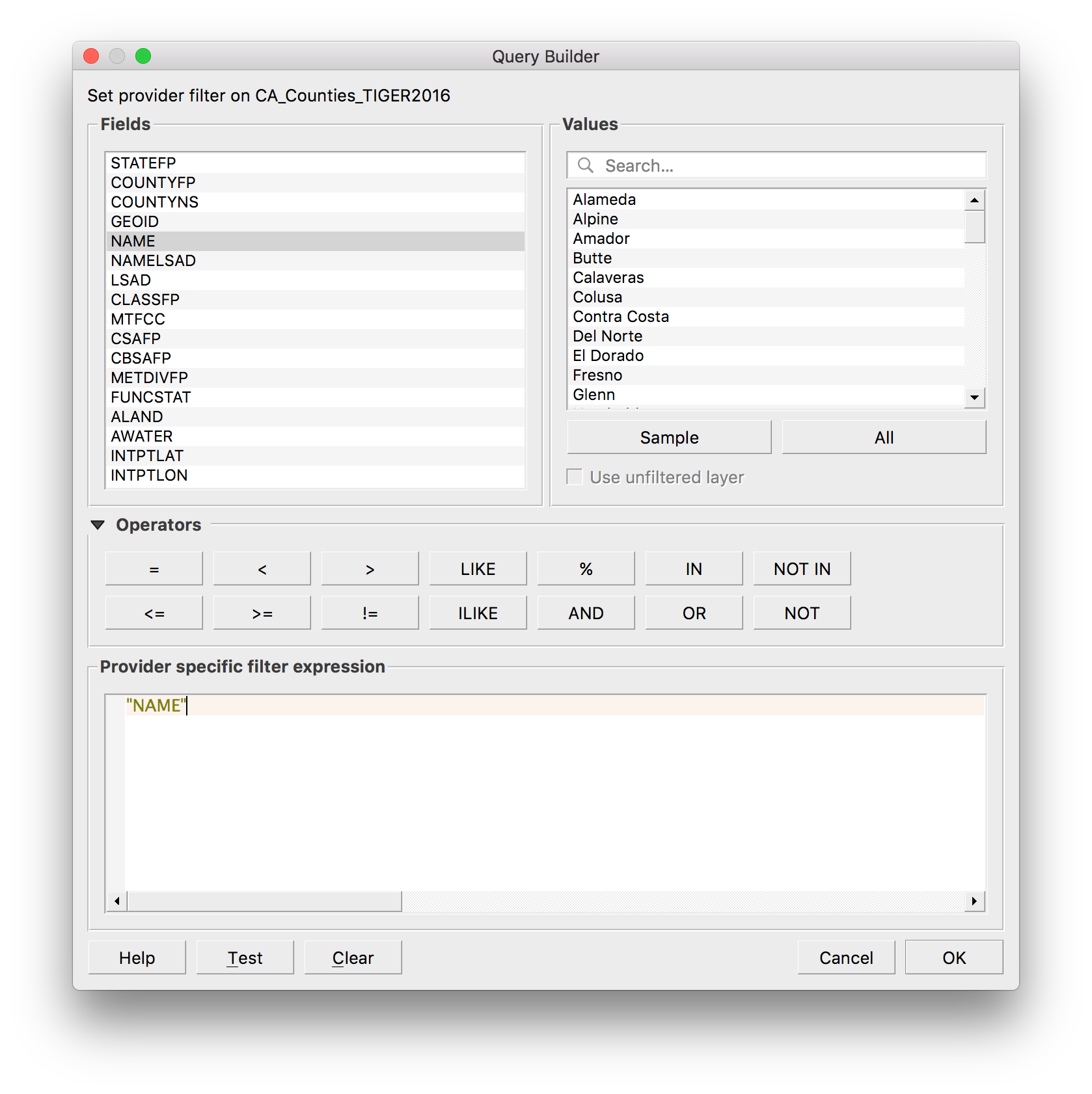
Looking at all the Fields, a safe bet to filter by name would be using the NAME column. So in our Fields column, lets select and double click the NAME option.
So what this does, as you can see above, is that it populates the space where we are meant to write our query with the text "NAME". Now if we click on the All button just below the Values block, it will populate the Values section with the name of each of the counties that are included in our shapefile.
As the text in the block below the title Provider specific filter expression is essentially a space for SQL statements, we need to have an operator after our "NAME". So after name, we should click on the = operator.
So the last step is to find Orange county in our list of county names. It looks like the names are in alphabetical order, so we could literally scroll down to find Orange county or we could type it in the values box. Once we have found it, if we double click it, it will populate the query section and our query should be now complete.
Before you click on OK and run this filter query, you can actually test how many features (in our cases counties) this query will capture and check that this is the result you expected.
To do this, just click the Test button at the bottom left of your Query Builder window.
This is the reply you should get - which is exactly what we want, that our result is one county, Orange county!
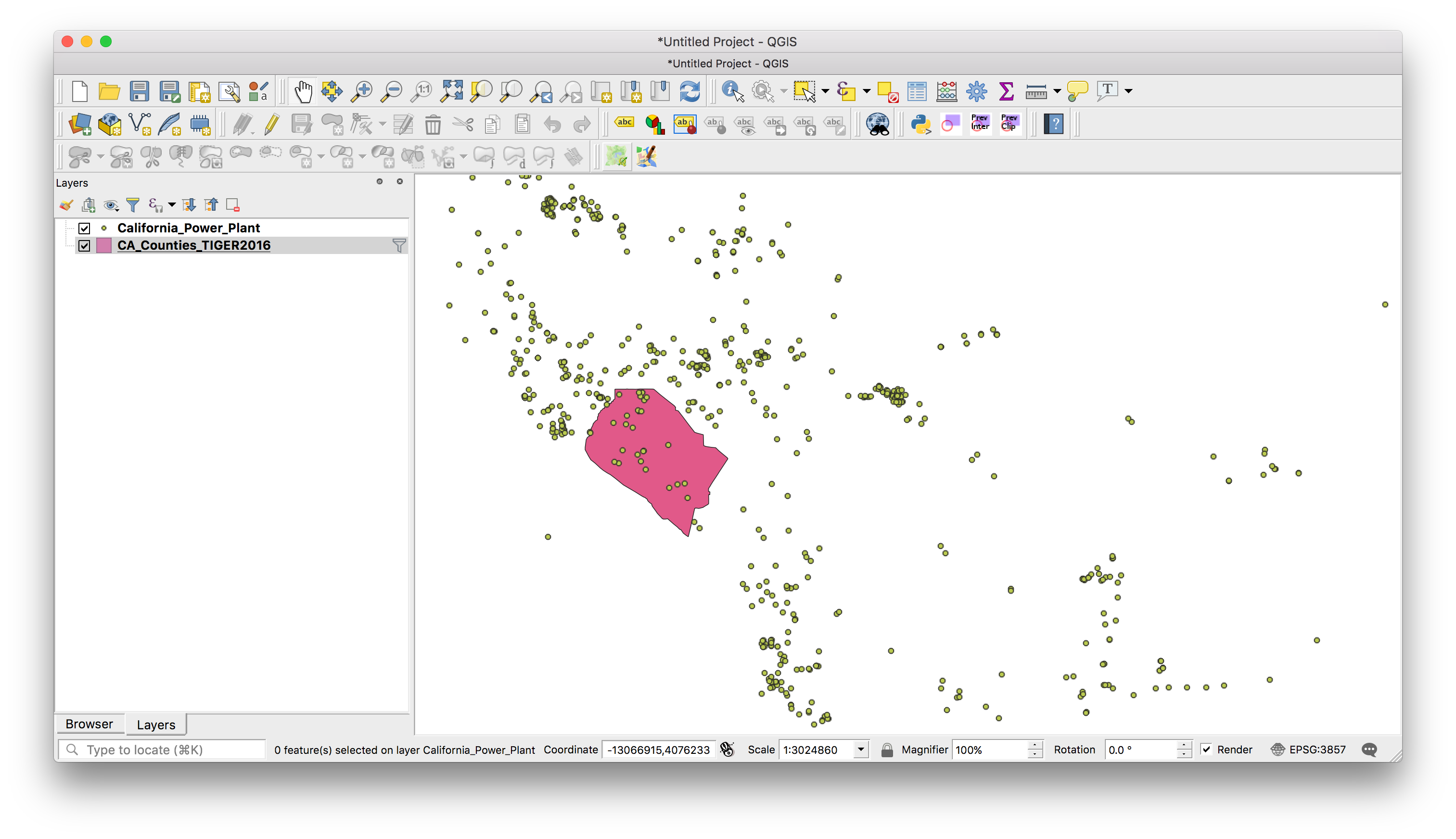
And if we now do press OK in our Query Builder, our counties layer should now display just Orange county.
Success!
Filtering in QGIS is a very powerful tool as it enables you to run a whole host of queries on your data, not just select a feature by name as we have done above. With discrete data, you can filter by category or with numeric data you can filter by any mathematical operations or values.
So looking at our other dataset, the power plants dataset, it has a number of columns with the different characteristics of each power plant. For example, there is a Status column which describes whether the power plant is is operational, retired, on standby or shutdown as well as as a column describing the type of fuel produced power plant, General_Fu. There are also numeric columns, such as the MW column that details the capacity of each plant in megawatts and the Online_Year column with the year that each plant came online.
So given what we know about the data, we can run a more complex filter query and can choose to show power plants based on the following criteria:
- Currently operational
- Solar or Solar Thermal
- Produce above 10MW
- Came online after 2010
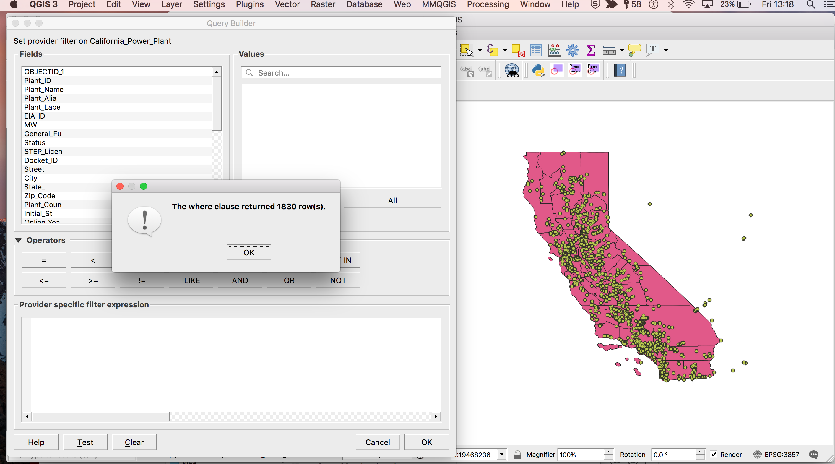
Before we write and run the query needed to filter the data, we can see that the full dataset has a total of 1830 power plants in our data.
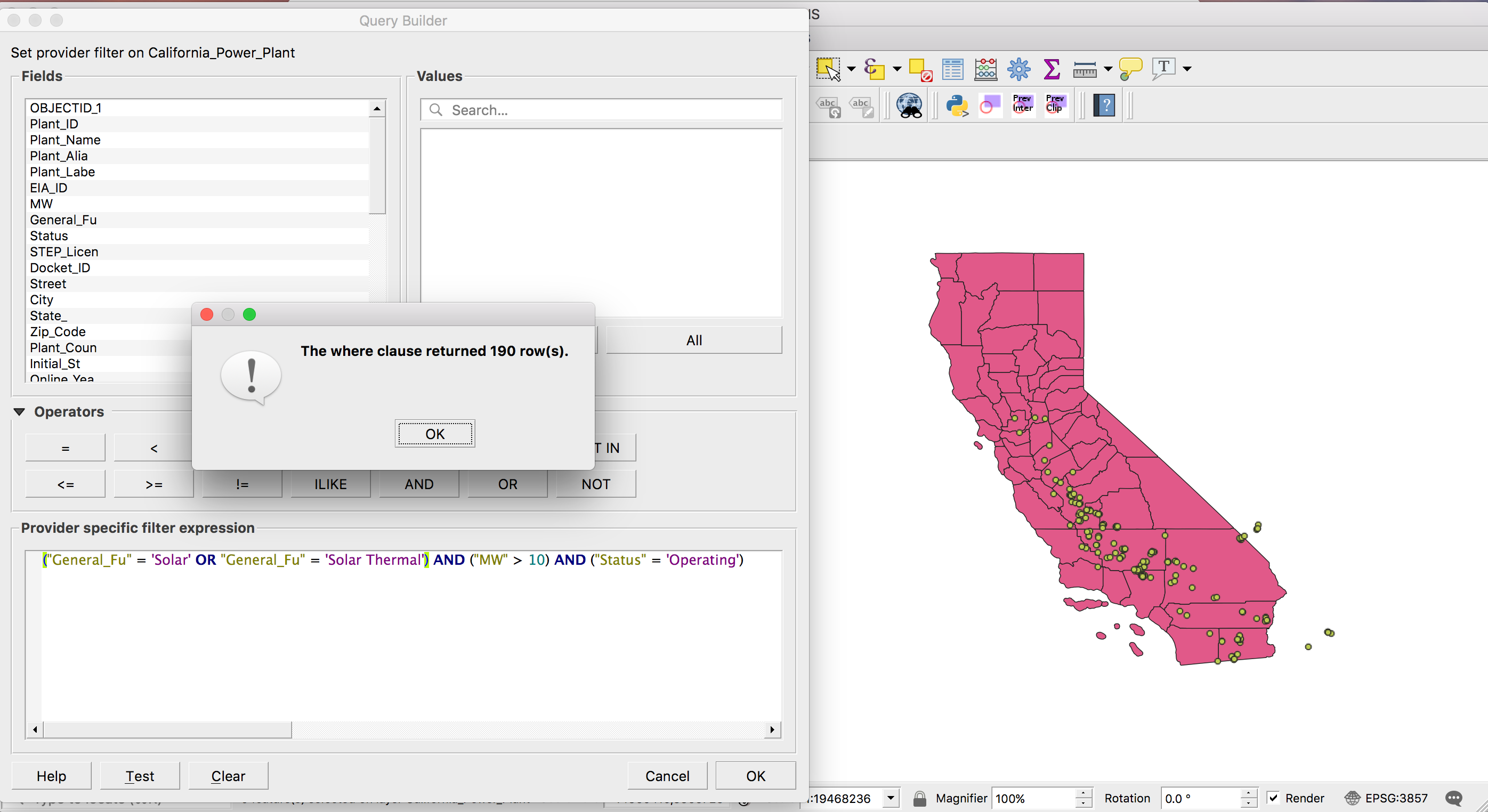
But when we run our query to include all power plants that satisfy the criteria set above, we get just 190 power plants and a map that looks much less crowded - and potentially more meaningful to us depending on the story we are trying to tell or the data we want to investigate.
Here is the query we run:
("General_Fu" = 'Solar' OR "General_Fu" = 'Solar Thermal') AND ("MW" > 10) AND ("Status" = 'Operating')
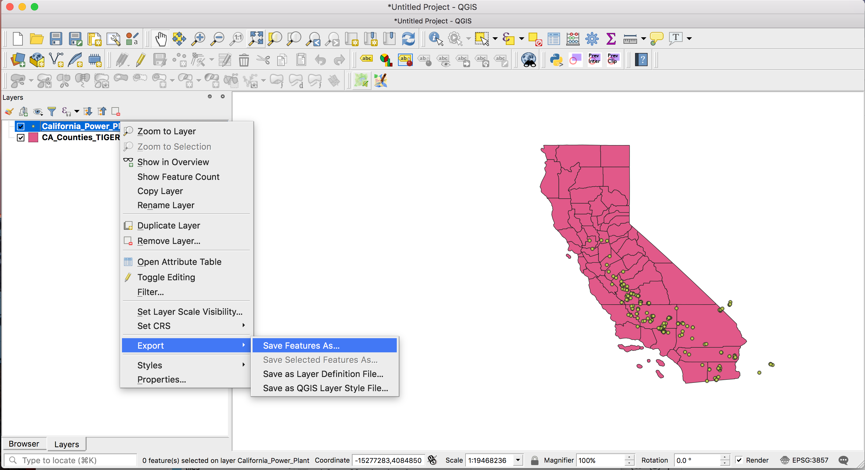
Now if we wanted to actually save out this filtered selection as a new file and only work with the selected data so that we do not have to load and import the entire dataset with almost 2,000 rows, then all you need to do is right click on the layer while it is filtered and click Export > Save Features As…
What that will then do is give you a new popup screen where you can set your new file name, where you want to save it as well as the file format, so depending on what you plan to do with it, you can save it as a CSV a Shapefile, a KML etc.
So now you should be able to not only filter geographic data you have brought into QGIS but also do so using a complex query to filter on a number of criteria, before saving out your filtered dataset into an entire new file to work with.
Another thing you can use QGIS for is to select data by its geographic location.
So say we want to select power plants located in a few select California counties.
The difference of selecting by location to the filtering we did earlier is that we are selecting data in one dataset, the power plant data, based on the geographic location which comes from another dataset, the counties shapefile.
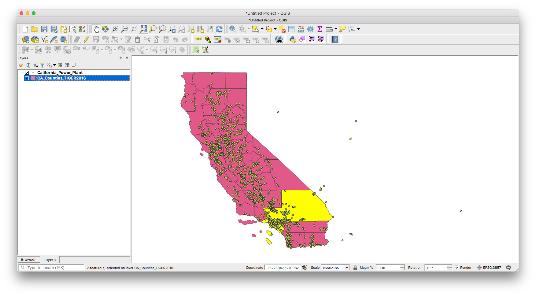
So in order to select just the power plants in Los Angeles county, Orange county and San Bernadino county, we have to first select these three counties in our CA_Counties_TIGER2016 layer.
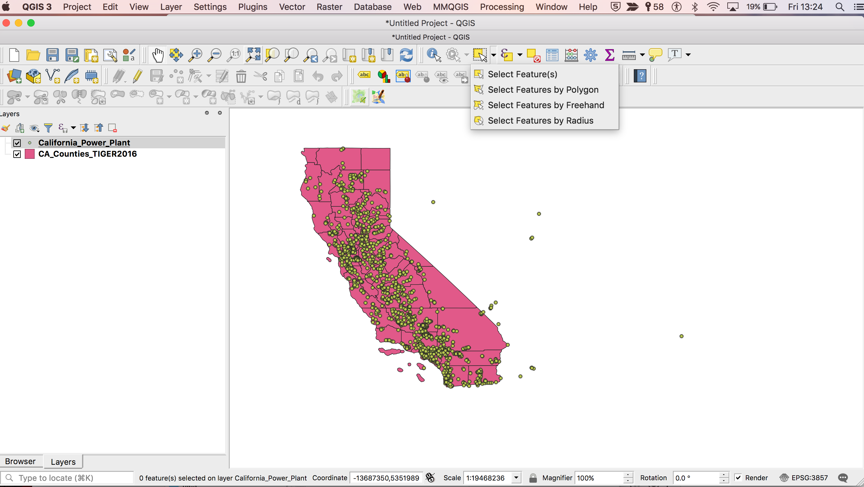
Now there are a number of different ways to select features from a layer in QGIS. You can select them manually, or by drawing a shape around them from the select features tool in the QGIS toolbar if you want to select them by eye for example.
Another way is by opening the attribute table of the shapefile and ‘look under the hood’ so to speak.
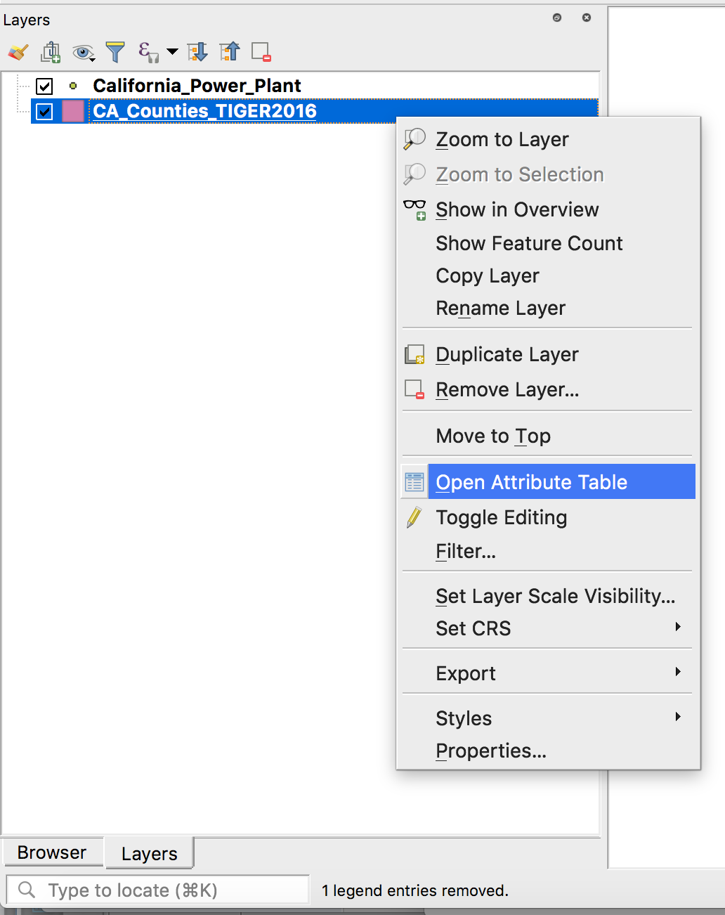
We can do this by right clicking on our shapefile and selected the Open Attribute Table option.
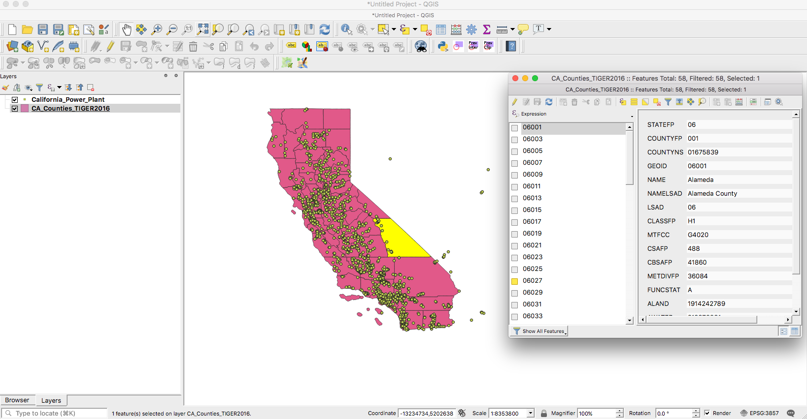
This should open a popup for you with the attributes and data for each feature in our CA_Counties_TIGER2016.shp shapefile.
In the Attribute table, clicking on the ID of each feature on the left side will select that polygon in the map.
If you hold the (⌘) button on Mac or Ctrl in Windows and then click on the ID you can select more than one polygon at a time.
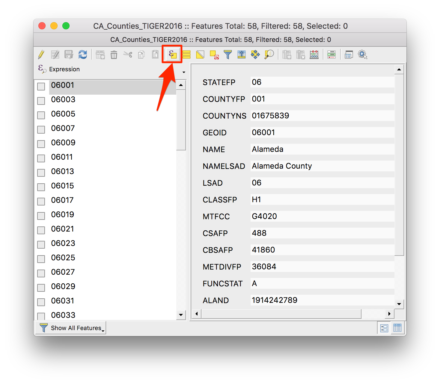
Additionally, once we are in the Attribute table popup, we can actually select features in our shapefile by using a query/expression in a similar way to the filtering we did earlier.
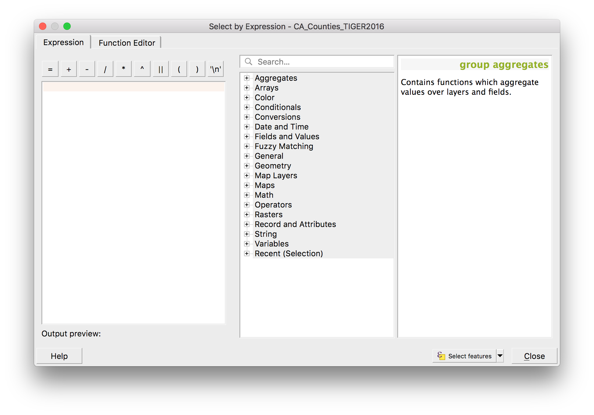
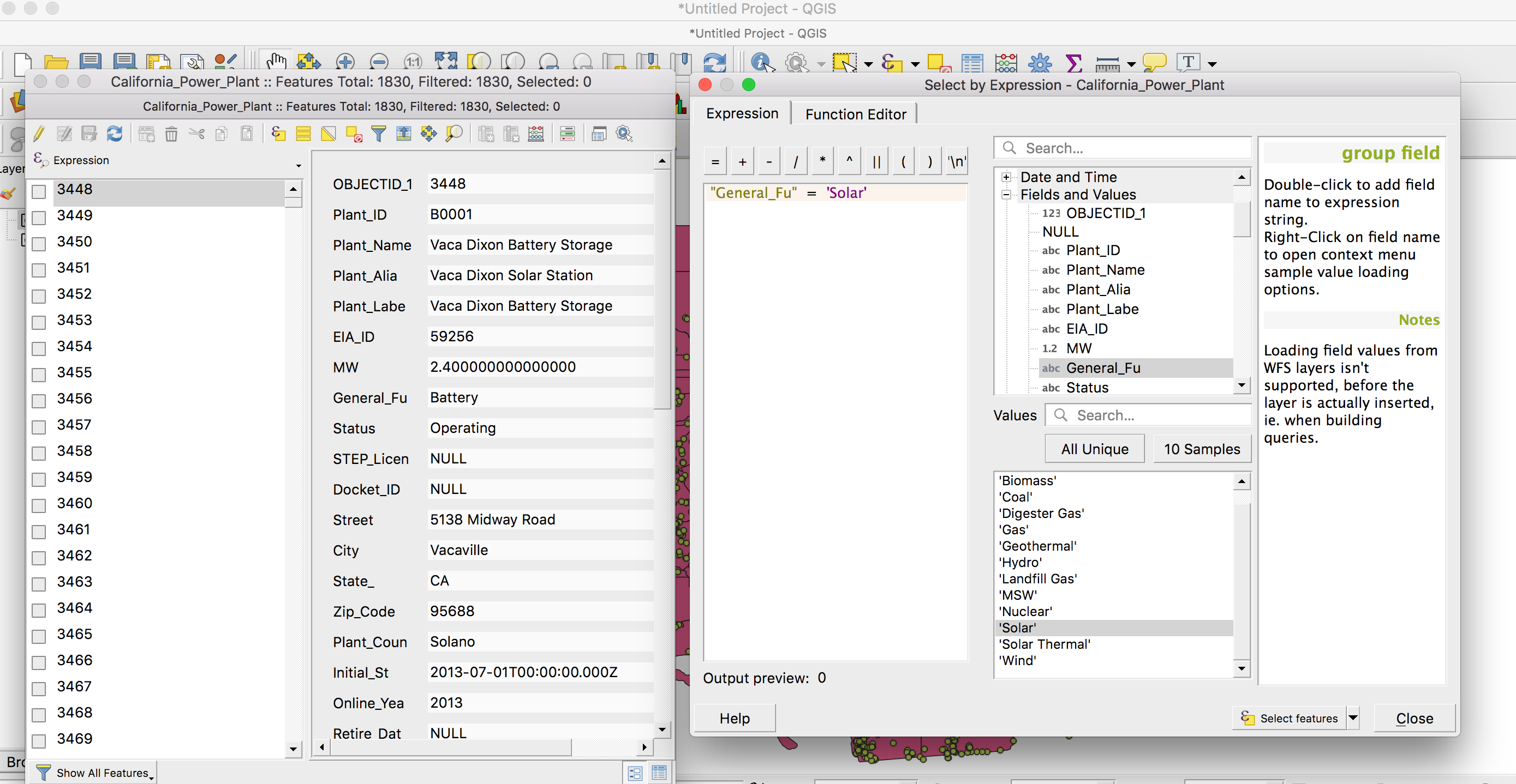
If we click on the Select features by expression option (highlighted in screenshot above) in the toolbar of the attribute table, this will launch the Expression builder popup, which is not hugely different from the filter popup we worked with above.
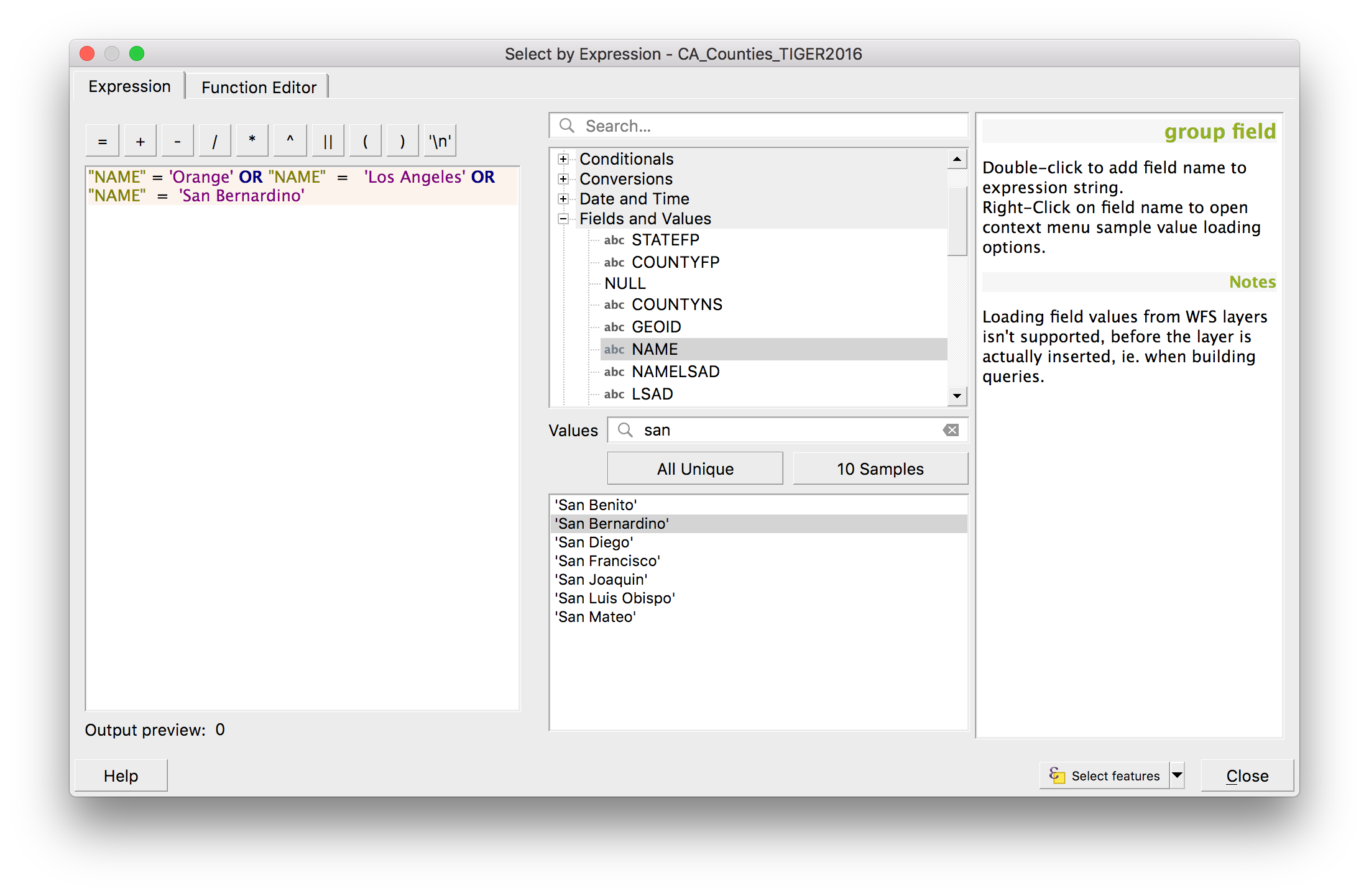
The expression builder is very powerful and enables you to do a lot of complex mathematical operations, not just simple queries. In our case, we want to open up the Fields and Values where we can see all the columns in our data. If we double click on the column we want to use, in our case the NAME column and similarly to how we wrote the query above to filter our data, we can write a query to select the three counties, Orange county. Los Angeles county and San Bernadino county.
Here is the query we have included in the Expression box:
"NAME" = 'Los Angeles' OR "NAME" = 'Orange' OR "NAME" = 'San Bernardino'
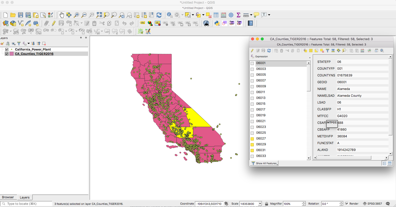
If you then click on the Select features button at the bottom right of your popup box, the three counties in question should be selected (highlighted in yellow) on your map view.
So now that we have selected our three counties, the fun bit! How can we select only the power plants located here?
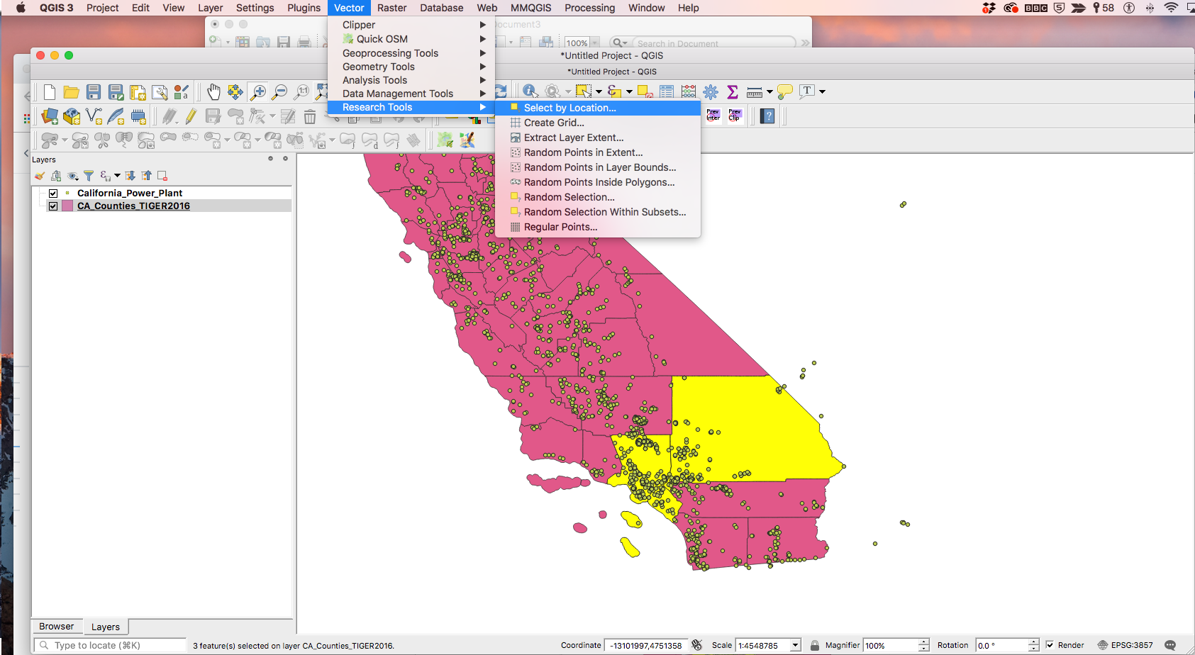
With our three counties selected, by going to the Vector menu in our QGIS menu bar, we should pick the Select by Location option from the Research Tools options, like below:
Vector > Research Tools > Select by Location…
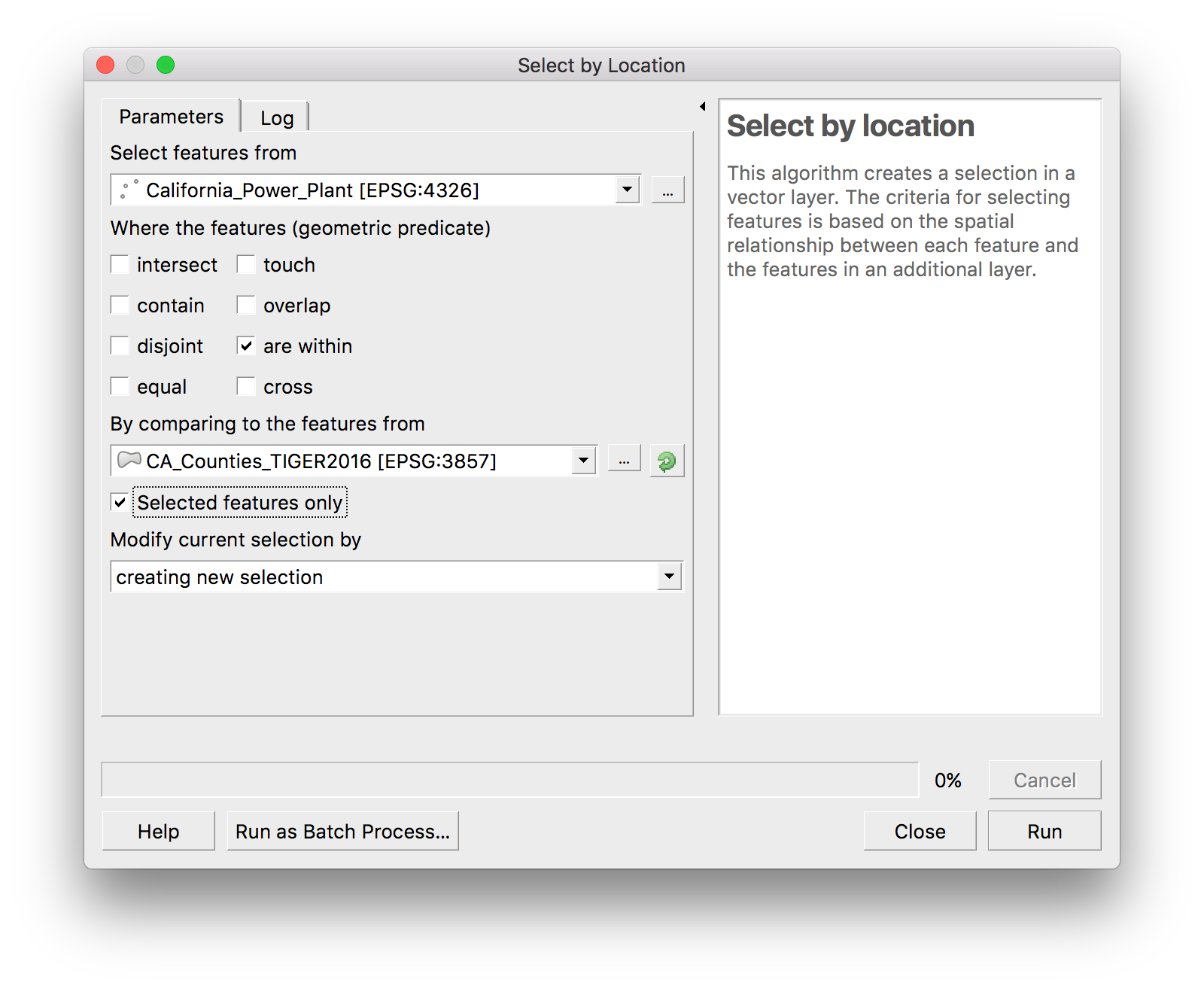
On making that choice, you get a popup so that you can make the right selection. What we want to do is select features from our power plant point dataset that are within the counties shapefile, so we modify the options in our Select by Location popup to reflect that, as you can see below.
The last thing is that we we want to ensure that the Selected features only option is ticked, so that only the power plants in our selected states of Los Angeles, Orange county and San Bernadino will be selected. We have also selected to create a new selection and then we can press Run.
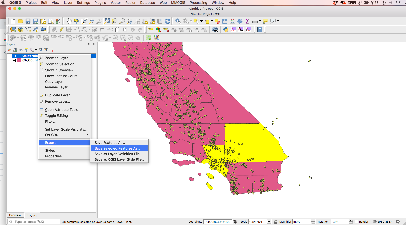
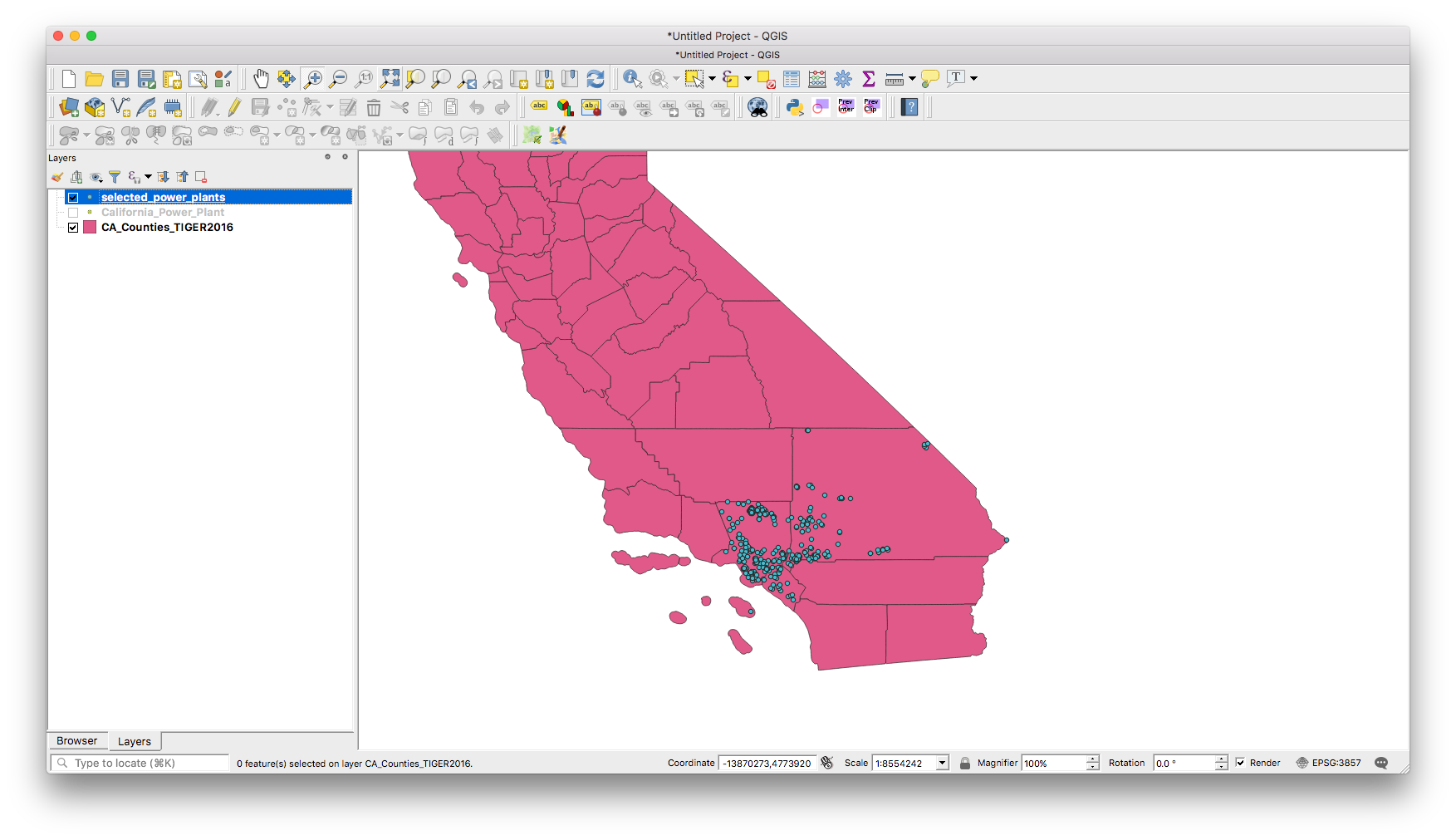
What you should now see after clicking Run is that all the power plants in these three counties alone are now highlighted yellow, so you can tell that the have been selected.
In order to save these in a new file, whether you want to save it out as a Geojson, shapefile or CSV, all you need to do is right click on the California_Power_Plant layer, got to Export > Save Selected Features As…. Make sure you click on save selected features, otherwise it will just save all the features (points) in the dataset.
Awesome, you have now created a new shapefile with just the power plants that are in those three counties!
Using the same California states shapefile as above with our power stations data on top, we can start adding some labels.
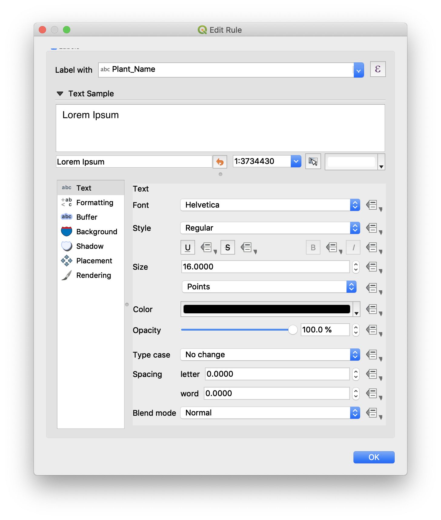
At first you might want to simply add a label for every power station. Do this by double clicking the power plants layer (or right click and hit Properties) and head into the Labels tab on the left. Select Single labels at the top and then choose the column in the data that should generate the labels: Plant_Name. You can also change the font style and size in here. Click OK.
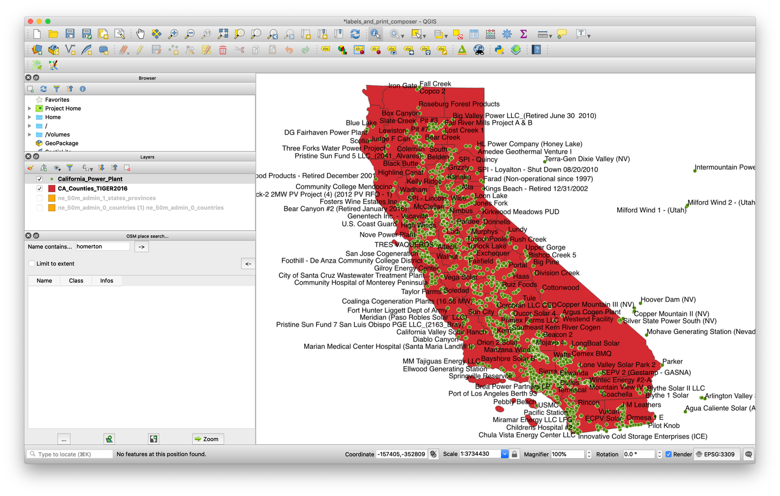
However, this will get a bit unwieldy!
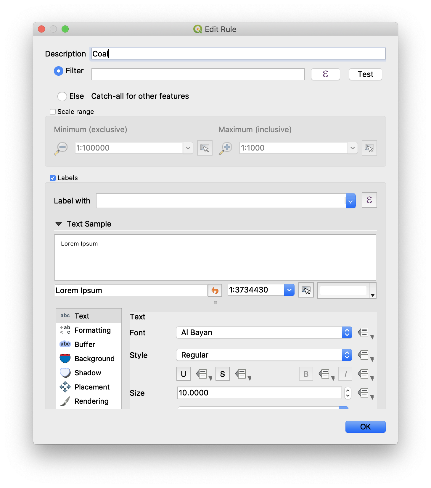
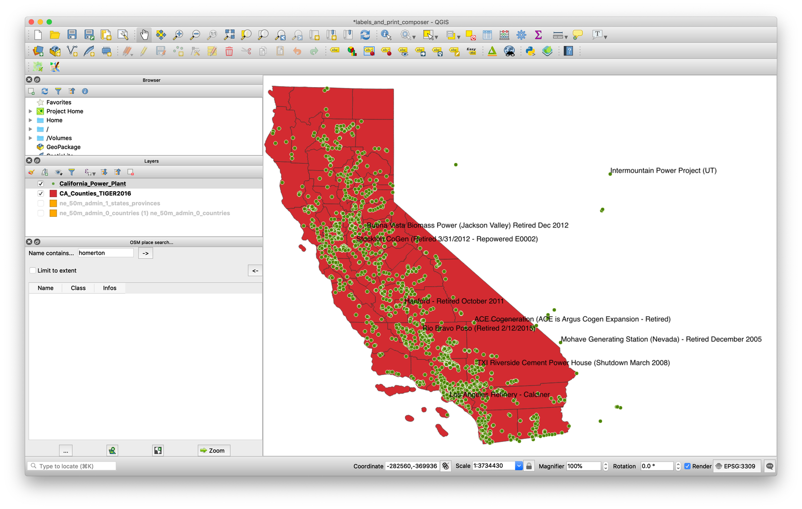
If we were doing a story on one type of power plants we’d want to add criteria for our labels, by displaying them just for coal power plants, say. To do this go back into your layer properties and in the labels tab choose Rule-based labeling at the top. Add a new rule by clicking the + sign in the bottom left, then in the Edit rule window that pops up automatically (or by double clicking the rule you made) give your rule a name.
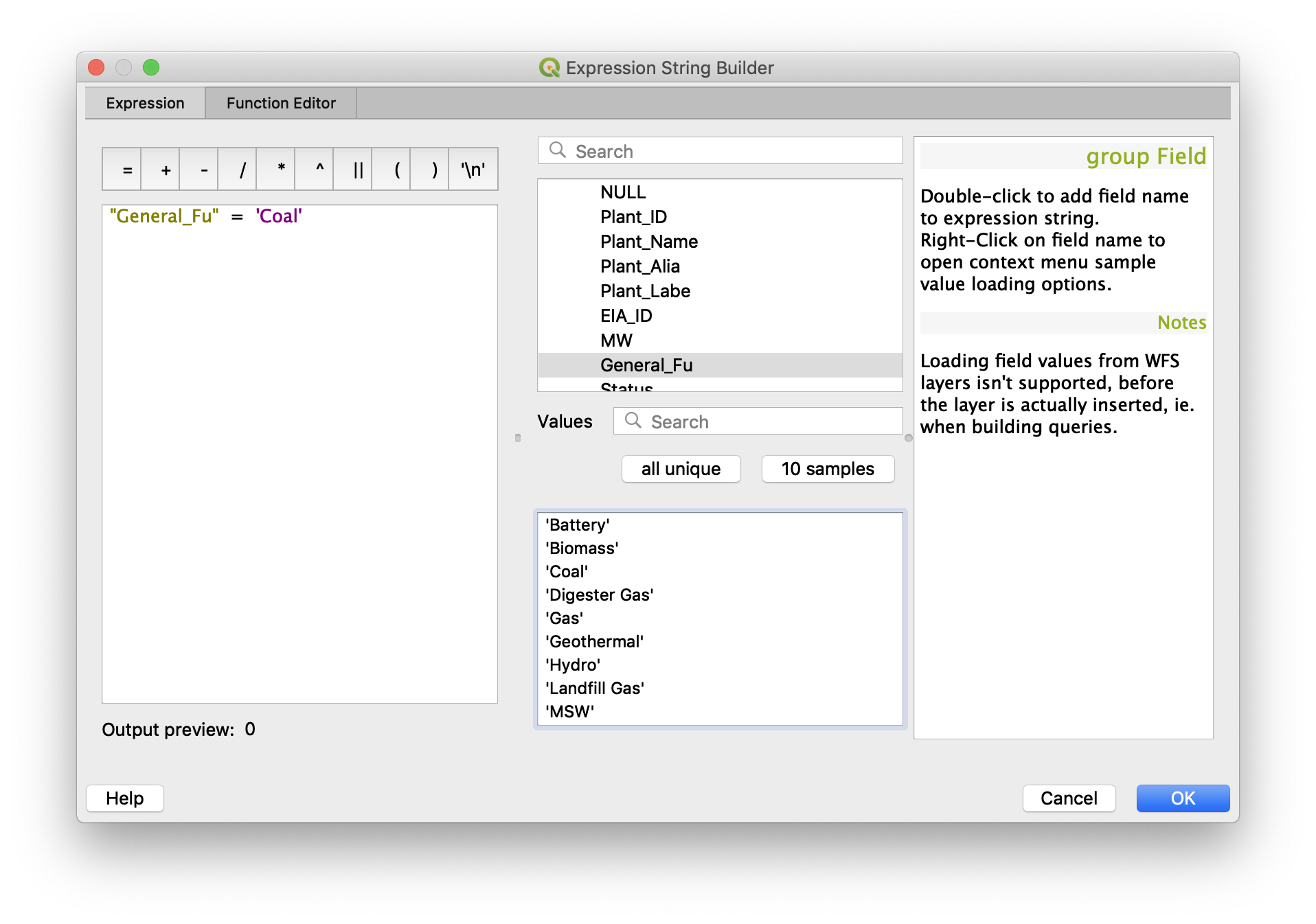
Click the ∈ sign to get to the Expression String Builder and when that opens expand the Fields and Values section and double click the column we want to use as a criteria: General_Fu. This will place it into the expression builder but we also have to set what value General_Fu must be equal to in order to display a label. Click all unique and you’ll see the unique values of that column. Press or type the equals sign where the expression is being written and then double click the value we want: Coal. Click OK.
Click OK to get out of the other windows too and you should see your filtered labels on the map:
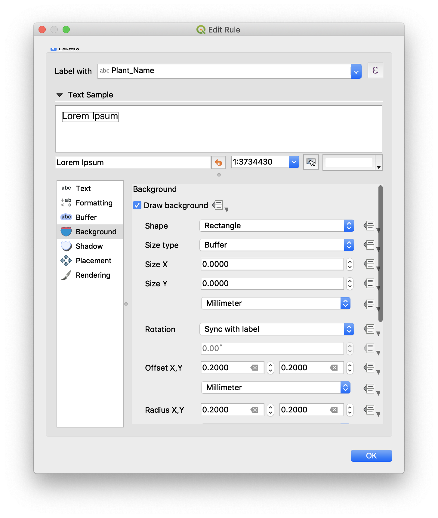
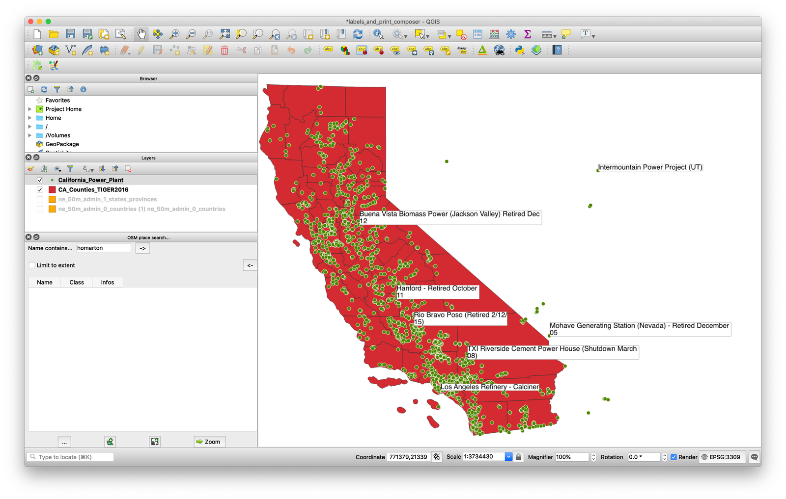
You might also want to add a background to the labels so they can be seen over land areas. Double click on the rule you created in the properties window of the power stations layer, and edit this in Background.
You can also go into the Formatting section to make labels wrap onto 2 lines after a certain amount of characters.
You can connect points with labels via callout lines, but you need to install another plugin such as EasyCustomLabeling.
Print composer is where you go to get a map ready for publication. It allows you to add titles, scales, sources and then export them as a SVG or PNG. Using the power stations map that we labelled above, find New Print Layout under Project and in the box that pops up give it a name. Naming the print layout allows you to open it up again when the project is saved.
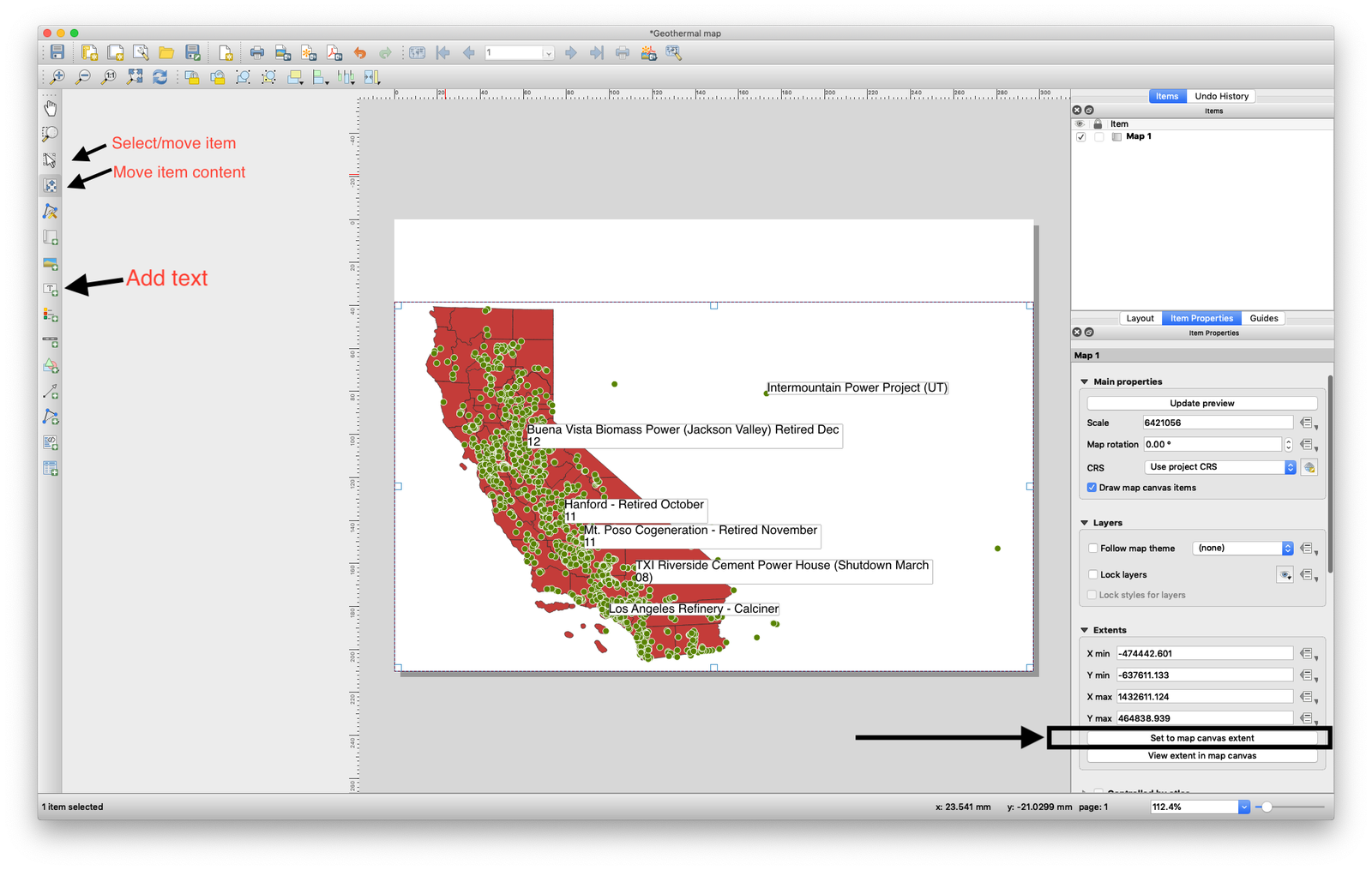
Once the print composer window has opened, add the map by clicking Add item > Add Map. Draw a box on your canvas and the map, as it appears back in the main QGIS window, will be added. Try and get your map to look how you want it to in the main QGIS window, then come back to the print composer and click Set to map canvas extent in the Item properties toolbar on the right to get the print composer to reflect your changes. By default moving the box with the map in will move the box but not its contents. To move the contents, click Move item content in the toolbar on the left.
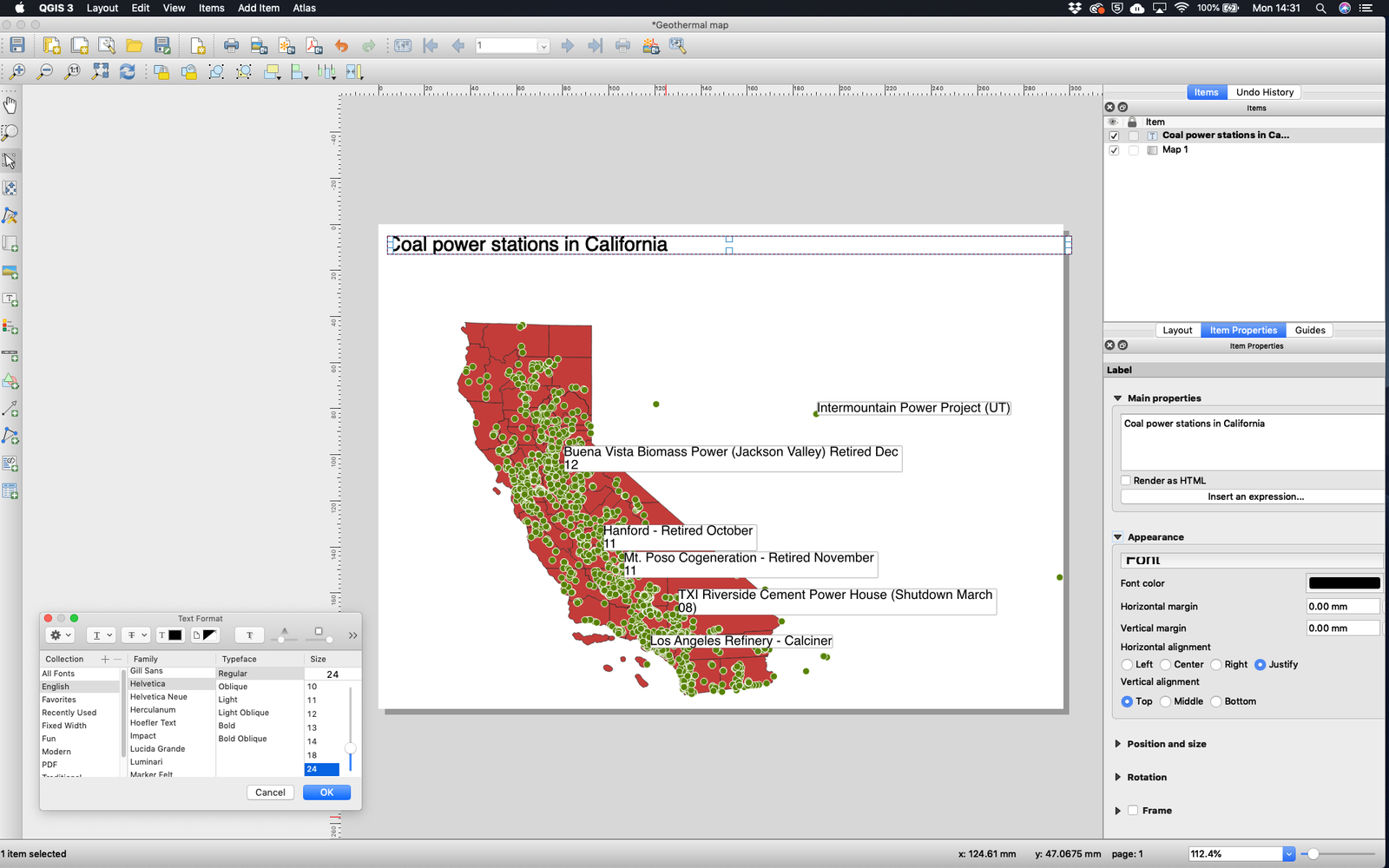
To add a title click Add Item > Add Label and draw a text box on the main canvas. Make sure you have selected the text box (select items by clicking the arrow button on the left hand toolbar) and then to edit the text write your title in the Main properties section of the label’s Item Properties on the right. To change the font size or style click the Font box under Appearance and a Text Format box will appear.
Reposition the map a bit using the steps above to give yourself room for a scale bar and source at the bottom.
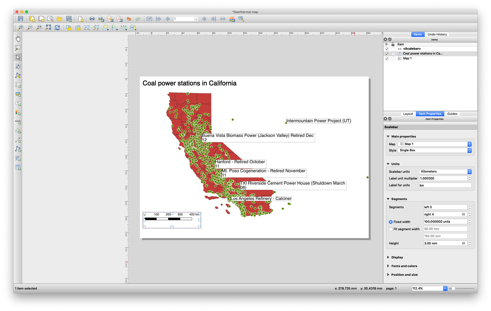
To add the scale bar, click Add Item > Add Scale Bar and drag it to where you want it. Once it’s selected you can change the number of points by editing the settings in Segments on the right toolbar (making these left 0 and right 4 will give you 0-400 with 4 intervals). You can also change the font by expanding the Fonts and colors section and double clicking the box that says Font.
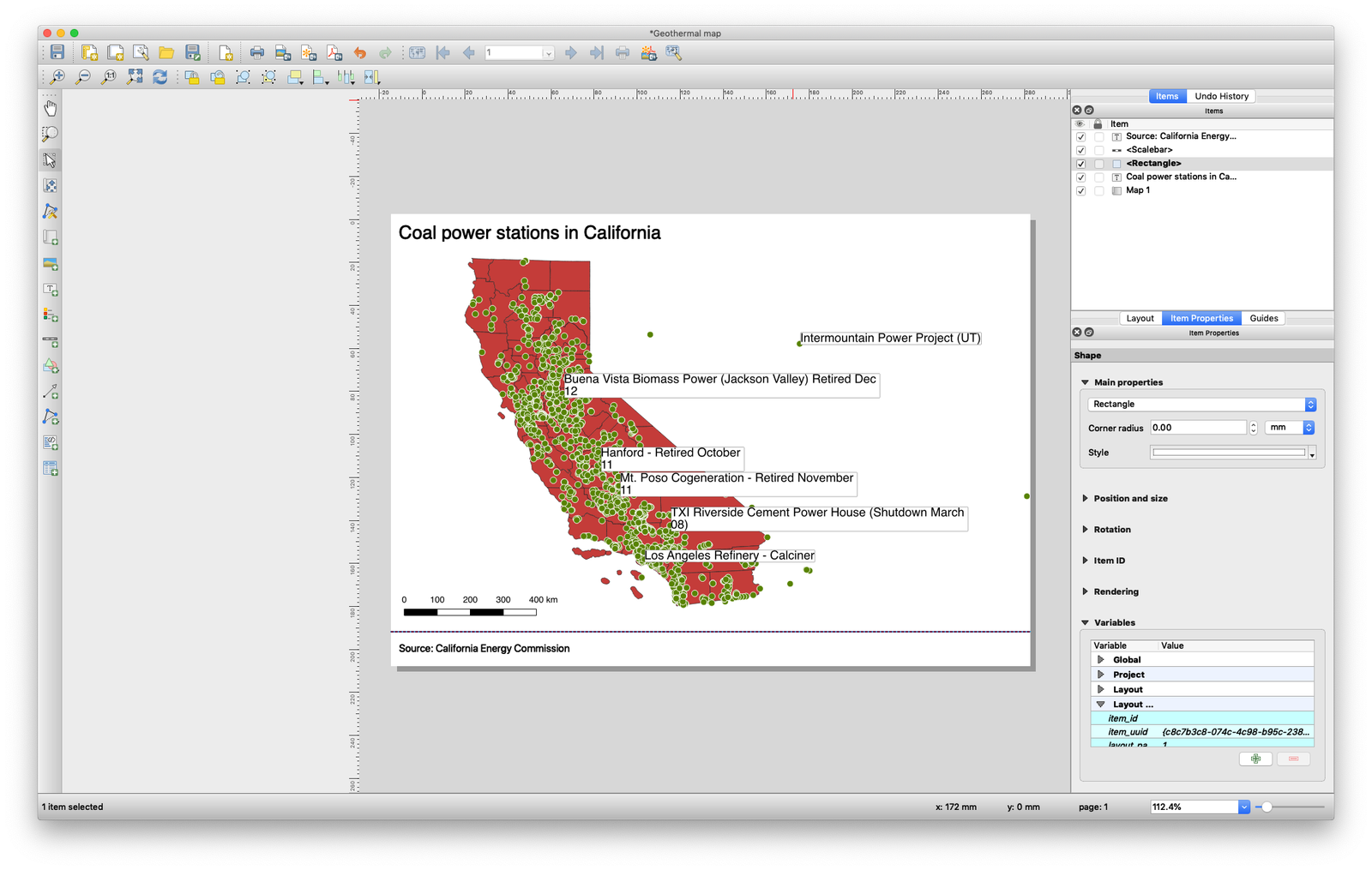
To add a source, repeat the steps above on creating a title but lower the font size a bit. Move it to the bottom and then draw a line above it by clicking Add Item > Add Shape > Add Rectangle. Drag this across the width of the canvas and make sure it’s not got any depth, so it looks like a line rather than a box. If you find it hard to select the line using the cursor once it’s created because it’s so thin, select the <rectangle> item it in the Items panel in the top right instead; from there you can set the style under the Main properties section on the right.
To add a logo to your map click Add Item > Add Picture, draw a box where you want it and then in the Image source section of Main Properties on the right browse to the location of your picture, which is in the screenshots folder. Insert the image and then drag it to the bottom right of the map.
You can now export the map as an image, under Layout > Export as Image or as an SVG under Layout > Export as SVG , although the SVG export function is probably better used at an earlier stage, before all the labels etc have been added, so that you can edit the map in Adobe Illustrator, say, and add the extras using Illustrator itself.
What if you have a lot of point data, and you want to actually make a choropleth map of the number of points in each area? For example in our case, we want to make a map displaying the number of solar power plants in each of California’s counties?
You could export the data and group it by county for example if you have a counties column in your dataset, or if you don’t you could geocode the data to find the county each point lies within, but we can count how many points are located within each polygon easily within QGIS with a Count points in polygons spatial analysis.
First up, we will select the solar power plants in the same way we explored above, so if we right click the California_Power_Plant layer and select Open Attribute Table and then click the Select features by expression icon at top of the toolbar, we can write a query to filter just the plants which have Solar in the General_Fu column.
And if you click Select features at the bottom once you have queried by Solar, you should get something like this, which shows the points highlighted in yellow (selected) that are the Solar power plants.
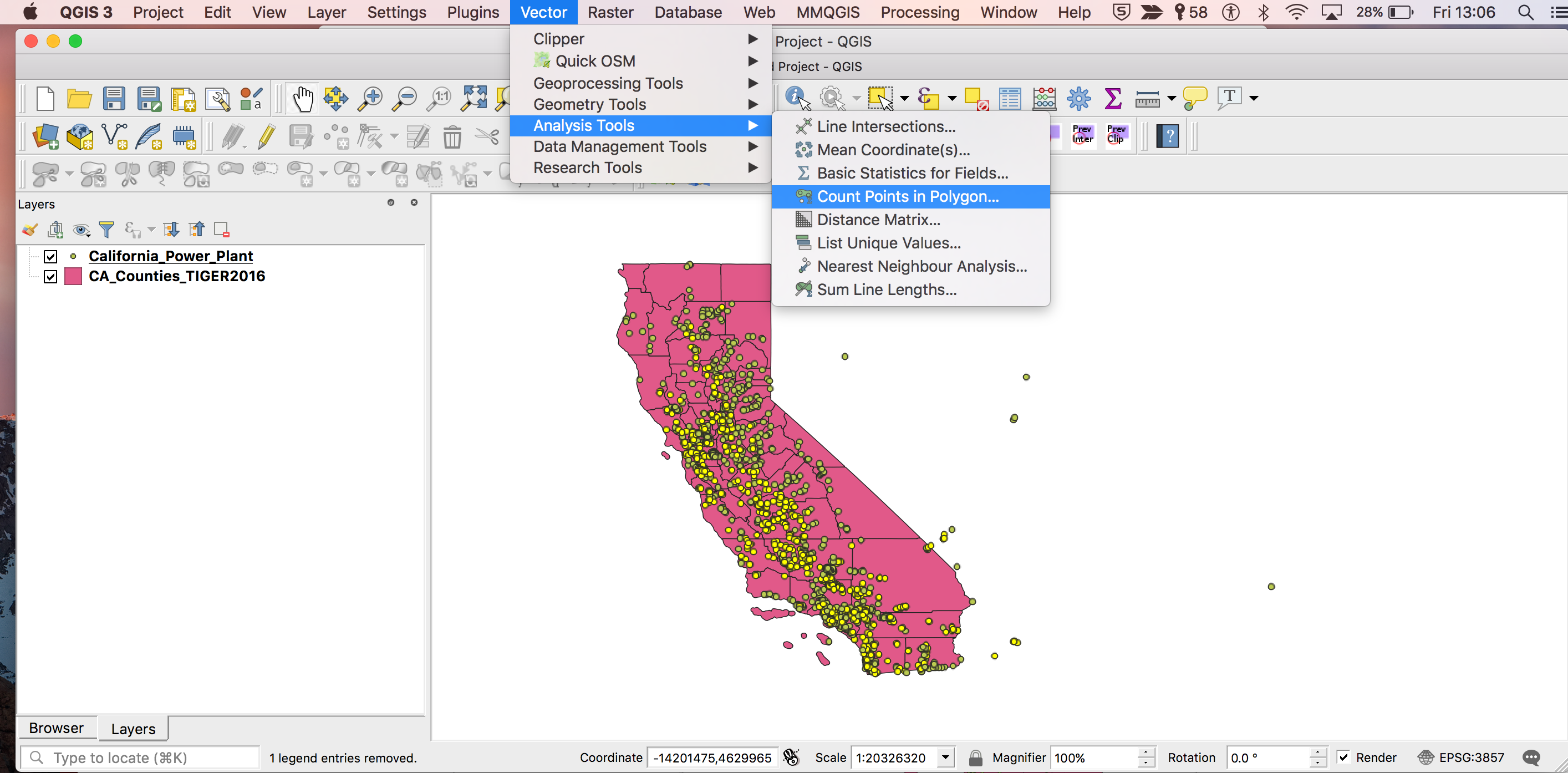
Once you have selected the power plants you want, the next step to making the choropleth map is to run the Count Points in Polygon analysis.
Vector > Analysis Tools > Count Points in Polygon
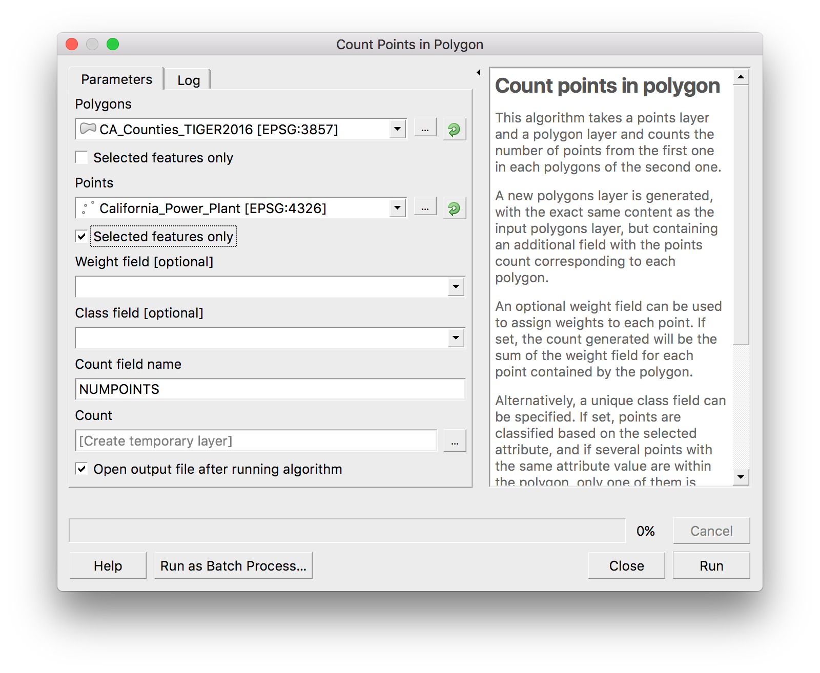
When we select that option, we get a popup to select the specific layers we want to look at, the layer for the points we want to count and the layer with the polygons that we want the points to fall within.
So for our data, the points layer is the California_Power_Plant and the polygons layer is the CA_Counties_TIGER2016. The Count field name is automatically filled in for us with the name NUMPOINTS, you can change that if you want to.
Remember given we want to see just the solar power plants, which we selected above, we need to make sure that Selected features only is ticked.
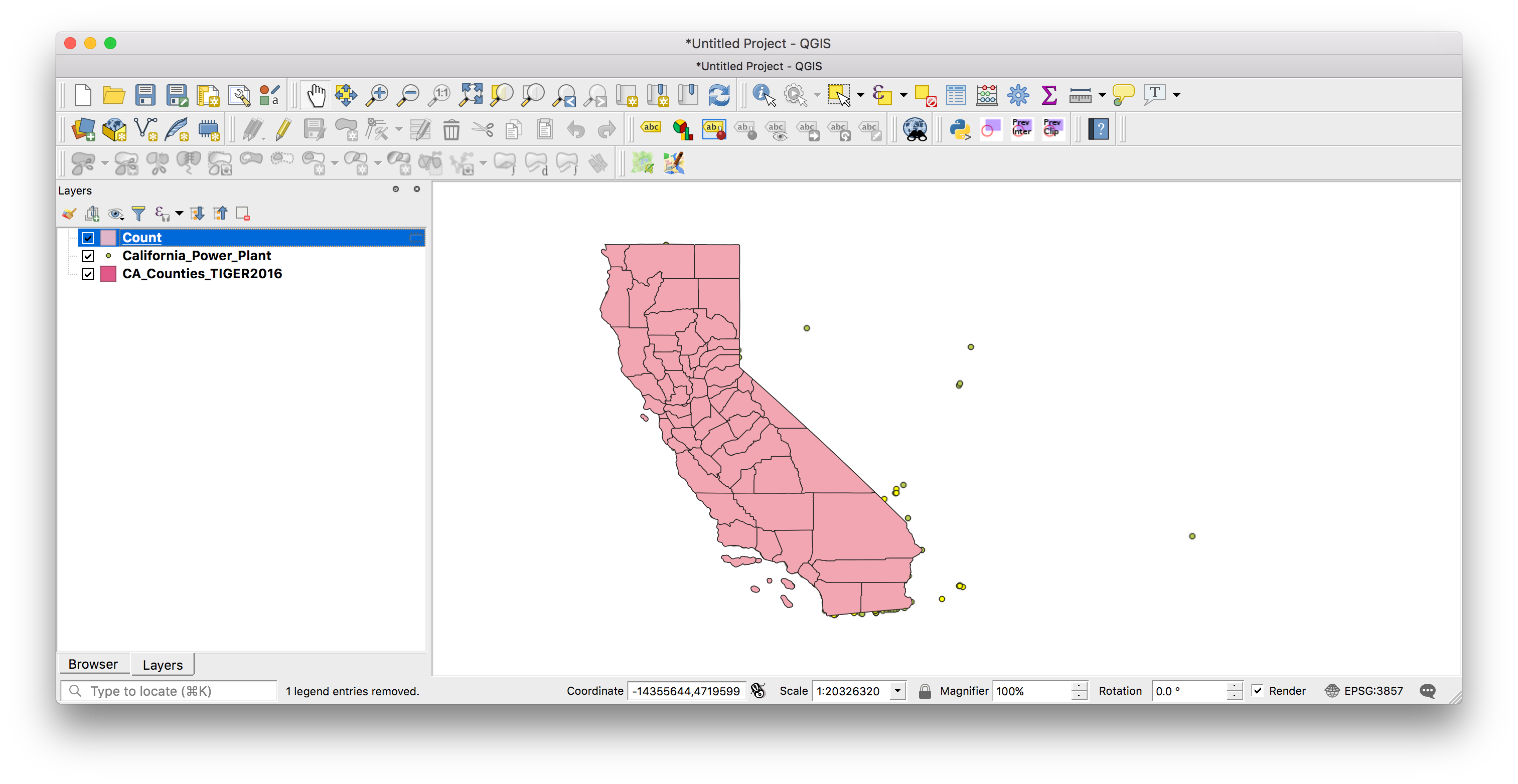
When we click the Run button, what this will do is that it will create a new temporary layer which is identical to the counties shapefile but append a numeric column called NUMPOINTS, which will have the number of solar power plants in the NUMPOINTS column.
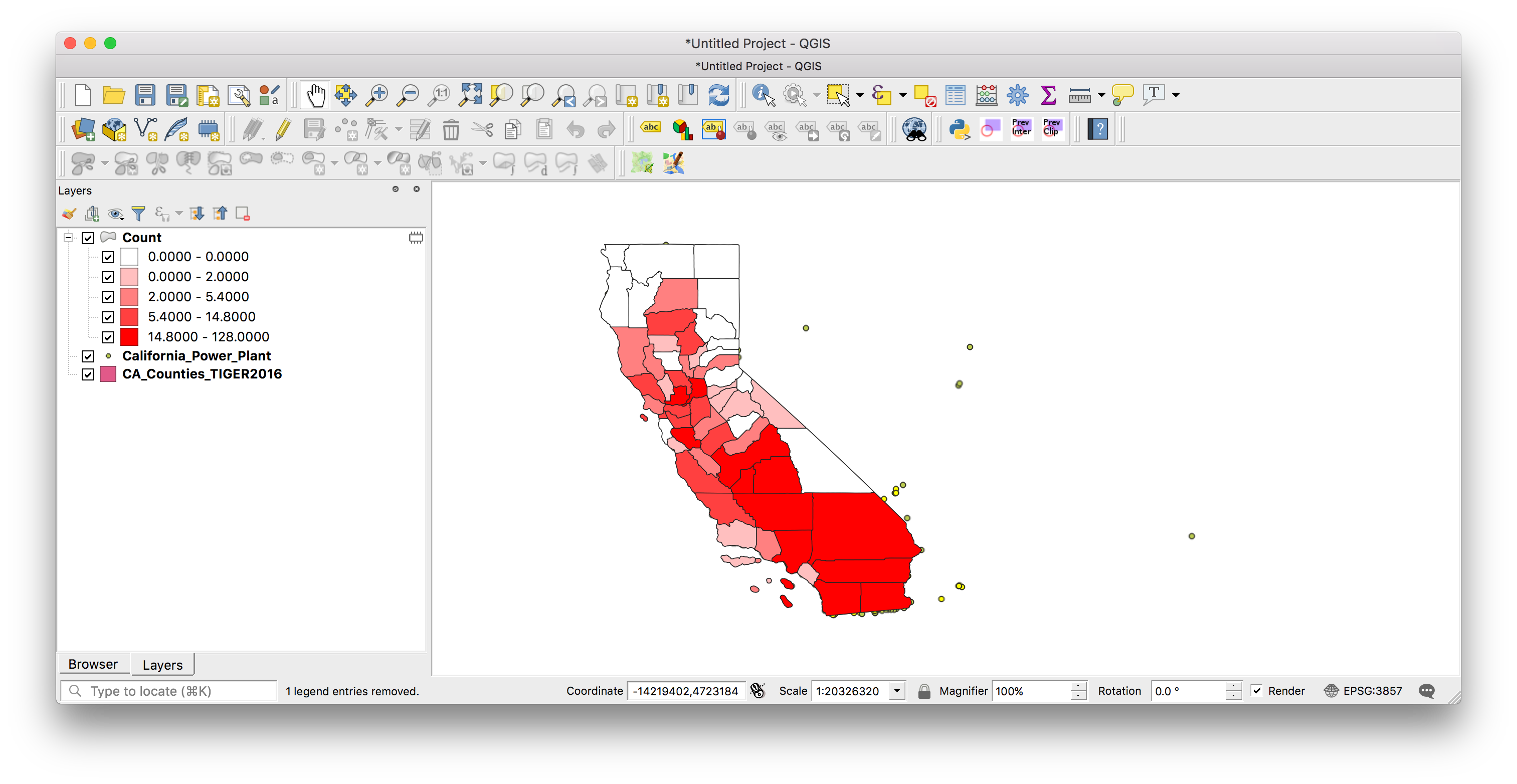
When you go back to your main QGIS window after the count points in polygons analysis finishes, you will get a new layer called Count in your layer window.
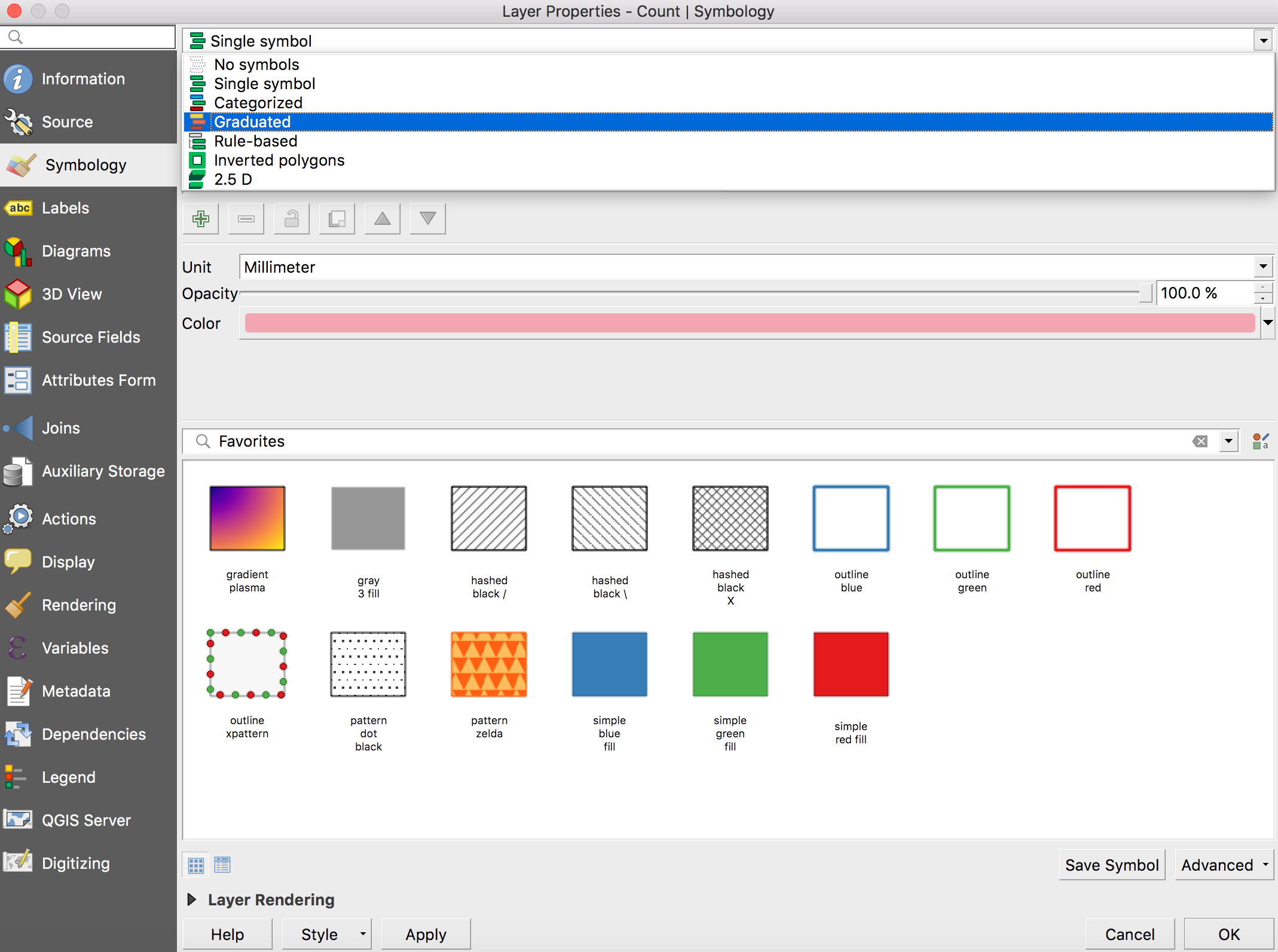
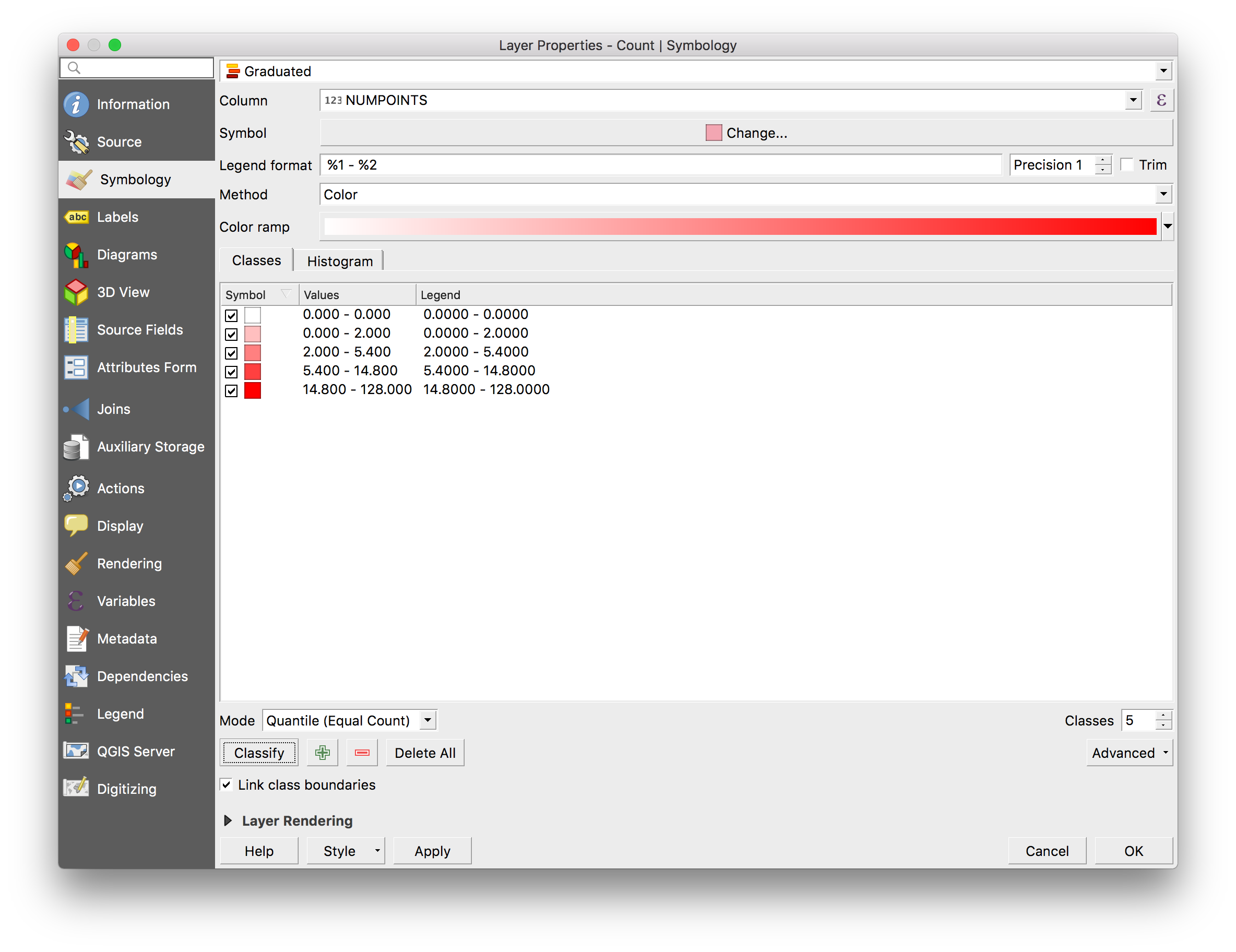
To make your choropleth map, you need to double click on the Count layer and make your map as you would normally do (see QGIS I).
Double click Count layer > Symbology > Graduated
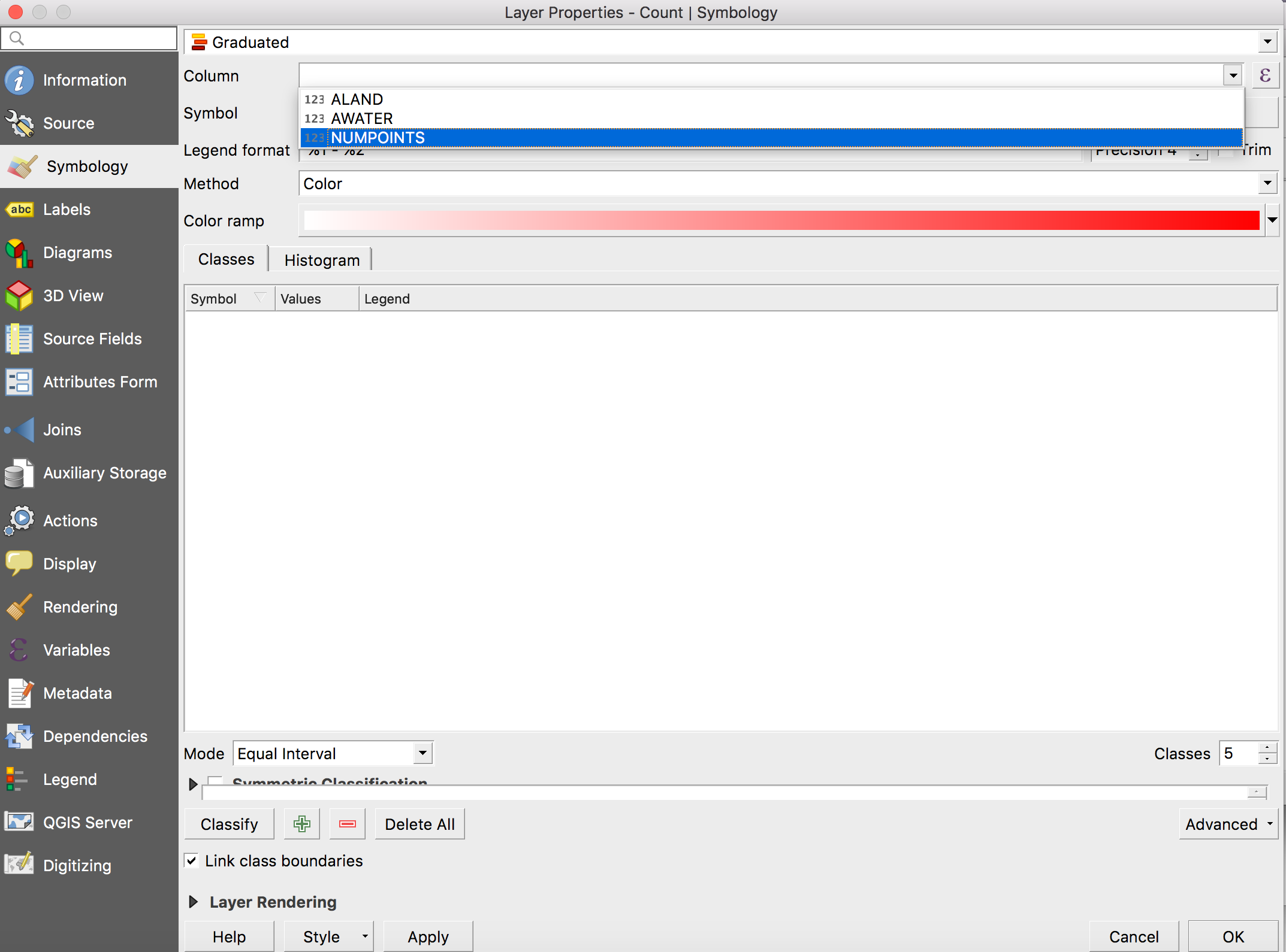
Once you select the Graduated option, you can then pick the column which contains the data you want to use for your choropleth map, which we know in our case is the column called NUMPOINTS.
You can then choose the mode you want - have gone for Equal Interval here - and picked five classes, but what you choose is up to you!
Once you click Classify, you will get the different classes and colours QGIS has selected for your map based on the input options.
Success! If you then go back to the main QGIS window, you can see your choropleth map where each county is coloured based on the number of solar power plants it has.
Open Street Map is an open source map of the world built by contributors. There is an API that you can use to get the data as well as a browser-based explorer called overpass turbo, but these can be a bit tricky to use.
Quick OSM is a nice plugin for QGIS that allows you to download OSM data directly into QGIS. You can use it to visualise roads, boundaries, rivers, restaurants and many more things. We used it to show that there’s actually already a lot of ’wall’ along the Mexican border.
A good place to start is with roads. If you haven’t already installed the plugin, go to Plugins at the top, then Manage and Install Plugins and type Quick OSM into the search bar and install. Once installed find the plugin under the Vector tab, open it up and make sure you’re in Quick Query on the left panel.
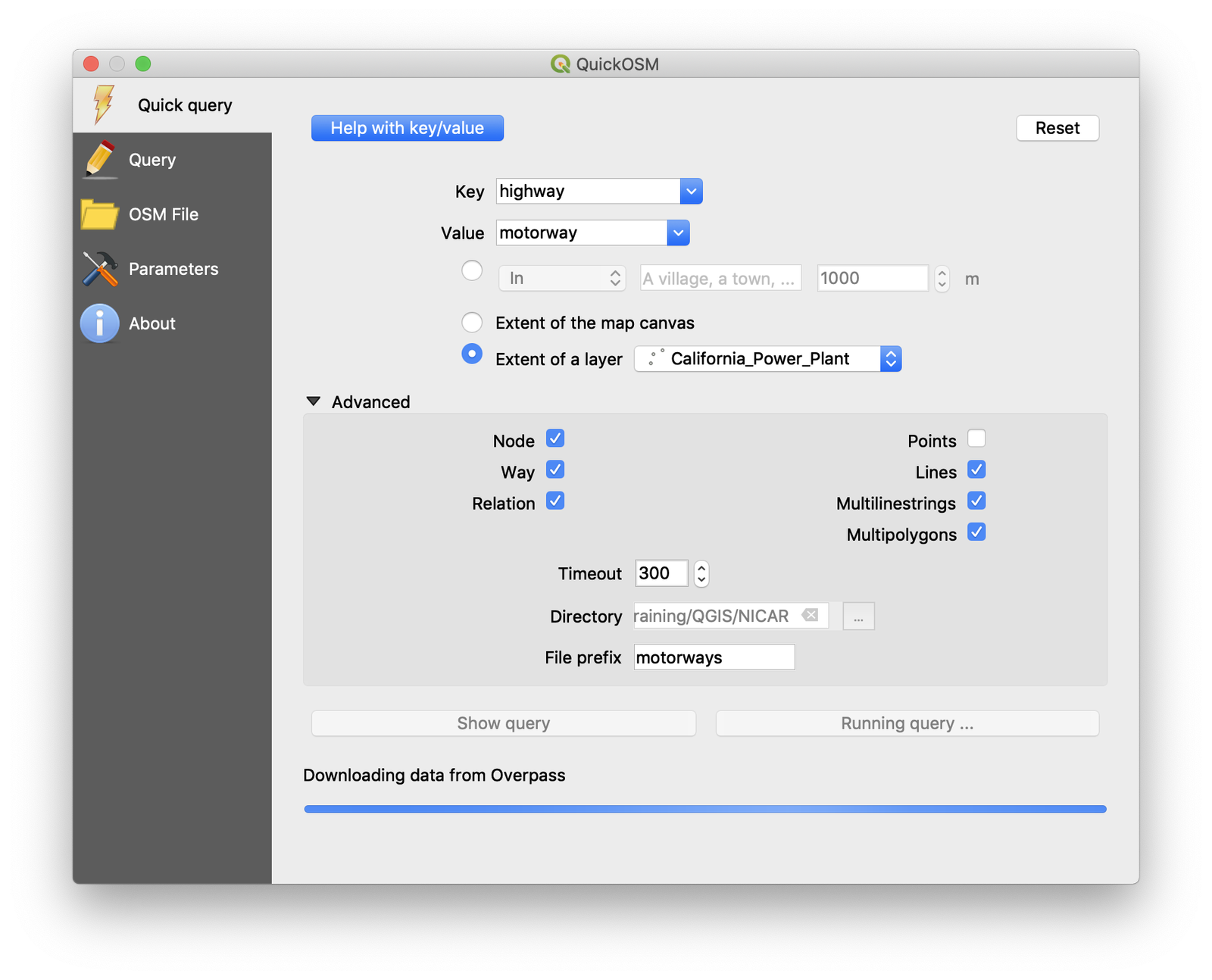
When you begin playing around with this you’ll want to make sure that you’re zoomed into a fairly small area and have Extent of map canvas selected in the Quick OSM window, as it can take a while to request lots of data. If you’re ready to get a lot of data you can switch that to Extent of a layer and choose your layer.
Select highway under Key and primary under Value. There’s a useful taxonomy on the OSM wiki (which is really good). Essentially the order of importance/size of roads is: motorway (ie freeway) > trunk > primary > secondary.
When downloading roads, you may as well deselect Points in the Advanced section as this is just another lump of data to download that we don’t really need (it’s just the points where roads connect). It’s also worth adding a directory and file name for the data as QGIS could crash, forgetting your layer if it’s only temporary layer.
[can also deselect Node and Relation on the left. Along with Way these are the three fundamental elements in OSM and we only need Ways, which are essentially lines]
Hit Run query once your QuickOSM window looks like this:
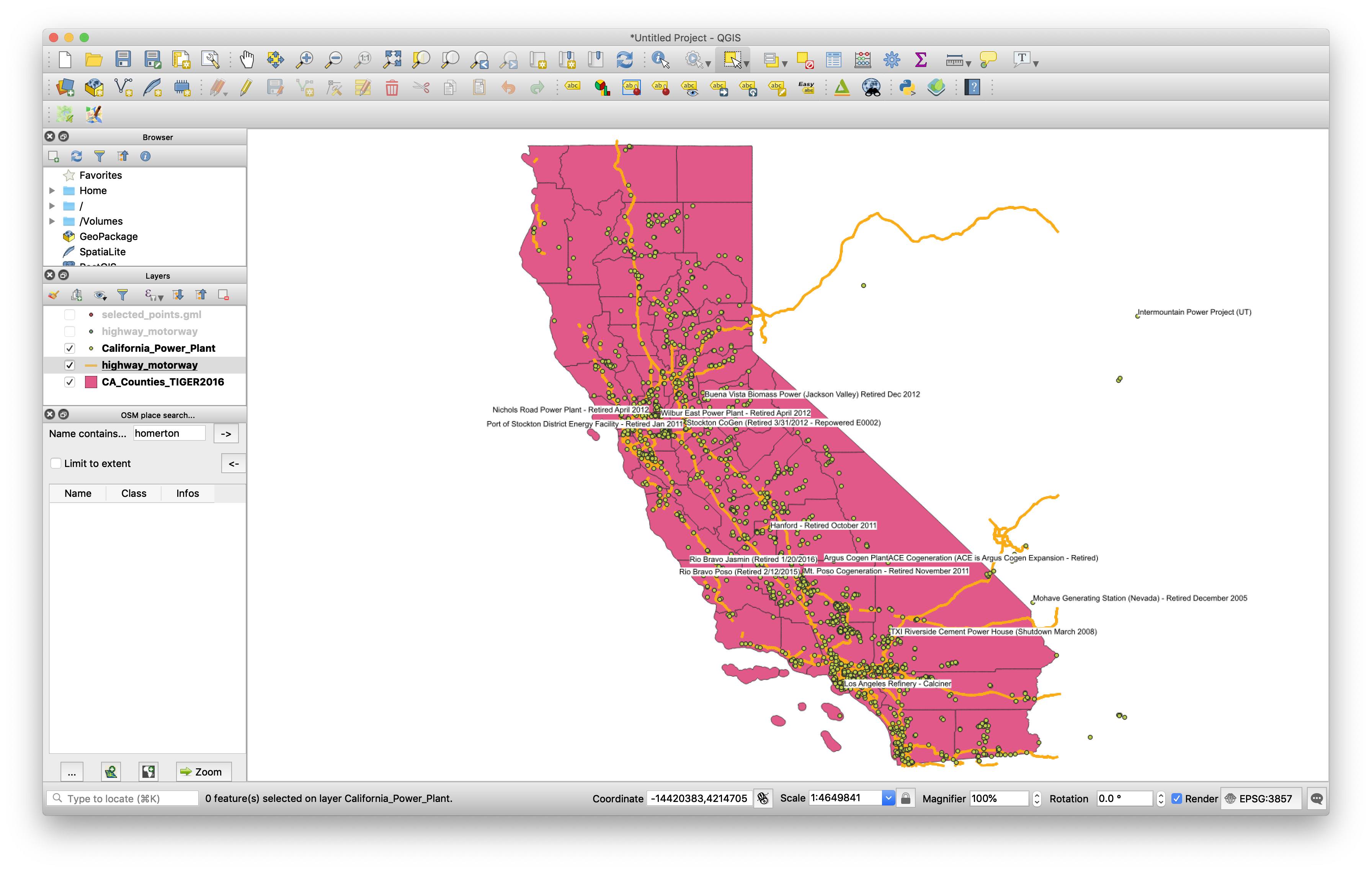
After you’ve run that on both motorways and trunks (here I’ve also got state boundaries by setting the Key as admin_level and Value as 4 - wiki here) you should have something like this:
Bonus extra:
It seems that if you’re trying to download too much data Quick OSM just says there isn’t any, so in case you need to download a really large amount of OSM data you can find it in zip files broken down by areas of the world. You can download it as a shapefile (but these are huge) or a .pbf to save time/space. If you go for .pbf you will need to convert it to a spatialite database (.db) in the command line using ogr2ogr and extract only the area you need, eg like this:
ogr2ogr -f "SQLite" -dsco SPATIALITE=YES -spat 2.59 46.58 -1.44 47.07 out.db in.pbf
(where -spat is the west, south, east, north coordinates of the area within the downloaded data that you want to extract). Then you can add the spatialite layer in QGIS and filter it for the type of data you need, eg get just the motorways by filtering for polylines and "highways" = 'motorways'
