This repo contains a small Node.js script that consolidates loosely structured Excel data from LinkedIn. I created it as part of my final assignment for the class DCAS 5331 - Social Media Analytics. The following steps cover how to use the repo, as well as retrieving your initial data from LinkedIn.
These were the project deliverables.
-
Final paper:
Nathan-Smith-DCAS-5331-final-paper.pdf -
Final slide deck:
Nathan-Smith-DCAS-5331-final-deck.pdf -
Narrated slide deck video:
https://youtu.be/G111fLzhE_w
This presupposes that you already have Node.js installed.
Clone this repo. Then run the install command from within the project directory. That will download all the necessary dependencies. It is worth noting that SheetJS installs from their own hosting endpoint, because they prefer maintain it separately from NPM.
npm installRun this command to invoke the script.
npm startAfter which, you should see newly generated *.csv and *.xlsx files present in the output directory. Without any changes, the initial pass will use my example data from the excel directory. Replace those Excel files to consolidate your own LinkedIn data.
Input:
excel/PostAnalytics_UserName_7057749101953626112.xlsxexcel/PostAnalytics_UserName_7058097033693315072.xlsxexcel/etc…
Output:
output/linkedin-data-list.csvoutput/linkedin-data-list.xlsx
The CLI should log something akin to this.
============
Example row:
============

{
  "post_date": "2025-04-26",
  "post_publish_time": "18:23",
  "impressions": 2101,
  "members_reached": 1252,
  "reactions": 75,
  "comments": 13,
  "reposts": 1,
  "employees_1_to_10": 0.0854632556438446,
  "employees_51_to_200": 0.11821085959672928,
  "employees_201_to_500": 0,
  "employees_501_to_1000": 0,
  "employees_1001_to_5000": 0.08785942196846008,
  "employees_5001_to_10000": 0,
  "employees_10001_or_more": 0.1645367443561554,
  "reactions_top_job_title": "Founder",
  "reactions_top_location": "Dallas-Fort Worth Metroplex",
  "reactions_top_industry": "Software Development",
  "comments_top_job_title": "Software Engineer",
  "comments_top_location": "Boise Metropolitan Area",
  "comments_top_industry": "Software Development",
  "post_url": "https://www.linkedin.com/feed/update/urn:li:ugcPost:7321962034693054465"
}

==================
New files created:
==================

• output/linkedin-data-list.csv
• output/linkedin-data-list.xlsx
⚠️ NOTE:
- Make sure to delete my example files from the
exceldirectory so you are parsing only your specific data.- Feel free to use mine for kicking the tires. But to get real utility from this script you will probably want your own info. If you simply add your files to mine, that will create an unrelated mishmash.
To see a list of all your posts on LinkedIn — including reposts that are not first-party authored — go to this URL. Replace YOUR_USER_NAME with your actual user name.
https://linkedin.com/in/YOUR_USER_NAME/recent-activity/all
In my case, the URL looks like this. Yours will obviously be different.
https://linkedin.com/in/nathan/recent-activity/all
Hit your "page down" button several times. Eventually, you will run out of posts that contain a link with the text "view analytics." This is due to LinkedIn only retaining approximately a two-year rolling window of past data about posts.
Once you are reasonably certain there are no other posts that still have analytics available, paste this script the browser's JavaScript console in dev tools. That will build an array of URLs. Open those one by one, and download your Excel files into the excel directory in this project. Then follow the "convert data" step listed above.
(() => {
  // Get links.
  const linkList = document.querySelectorAll(".analytics-entry-point[href]");

  // Set later.
  const urlList = [];

  // Loop through.
  linkList.forEach((item) => {
    // Get URL.
    const url = item.getAttribute("href");

    // URL exists: YES.
    if (url) {
      // Add to list.
      urlList.push(`https://www.linkedin.com${url}`);

      /*
      =====
      NOTE:
      =====

        You can optionally enable this line. It may cause
        LinkedIn to rate limit your requests. It might be
        best to simply open each link manually to prevent
        being flagged as engaging in bot-like behavior.
      */
      // window.open(url);
    }
  });

  // Log array.
  console.log(urlList);
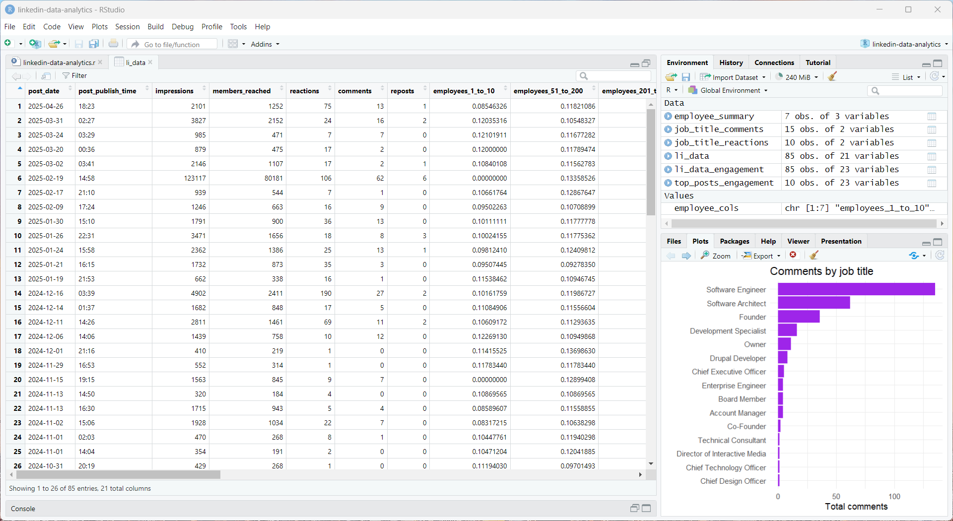
})();Beyond the scope of this repo, you might find it helpful to parse your collated Excel file using an app like RStudio. Scroll to the bottom of this document to see the R code that generated these example graphs.
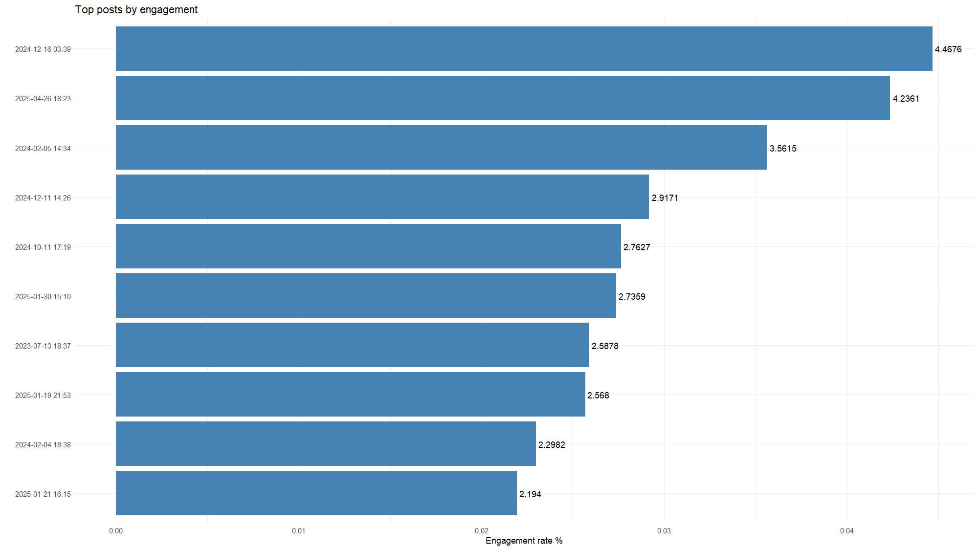
Top posts by engagement
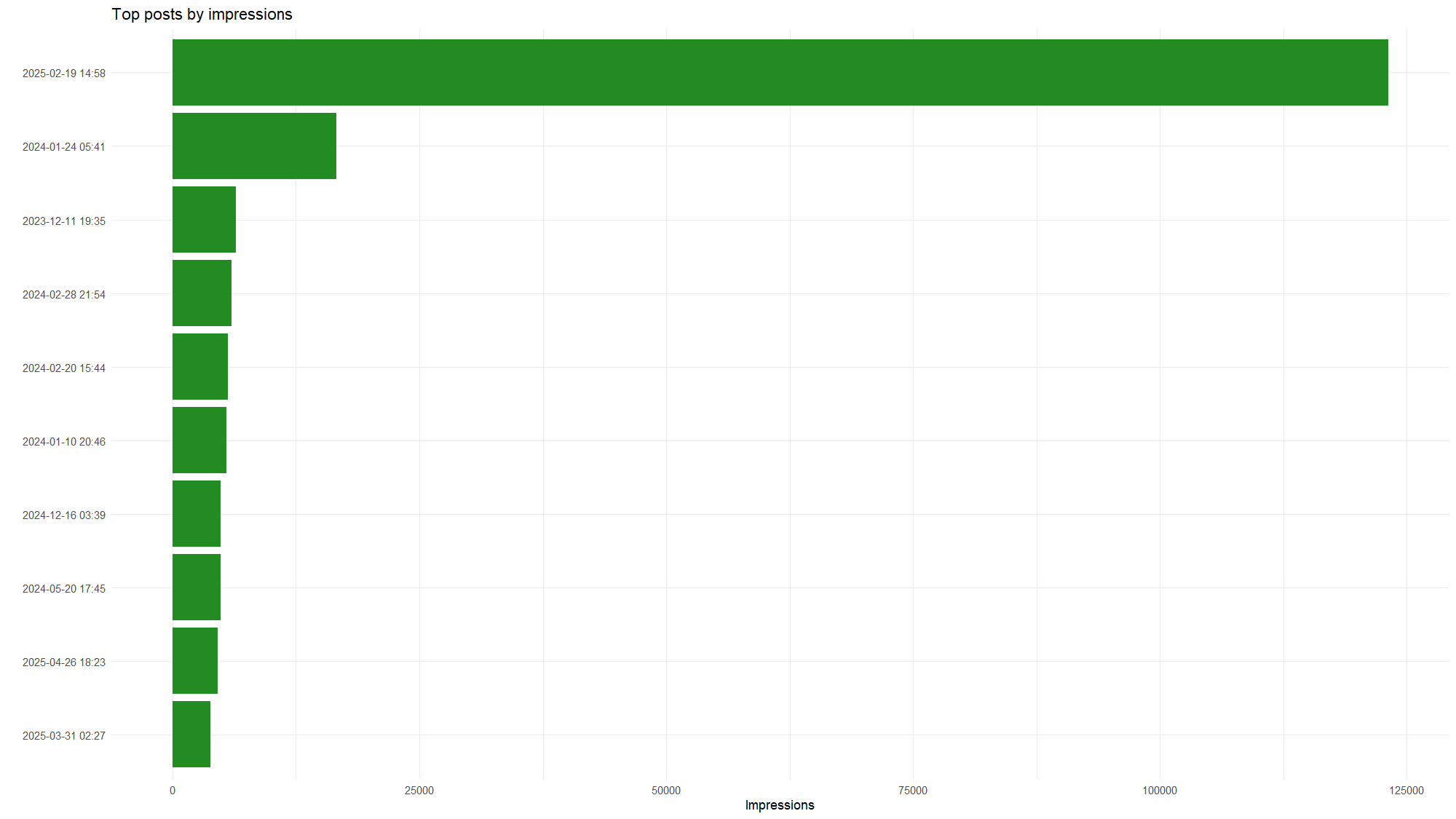
Top posts by impressions
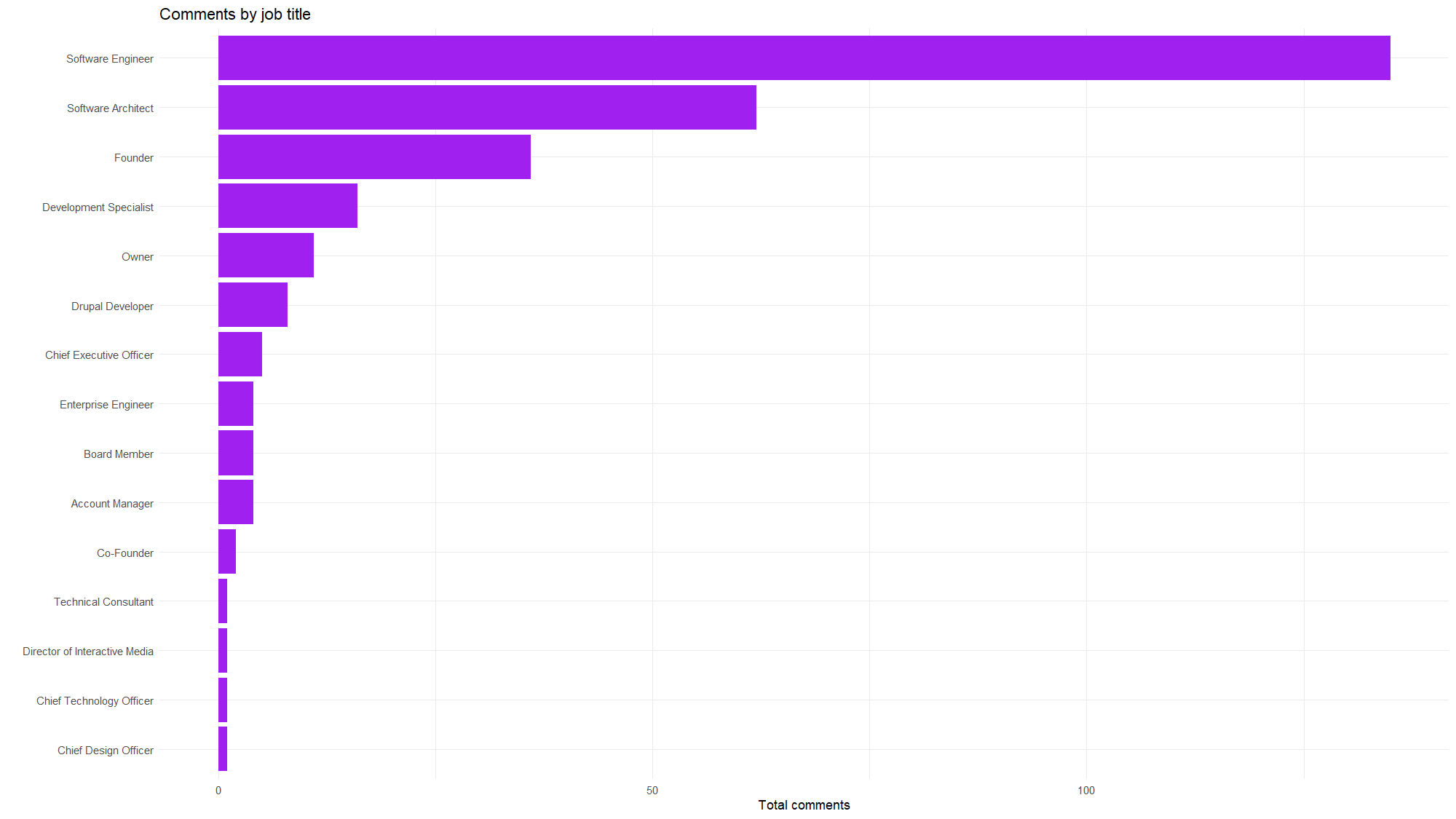
Comments by job title
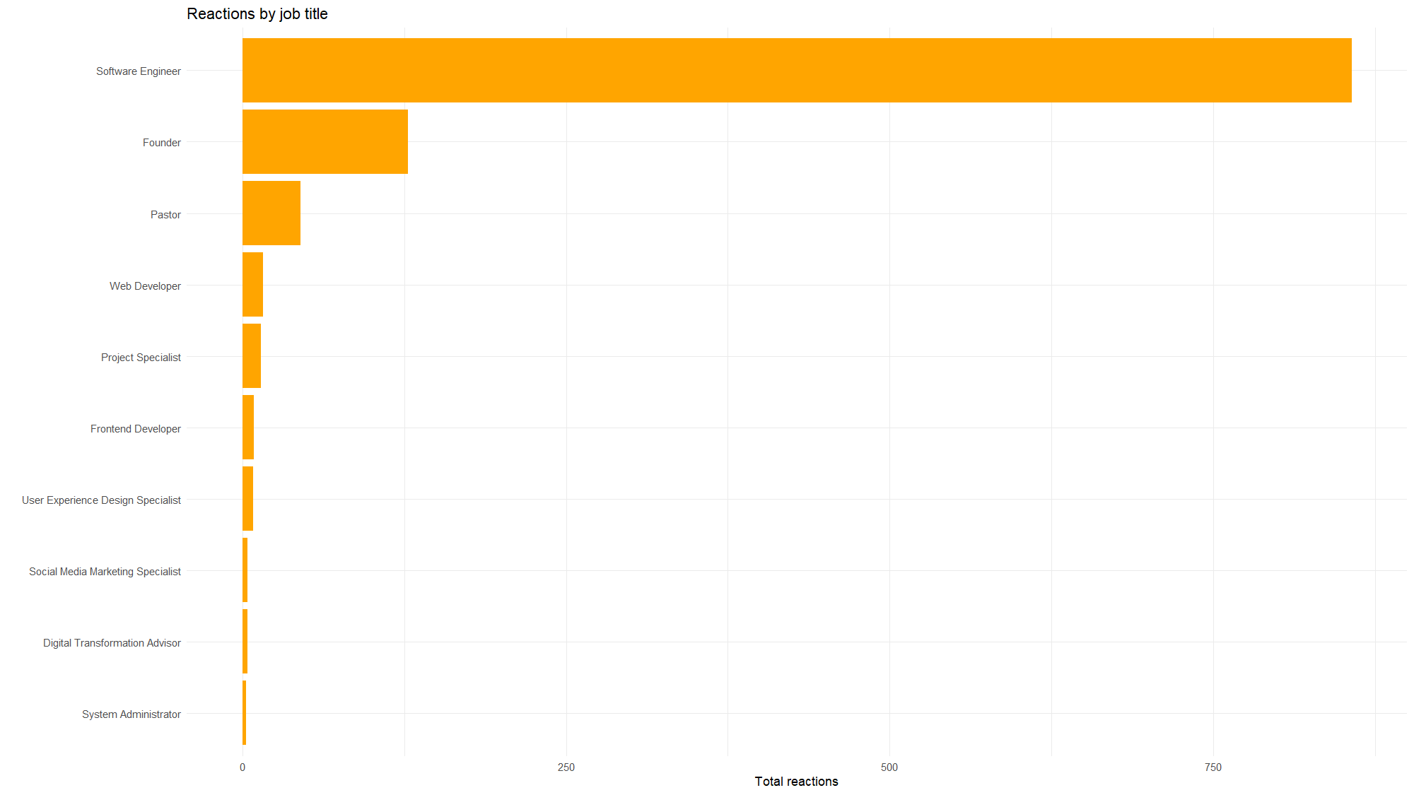
Reactions by job title
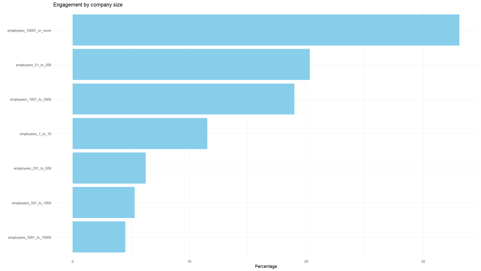
Engagement by company size
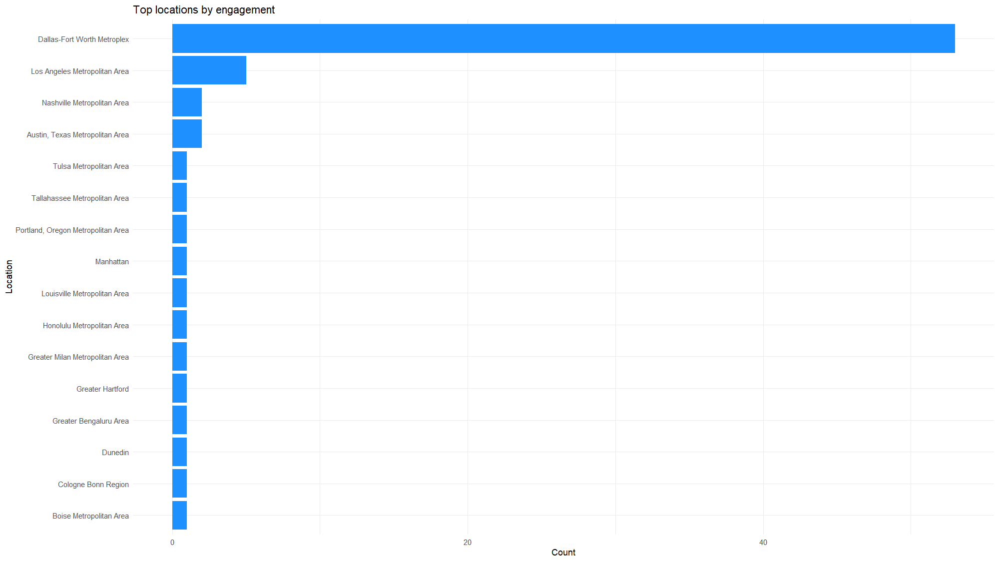
Top locations by engagement
➡️ This R code can be used to generate graphs.
# ~~~~~~~~~~~~~~
# FILE PATH ----
# ~~~~~~~~~~~~~~

PATH_TO_EXCEL_FILE = "./output/linkedin-data-list.xlsx"

# ~~~~~~~~~~~~
# INSTALL ----
# ~~~~~~~~~~~~

install.packages("dplyr")
install.packages("ggplot2")
install.packages("readxl")
install.packages("scales")
install.packages("tidyr")
install.packages("tidytext")

library(dplyr)
library(ggplot2)
library(readxl)
library(scales)
library(tidyr)
library(tidytext)

# ~~~~~~~~~~~~~~~~~~~~~~
# WORKING DIRECTORY ----
# ~~~~~~~~~~~~~~~~~~~~~~

# Maybe not needed.
# setwd(dirname(getActiveDocumentContext()$path))

# ~~~~~~~~~~~~~~~~
# INGEST DATA ----
# ~~~~~~~~~~~~~~~~

# Get data.
li_data = read_excel(
  PATH_TO_EXCEL_FILE,
  sheet = "Sheet1"
)

# Peek at rows.
head(li_data)

# ~~~~~~~~~~~~~~~~~~~~~~~~~~~
# GRAPH: ENGAGEMENT RATE ----
# ~~~~~~~~~~~~~~~~~~~~~~~~~~~

# Get data.
li_data_engagement = li_data |>
  mutate(
    engagement_rate = (reactions + comments + reposts) / impressions,
    date_time = paste(post_date, post_publish_time)
  )

# Trim list.
top_posts_engagement = li_data_engagement |>
  arrange(desc(engagement_rate)) |>
  slice_head(n = 10)

# Graph.
ggplot(
  top_posts_engagement,
  aes(
    x = reorder(date_time, engagement_rate),
    y = engagement_rate
  )) +
  geom_col(fill = "steelblue") +
  geom_text(
    aes(
      label = round(engagement_rate * 100, 4)
    ),
    hjust = -0.1, color = "black"
  ) +
  labs(
    title = "Top posts by engagement",
    x = "",
    y = "Engagement rate %"
  ) +
  coord_flip() +
  theme_minimal()

# ~~~~~~~~~~~~~~~~~~~~~~~~~~~~~~~~~~~~~
# GRAPH: TOP POSTS BY IMPRESSIONS. ----
# ~~~~~~~~~~~~~~~~~~~~~~~~~~~~~~~~~~~~~

# Get data.
top_posts_impressions = li_data |>
  mutate(post_label = paste(post_date, post_publish_time)) |>
  arrange(desc(impressions)) |>
  slice_head(n = 10)

# Graph.
ggplot(top_posts_impressions, aes(x = reorder(post_label, impressions), y = impressions)) +
  geom_col(fill = "darkgreen") +
  coord_flip() +
  labs(
    title = "Top posts by impressions",
    x = "",
    y = "Impressions"
  ) +
  theme_minimal()

# ~~~~~~~~~~~~~~~~~~~~~~~~~~~~~~~~~~
# GRAPH: REACTIONS BY JOB TITLE ----
# ~~~~~~~~~~~~~~~~~~~~~~~~~~~~~~~~~~

# Get data.
job_title_reactions = li_data |>
  filter(!is.na(reactions_top_job_title)) |>
  group_by(reactions_top_job_title) |>
  summarize(total_reactions = sum(reactions, na.rm = TRUE), .groups = "drop") |>
  arrange(desc(total_reactions))

# Graph.
ggplot(
  job_title_reactions,
  aes(
    x = reorder(reactions_top_job_title, total_reactions),
    y = total_reactions
  )) +
  geom_col(fill = "orange") +
  coord_flip() +
  labs(
    title = "Reactions by job title",
    x = "",
    y = "Total reactions"
  ) +
  theme_minimal()

# ~~~~~~~~~~~~~~~~~~~~~~~~~~~~~~~~~
# GRAPH: COMMENTS BY JOB TITLE ----
# ~~~~~~~~~~~~~~~~~~~~~~~~~~~~~~~~~

# Get data.
job_title_comments = li_data |>
  filter(!is.na(comments_top_job_title)) |>
  group_by(comments_top_job_title) |>
  summarize(total_comments = sum(comments, na.rm = TRUE), .groups = "drop") |>
  arrange(desc(total_comments))

# Graph.
ggplot(
  job_title_comments,
  aes(
    x = reorder(comments_top_job_title, total_comments),
    y = total_comments
  )) +
  geom_col(fill = "purple") +
  coord_flip() +
  labs(
    title = "Comments by job title",
    x = "",
    y = "Total comments"
  ) +
  theme_minimal()

# ~~~~~~~~~~~~~~~~~~~~~~~~~~~~~~~~~~~~~~~~~
# GRAPH: EMPLOYEE COUNTS OF ENGAGEMENT ----
# ~~~~~~~~~~~~~~~~~~~~~~~~~~~~~~~~~~~~~~~~~

# Columns.
employee_cols = c(
  "employees_1_to_10",
  "employees_51_to_200",
  "employees_201_to_500",
  "employees_501_to_1000",
  "employees_1001_to_5000",
  "employees_5001_to_10000",
  "employees_10001_or_more"
)

# Get data.
employee_summary = li_data |>
  select(all_of(employee_cols)) |>
  pivot_longer(
    cols = everything(),
    names_to = "employee_category",
    values_to = "value"
  ) |>
  group_by(employee_category) |>
  summarize(total_value = sum(value, na.rm = TRUE), .groups = "drop") |>
  mutate(percentage = (total_value / sum(total_value)) * 100)

# Graph.
ggplot(
  employee_summary,aes(
    x = reorder(employee_category, percentage),
    y = percentage
  )) +
  geom_col(fill = "skyblue") +
  coord_flip() +
  labs(
    title = "Engagement by company size",
    x = "",
    y = "Percentage"
  ) +
  theme_minimal()

# ~~~~~~~~~~~~~~~~~~~~~~~~~~~~~~
# GRAPH: LOCATIONS OF USERS ----
# ~~~~~~~~~~~~~~~~~~~~~~~~~~~~~~

# Get data.
combined_locations = li_data |>
  select(reactions_top_location, comments_top_location) |>
  pivot_longer(
    cols = c("reactions_top_location", "comments_top_location"),
    names_to = "interaction_type",
    values_to = "location"
  ) |>
  filter(!is.na(location))

location_summary = combined_locations |>
  group_by(location) |>
  summarize(count = n(), .groups = "drop") |>
  arrange(desc(count))

# Graph.
ggplot(location_summary, aes(x = reorder(location, count), y = count)) +
  geom_col(fill = "dodgerblue") +
  coord_flip() +
  labs(
    title = "Top locations by engagement",
    x = "Location",
    y = "Count"
  ) +
  theme_minimal()