inNotion UI - Customised Component Library
inNotion UI is a customised & roburst component library where you can build your own design system and develop your dream applications faster. This component library documentaion uses component from the inNotion UI Library to display information with integrated light
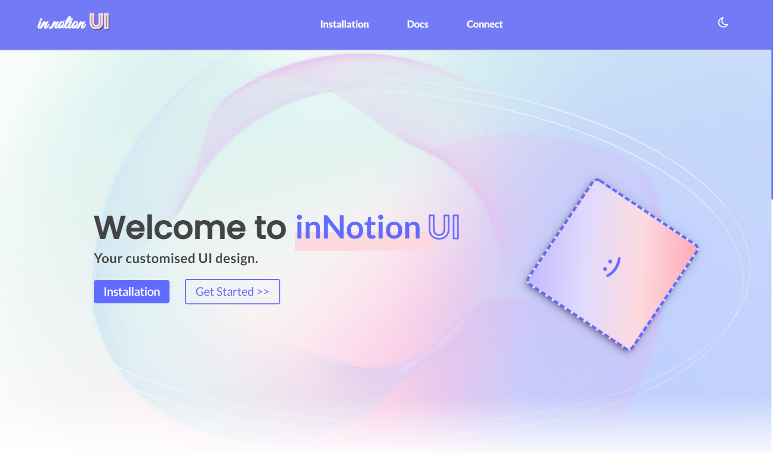
Screenshots
Homescreen in light mode
Homescreen in dark mode

Components:
Technologies used
- HTML
- CSS
- Javascript
How to use?
Copy and paste the code in the head tag of your html document. So that you can style your components by just adding class names to your html elements.
<link rel="stylesheet" href="https://innotion-ui-library.netlify.app/in-notion.css">To know about the styled components, their variations, read the inNotion UI Documentation.