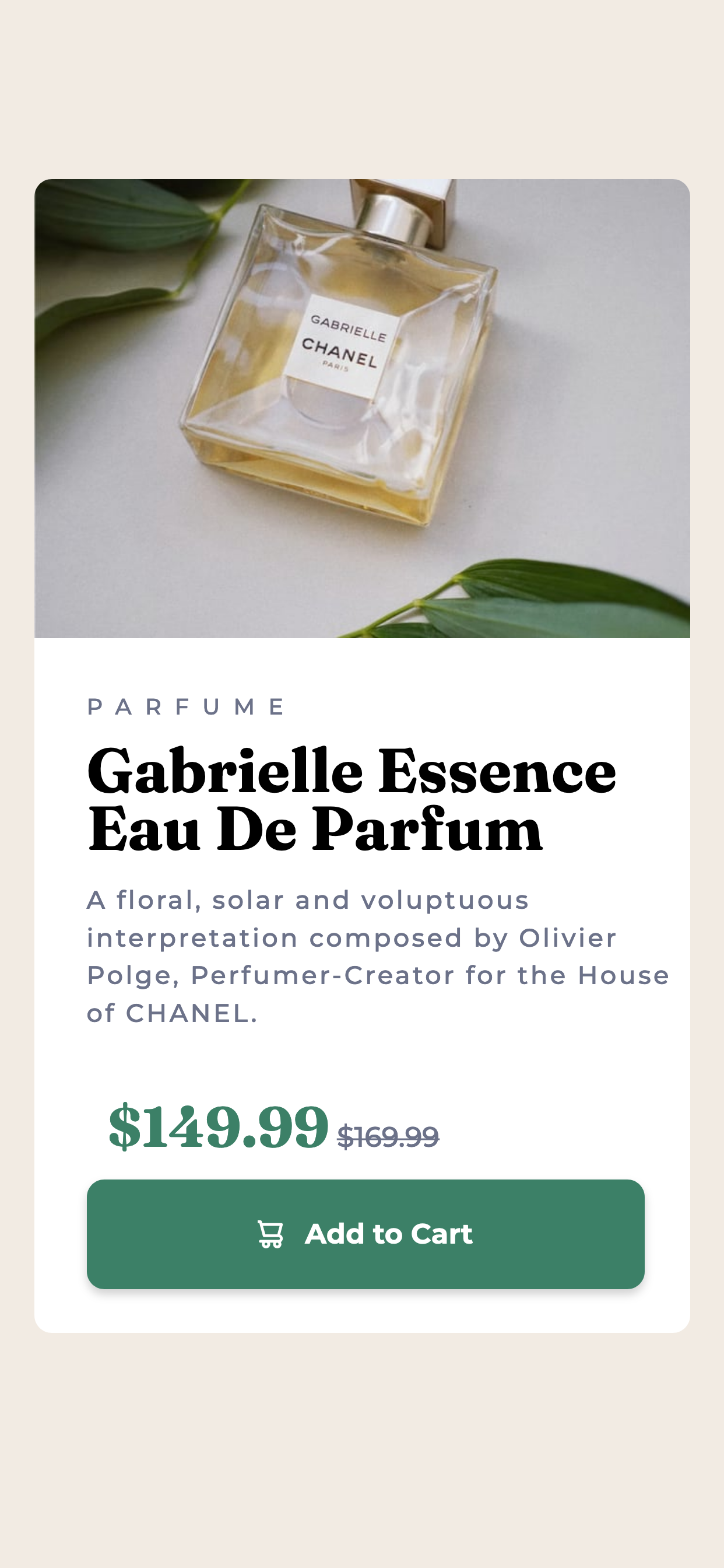
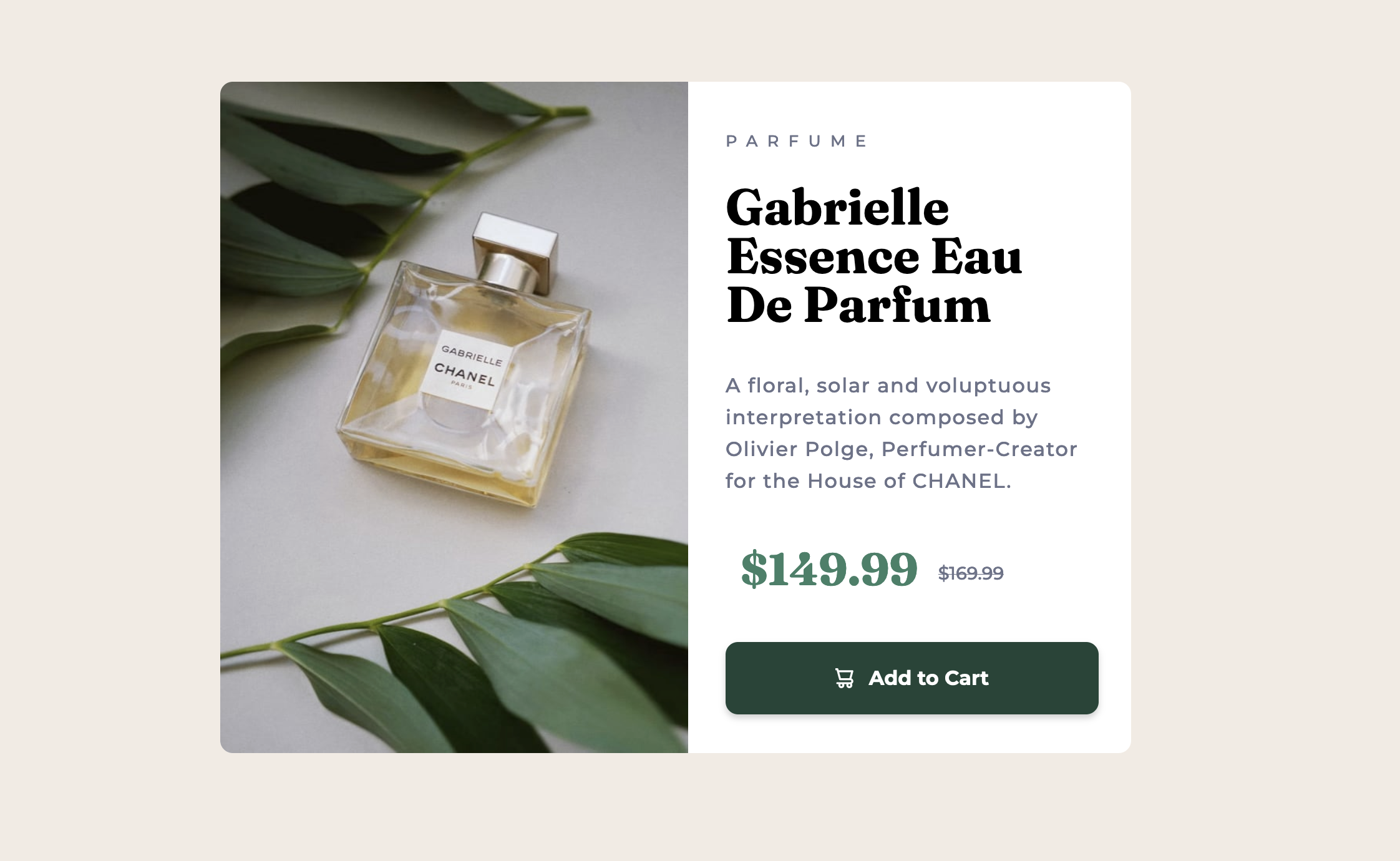
This is a solution to the Product preview card component challenge on Frontend Mentor. Frontend Mentor challenges help you improve your coding skills by building realistic projects.
Users should be able to:
- View the optimal layout depending on their device's screen size
- See hover and focus states for interactive elements
- Solution URL: Add solution URL here
- Live Site URL: Add live site URL here
- Semantic HTML5 markup
- CSS custom properties
- Flexbox
- CSS Grid
- Mobile-first workflow
I learned the use of picture HTML tag. First time using it and wasn't aware of this new tag.
<picture>
  <source
    srcset="./images/image-product-desktop.jpg"
    media="(min-width: 700px)"
  />
  <img
    src="./images/image-product-mobile.jpg"
    alt="perfume image"
    class="product-image"
  />
</picture>
As I learn HTML and CSS, I'm also learning how to use markdown to take better documentation. Learning from a makerspace programming class, the mentor mention taking painstaking detailed code. Once of the codes we were looking for took longer to deployed because there was no doucmentation. The mentor mentioned it doesn't take long to learn markdown, so this is my first time adding HTML tag in any markdown document.
Media queries. I'm learning to develop mobile first and designing this build with two different pictures made my design have three breakpoints. The middle breakpoint was inbetween desktop and mobile which broke. I added an additional media querry but remember from my previous project which a comment was made that I shouldn't repeat previous code in media querries from the main code. I wasn't copying from the main code but from the previous media querry. I didn't think that was correct either because in general, learning if you repeat yourself there something wrong. I commented out the media querry and changed the sizing of the first media querry and that worked, when working with dev tools in Firefox.
I was just trying to get it to look like the media from the project but my code could be much better. I'll come back to this code at a latter time after grasping responsive design and other technologies such as bootstrap.
- Line Height Property - I couldn't remember how to space out the paragraphs. I remember learning a little about typography and the terms used but I kept getting the terms wrong. Finally I found it and from a search came up this article.
The Markdown Guide - Taking from the readme template
- Website - Nemo Anderson
- Frontend Mentor - @nemoanderson

