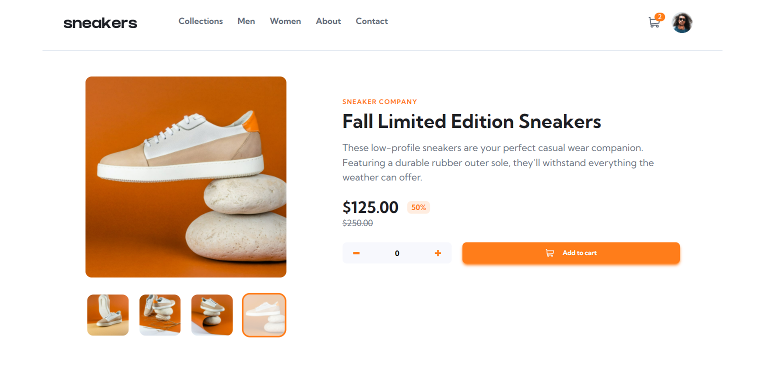
This is a solution to the E-commerce product page challenge on Frontend Mentor. Frontend Mentor challenges help you improve your coding skills by building realistic projects.
Users should be able to:
- View the optimal layout for the site depending on their device's screen size
- See hover states for all interactive elements on the page
- Open a lightbox gallery by clicking on the large product image
- Switch the large product image by clicking on the small thumbnail images
- Add items to the cart
- View the cart and remove items from it
- Solution URL: repository
- Live Site URL: e-commerce-product-page
- Semantic HTML5 markup
- Flexbox
- Tailwind CSS - CSS Frameworks
Since this is my first project using TailwindCSS, it feels like i am writing CSS in a whole different universe, it's really a life changing. Even though, things didn't quite works well with what i want at first because i realized that TailwindCSS is using mobile-first workflow right after i finished designing my desktop version. Eventually, i managed to fix some things related to responsive design and finally finishing up.
Example implementation of TailwindCSS
<button
	class="bg-white w-10 h-10 flex items-center justify-center pr-1 rounded-full absolute left-6 z-10 sm:hidden"
	id="previous-mobile"
>
	<svg
		width="12"
		height="18"
		xmlns="http://www.w3.org/2000/svg"
		id="previous-mobile"
	>
		<path
			d="M11 1 3 9l8 8"
			stroke="#1D2026"
			stroke-width="3"
			fill="none"
			fill-rule="evenodd"
			id="previous-mobile"
		/>
	</svg>
</button>
Local storage usage
// Config localStrogae
if (localStorage["total"] == 0) {
	localStorage.setItem("total", amount.innerHTML);
} else {
	amountCart.innerHTML = items;
	if (amountCart.innerHTML >= 1) {
		amountCart.classList.replace("scale-0", "scale-1");
	}
}