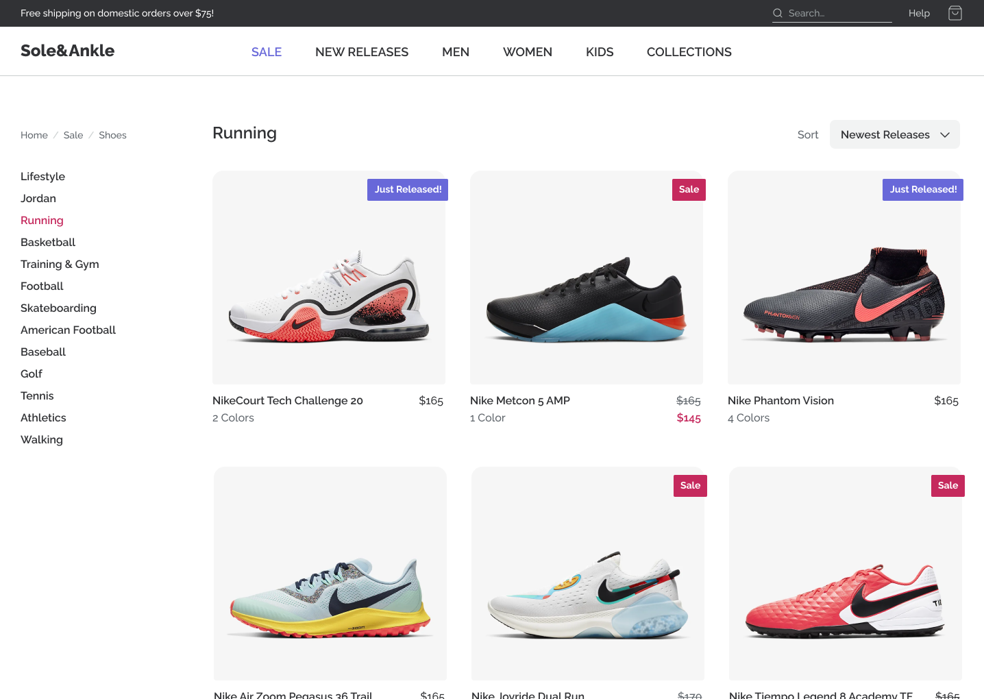
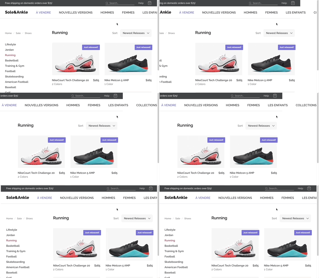
In the Flexbox module, we built an e-commerce store:
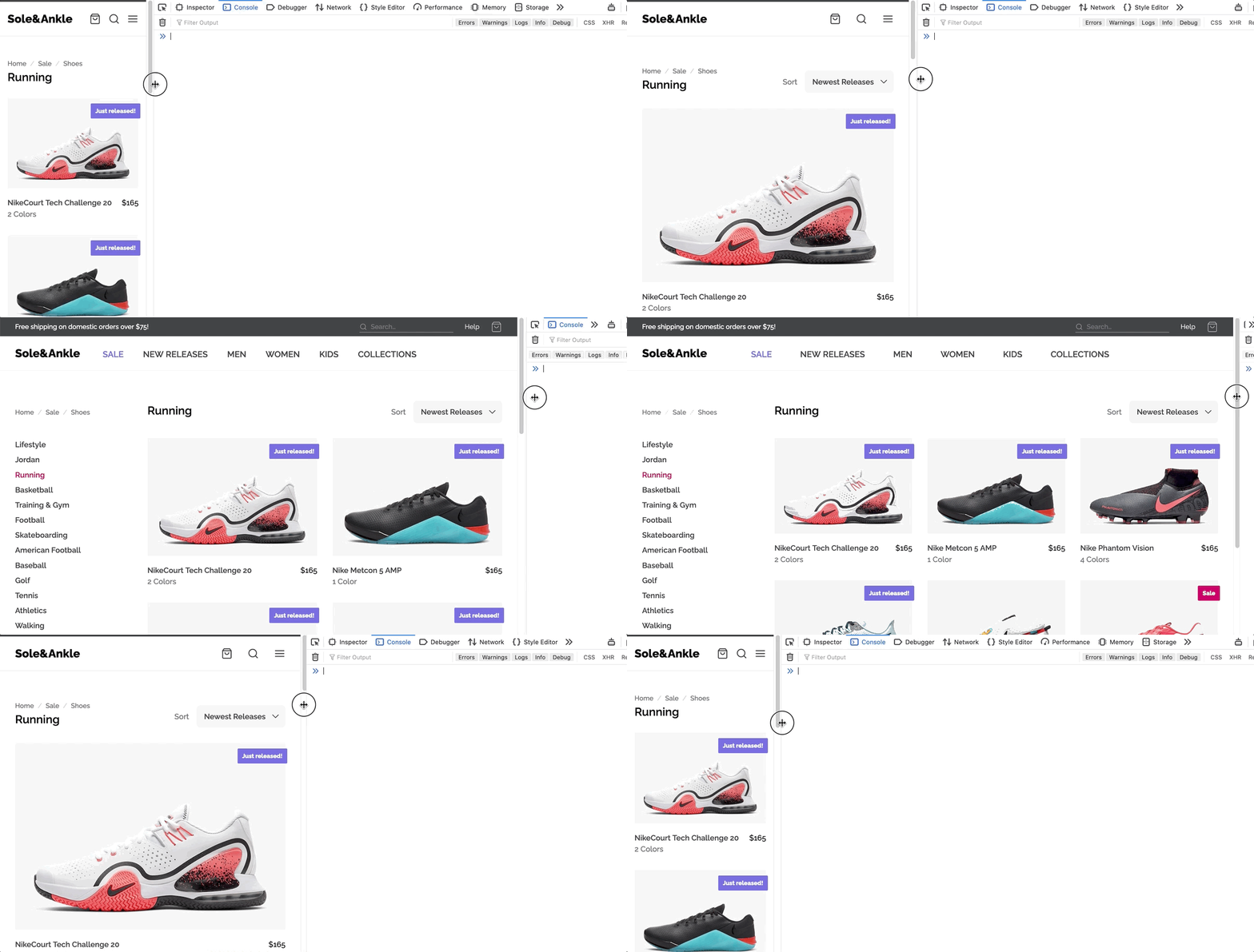
In this workshop, we'll make this application responsive, so that it looks great and works well on phones and tablets:
The design can be found on Figma:
We'll use a desktop-first approach for this process, and our breakpoints will be set as follows:
| Name | Width (px) | Width (rem) |
|---|---|---|
| phone | 600 | 37.5 |
| tablet | 950 | 59.375 |
| laptop | 1300 | 81.25 |
If you run into problems running a local development server, check out our Troubleshooting Guide on the course platform.
This guide addresses the common Digital Envelope Routine error you may have seen.
Before we start tweaking the UI, let's add some structure to make it easy for us to use media queries.
It's up to you how you'd like to structure it! You can use the strategy discussed in the “breakpoints” lesson, or you can use styled-components' “theming” feature.
Whichever approach you choose, your breakpoints should be specified in rems (not pixels).
On smaller screens, we want to switch up our header:
Our SuperHeader is removed, replaced with a decorative dark-gray line. The Header's navigation is replaced by 3 icon buttons.
On mobile, a lot of the spacing gets tightened up.
Be sure to check your work on a real mobile device. You can use ngrok, as described in the “Mobile Testing” lesson.
On portrait tablet, our left-hand column disappears.
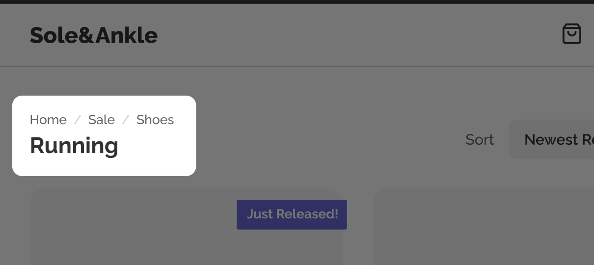
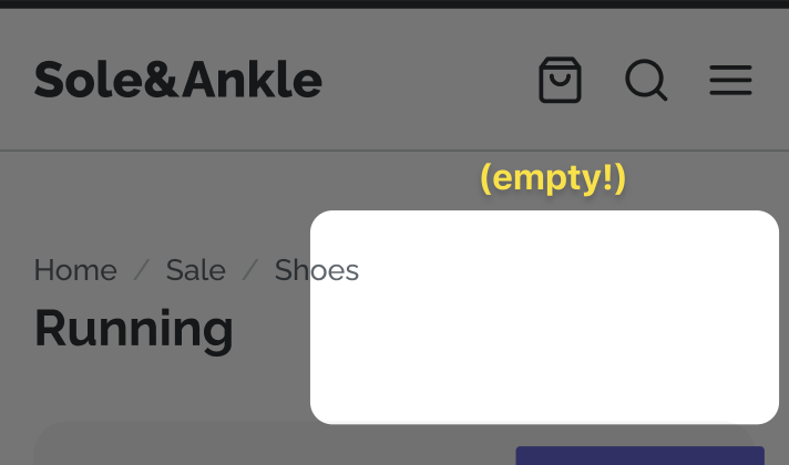
The categories are really more of a nice-to-have, so they're removed. The breadcrumbs, though, are important for navigation, so they move to sit just above the category heading:
On mobile, we lose the "Sort" filter as well:
Alright, let's implement the hamburger menu!
For convenience, a new component has been created for you, MobileMenu. It's not really a modal yet, though. Your job is to make it look and act like a modal.
You'll need to update the hamburger-menu button we added in Exercise 2 to flip showMobileMenu to true.
You should use the @reach/dialog package to make sure that the modal is accessible. We took a quick look at this package in a bonus video, “Building accessible modals”. You can check out the docs for more details:
(You may wish to skip the default styles that come with the package. This is explained in their styling guide. The --reach-dialog flag has already been set for you, in GlobalStyles.js)
As it stands, our desktop navigation disappears just before it runs out of space:
What happens, though, if our Marketing friends rename the categories? Or, what happens when we internationalize the project, and the category names are rendered in a longer language?
We can do two things to make this better:
- Manage the overflow in the header to scroll this section when it doesn't fit.
- Use fluid gaps between the nav links, to reduce the likelihood that this'll be required.
Here's our goal:
NOTE: Your solution doesn't have to match this GIF exactly. Don't worry about picking the perfect numbers! You can use the “Fluid Calculator” tool to get close enough
As it stands, we have a few colors in our constants.js file. When we want to use a color, we import and interpolate it:
import { COLORS } from '../../constants';

const Something = styled.p`
  color: var(--color-gray-900);
`;
This works fine, but I personally prefer to use CSS variables for colors. It makes it a bit easier to write:
const Something = styled.p`
  color: var(--color-gray-900);
`;
In this exercise, your goal is to update the project to use CSS variables for colors, and optionally font-weights.
BONUS: The modal backdrop should use a CSS variable that is created using fragments from the main colors.
