Antonio's Pizza is a single scrolling page website that depicts the authentic method of baking pizza in Napoletano's original style. An old 18th-century building in the heart of Uppsala.
Users of this website will quickly and easily find the menu well sorted with ingredients and price. Visitors also get to see a glimpse of what the food looks like. You can also read a little about them. A map and contact details are also available so that visitors can find their way there on their own or call/email if they have any questions.
The live link can be found here - Antonio's pizza

- Navigation
-
At the top of the page, the navigation shows logo in the left corner and home, menu, about, and contact on the right.
-
Navigation is sticky so it's easy for the user to navigate.
-
On devices under 768px width, the navigation will show on the left side with a hamburger menu and the logo will go from the right and slide into the middle of the page on smaller screen devices.
-


-
Header
-
In the heading, the restaurant's name and address are displayed.
-
It provides fast and clear information about the name and location.
-

-
Menu
-
On the menu, you can see what is available to order, what the ingredients are, and what the price is.
-
A clear division of four categories is presented
-

-
About
-
This section shows the quality of the food and the cooking process that they use.
-
The background image has a Parallax Scrolling effect on larger screens.
-
On screens with a max width of 768px, the Parallax Scrolling effect is removed.
-

-
What Customer Saying
- a section for previous customers and what they think of the restaurant.

-
Social Media
- Social media direct link to Facebook as well as three selected pictures of the food served.
- Helps the visitor get an insight into the quality and what to expect when visiting the restaurant

-
Contact
- Easily accessible and clear contact section with address, opening hours, phone number and a map for easy directions

-
Footer
- The footer part breaks off with the continuous orange color with quick buttons for mail and call.

-
I have tested the page in different browsers: Chrome, Safari, Microsoft Edge.
-
The entire project is tested with devtools device toolbar and everything works responsively, looks good and arranges itself depending on the size of the screen.
-
The call and email buttons work on both telephone and computer.
-
Tested so that parallax scrolling is turned off on screens less than 768px width.
-
HTML
- No errors were returned when passing through the official W3C validator
-
CSS
-
No errors were found when passing through the official (Jigsaw) validator
-
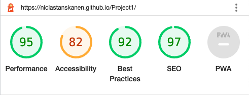
Lighthouse in devtools
-

N/A - No unfixed bugs.
- The site was deployed to GitHub pages. The steps to deploy are as follows:
- In the GitHub repository, navigate to the Settings tab
- From the source section drop-down menu, select the Master Branch
- Once the master branch has been selected, the page will be automatically refreshed with a detailed ribbon display to indicate the successful deployment.
The live link can be found here - Antonio's pizza
-
Hamburger menu - User: Álvaro - url: https://codepen.io/alvarotrigo/pen/XWejzjR
-
Parallax Scrolling effect - w3schools - url: https://www.w3schools.com/howto/howto_css_parallax.asp
-
The text and menu for the page was taken from Paesano italiano Homepage and Villa Romana homepage
-
The icons in the logo,social media and footer were taken from Font Awesome
-
The icons with a line and a star was created by myself in Canva. homepage
-
The code for Google maps was taken from the embedded code for Google maps.
-
Mockup picture in README.md from Am I Responsive?
- The header foto from Rawpixel. homage
- The about us foto from Rawpixel. homage
- The images used for the gallery page were taken from Paesano italiano social media. (Permission from the orginal content creator). Instagram
- My mentor Mitko from Code Institute
- My stand in mentor Jubril from Code Institute
- Lane-Sawyer Thompson - Community Executive at Code Institute
- Álvaro from codepen with Hamburger menu
- Paesano Italiano for content and picture