React advanced Date-Time Range Picker
This project is based upon dangrossman daterangepicker (https://github.com/dangrossman/daterangepicker)
The project has been rewritten in React, this is not a JQuery wrap around, thanks to v0ltoz to start this great project.
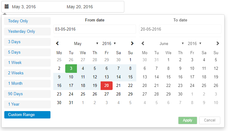
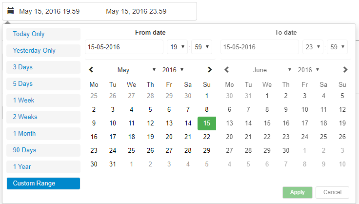
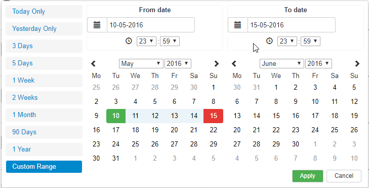
It is based off of the bootstrap UI with some slight adjustments and added keyboard accessibility such as Keyboard arrow key navigation and Tab navigation. This is a fully rewritten, keyboard friendly implementation of a date time range picker It has been designed for selecting date ranges and partially includes a single date picker.
Run the following command:
npm install react-anci-daterangepicker
The package exports three components:
DateTimeRangeComponent Simple, ready to use component. It creates the two textboxes by himself and exposes two callbacks for the selected period. This component also manages all optional parameters and create a default ranges sets.
DateTimeRangeContainer The component used by the DateTimeRangeComponent. Using this directly you can customize how the external textbox behaves.
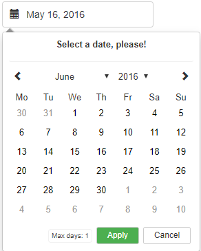
DatePickerComponent Simple single-day date picker. No time support.
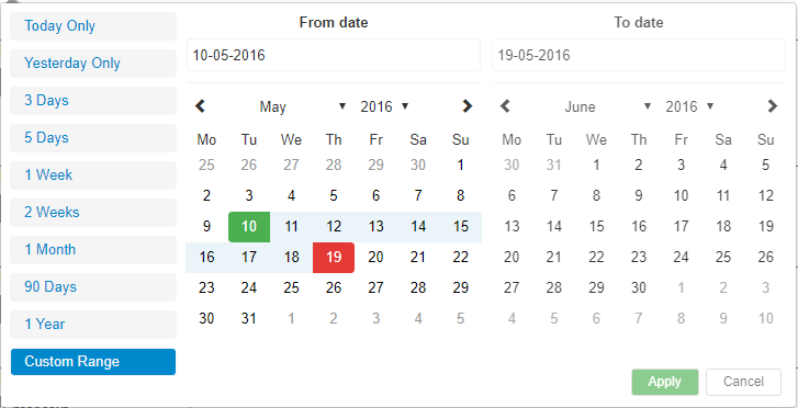
ranges {React.Object}
Object of ranges that will be you default ranges. Example:
let ranges = {
	'Today Only': [moment(start), moment(end)],
	'Yesterday Only': [moment(start).subtract(1, 'days'), moment(end).subtract(1, 'days')],
	'3 Days': [moment(start).subtract(3, 'days'), moment(end)]
};
start (Required) {Moment Object}
Initial Start Date that will be selected, should be a moment object
end (Required) {Moment Object}
Initial End Date that will be selected, should be a moment object
local (Required in DateTimeRangeContainer) {Object}
Defines a local format for date labels to be shown as. Can also set Sunday to be first day or Monday. Local object accepts format and sunday first params.
--> format: moment display format --> sundayFirst: True Sunday the first day of the week. False, Monday first day of the week.
let local = {
	format: 'DD-MM-YYYY', // do not put HH:mm here to avoid strange behaviours in textboxes
	sundayFirst: false
};
applyCallback (Required) {React.func}
Function which is called when the apply button is clicked/pressed. Takes two params, that start date and the end date.
func applyCallback(startDate, endDate){
    ...
}
rangeCallback {React.func}
Function which is called when a custom range is selected. Takes three params, the range id, the array from the definition and an object containing start date and end date.
func applyCallback(value, data, cbdata){
alert(cbdata.start + ' ' + cbdata.end);
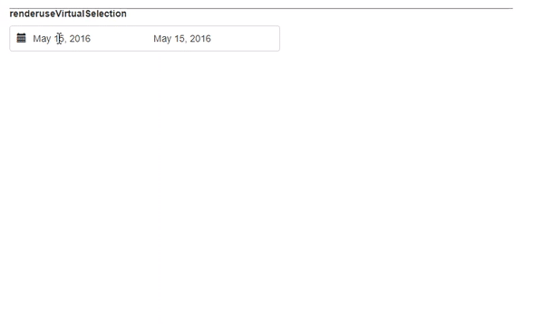
}useVirtualSelection (optional) {bool}
Better selection mode.
showCurrentState (optional) {bool}
Show the bottom bar with the text "Selecting From / To".
rangesOnTheRight (optional) {bool}
Put custom ranges on the right.
autoCloseOnSelection (optional) {bool}
Auto close the calendar on selection.
maxDate (optional) {Moment Object}
Maximum date that can be selected.
minDate (optional) {Moment Object}
Minumum date that can be selected.
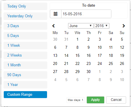
maxDays (optional) {bool}
Maximum number of days. Setting to 1 shows only one calendar.
minYear (optional) {bool}
Starting year for combobox.
maxYear (optional) {bool}
Ending year for combobox.
disabled (optional) {bool}
Disable the control.
enableTime (optional, in DateTimeRangeComponent only) {bool}
Disable Time selector. Used in this way to keep compatibility.
disableTime (optional, in DateTimeRangeContainer only) {bool}
Disable Time selector. Used in this way to keep compatibility.
disableDateBox (optional) {bool}
Disable the internal date textbox.
label (optional, in DatePickerComponent only) {string}
Change label on top. This can be done also changing the ToDate in translation
translations (optional) {object}
Object containing custom translations.
let my_translations = {
Apply: 'Apply',
Cancel: 'Cancel',
customRange: 'Custom Range',
FromDate: 'From date',
ToDate: 'To date',
SelectingFrom: 'Selecting from',
SelectingTo: 'Selecting to',
MaxDays: 'Max days',
MaxDate: 'Max date',
months: ['January', 'February', 'March', 'April', 'May', 'June', 'July', 'August', 'September', 'October', 'November', 'December'],
days: ['Mo', 'Tu', 'We', 'Th', 'Fr', 'Sa', 'Su']
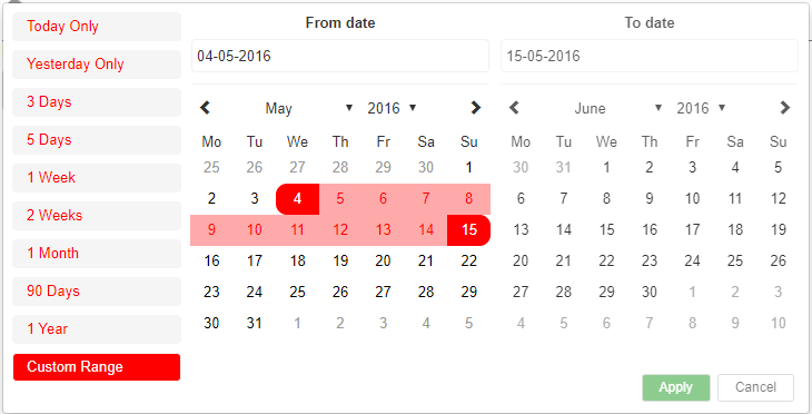
};calendarStyles (optional) {object}
Object containing custom styles for some components.
let my_styles = {
	//RANGES SELECTOR
	normalRangeStyle: () => {
		return {};
	},
	selectedRangeStyle: () => {
		return {};
	},

	//CALENDAR CELLS STYLE
	startDateStyle: () => {
		return {};
	},

	endDateStyle: () => {
		return {};
	},

	inBetweenStyle: () => {
		return {};
	},

	normalCellStyle: () => {
		return {};
	},

	hoverCellStyle: between => {
		return {};
	},

	greyCellStyle: () => {
		return {};
	},

	invalidStyle: () => {
		return {};
	}
};
This is the base example. Please check Wrapper.jsx for more examples.
import React, { Component } from 'react';
import { DateTimeRangeComponent } from './lib';
import moment from 'moment';

export default class DemoBase extends Component {
	constructor(props) {
		super(props);

		let now = new Date();
		let start = moment(new Date(now.getFullYear(), now.getMonth(), now.getDate(), 0, 0, 0, 0));
		let end = moment(start)
			.add(1, 'days')
			.subtract(1, 'seconds');

		this.state = {
			start: start,
			end: end
		};

		this.applyCallback = this.applyCallback.bind(this);
	}

	applyCallback(startDate, endDate) {
		this.setState({
			start: startDate,
			end: endDate
		});
	}

	render() {
		return (
			<div>
				<DateTimeRangeComponent start={this.state.start} end={this.state.end} applyCallback={this.applyCallback} />
			</div>
		);
	}
}In the project directory, you can run:
Runs the app in the development mode.
Open http://localhost:3000 to view it in the browser.
The page will reload if you make edits.
You will also see any lint errors in the console.
Launches the test runner in the interactive watch mode.
See the section about running tests for more information.
Builds the app for production to the build folder.
It correctly bundles React in production mode and optimizes the build for the best performance.
the -win version is obviously for windows.
Create .tgz package
Gets test coverage when running tests to see how much of the code is covered by your tests.