This repository contains dashboards created for three separate tasks at TheForage. These dashboards utilize real-world datasets to illustrate various business scenarios and steps to solve corresponding business problems. By leveraging Power BI, these dashboards empower users to identify patterns, risks, and opportunities within the data, enabling them to derive actionable insights.
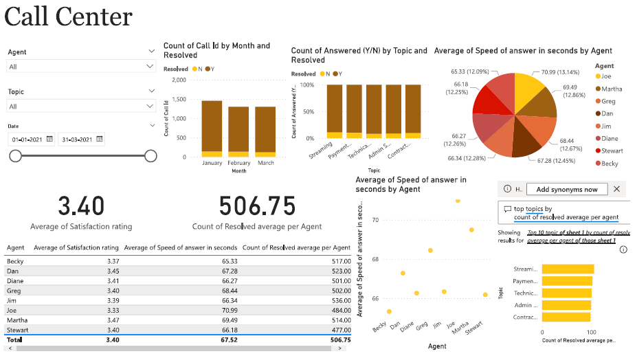
- Overall calls answered/abandoned
- Calls received by time, day
- Average speed of answer, handle duration
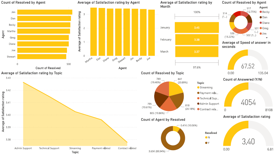
- Resolved rate by Agents, Topics
- Agent’s performance quadrant -> average handle time (talk duration) vs calls answered
- Overall customer satisfaction
- Customer satisfaction distribution by Agents, Topics
The purpose of this dashboard is to serve as self-exploratory for managers, but I still note some highlighted points that I recognize below:
- Customers tend to call more between 5:00 pm - 5:30 pm at 250 calls received with an abandoned rate is 18.40% (approximately to the average abandoned rate) and distributed mainly in the middle of the month
- The highest abandoned rate is 28.03% between 1:00 pm - 1:30 pm
- Customers have more problems with Streaming service
- The resolved rate is at a high rate (89,94%)
- The agent who satisfies customers most is Becky with a 12.02% of “Very good” rating
- The agent who has the highest resolved rate is Jim and he is effective with solving problems related to “Contract related” and “Admin Support”
- The average customer satisfaction is at an acceptable rate with 3.40, mainly comes from “Average” (30.04%) and “Good” (29.11%) rating
- The correlation between call answered and call resolved is strongly positive which resulted in a increase in the customer satisfaction rate
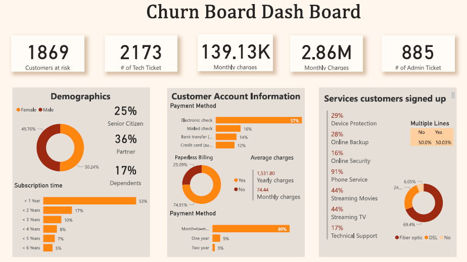
Task 2: Create Customer Retention and predict churn customers - visualizing customer demographics and insights.
- Number of retained and churned customers
- Retention & Churn Rate
- Total Admin & Tech ticket
- Total and monthly charge
- Demographic, Account and Service info
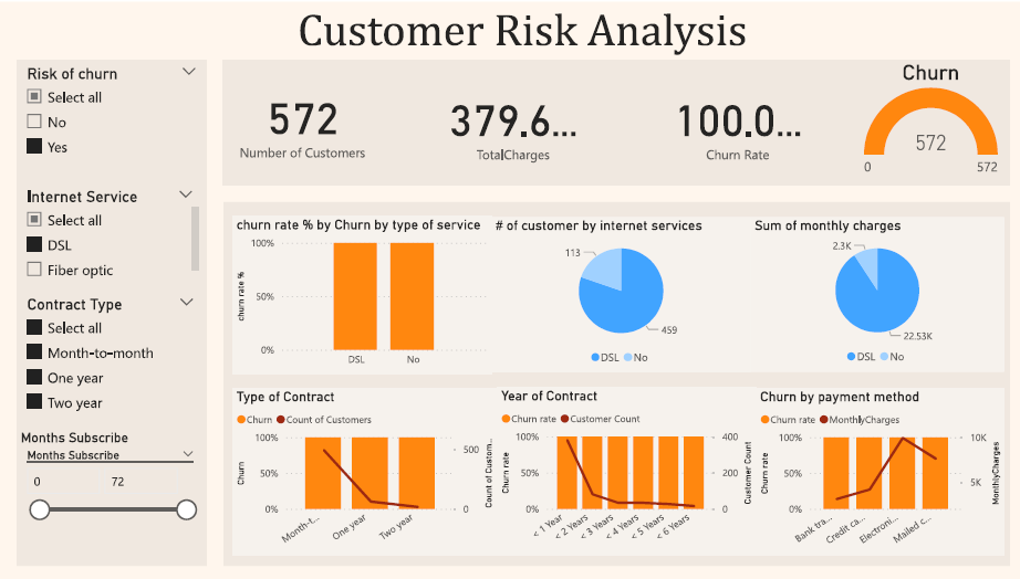
- Churn by each service
- Churn by tenure
- Churn by Contract type
- Total Admin & Tech tickets of churn customers
- Churn Predictive Model Evaluation
- Most important model features
- Risk level
The purpose of this dashboard is to serve as self-exploratory for managers, but I still note some highlighted points that I recognize below:
- Month-to-Month contracts, lack of online security and tech support, and issues with Fiber Optic service are some of the reasons for customer churn.
- Only 16% of the customers are senior citizens, with almost double the churn rate compared to younger customers.
- The customers have varying contract lengths, with a lot of them only staying for a month and some for up to 72 months.
- Customers taking longer contracts tend to be more loyal and stay with the company for a longer period of time.
- Customers are more likely to churn when the monthly charges are high, and there is a higher chance of churn when the total charges are lower.
- Number of employees, leavers
- Number of promotions and hiring in FY20
- Average Performance
- Age distribution
- Nationality distribution
- Job-level distribution
- Time type distribution
- Average Performance of gender, leavers
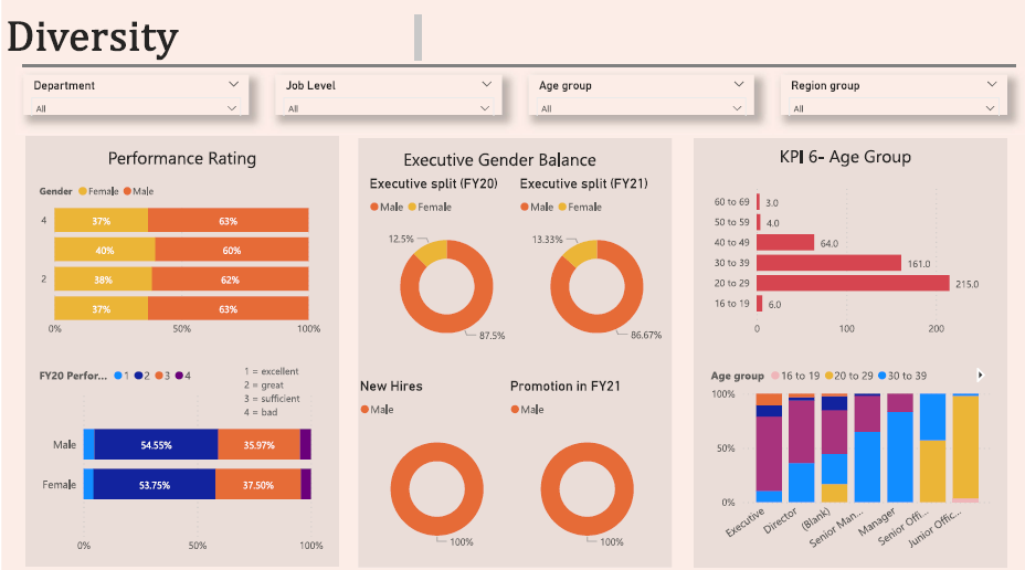
- Performance Rate distribution
- Average Performance Rate by Positions, Age, Region
- Comparison performance between leaver and non-leaver by department
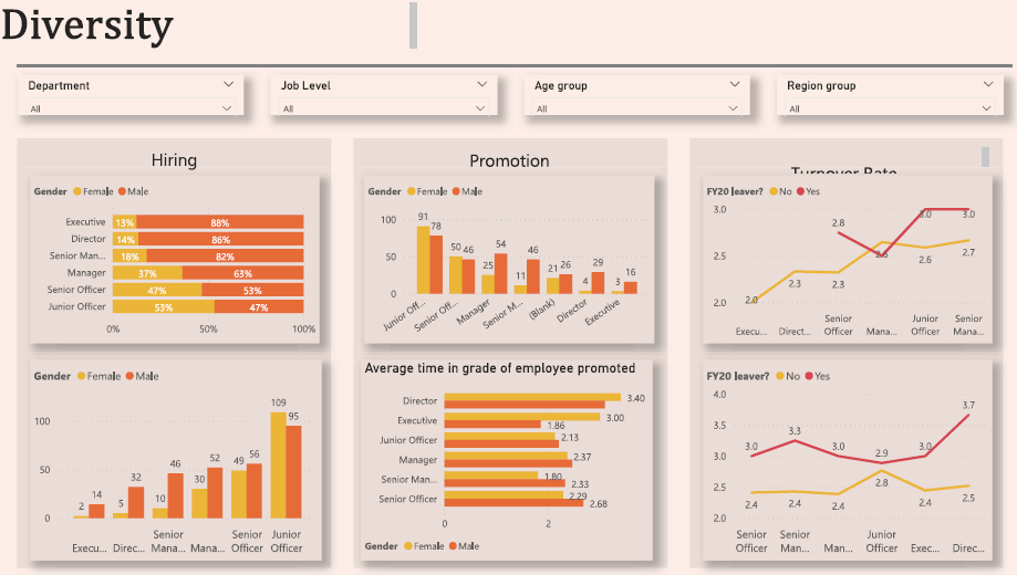
- Indicators of the gender balance of new hire FY20, Promotion FY21, Turnover rate
- Executive gender balance
- Average Time at the Job level
- Hiring trend and hiring distribution by nationality
- Promotion and Turnover rate FY 21
The purpose of this dashboard is to serve as self-exploratory for managers, but I still note some highlighted points that I recognize that some root causes of their slow progress in improving gender balance at the executive management level might be below:
- Employees who were promoted twice within two years had very low-performance ratings, while those who left had higher ratings.
- According to the data, it appears that a significant portion of employees has been stagnating in their current job level for more than two years, despite working diligently. Promotions have not been forthcoming, female directors, in particular, require more time to be nominated as executives compared to their male counterparts.
- There is a significant gender imbalance in the distribution of new hires and promotions for executive positions, despite the fact that these female directors perform better.
- A potential factor contributing to the slow progress in achieving gender balance at the executive management level is that the performance evaluations for promotion at management levels may not be entirely objective and honest. This could result in qualified female candidates being overlooked for executive positions, despite their superior performance compared to their male counterparts.
