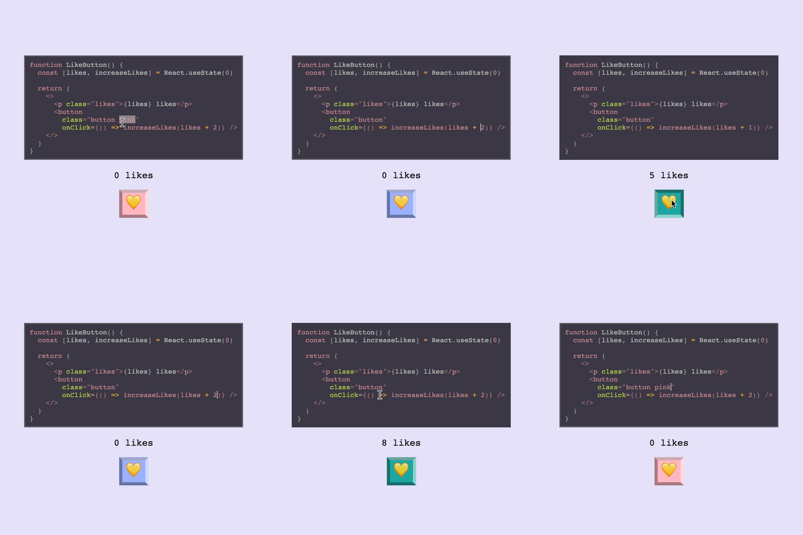
A flexible playground for live editing React code


React Live brings you the ability to render React components with editable source code and live preview. It supports server-side rendering and comes in a tiny bundle.
The library is structured modularly and lets you style and compose its components freely.
Install it with npm install react-live or yarn add react-live and try out this piece of JSX:
import {
  LiveProvider,
  LiveEditor,
  LiveError,
  LivePreview
} from 'react-live'

<LiveProvider code="<strong>Hello World!</strong>">
  <LiveEditor />
  <LiveError />
  <LivePreview />
</LiveProvider>https://react-live.netlify.com/
It takes your code and transpiles it with Bublé, while the code is displayed using react-simple-code-editor and the code is highlighted using prism-react-renderer.
The transpiled code is then rendered in the preview component (LivePreview), which does a fake mount if the code
is a React component.
The code can be one of the following things:
- React elements, e.g.
<strong>Hello World!</strong> - React pure functional components, e.g.
() => <strong>Hello World!</strong> - React component classes
If you enable the noInline prop on your LiveProvider, you’ll be able to write imperative code,
and render one of the above things by calling render.
The scope prop on the LiveProvider accepts additional globals. By default it injects React only, which
means that the user can use it in their code like this:
//                    ↓↓↓↓↓
class Example extends React.Component {
  render() {
    return <strong>Hello World!</strong>
  }
}
But you can of course pass more things to the scope. They will be available as variables in the code. Here's an example using styled components:
import styled from 'styled-components';

const headerProps = { text: 'I\'m styled!' };

const scope = {styled, headerProps};

const code = `
  const Header = styled.div\`
    color: palevioletred;
    font-size: 18px;
  \`

  render(<Header>{headerProps.text}</Header>)
`

<LiveProvider code={code} scope={scope} noInline={true}>
  <LiveEditor />
  <LiveError />
  <LivePreview />
</LiveProvider>
Here's an example using a custom component <MyButton />. This component lives in a different directory. It gets passed into the scope wrapped in an Object. Note that since we are not using render() in the code snippet we let noInline stay equal to the default of false:
import { MyButton } from './components/MyButton';

const scope = { MyButton };

const code = `
  <MyButton />
`

<LiveProvider code={code} scope={scope}>
  <LiveEditor />
  <LiveError />
  <LivePreview />
</LiveProvider>Our reported bundle size badges don't give you the full picture of the kind of sizes you will get in a production app. The minified bundles we publish exclude some dependencies that we depend on.
In an actual app when you use react-live you will also be bundling
Buble for transpilation, which adds ~135kB to your bundle. This also
includes their dependency on regenerate-unicode-properties, which
is rather large as well.
We maintain a fork of Buble which excludes the ESnext Regular Expression
transpilation with removes Buble's large dependency and weighs in at
a smaller size of ~51kB, which you can find published at @philpl/buble.
You can alias this in Webpack or the build tool of your choice, which
will reduce the overall bundle size of react-live to about 83kB.
This component provides the context for all the other ones. It also transpiles the user’s code!
It supports these props, while passing any others through to the children:
| Name | PropType | Description |
|---|---|---|
| code | PropTypes.string | The code that should be rendered, apart from the user’s edits |
| scope | PropTypes.object | Accepts custom globals that the code can use |
| noInline | PropTypes.bool | Doesn’t evaluate and mount the inline code (Default: false). Note: when using noInline whatever code you write must be a single expression (function, class component or some jsx) that can be returned immediately. If you'd like to render multiple components, use noInline={true} |
| transformCode | PropTypes.func | Accepts and returns the code to be transpiled, affording an opportunity to first transform it |
| language | PropTypes.string | What language you're writing for correct syntax highlighting. (Default: jsx) |
| disabled | PropTypes.bool | Disable editing on the <LiveEditor /> (Default: false) |
| theme | PropTypes.object | A prism-react-renderer theme object. See more here |
All subsequent components must be rendered inside a provider, since they communicate using one.
The noInline option kicks the Provider into a different mode, where you can write imperative-style
code and nothing gets evaluated and mounted automatically. Your example will need to call render
with valid JSX elements.
This component renders the editor that displays the code. It is a wrapper around react-simple-code-editor and the code highlighted using prism-react-renderer.
| Name | PropType | Description |
|---|---|---|
| style | PropTypes.object | Allows overriding default styles on the LiveEditor component. |
This component renders any error that occur while executing the code, or transpiling it.
It passes through any props to a pre.
Note: Right now when the component unmounts, when there’s no error to be shown.
This component renders the actual component that the code generates inside an error boundary.
| Name | PropType | Description |
|---|---|---|
| Component | PropTypes.node | Element that wraps the generated code. (Default: div) |
The withLive method creates a higher-order component, that injects the live-editing props provided
by LiveProvider into a component.
Using this HOC allows you to add new components to react-live, or replace the default ones, with a new desired behavior.
The component wrapped with withLive gets injected the following props:
| Name | PropType | Description |
|---|---|---|
| code | PropTypes.string | Reflects the code that is passed in as the code prop |
| error | PropTypes.string | An error that the code has thrown when it was previewed |
| onError | PropTypes.func | A callback that, when called, changes the error to what's passed as the first argument |
| onChange | PropTypes.func | A callback that accepts new code and transpiles it |
| element | React.Element | The result of the transpiled code that is previewed |
Note: The code prop doesn't reflect the up-to-date code, but the
codeprop, that is passed to theLiveProvider.
I want to use experimental feature x but Bublé doesn't support it! Can I use babel instead?
react-live doesn't currently support configuring the transpiler and it ships with Bublé. The current workaround for using some experimental features bublé doesn't support would be to use the transformCode prop on LiveProvider to transform your code with babel alongside bublé.
Here is a minimal example on how you could use babel to support class-properties in react-live:
Comparison to component-playground
There are multiple options when it comes to live, editable React component environments. Formidable actually has two first class projects to help you out: component-playground and react-live. Let's briefly look at the libraries, use cases, and factors that might help in deciding which is right for you.
Here's a high-level decision tree:
- If you want fast and easy setup and integration, then
component-playgroundmay be the ticket! - If you want a smaller bundle, SSR, and more flexibility, then
react-liveis for you!
Here are the various factors at play:
- Build:
component-playgroundusesbabel-standalone,react-liveusesbublé. (Note:react-livemight make transpiler customizable in the future). - Bundle size:
component-playgroundhas a larger bundle, but uses a more familiar editor setup.react-liveis smaller, but more customized editor aroundprism. - Ease vs. flexibility:
react-liveis more modular/customizable, whilecomponent-playgroundis easier/faster to set up. - SSR:
component-playgroundis not server-side renderable,react-liveis. - Extra features:
component-playgroundsupports raw evaluation and pretty-printed output out-of-the-box, whilereact-livedoes not. - Error handling:
component-playgroundmight have more predictable error handling thanreact-livein some cases (due toreact-dom, although this might change with React 16).
Active: Formidable is actively working on this project, and we expect to continue for work for the foreseeable future. Bug reports, feature requests and pull requests are welcome.


