#MaterialDrawer 
The MaterialDrawer library aims to provide a quick and easy Activity to create and implement a drawer layout in your application.
Here's a quick overview of functions it include:
- easy integration
- quick and simple api
- follows the Google Material Design Guidelines
- modify the colors on the go
- uses the AppCompat support library
- comes with a basetheme which helps if you want an activity with a colored statusbar
- the navigationdrawer is also under the statusbar
- compatible down to API Level 10
- supports multiple drawers
- comes with multiple default drawer items
- badge support
#Preview ##Demo You can try it out here Google Play (wall:splash an open source application which uses this drawer implementation)
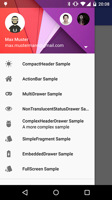
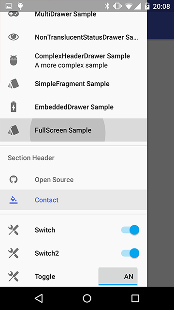
##Screenshots
#Include in your project
##Using Maven
The MaterialDrawer Library is pushed to Maven Central, so you just need to add the following dependency to your build.gradle.
compile('com.mikepenz.materialdrawer:library:1.0.0@aar') {
	transitive = true
}
##How to use Here's a quick overview what you have to do within your application.
###Minimal SetUp ####Code: It's (theoretically) a one-liner :D. This will create an empty drawer.
new Drawer().withActivity(this).build()###Activity with Toolbar ####Code:
new Drawer()
    .withActivity(this)
    .withToolbar(toolbar)
    .addDrawerItems(
	    new PrimaryDrawerItem().withName(R.string.drawer_item_home),
	    new DividerDrawerItem(),
	    new SecondaryDrawerItem().withName(R.string.drawer_item_settings)
    )
    .withOnDrawerItemClickListener(new Drawer.OnDrawerItemClickListener() {
    @Override
    public void onItemClick(AdapterView<?> parent, View view, int position, long id, IDrawerItem drawerItem) {
    	// do something with the clicked item :D
    }
    })
    .build();
###Activity with ActionBar ####Code:
new Drawer()
	.withActivity(this)
	.withTranslucentStatusBar(false)
	.addDrawerItems(
		//pass your items here
	)
	.build();
###Activity with Multiple Drawers ####Code:
Drawer.Result result = new Drawer()
	.withActivity(this)
	.withToolbar(toolbar)
	.withHeader(R.layout.header)
	.addDrawerItems(
		//pass your items here
	)
	.build();

new Drawer()
	.withActivity(this)
    .withFooter(R.layout.footer)
    .withStickyFooter(R.layout.sticky_footer)
    .addDrawerItems(
    	//pass your items here
    )
    .withDrawerGravity(Gravity.END)
    .append(result);
###Method description ####Code:
new Drawer()
                //set the activity so we can inflate layouts automatically
                .withActivity(this)
                //set the toolbar to use with the drawer. will allow special stuff like ActionBarDrawerToggle
                .withToolbar(toolbar)
                //set the layout for the drawer manually. normally handled by the library
                .withDrawerLayout(VIEW|RES)
                //set the gravity for the drawer DEFAULT: START
                .withDrawerGravity(Gravity.END)
                //set this if you use the translucent statusBar feature DEFAULT: true
                .withTranslucentStatusBar(true)
                //set this to disable the ActionBarDrawerToggle, or pass a custom ActionBarDrawerToggle DEFAULT: true
                .withActionBarDrawerToggle(BOOLEAN|ActionBarDrawerToggle)
                //set the header for the drawer
                .withHeader(VIEW|RES)
                //set this to disable the divider after the header DEFAULT: true
                .withHeaderDivider(false)
                //set the footer for the drawer
                .withFooter(VIEW|RES)
                //set this to disable the divider before the footer DEFAULT: true
                .withFooterDivider(false)
                //set the sticky footer for the drawer (this one is always visible)
                .withStickyFooter(VIEW|RES)
                //set this if you want a onClick event as soon as you call .build() for the initial set DEFAULT: false
                .withFireOnInitialOnClick(true)
                //set the initial selected item. this is the position of the item. NOT the identifier
                .withSelectedItem(0)
                //set this to pass a custom ListView to the drawer. normally handled by the library
                .withListView(VIEW)
                //set this to pass a custom BaseDrawerAdapter to the drawer. normally handled by the library
                .withAdapter(BaseDrawerAdapter)
                //set one of this parameters to set the items for the drawer. not required if you pass your own adapter or even your own listView
                .withDrawerItems()
                .addDrawerItems()
                //set this to disable the auto-close of the drawer after onClick DEFAULT: true
                .withCloseOnClick(false)
                //set this to modify the delay to close the drawer. this is a "hack" to prevent lag after onClick DEFAULT: 150 / DISABLE: -1
                .withDelayOnDrawerClose(-1)
                //set one of these methods to set listeners for the drawer
                .withOnDrawerListener()
                .withOnDrawerItemClickListener()
                .withOnDrawerItemLongClickListener()
                .withOnDrawerItemSelectedListener()
                //set this method if you got a savedInstance (find more details in the sample application)
                .withSavedInstance()
                //set the width of the drawer FROM RES/DP/PX (just use one)
                .withDrawerWidthRes(R.dimen.material_drawer_width)
                .withDrawerWidthDp(240)
                .withDrawerWidthPx(1000)
                //set this if you use an actionBar and want also a translucent statusBar (really rare scenario) DEFAULT: false
                .withTranslucentActionBarCompatibility(true)
                //use one of those methods to finalize the drawer and to build it. append to add a second drawer to an existing drawer
                .build()
                .append(Drawer.Result)
###AndroidManifest.xml (OPTIONAL) You can and should use (one of) the provided themes for your application or activity which contains the drawer. They contain many special settings for different Android versions.
- MaterialDrawerTheme
- MaterialDrawerTheme.TranslucentStatus
- MaterialDrawerTheme.ActionBar
- MaterialDrawerTheme.ActionBar.TranslucentStatus
- MaterialDrawerTheme.Light
- MaterialDrawerTheme.Light.TranslucentStatus
- MaterialDrawerTheme.Light.ActionBar
- MaterialDrawerTheme.Light.ActionBar.TranslucentStatus
- MaterialDrawerTheme.Light.DarkActionBar
- MaterialDrawerTheme.Light.DarkActionBar.TranslucentStatus
- MaterialDrawerTheme.Light.DarkActionBar.ActionBar
- MaterialDrawerTheme.Light.DarkActionBar.ActionBar.TranslucentStatus
###styles.xml (OPTIONAL) You have to use the provided theme for this to get it working. Overwrite following colors to create a quick custom style for your application
	<!-- Material DEFAULT colors -->
    <color name="material_drawer_primary">#2196F3</color>
    <color name="material_drawer_primary_dark">#1976D2</color>
    <color name="material_drawer_primary_light">#BBDEFB</color>
    <color name="material_drawer_accent">#FF4081</color>
    <color name="material_drawer_window_background">#F9F9F9</color>
    <color name="material_drawer_background">#F9F9F9</color>
    <!-- Material DEFAULT text / items colors -->
    <color name="material_drawer_icons">#FFF</color>
    <color name="material_drawer_primary_text">#212121</color>
    <color name="material_drawer_secondary_text">#727272</color>
    <color name="material_drawer_hint_text">#B8B8B8</color>
    <color name="material_drawer_divider">#B6B6B6</color>
    <!-- Material DEFAULT drawer colors -->
    <color name="material_drawer_selected">#E8E8E8</color>
    <color name="material_drawer_selected_text">#2196F3</color>
#Credits
-
Mirosław Stanek - GitHub
- For his InstaMaterial concept and the idea of inflating the drawerLayout InstaMaterial Concept
-
Lunae Luman - Behance for the Header Image
#Developed By
- Mike Penz - http://mikepenz.com - mikepenz@gmail.com
#License
Copyright 2015 Mike Penz

Licensed under the Apache License, Version 2.0 (the "License");
you may not use this file except in compliance with the License.
You may obtain a copy of the License at

   http://www.apache.org/licenses/LICENSE-2.0

Unless required by applicable law or agreed to in writing, software
distributed under the License is distributed on an "AS IS" BASIS,
WITHOUT WARRANTIES OR CONDITIONS OF ANY KIND, either express or implied.
See the License for the specific language governing permissions and
limitations under the License.