Academind - Why you should look into these React component styling options! (Oct 9, 2019)
Link: https://www.youtube.com/watch?v=NMiEREulVLc
Description
Styling React components is easy and difficult at the same time. There are so many options! Inline styles, styled components, vanilla CSS, CSS modules and more. Let's take a closer look at the best alternatives!
This video comes with an article you shouldn't miss! You also find all the source code links there: https://www.academind.com/learn/react...
Article Link: https://academind.com/tutorials/inline-styles-styled-components-css/
TABLE OF CONTENTS
- ACDM-ReactJSwithStyledComponents-20191009
- 1 - Project Setup
- 2 - Installing Styled Components
- 3 - Using Styled Components
- 4 - Styled Components vs CSS + CSS Modules
- Getting Started with Create React App
npx create-react-app acdm-reactjswithstyledcomponents-20191009
cd acdm-reactjswithstyledcomponents-20191009
yarn start
In src/, leave only :
- components
- Button.js
- UserDetails.js
- UserSummary.js
- App.js
- index.css
- index.js
Then get the starting state here:
yarn add styled-componentsApp.js
// START: IMPORTS
import React from 'react'
import styled from 'styled-components'

// Start: Import Components
import UserSummary from './components/UserSummary'
// End: Import Components
// END: IMPORTS

// Start: Styled Components
const StyledDiv = styled.div`
  width:90%;
  max-width:40rem;
  margin: 2rem auto;
  border:1px solid #ccc;
  padding:1rem;

`
// End: Styled Components

// Start: Template
const App = () => {
  return (
    <StyledDiv>
      <UserSummary />
    </StyledDiv>
  )
}
// End: Template

export default Appcreate new components/StyledParagraph.js:
import styled from 'styled-components'

const StyledParagraph = styled.p`
  color:#aaa
`
export default StyledParagraph;
components/UserSummary.js
import React, { useState } from 'react';

import UserDetails from './UserDetails';
import Button from './Button';

import StyledParagraph from './StyledParagraph'

const UserSummary = () => {
  const [detailsVisible, setDetailsVisible] = useState(false);

  return (
    <section>
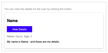
      <StyledParagraph>You can view the details for the user by clicking the button.</StyledParagraph>
      <div
        style={{
          boxShadow: '0 2px 6px rgba(0, 0, 0, 0.26)',
          padding: '1rem',
          borderRadius: '10px'
        }}
      >
        <h2>Name</h2>
        <Button onClick={() => setDetailsVisible(curVisible => !curVisible)}>
          {detailsVisible ? 'Hide' : 'Show'} Details
        </Button>
        {detailsVisible && <UserDetails name="Name" age="0" />}
      </div>
    </section>
  );
};

export default UserSummary;
components/UserDetails.js
import React from 'react';
import StyledParagraph from './StyledParagraph'

const UserDetails = props => {
  return (
    <div>
      <StyledParagraph>
        <strong>Name</strong>: {props.name}, <strong>Age</strong>: {props.age}
      </StyledParagraph>
      <p>My name is {props.name} - and these are my details.</p>
    </div>
  );
};

export default UserDetails;create new components/Button.module.css
.button {
  font: inherit;
  cursor: pointer;
  border: 1px solid blue;
  background: blue;
  color: white;
  padding: 0.5rem 2rem;
}

.button:focus {
  outline: none;
}

.button:hover,
.button:active {
  background: lightblue;
  color: blue;
  border-color: lightblue;
}
components/Button.js
import React from 'react'
import classes from './Button.module.css';

// import styled from 'styled-components'

// const Button = styled.button`
//   font:inherit;
//   cursor:pointer;
//   border:1px solid blue;
//   color:white;
//   background:blue;
//   padding:0.5rem 2rem;

//   :focus{
//     outline:none;
//   }

//   :hover, :active{
//     background:lightblue;
//     color:blue;
//     border-color:lightblue;
//   }
// `

const Button = props => {
  return <button className={classes.button} onClick={props.onClick}>{props.children}</button>
};

export default Button;
what this done then is then assign the div elements with a unique identifier due to using css modules instead of just mere classes.
Which can be easier or better to use instead of Styled Components.
This project was bootstrapped with Create React App.
In the project directory, you can run:
Runs the app in the development mode.
Open http://localhost:3000 to view it in the browser.
The page will reload if you make edits.
You will also see any lint errors in the console.
Launches the test runner in the interactive watch mode.
See the section about running tests for more information.
Builds the app for production to the build folder.
It correctly bundles React in production mode and optimizes the build for the best performance.
The build is minified and the filenames include the hashes.
Your app is ready to be deployed!
See the section about deployment for more information.
Note: this is a one-way operation. Once you eject, you can’t go back!
If you aren’t satisfied with the build tool and configuration choices, you can eject at any time. This command will remove the single build dependency from your project.
Instead, it will copy all the configuration files and the transitive dependencies (webpack, Babel, ESLint, etc) right into your project so you have full control over them. All of the commands except eject will still work, but they will point to the copied scripts so you can tweak them. At this point you’re on your own.
You don’t have to ever use eject. The curated feature set is suitable for small and middle deployments, and you shouldn’t feel obligated to use this feature. However we understand that this tool wouldn’t be useful if you couldn’t customize it when you are ready for it.
You can learn more in the Create React App documentation.
To learn React, check out the React documentation.
This section has moved here: https://facebook.github.io/create-react-app/docs/code-splitting
This section has moved here: https://facebook.github.io/create-react-app/docs/analyzing-the-bundle-size
This section has moved here: https://facebook.github.io/create-react-app/docs/making-a-progressive-web-app
This section has moved here: https://facebook.github.io/create-react-app/docs/advanced-configuration
This section has moved here: https://facebook.github.io/create-react-app/docs/deployment
This section has moved here: https://facebook.github.io/create-react-app/docs/troubleshooting#npm-run-build-fails-to-minify
