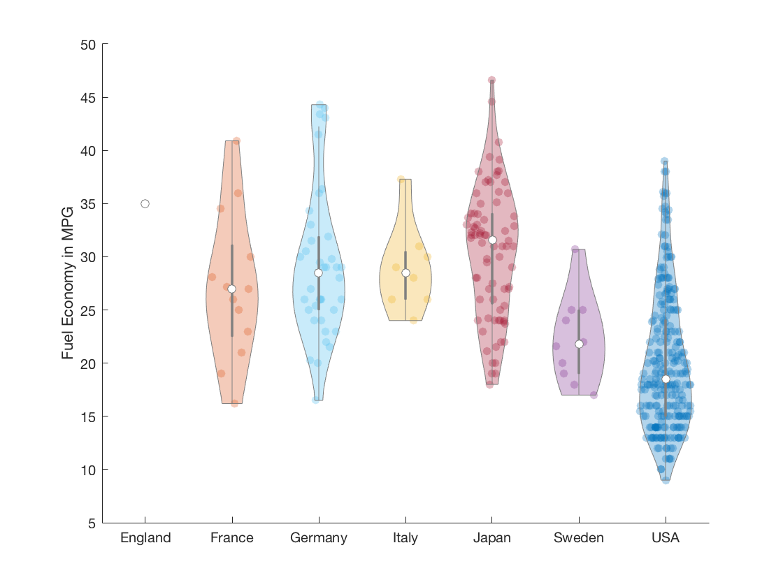
A violin plot is an easy to read substitute for a box plot that replaces the box shape with a kernel density estimate of the data, and optionally overlays the data points itself. The original boxplot shape is still included as a grey box/line in the center of the violin.
Violin plots are a superset of box plots, and give a much richer understanding of the data distribution, while not taking more space. You will be able to instantly spot too-sparse data, or multi-modal distributions, which could go unnoticed in boxplots.
violinplot is meant as a direct substitute for boxplot (excluding
named arguments). Additional constructor parameters include the width
of the plot, the bandwidth of the kernel density estimation, and the
X-axis position of the violin plot.
For more information about violin plots, read "Violin plots: a box plot-density trace synergism" by J. L. Hintze and R. D. Nelson in The American Statistician, vol. 52, no. 2, pp. 181-184, 1998 (DOI: 10.2307/2685478).
load carbig MPG Origin
Origin = cellstr(Origin);
figure
vs = violinplot(MPG, Origin);
ylabel('Fuel Economy in MPG');
xlim([0.5, 7.5]);