yarn install
yarn start
yarn test:unit
yarn lint
- Modify the Button component to have
- Variations
- Dark
- Light
- Sizes
- Large
- Small
- Variations
- Add type validation for
variationandsizeprops
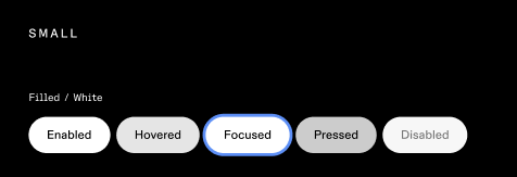
Button should look more or less the same a shown in images below. Fell free to add any css properties as you please to achieve the desired look.
background - #000
height - 64px
background - #000
height - 48px
background - #fff
height - 64px
background - #fff
height - 48px


