‘ggVennDiagram’ enables fancy Venn plot with 2-4 sets and generates
publication quality figure. It is the first software that can
automatically fill different colors to each part of a Venn diagram.
You can install the released version of ggVennDiagram from CRAN with (under evaluation in CRAN):
install.packages("ggVennDiagram")And the development version from GitHub with:
# install.packages("devtools")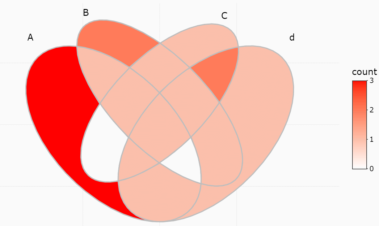
devtools::install_github("gaospecial/ggVennDiagram")ggVennDiagram maps the fill color of each region to quantity, allowing
us to visually observe the differences between different parts.
library(ggVennDiagram)
genes <- paste("gene",1:1000,sep="")
set.seed(20190708)
x <- list(A=sample(genes,300),B=sample(genes,525),C=sample(genes,440),D=sample(genes,350))

# four dimension Venn plot
ggVennDiagram(x)
# three dimension Venn plot
ggVennDiagram(x[1:3])
# two dimension Venn plot
ggVennDiagram(x[1:2])
ggVennDiagram return a ggplot object, which can be further modified
with ggplot functions.
library(ggplot2)
ggVennDiagram(x) + scale_fill_gradient(low="blue",high = "red")
#> Scale for 'fill' is already present. Adding another scale for 'fill', which
#> will replace the existing scale.
ggVennDiagram(x,lty="dashed",color="black",size=2) + scale_fill_gradient(low="white",high = "red")
#> Scale for 'fill' is already present. Adding another scale for 'fill', which
#> will replace the existing scale.
ggVennDiagram now support 2-4 dimension Venn plot. The generated
figure is generally ready for publish. The main function
ggVennDiagram() will check how many items in the first parameter and
call corresponding function automatically.
The parameter category.names is set names. And the parameter label
can label how many items are included in each parts.
ggVennDiagram(x,category.names = c("Stage 1","Stage 2","Stage 3", "Stage4"))
ggVennDiagram(x,category.names = c("Stage 1","Stage 2","Stage 3", "Stage4"), label = NULL)
Set label_alpha = 0 to remove label background
ggVennDiagram(x, label_alpha=0)
Note: you need to install the GitHub version to enable these functions.
We implemented the get_region_items() to get intersection values.
y <- list(
  A = sample(letters, 8),
  B = sample(letters, 8),
  C = sample(letters, 8),
  D = sample(letters, 8)
)

get_region_items(y)
#> $A
#> [1] "y" "b" "e"
#>
#> $B
#> [1] "i" "v"
#>
#> $C
#> [1] "a"
#>
#> $D
#> [1] "h"
#>
#> $AB
#> [1] "c"
#>
#> $AC
#> character(0)
#>
#> $AD
#> [1] "z"
#>
#> $BC
#> [1] "d"
#>
#> $BD
#> [1] "k"
#>
#> $CD
#> [1] "f" "m"
#>
#> $ABC
#> [1] "w"
#>
#> $ABD
#> character(0)
#>
#> $ACD
#> [1] "j"
#>
#> $BCD
#> [1] "p"
#>
#> $ABCD
#> [1] "x"
If only several items were included, intersections may also be viewed
interactively by plotly method (if you have two many items, this is
useless).
p <- ggVennDiagram(y, show_intersect = TRUE)
p
plotly::ggplotly(p)In web browser or RStudio, you will get:
If you have reviewed my codes, you may find it is easy to support Venn Diagram for more than four sets, as soon as you find a ideal parameter to generate more circles or ellipses in the plot. The key point is to let the generated ellipses have exactly one intersection for each combination.
However, Venn Diagram for more than four sets may be meaningless in some conditions, as some parts may be omitted in such ellipses. Therefore, it is only useful in specific conditions. For example, if the set intersection of all group are extremely large, you may use several ellipses to draw a “flower” to show that.
在 @GuangchuangYu 的公众号下面,我投稿了一篇文章,介绍了 “ggVennDiagram”
包开发的始末,有兴趣的同学可以移步至此查看。