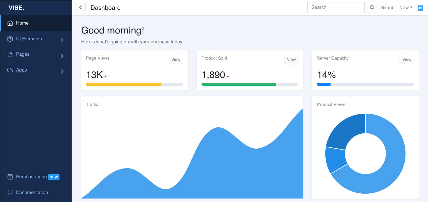
Vibe is a beautiful React.js dashboard built with Bootstrap 4 and comes with lots of custom templates and components. It's built with Sass which allows you to quickly change global colors and styles.
Quick Start
- Install dependencies by running
yarnornpm install. - Run
yarn startornpm run startto start the local dev server.
Reporting Issues
Report any issues you may find with Vibe on the github issues tab. I will get an update to you as soon as possible. Feel free to open a pull request and I will review and merge.
Documentation
Vibe is based on Create React App. Follow the documentation there for an introduction of the development environment.
Modifying the layout
The basic dashboard layout is defined in ./src/views/layouts/DashboardLayout.js. You can modify parts of the layout with the following code:
| Part | Modification |
|---|---|
| CSS | Sass files can be found in ./src/vibe/scss. Update ./src/vibe/scss/components/vars.scss to change global styles. |
| Responsivity | Configure the switch between mobile and desktop layout with the constant MOBILE_SIZE |
| Logo | Change file ./src/assets/images/vibe-logo.svg or import a different Logo |
| Chat | Enable/Disable it by default by setting the initial state of showChat1 |
| Header | Change function component HeaderNav. |
| Footer | Change the <Footer> part in the render() function of DashboardLayout. |
| Menu | See below. |
Creating a new page
- Create your page as component in the folder
./src/views/pages. (You can actually create these components anywhere you wish, this is just a recommendation.) - Add your component to the
pageListarray in./src/views/index.js. - Call it by opening the route you've chosen.
| Key | Value |
|---|---|
component |
Your component name |
name |
The display name in the top bar (Header) of the dashboard |
route |
Route of this page, using the react-router-dom syntax |
exact |
(Optional) Set to true if you want to match this route exactly. See Routes documentation for details. |
See below for how to use Bootstrap components to design your page content.
Creating a menu entry
All pages are accessible by their routes, but only pages manually added to ./src/_nav.js show up on the sidebar menu.
There are two menus available to fill: top and bottom.
Every top level menu entry can either be a top level button or a folder with a single level of child entries.
| Key | Value |
|---|---|
name |
Display name of the menu entry |
icon |
(Optional) Icon prefixed to the display name. The correct item gets autoloaded by Vibe. (react-feather is used for icons. |
url |
(Optional) Either a relative URL to the target page or an absolute URL to an external page (For linked menu entries. Make sure relative URLs start with a slash, i.e. /home) |
external |
(Optional) Set to true if the url points to an external page. |
target |
(Optional) Set to _blank if you want the link to an external page to open in a new window. |
children |
(Optional) Child entries as array (For folder menu entries) |
divider |
(Optional) Inserts a visual divider if set to true (Use this instead of a menu entry) |
Note: If you wish menus to be expanded by default, you have to change the initial state of open in ./src/vibe/components/SidebarNav/components/NavDropdownItem.js.
Using Bootstrap / reactstrap
Vibe is using the Bootstrap-for-React library reactstrap. Follow the components documentation for using them in a Vibe Dashboard.
Note that Vibe overwrites the default Bootstrap styles in ./src/vibe/scss/components/.
Custom Vibe components are in the ./src/vibe/components/ directory.
Using Feather icons
Vibe is using react-feather for its icons.
A nice overview over all available icons can be found on https://feathericons.com/.
Note: In order to use a Feather icon in react, convert the name to camel case. (I.e. alert-circle becomes AlertCircle).
