Bundle of Stylish customizable Color pickers, selectors, colorful sliders written with Jetpack Compose enables users to choose from HSL, HSV or RGB color models to pick Solid colors or gradients. With colorful Sliders, panels, hex and color displays and various elements to create customized pickers based on preference.
There are 12, as of current version, different color pickers and 3 different color+gradient pickers available to choose from to use as Composables or inside dialogs that are available in demos.
intro_720.mp4
To get a Git project into your build:
- Step 1. Add the JitPack repository to your build file Add it in your root build.gradle at the end of repositories:
allprojects {
  repositories {
      ...
      maven { url 'https://jitpack.io' }
  }
}
- Step 2. Add the dependency
dependencies {
    implementation 'com.github.SmartToolFactory:Compose-Color-Picker-Bundle:<version>'
}
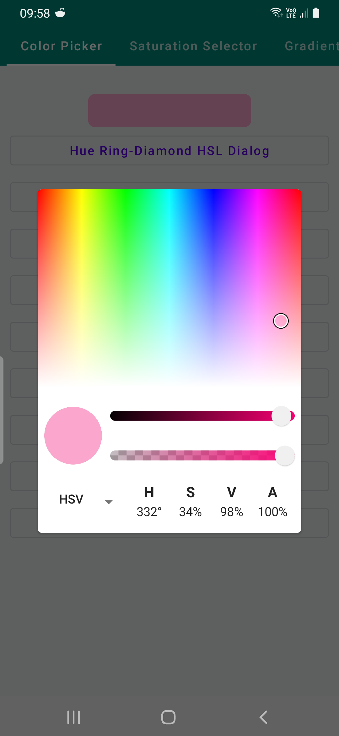
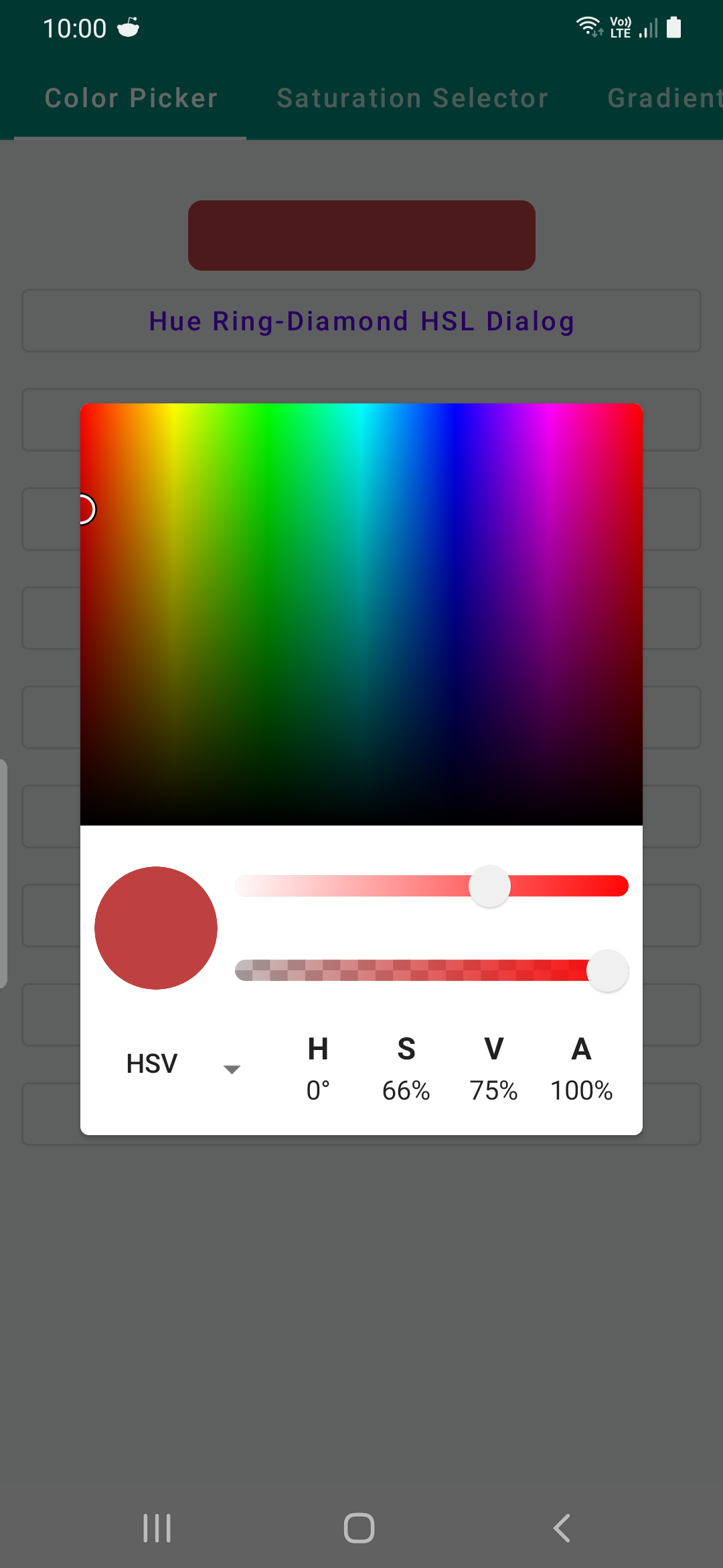
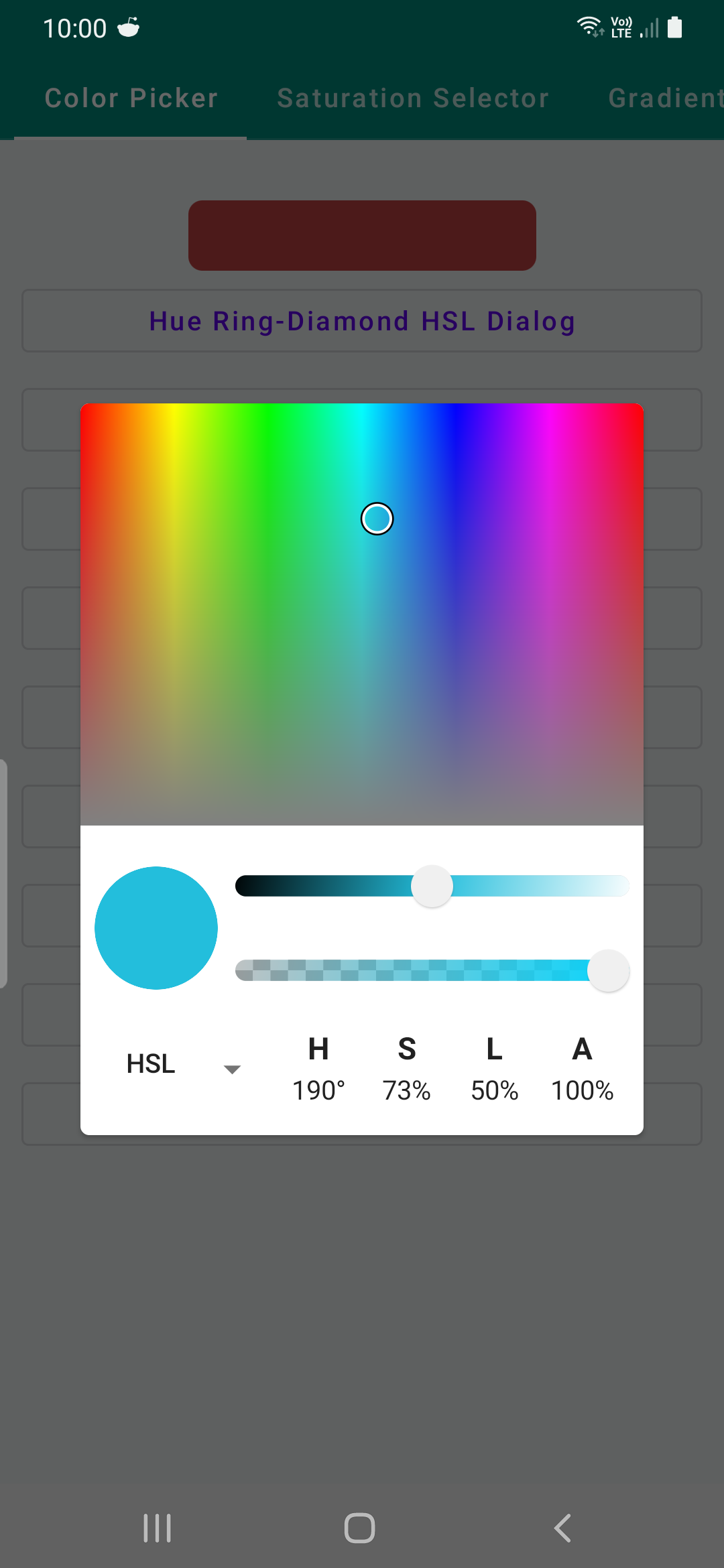
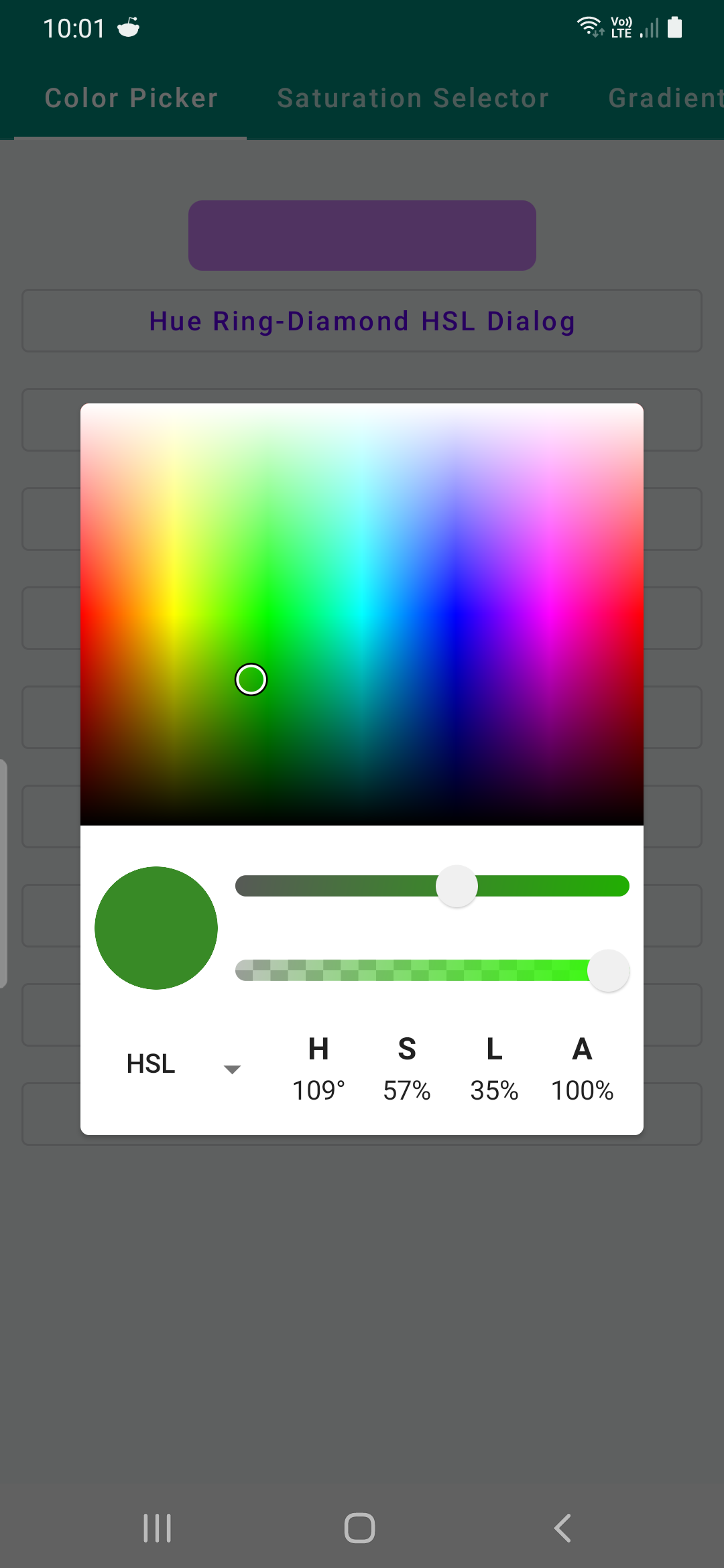
There are various selection of default color pickers and with selectors sliders, and hex displays it's possible to create new ones either.
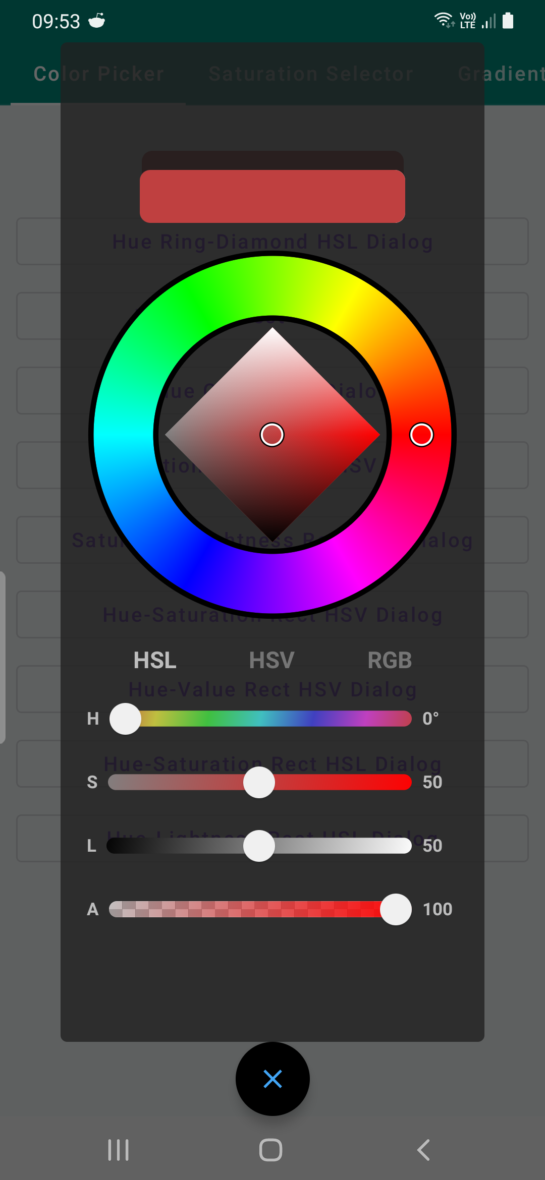
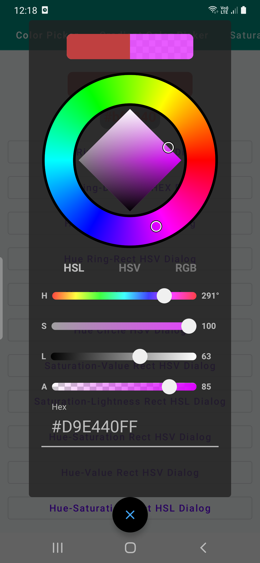
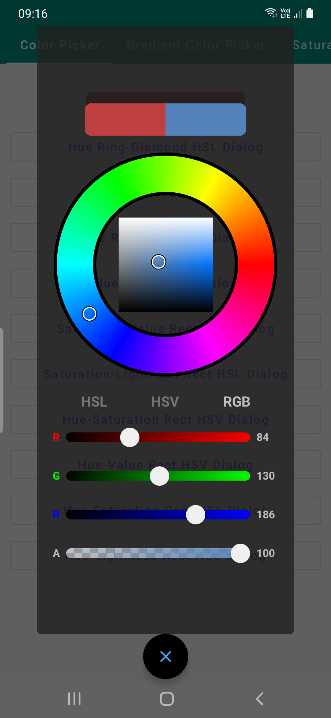
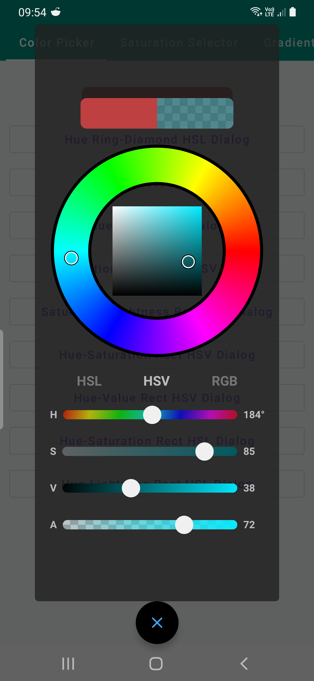
| Hue Ring-Diamond HSL | Hue Ring-Diamond HEX | Hue- Ring-Rect HSL | Hue Ring-Rect HSV |
|---|---|---|---|
 |
 |
 |
 |
| Saturation-Value HSV | Saturation-Lightness HSL | Hue-Circle HSV | Hue Ring-Rect Hex |
|---|---|---|---|
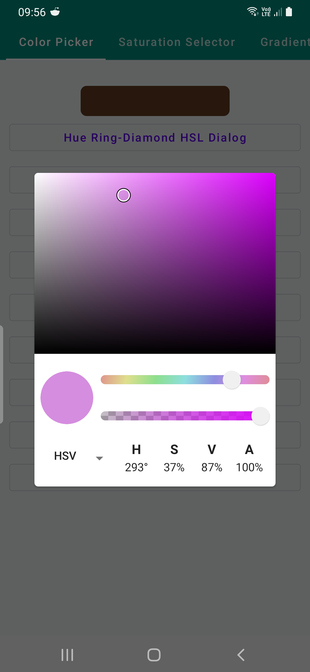 |
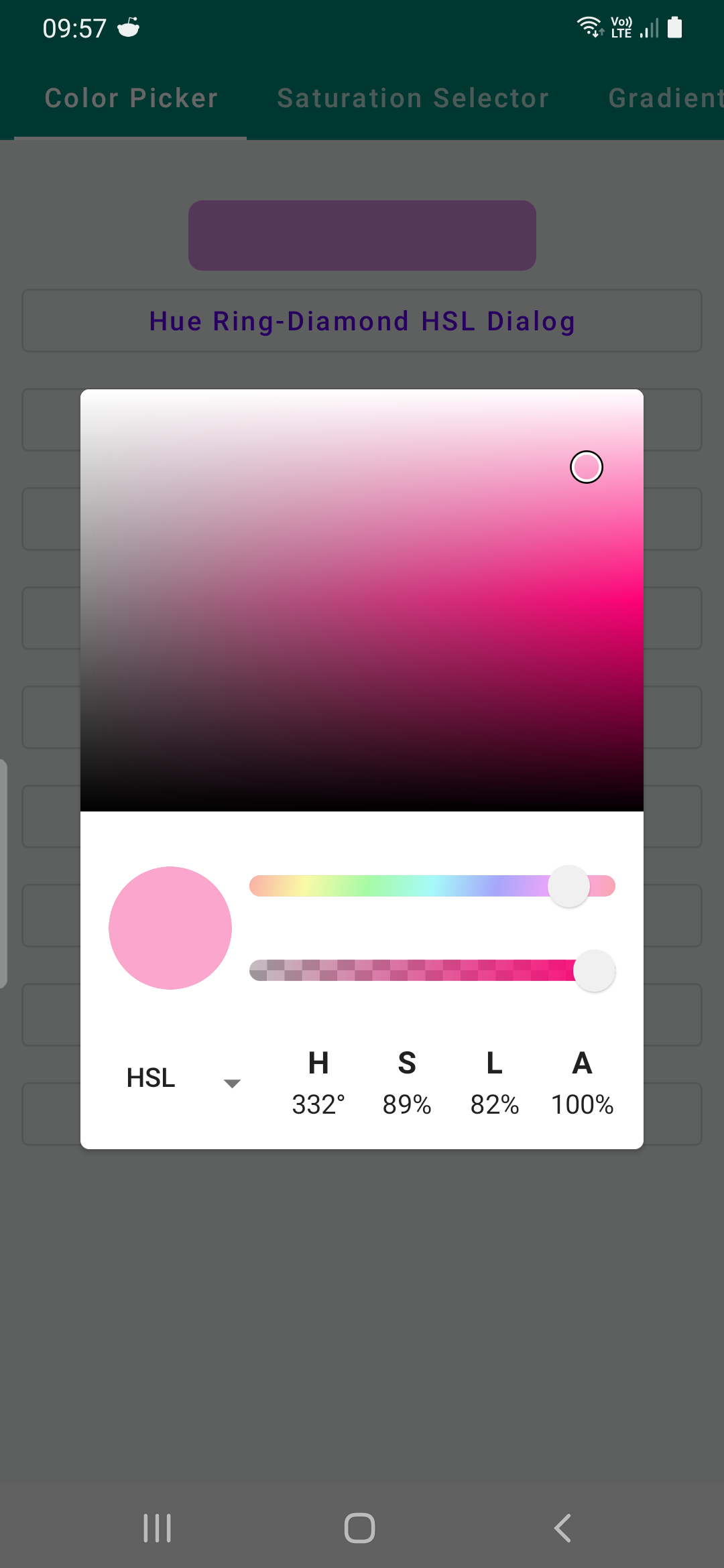 |
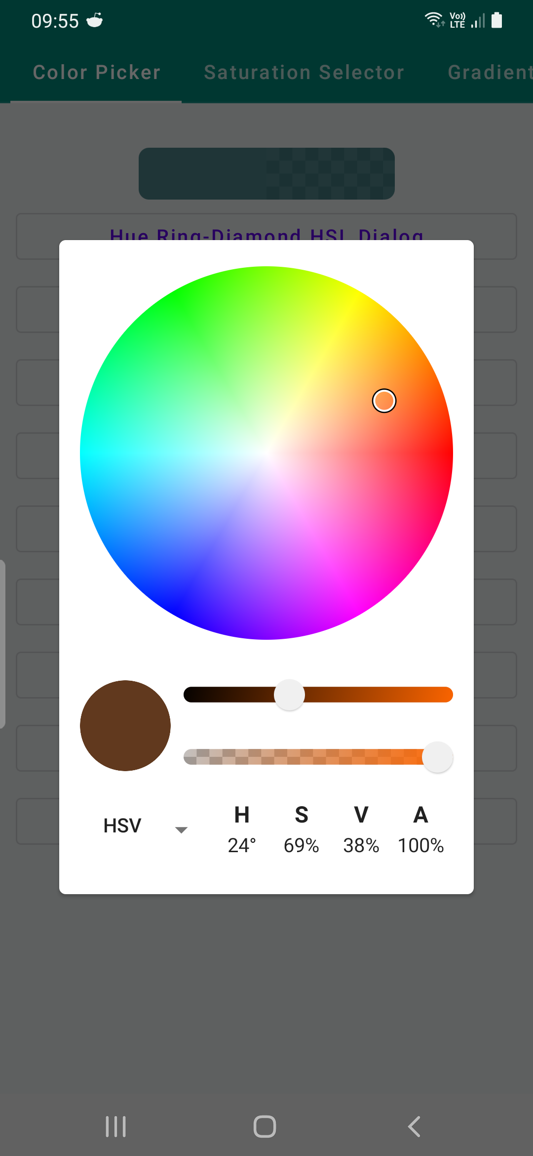 |
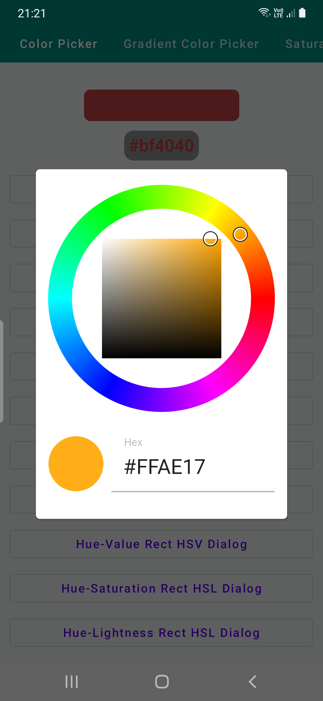 |
| HS HSV | HL HSV | HS HSL | HL HSL |
|---|---|---|---|
 |
 |
 |
 |
ColorPickerRingRectHSL(
  modifier: Modifier = Modifier,
  initialColor: Color,
  ringOuterRadiusFraction: Float = .9f,
  ringInnerRadiusFraction: Float = .6f,
  ringBackgroundColor: Color = Color.Transparent,
  ringBorderStrokeColor: Color = Color.Black,
  ringBorderStrokeWidth: Dp = 4.dp,
  selectionRadius: Dp = 8.dp,
  onColorChange: (Color) -> Unit
)
ColorPicker with SelectorRingHue hue selector and SelectorRectSaturationLightnessHSL saturation
lightness Selector that uses HSL color model as base.
This color picker has tabs section that can be changed between HSL, HSV and RGB color models and
color can be set using CompositeSliderPanel which contains sliders for each color models.
- initialColor color that is passed to this picker initially.
- ringOuterRadiusFraction outer radius of
SelectorRingHue. - ringInnerRadiusFraction inner radius of
SelectorRingHue. - ringBackgroundColor background from center to inner radius of
SelectorRingHue. - ringBorderStrokeColor stroke color for drawing borders around inner or outer radius.
- ringBorderStrokeWidth stroke width of borders.
- selectionRadius radius of white and black circle selector.
- onColorChange callback that is triggered when
Coloris changed usingSelectorRingHueSelectorDiamondSaturationLightnessHSLorCompositeSliderPanel
ColorPickerCircleValueHSV(
    modifier: Modifier = Modifier,
    selectionRadius: Dp = 8.dp,
    initialColor: Color,
    onColorChange: (Color) -> Unit
)
- selectionRadius radius of white and black circle selector.
- initialColor color that is passed to this picker initially.
- onColorChange callback that is triggered when
Coloris changed
| Hue Ring-Diamond HSL | Hue Ring-Diamond HSL2 | Hue- Ring-Rect HSL | Hue Ring-Rect HSV |
|---|---|---|---|
 |
 |
 |
 |
ColorPickerGradientRingDiamondHSL(
    modifier: Modifier = Modifier,
    initialBrushColor: BrushColor,
    gradientColorState: GradientColorState = rememberGradientColorState(),
    ringOuterRadiusFraction: Float = .9f,
    ringInnerRadiusFraction: Float = .6f,
    ringBackgroundColor: Color = Color.Black,
    ringBorderStrokeColor: Color = Color.Black,
    ringBorderStrokeWidth: Dp = 4.dp,
    selectionRadius: Dp = 8.dp,
    onBrushColorChange: (BrushColor) -> Unit
)
Gradients in Compose might require Size, Offset, or radius based on Linear, Radial, or Sweep gradient is implemented.
A GradientColorState should be provided to this picker that hold brush, color and other
meta-data about the gradient or color. When there is no size provided you won't be able to choose
linear gradient with start end offset, angle rotation still available, or other gradients.
@Composable
fun rememberGradientColorState(
    color: Color = Color.Unspecified,
    size: DpSize = DpSize.Zero
): GradientColorState {

    val density = LocalDensity.current

    return remember {

        val sizePx = if (size == DpSize.Zero) {
            Size.Zero
        } else {
            with(density) {
                Size(
                    size.width.toPx(),
                    size.height.toPx()
                )
            }
        }
        GradientColorState(color, sizePx)
    }
}
Set size of your container that you wish to display gradients in and pass it
val size = DpSize(150.dp, 100.dp)

and initial color to be displayed on picker
val gradientColorState = rememberGradientColorState(
    color = currentBrushColor.color,
    size = size
)
BrushColor class is a color and brush wrapper class that is returned from gradient pickers in **
onChange** callback instead of Color
/**
 * Data class that contains [Brush] and [Color] and can return either based on user selection.
 */
data class BrushColor(
    var color: Color = Color.Unspecified,
    var brush: Brush? = null
) {
    /**
     * [Brush] that is not **null** [brush] property or [SolidColor] that is not nullable and
     * contains [color] property as [SolidColor.value]
     */
    val activeBrush: Brush
        get() = brush ?: solidColor

    /**
     * [SolidColor] is a [Brush] that
     * wraps [color] property that is used for [activeBrush] if [brush] property is **null**
     */
    val solidColor = SolidColor(color)
}
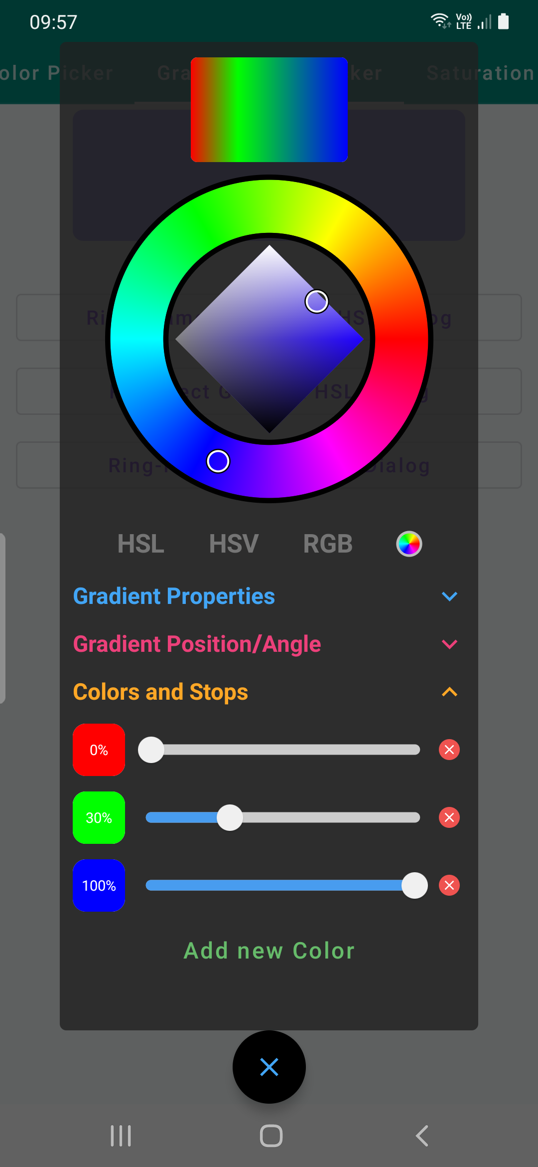
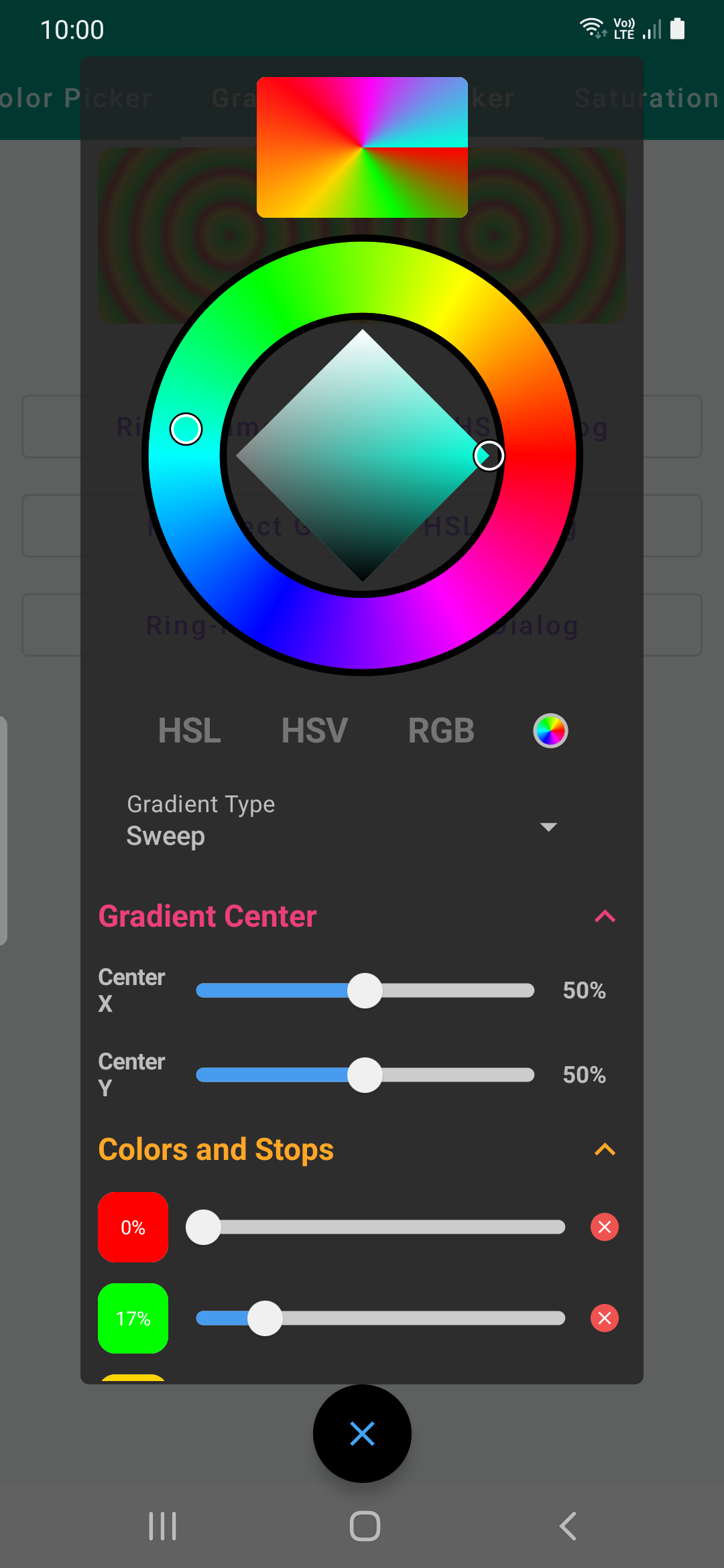
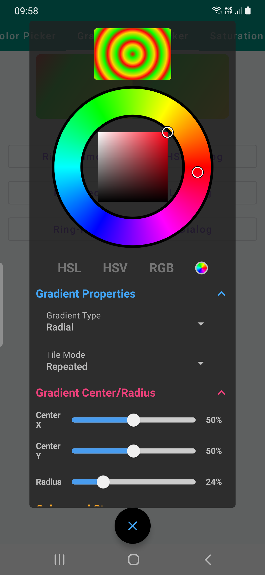
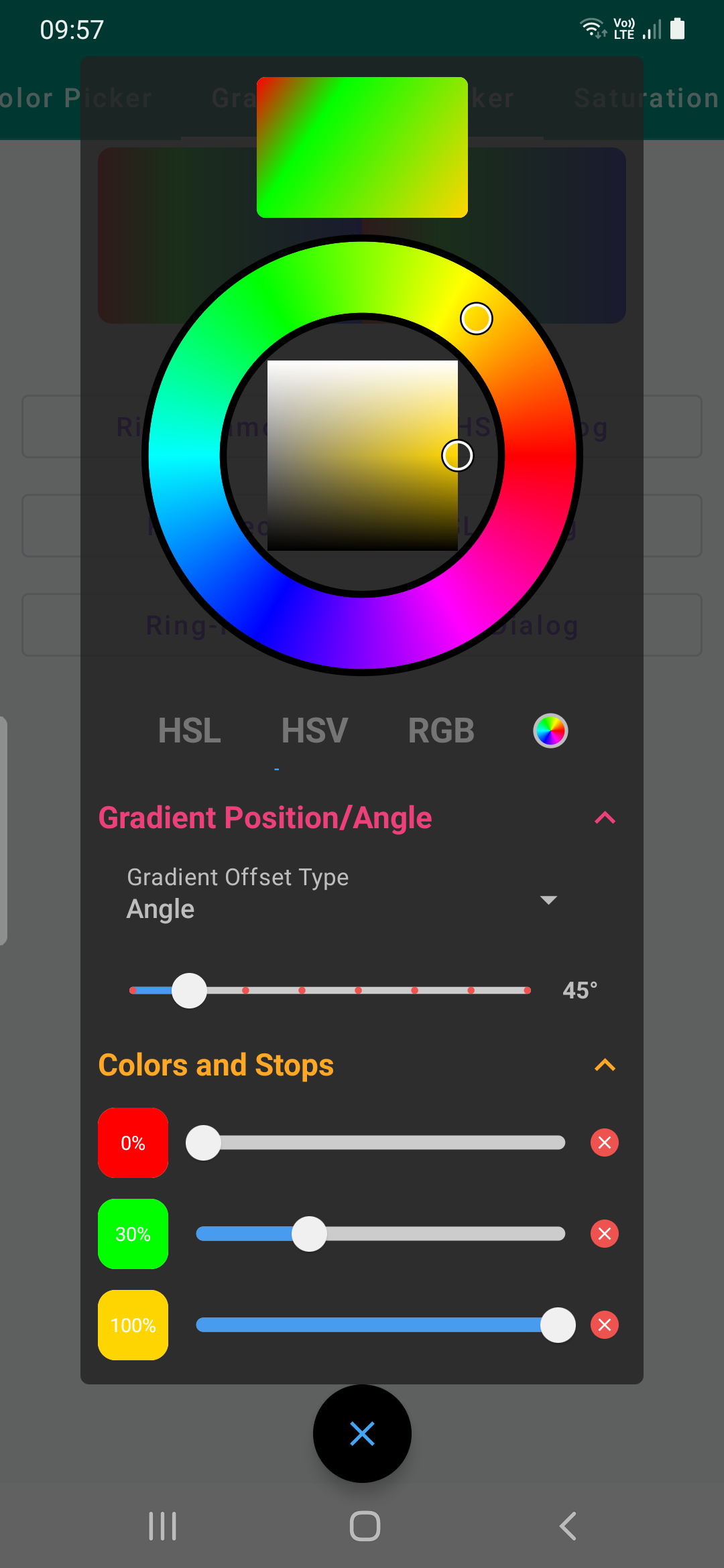
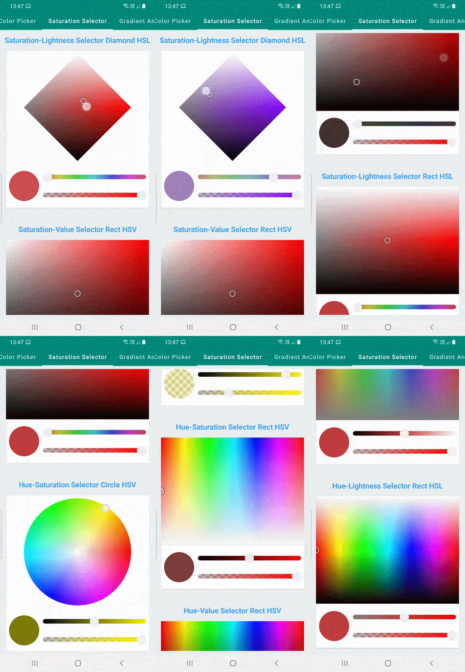
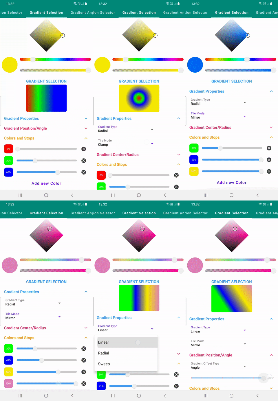
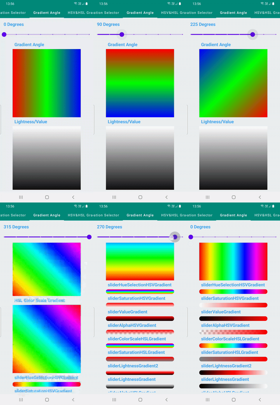
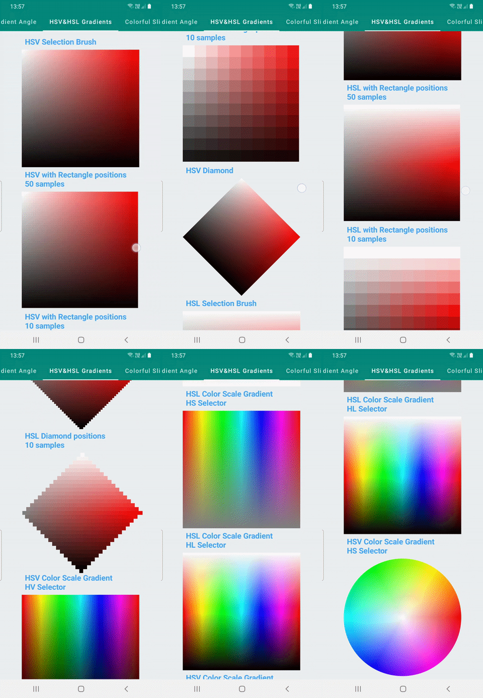
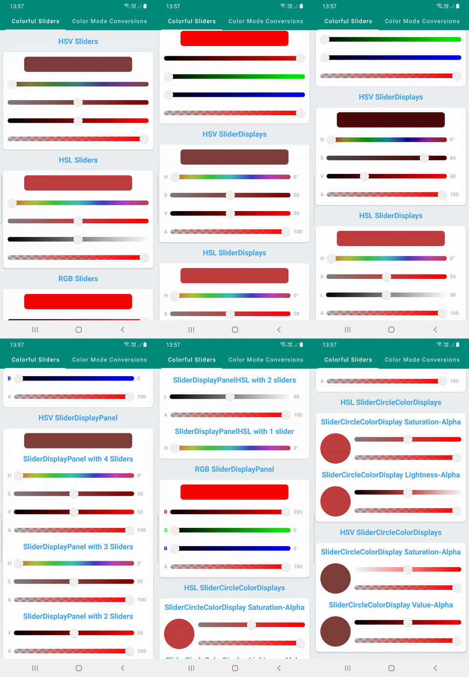
SaturationSelectorDemodifferent type of Hue/Saturation/Value/Lightness SelectorsGradientSelectionselect gradient with varying properties such as tile mode, angle, size, or type, colors and color stopsGradientAngleDemegradient rotation withGradientOffsetobjects.HSVHSLGradientDemovarious types of gradients for creating pickersColorfulSliderDemoSliders that can be used with different type of options with different Selectors and Pickers
| Selectors | Gradient Selection | Gradient Angle | HSV/HSL Gradients | Colorful Sliders |
|---|---|---|---|---|
 |
 |
 |
 |
 |
- Add Hue Picker Wheel for selecting Hue
- Add Saturation Rectangle for selecting Saturation and Lightness
- Add Saturation Diamond for selecting Saturation and Lightness
- Add Composable to display previous and current color
- Fix Saturation Diamond color display for HSL
- Add colorful Sliders to have more stylish sliders
- Add gradient rotation option(GradientOffset)
- Add HSV-HSL gradient demo
- Add gradient rotation demo
- Add checker Composable/Modifier that draws checker pattern behind to display alpha
- Add console with interoperability between HSV, HSL and RGB(Conversion between color models)
- Add Rectangle Hue+Saturation/Value/Lightness HSV/HSL Selectors
- Add Circle Hue Saturation Selector
- Add Composable to display colors in HEX and change color using TextField
- Add option to display colors in a dialog
- Add gradient color selection with percentage stops, linear, radial and sweep options
- Add gradient selection demo
- Add color detection from screen demo