| title | authors | date | reviewers | layout | |
|---|---|---|---|---|---|
Georeferencing and mapping FAME data
|
|
2018-06-26 |
lesson |
Learn how to georeference FAME data and create an interactive map in CARTO
-
Lesson goals
-
Lesson structure
-
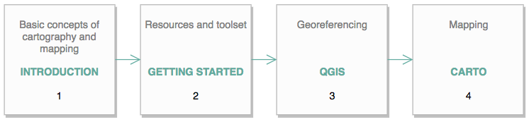
Introduction
-
Getting started
-
Georeferencing FAME data in QGIS
-
Mapping FAME data in CARTO
The purpose of this lesson is to learn how to create an interactive map that enables the user to explore geographic and spatial relations between economic activities according to their trading addresses. By the end of this lesson you would be able to:
- Identify and collect the relevant data
- Perform basic operations to manipulate the data in QGIS
- Create an interactive map to visualise the data in CARTO
The lesson is organised in four sections. The first section is an introduction to basic concepts of cartography and mapping. The second section describes the resources needed to create an interactive map. The third section will focus on data manipulation in the QGIS environment. Finally, the last section refers to creating an interactive map on the CARTO platform.
Neogeography
With the ogoing advancements of web digital technologies the term neogeography has emerged. In short according to Turner quoted by Haklay, Singleton and Parker (p.10) neogeography:
- means ‘new geography’ and consists of a set of techniques and tools that fall outside the realm of traditional GIS, Geographic Information Systems.
- is about people using and creating their own maps, on their own terms and by combining elements of an existing toolset.
- is about sharing location information with friends and visitors, helping shape context, and conveying understanding through knowledge of place.
- is fun.
However, despite the opportunities and new alternatives to understand the environment, neogeography also poses challenges and criticisms. Some critics have labelled maps produced by neogeographers as 'cheese burger' maps (in reference to low quality fast food).
While there are specific disciplines and fields that focus on the scientific measurement, analysis and representation of the earth (Geodesy, Cartography, Geography, etc.), it worth indicating that throughout this lesson some of these subjects will be only covered in general terms.
Mapping
While the definition of maps refers in general to the description of relationships between elements (e.g.: ideas, nodes) for the purpose of this lesson we will understand mapping in the cartographic sense, which states that reality can be modeled in ways that communicate spatial information effectively. As such, in the information age, mapping has emerged as a means to make the complex accesible, the hidden visible (Abrams and Hall, 2004).
Think for example of attempting to understand the relationship between businesses from a list of addressess.
Georeferencing
In simple terms georeferencing means referencing spatial data to a location on the earth's surface. The expresion of the position (or the location) of the data is done according to a reference and coordinate systems(mathematical determination of an element's position). Briefly speaking, spatial reference systems (SRS) or coordinate reference systems (CRS) are standarized by the OGC (Open Geospatial Consortium) and defines a specific map projection (e.g.: Mercator, Gall-Peters, Robinson, Stereographic). The selection of the correct CRS is crucial because the spatial representation varies considerably between the different reference systems.

Most maps are based on the Mercator projection, however, it has been critisized for misrepresenenting Europe and North America as larger areas giving white nations a sense of supremacy over non-white nations (Source: Geoawsomeness).
For the creation of an interactive map we will follow two general stages: 1) Georeferencing and 2) Mapping. For this purpose you will need to have QGIS installed in your computer and an account created on CARTO.
QGIS is a free and open-source cross-platform desktop geographic information system (GIS) application that supports viewing, editing, and analysis of geospatial data. To install it navigate to the QGIS download page an follow the instructions. For more a more detailed set of instructions and troubleshooting you can consult this guide to installing QGIS. The version used in this lesson is QGIS 2.18 Las Palmas.
CARTO is a cloud computing platform that provides GIS and web mapping tools for display in a web browser. CARTO is offered as freemium service, where accounts are free up to a certain time. Current free account options include a CARTO 30 days trial and a student account in partnership with Github (this one might take longer to get).
The first step before going into QGIS is getting the data from the FAME database (Financial Management Made Easy) published by Bureau van Dijk. The access to the FAME database you will need to log in to the UCL library database resources with your student credentials. After loging in to the FAME website the first step is to search by geographic area and postcode (Geographic / Postcode).
To get a reference of postcode geographic coverage vist the Office for National Statistics postcode directory lookup.
On the FAME window we need to specify a Postcode range indicating 'From' and 'To' (Outward code should be enough to perform the query).
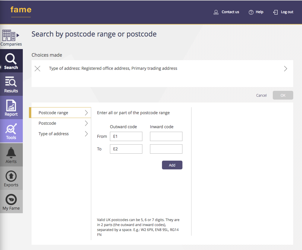
After indicating the postcode range you should be able to perform the query.
Add / OK / View results >
Then, to obtain the latitude and longitude of the primary trading address from the selected activities click on the following sections:
Add/remove columns / Trading addresses / Primary trading address / Primary trading address Latitude / Primary trading address Longitude / Apply / Excel / Export / Download
The sheet named 'Results' on your exported excel file should look like this:
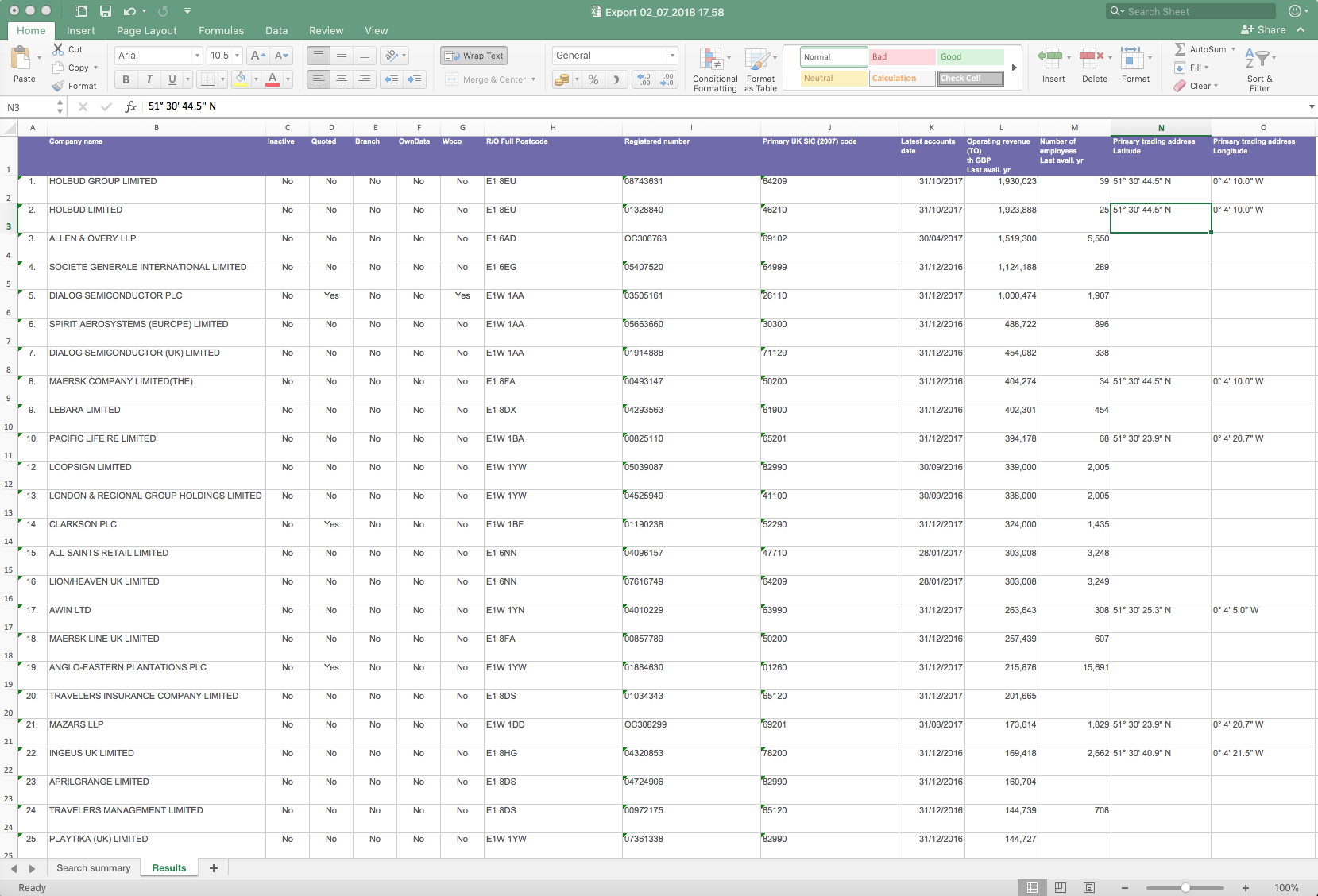
Note that some activities don't have the Latitude-Longitude information. Also, others are located in the same geographic position (equal coordinates) which might imply that these are located in the same building.
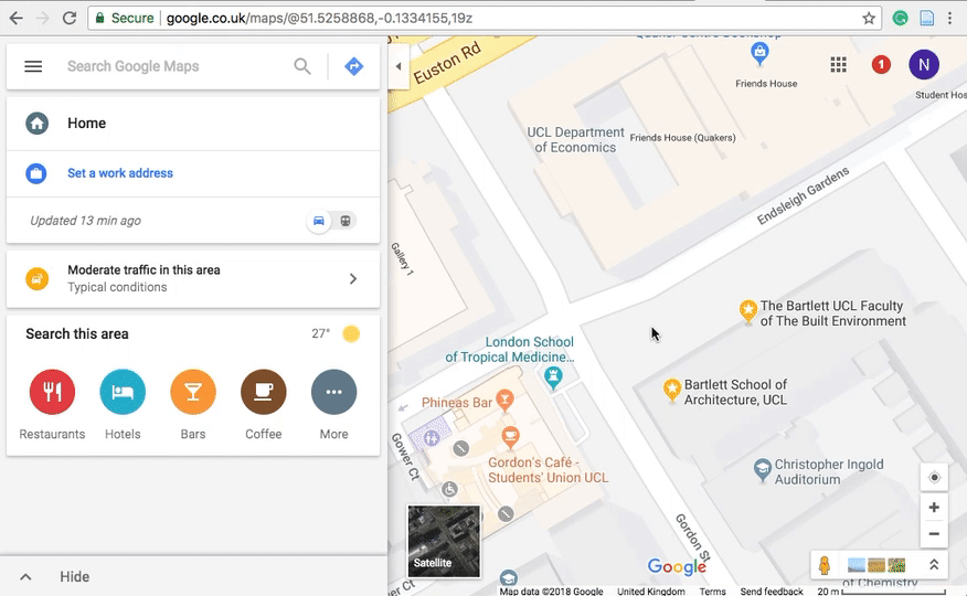
For those records that don't have the Latitude-Longitude information you can look up their position in Google Maps. Search for the location and then click on the map to activate a pop-up window at the bottom of the map. You should also get a pinpoint over the place you clicked on.

Then click on the on the coordinates shown on decimal degress in the pop-up window and copy the Latitude and Longitude from the side panel which are in this format: DD° MM' SS" X. Finally, paste these in the respective cell of your spreadsheet. Follow this same process to fill in the Latitude-Longitude information of your site observations.
Next step is to save the 'Results' sheet as a CSV file.
Comma Separared Values(.csv) - (not CSV UTF-8) / Save Active Sheet
Next, open QGIS and click trough the following sequences:
- To create a new project:
Project / New
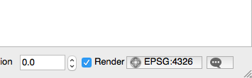
Note in the lower right corner that the project's default CRS (Coordinate Reference System) would be EPSG:4326, which is equivalent to WGS 84, the latest revision of the World Geodesic System established in 1984.
- To import the CSV file information:
Layer / Add layer / Add Delimited Text Layer
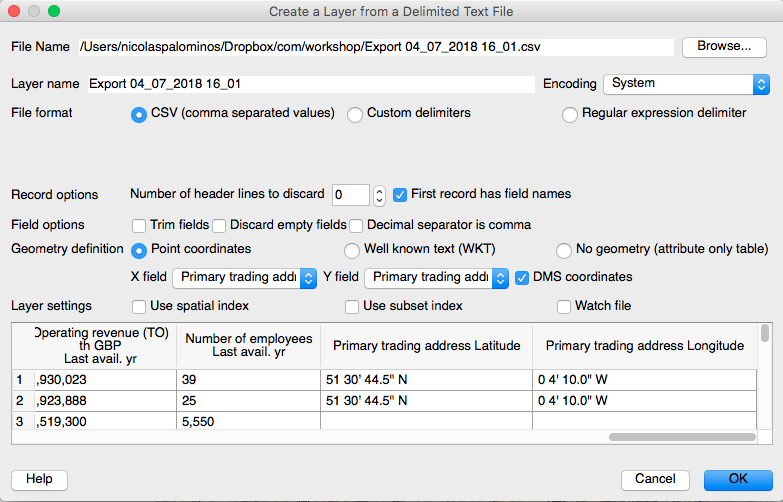
On the pop-up window browse the CSV file. Set the Encoding to System and verify that the DMS box is checked ('DMS' stands for Degree Minutes Seconds). The software should recognise the CSV file information, however if not, configure the window according to the following image. X field is Longitude and Y field is Latitude:
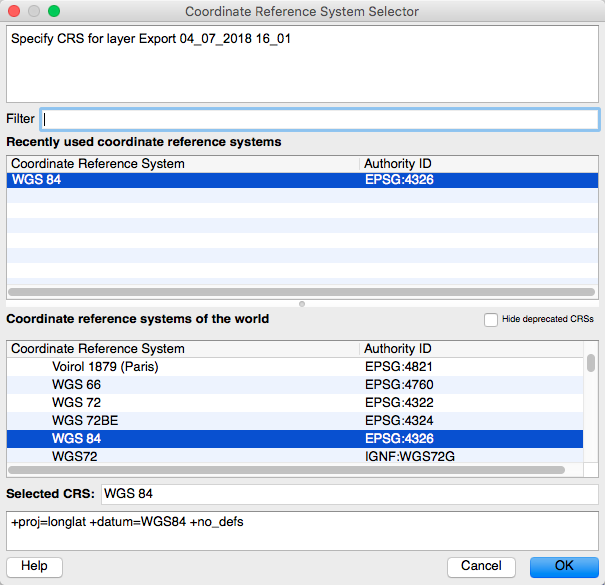
Then, hit OK and a Coordinate Reference System Selector window should pop-up. Again, the software by default should have selected WGS 84 EPSG:4326, which is a commonly used standard for maps. If not, select the CRS from the list and then hit OK.
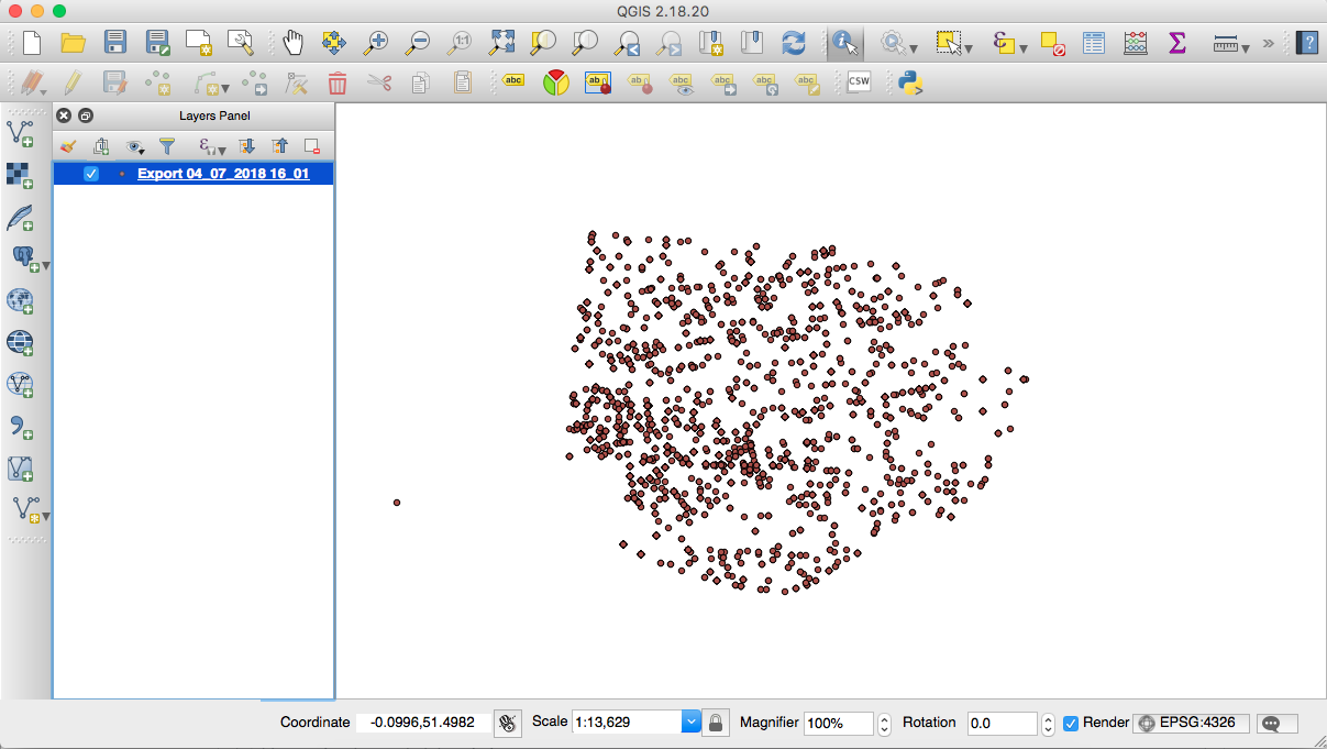
Now, on the main window you should be able to see a set of points that represent the geographic position of the activities queried. On the left hand side, on the Layers Panel, you will see that your data was added as a layer:
For a basic exploration of your map use the navigational tools on the toolbar. Also, the wheel on your mouse will behave in a similar way to navigating a Google Map.
To query the information associated with each point click on the Identify Features botton 
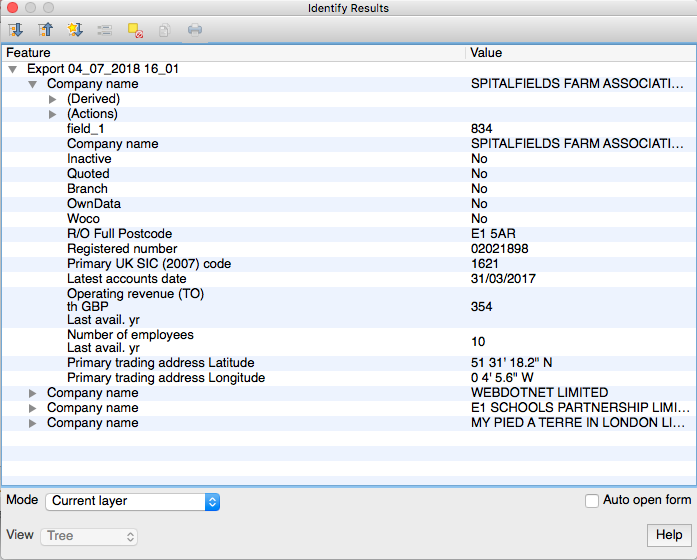
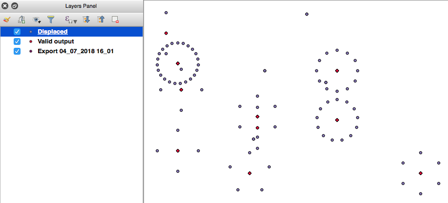
Note that one point might have more than one set of information. This means that some activities share the same 'Primary trading address Latitude and Longitude', so given that the points 'spatially' overlap the identify tool shows the information for all the overlapping points.
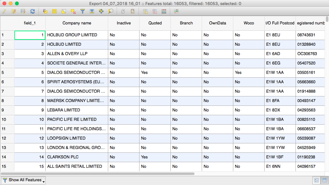
To explore all the records click ont the Open Attribute Table botton 
In order to visually analyse the spatial distribution of the points we need to 'see' all of them. Therefore, we need to spatially 'separate' those points that overlap. For this, we will 'displace' the overlapping points in relation to their current location. This will create a 'distorted' representation of the point's 'real' position but this is the trade-off to be able to visualise all the points which at the end will provide a more accurate spatial analysis (without any 'hidden' points).
Before running the displacement operation it is recommended to perfom a validity check of the geometries:
Vector / Geometry Tools / Check validity
In the pop-up window keep the default values, uncheck the last two boxes and click Run:
After running this process you will have created a new layer 'Valid output'. This will be your new working data.
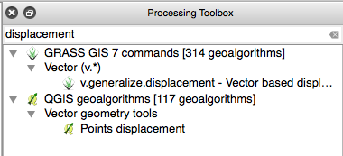
Next, to perform the point 'displacement' we need to call the QGIS toolbox:
Processing / Toolbox
Then, in the search box search for displacement and click on the Point displacement section:
In the pop-up window, for the Input layer selector choose the 'Valid output' layer, keep the dafault values and click Run. As a result, you will have created a new layer 'Displaced'. This will be your new working data. Note how the points on the 'Displaced' layer are now organized around the 'Valid output' layer through this operation that moved the overlaping points a small distance from their original position and organized them concentrically.
To perform a geographical verification of the data we can add a base or 'background' map. To do this we need to install a plugin:
Plugins / Manage and Install Plugins...
Search for 'openlayers', select 'OpenLayers Plugin' and click Install plugin. Then you should be able to add a base map layer:
Web / OpenLayers Plugin / OpenStreeMap / OpenStreetMap (or the map of your preference)
The base map will appear as a new layer on the Layers Panel. Also, note in the lower right corner that the CRS has changed to EPSG:3857 (OTF). 'OTF' stands for 'on the fly', which is a method that QGIS uses to transform and combine different CRS. EPSG:3857 is equivalent to WGS 84 / Pseudo Mercator, a commonly used CRS for webmaps. To be able to 'see' your data on top of the base map click on the 'OpenStreetMap' layer (or whichever you chose) and drag it to the bottom of the Layers Panel list
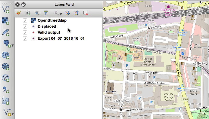
Now, you should be able to see the 'Displaced' layer on top of the base map. Because of the different CRS of the layers, note how the 'Displaced' layer looks oblique. The explanation of this was covered with more detail on section 3. Introduction. Similarly to what happened with the 'displacement' process this new type of representation should not affect the overall visual analysis of the data.
Another way of doing an exploratory data analysis of your spatial data is to 'Select feactures using an expression'. Try any of the alternatives available under this drop-down botton.

The selected elements will be higlighted in yellow and you should be able to export this data to 'extract it' from the original layer (follow the same sequence shown below plus click on the box 'Save only selected features' and 'Add saved file to map')
To finish the operations on QGIS, we need to export the 'Displaced' layer as a GeoJSON file:
(right) click on 'Displaced' layer (on the Layers Panel) / Save as...
Choose the GeoJSON 'Format' and click Browse to define the location and name of the file you are saving. Keep the rest of the fields as default. Before moving into CARTO you can save your QGIS project:
Project / Save As... / Save
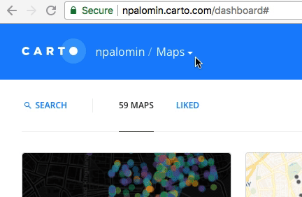
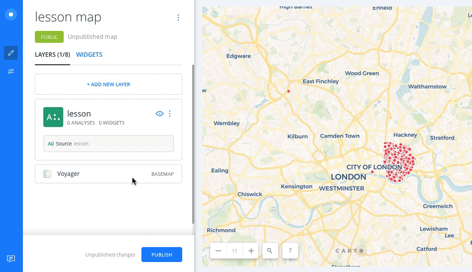
The first step is to open a web browser and log in to your CARTO account. You will see your dashboard (probably empty). On the header change from 'Your maps' to 'Your datasets'
Then, click on the NEW DATASET botton and BROWSE for the GeoJSON file on your computer. Click on CONNECT DATASET. You will have uploaded your file and you will see a spreadsheet of your data on the browser window. Click on CREATE MAP to generate a basic interactive map that you will later customize.
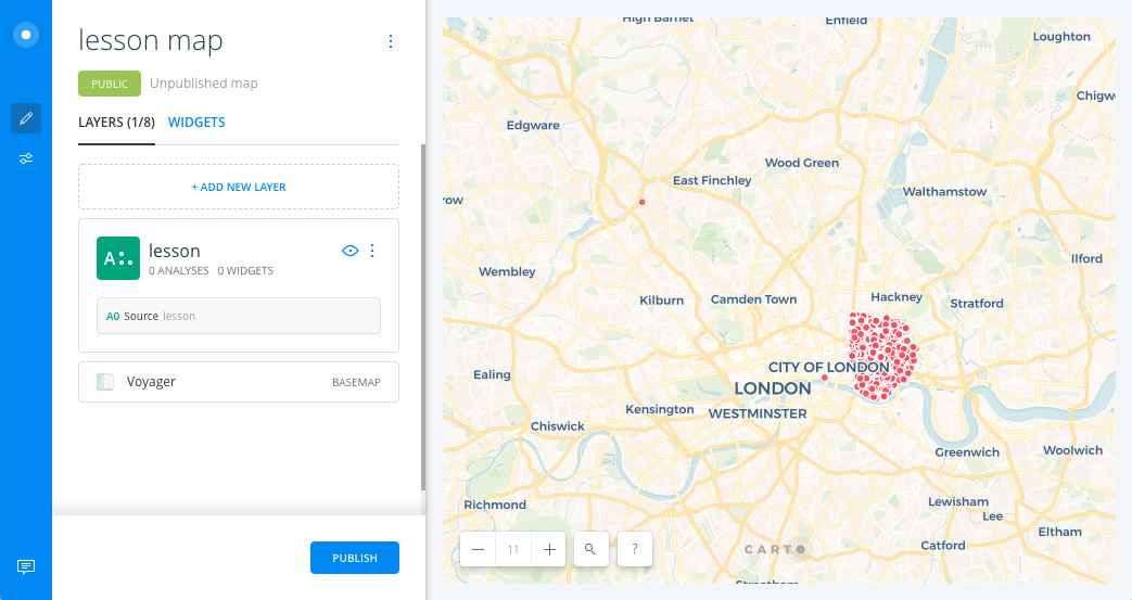
Similar to QGIS, the information is organized in layers. Before customizing your information it is recommended to select a neutral 'Base map' that doesn't 'compete' with the information you want to communicate. Click on the BASEMAP button and select an icon (e.g.: POSITRON (LABELS BELOW)).
Go <- Back to the main screen (blue letters on the top left). Click on your data layer to edit its STYLE (this will have the same name of your uploaded GeoJSON file) The panel on the left will change. Keep 1. Aggregation as default. On 2. Style change the POINT SIZE value to 10. Then, on POINT COLOR change from 'Solid' to 'By Value' and choose a column of categoric data (e.g.: primary_uk_sic_2007_code). Click on 'Quantiles' and select 'Category'. Select the color scheme of your preference (ideally one that contrasts with your base map). Select any color number and change the 'transparency' value from '1' to '0.5'. Click 'out' of the pop-up window.
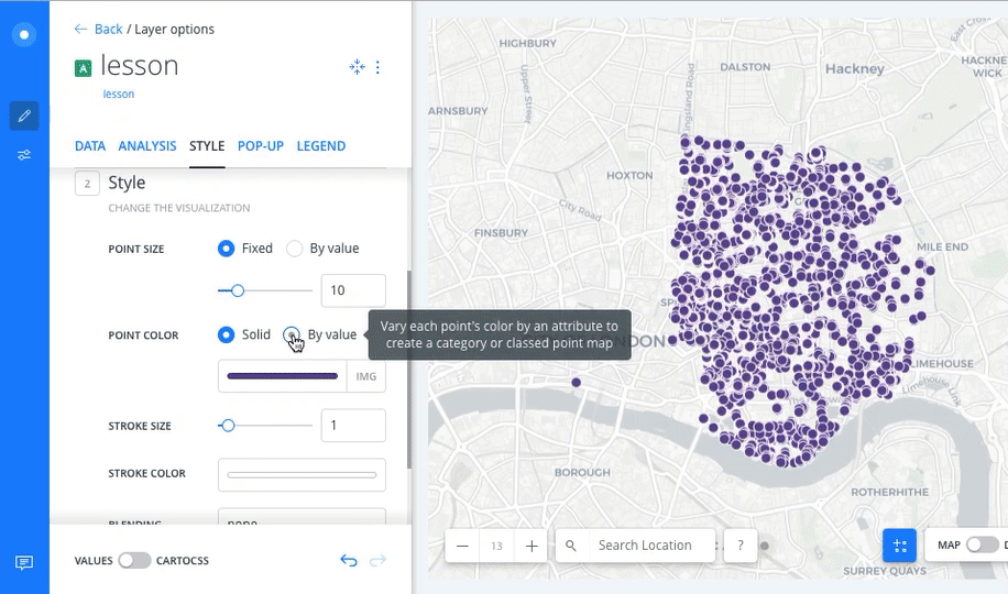
Next, change STROKE SIZE from '1' to '0'. These STYLE transformations were done according to the following principles:
- We changed the POINT SIZE to have a better view of the locations when we zoom in.
- We assigned color 'By value' to differentiate the categorical values of the NACE codes.
- We changed from 'Quantiles' to 'Category' because although the codes are a number data type these are categorical values. Note that the number of buckets is limited to '11' because that's the limit upto which humans can 'read' color variations.
- We added transparency to be able to see points overlap (and concentration) when we zoom out.
- We set the STOKE SIZE to '0' to have a better view of these overlaps.
All these transformations can be further tweaked according to the 'cartographer's' preference. For advice on this you can check the making maps recommendations checklist by John Krygier and Denis Wood 'Making Maps Is Hard'(p. 24-25).
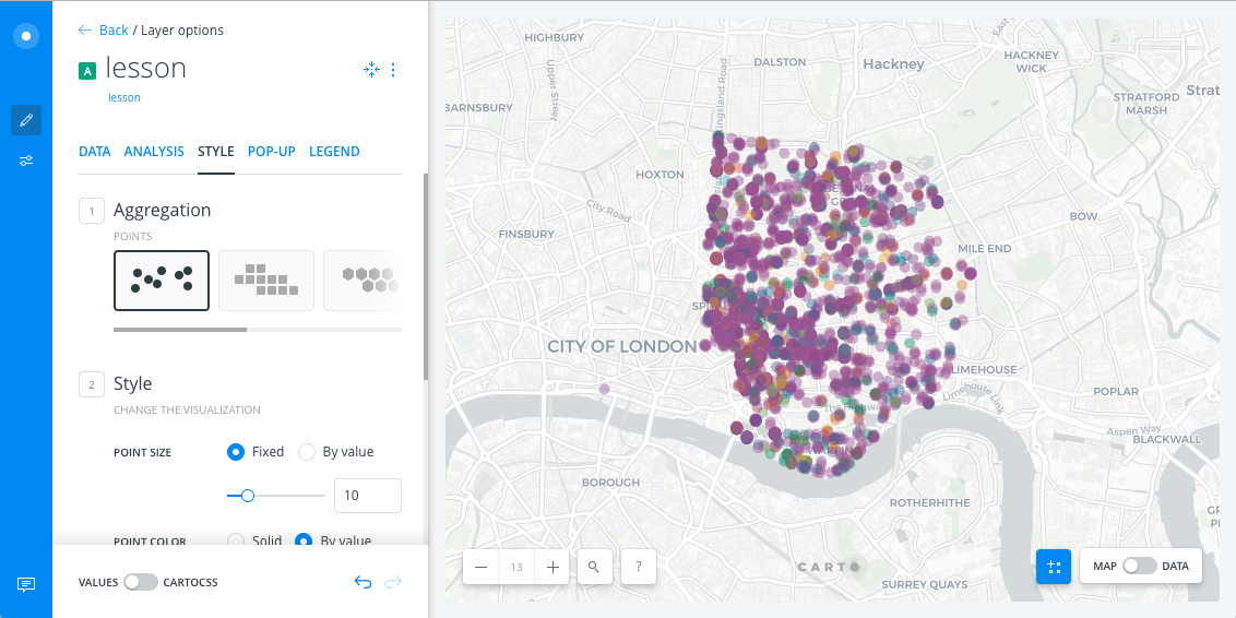
The resultant map doesn't meet the purpose of allowing to identify spatial concentration of activites per code. This is because the dataset we are using contains 351 categories wich are represented as 10 individual categories plus 1 'OTHERS' category that groups the remaining 341. This can be improved by categorizing the records in upto '11' categories. The best way to do this process is to go back to the excel file and add a column with this information for every row and then follow the same workflow.
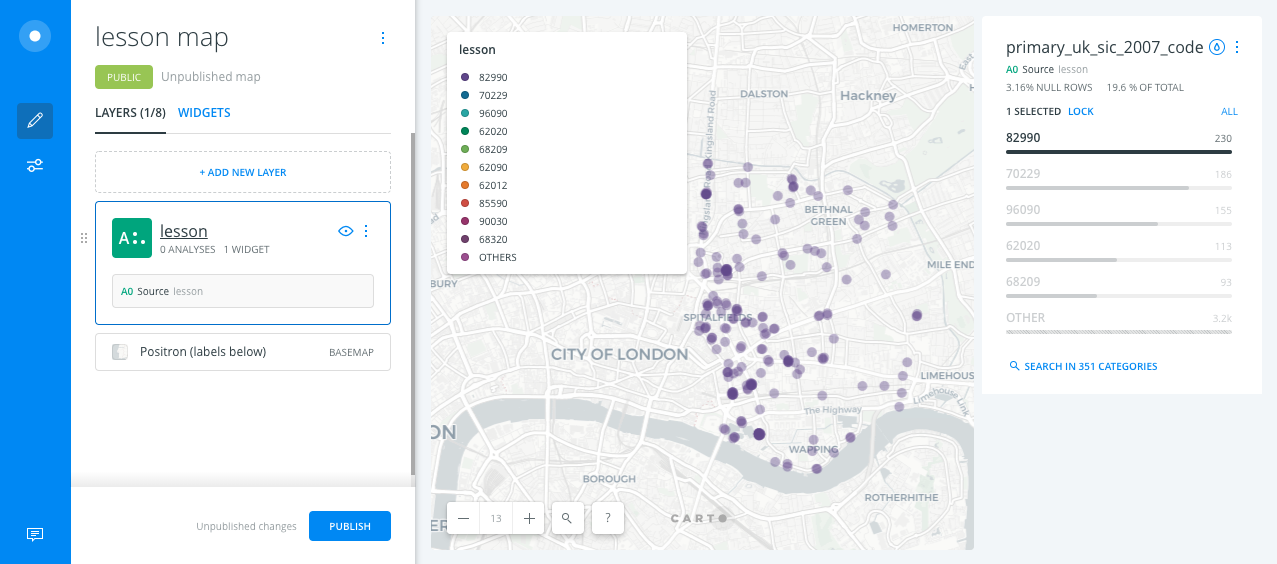
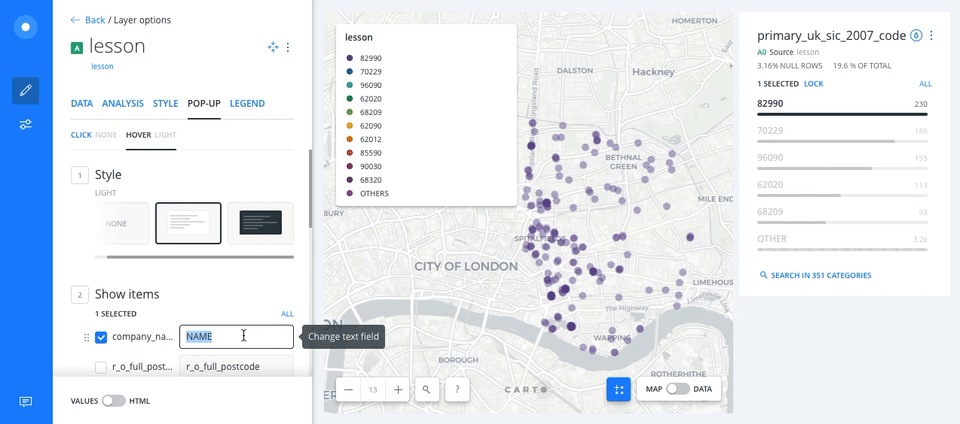
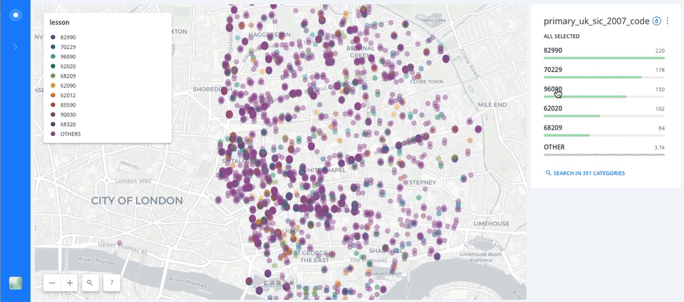
To complete our map we could add a legend and complementary navigational tools. To add a legend select the LEGEND tab and then the Category legend icon. Now, to help the map users explore the data we can add a data widget (a small web application with filtering capacities). Go to the DATA tab and select the field on which we will perform the data exploration (in this case we select the same field that we used to categorize the points (e.g.: primary_uk_sic_2007_code). Then we need to configure the widget. Click on the three stacked blue dots on the upper right corner 'More options' and select 'Edit'. A new left panel should appear. On 1. Type select the CATEGORY icon and click <- Back. At this point in 'editing mode' the widget we added will allow to filter the data to obtain a more clear view of the activities spatial distribution. The widget shows the 'COUNT' of each code. Click on any code to apply the respective filter.
Finally, we can add a 'mouse over' functionality to allow the map user to query the 'attributes' (column values) of each point. Click on your data layer, then on the POP-UP tab and select HOVER NONE. In 1. Style select 'Pop-Up Light' icon, then in 2. Show items click on the fields you want to show in the pop-up window (e.g.: company_name). On the right hand box you can edit the text.
Now you should be able to publish your map. Click <- Back and then click the PUBLISH botton. On the next window click the PUBLISH botton again and then COPY to get the link to your interactive map. Open a new browser window and paste. You are now ready to share your interactive map. You can keep editing your map (or generate new versions by duplicating it). To update the edits you'll have to 're-publish' the map PUBLISH / UPDATE. Note that the zoom in/out navigational tools also operate as a filtering tools which update the widget information.
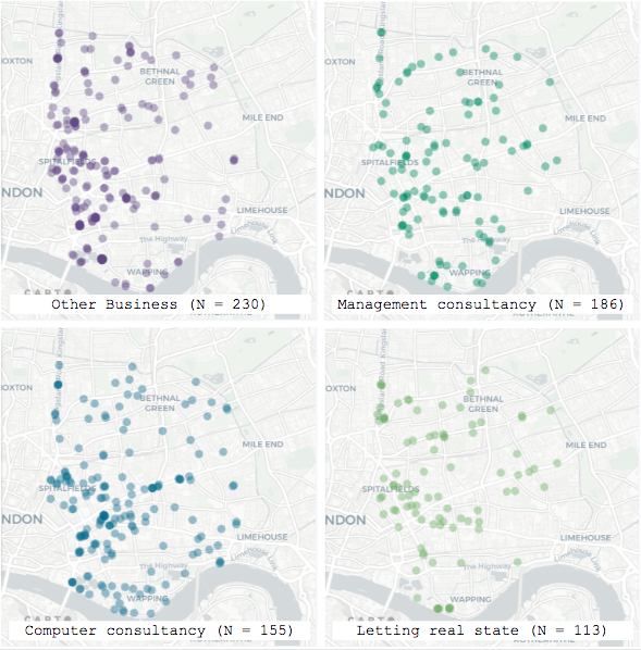
The information on the interactive map can be 'separated' by layers applying filters and then taking screenshots of the map and editing them on the software of your preference. The following image shows a comparison of the 4 most frequent of activities.
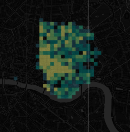
Alternatively, a more diagramatic method of representation like a Cartogram can facilitate a general overview of the concentration of activities. Cartograms are produced by placing a regular grid over a conventional map of whatever it is you want to show (source: Spatial.ly). To create a cartogram in CARTO we need to change the 1. Aggregation STYLE of the map from 'By Points' to 'By Squares' or 'By Hexbins'. This will draw a grid over your map and calculate the number of observations inside each of the squares or hexagons.
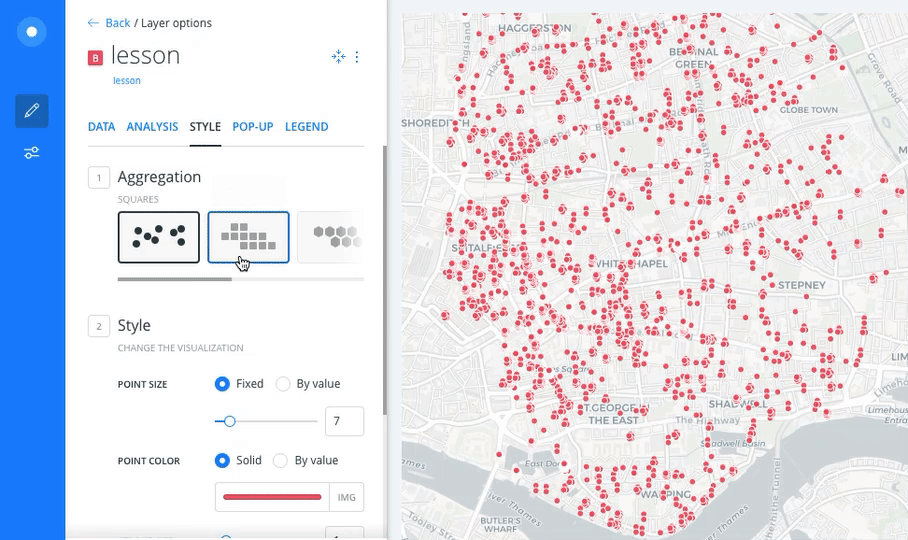
Finally, you can tweak the other STYLE variables to create the most appropiate visualisation (e.g.: Grid size, Color transparency, Base map)