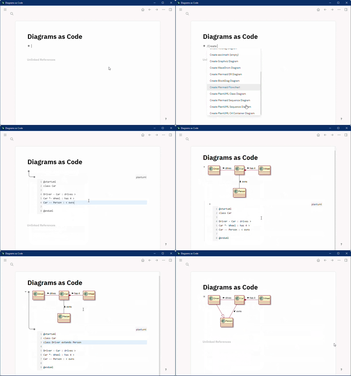
Logseq plugin that lets you create diagrams (and other visualizations) from textual representation (aka 'Diagrams as Code').
- PlantUML
- BPMN
- Bytefield
- BlockDiag
- SeqDiag
- ActDiag
- NwDiag
- Ditaa
- Graphviz
- Mermaid
- Nomnoml
- Erd
- Pikchr
- Structurizr
- Vega
- Vega-Lite
- WaveDrom
- D2
- UMlet
- SvgBob
- PGF/TikZ
Additionally, the plugin supports AsciiMath and TeX to display mathematical formulas.
Note that Logseq already supports TeX-style inline math (type $$ to try it out).
Another great option for writing math is darwis-mathlive-plugin.
Most diagram types are rendered using the awesome kroki.io API.
If you don't want to send your diagrams to a third party, there is the possibility to host it in your own infrastructure.
You can change the kroki URL in your plugin config accordingly:
{
    "kroki": {
        "baseUrl": "https://my-own-kroki-serice/"
    }
}
The plugin offers a lot of different diagram types.
Since one usually uses only a small part of them,
you can explicitly select the renderers that are relevant for you to avoid the large amount of unnecessary commands.
E.g. to enable commands for PlantUml and Mermaid diagrams only:
{
    "commands": {
        "renderers": ["plantuml", "mermaid"]
    }
}
There are some options to style and decorate your diagrams.
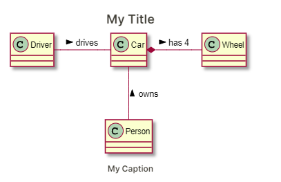
You can add a title and a caption to each diagram.
To do that, you have to specify diagram options.
Diagram options are provided as a renderer argument, where each option is a key-value pair with key and value
separated by '='.
Multiple options are separated by '&' (e.g. title=My Title&caption=My Caption).
Example
Without diagram options:
{{renderer code_diagram,plantuml}}
With diagram options:
{{renderer code_diagram,plantuml,title=My Title&caption=My Caption}}
The result would look something like this:
First, to better understand how the diagram options are used, let's have a look at the basic structure of the renderer component (in 'pseudo html'):
<Renderer>
    <Container style="${options.containerStyle}">
        <Title style="${options.titleStyle}">${options.title}</Title>
        <Content style="${options.contentStyle}">
            <MyDiagram/>
        </Content>
        <Caption style="${options.captionStyle}">${options.caption}</Caption>
    </Container>
</renderer>
List of all options:
| Key | Default | Example Value | Description |
|---|---|---|---|
| title | My Title | title text | |
| titleStyle | margin: 5px | title css style | |
| titleTag | h4 | h3 | title html tag |
| caption | My Caption | caption text | |
| captionStyle | font-style: italic; margin: 5px | caption css style | |
| captionTag | h6 | h5 | caption html tag |
| containerStyle | background: lightgray; padding:5px | container css style | |
| contentStyle | background: #eeeeee | content css style |
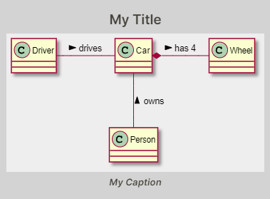
And this is how it would look if we used all example values:
Note: This PlantUML example uses the skinparam backgroundColor transparent to make the container and content
background visible.
Depending on the diagram type and the diagram content, the diagram may be too small to be readable. This is a common use case for using the containerStyle option to explicitly set the width of your diagram.
Example:
{{renderer code_diagram,d2,containerStyle=width: 400px}}
See #19 (comment) for why this is sometimes necessary.
If you have a preferred 'default look' for diagrams, it would be cumbersome to add the corresponding styles to each
diagram by hand.
Luckily, for styling that applies to all your diagrams there are some CSS classes that you can use in your custom.css
file ( Settings / General / Custom theme ).
- dac-container
- dac-title
- dac-caption
- dac-content
See pseudo html structure above
For global but diagram-type specific styling, just append -$diagramType to the CSS class name.
E.g. dac-container-plantuml for PlantUML diagrams.
For diagrams rendered by the kroki.io API, there are some additional options available.
See kroki.io docs for details.
You can use them by adding them to the renderer arguments.
All kroki.diagram.$options are passed to the kroki API.
For example, to enable sketch mode and the aubergine (7) theme for D2 diagrams:
{{renderer code_diagram,d2,kroki.diagram.theme=7&kroki.diagram.sketch=1}}


