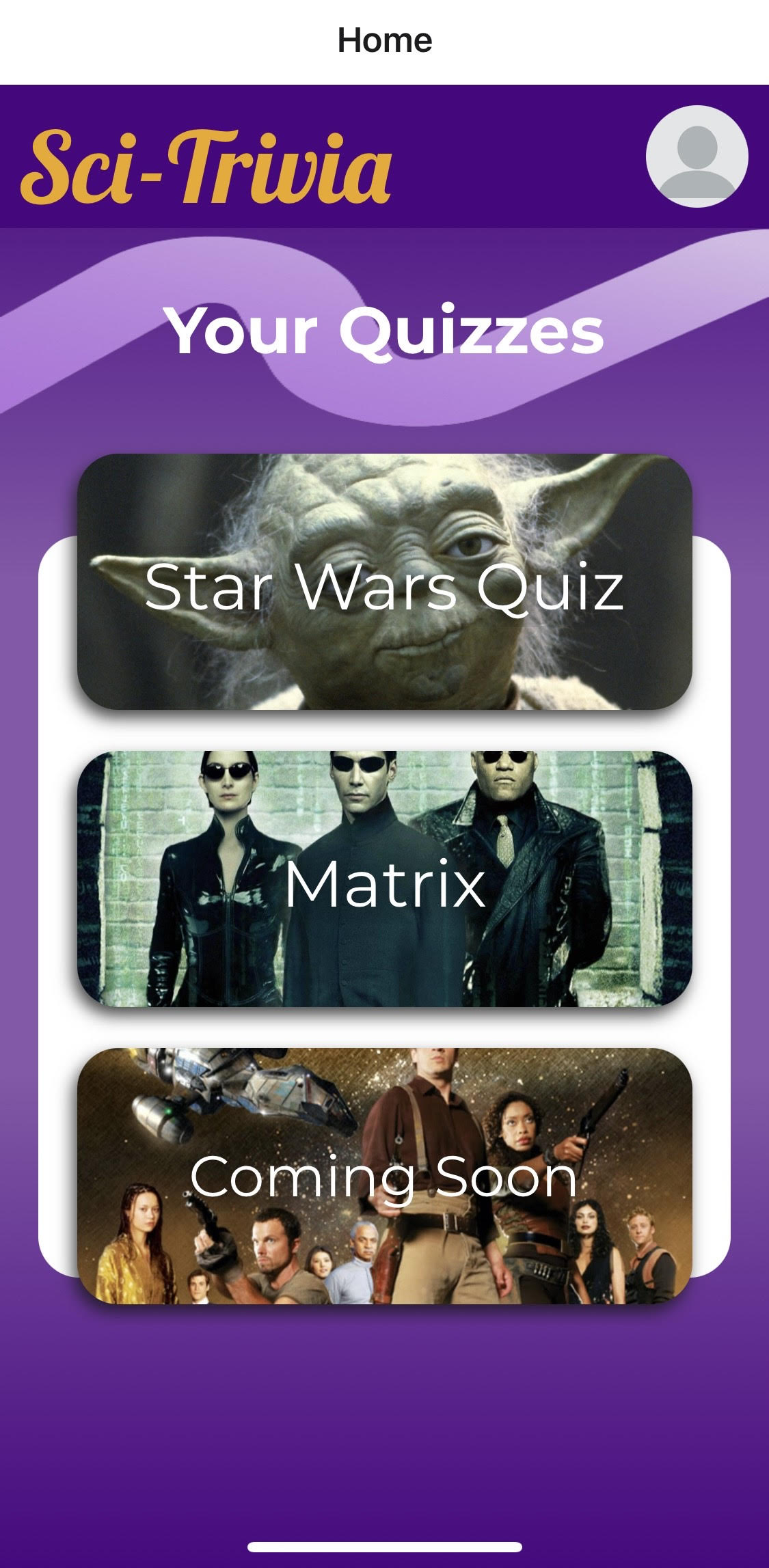
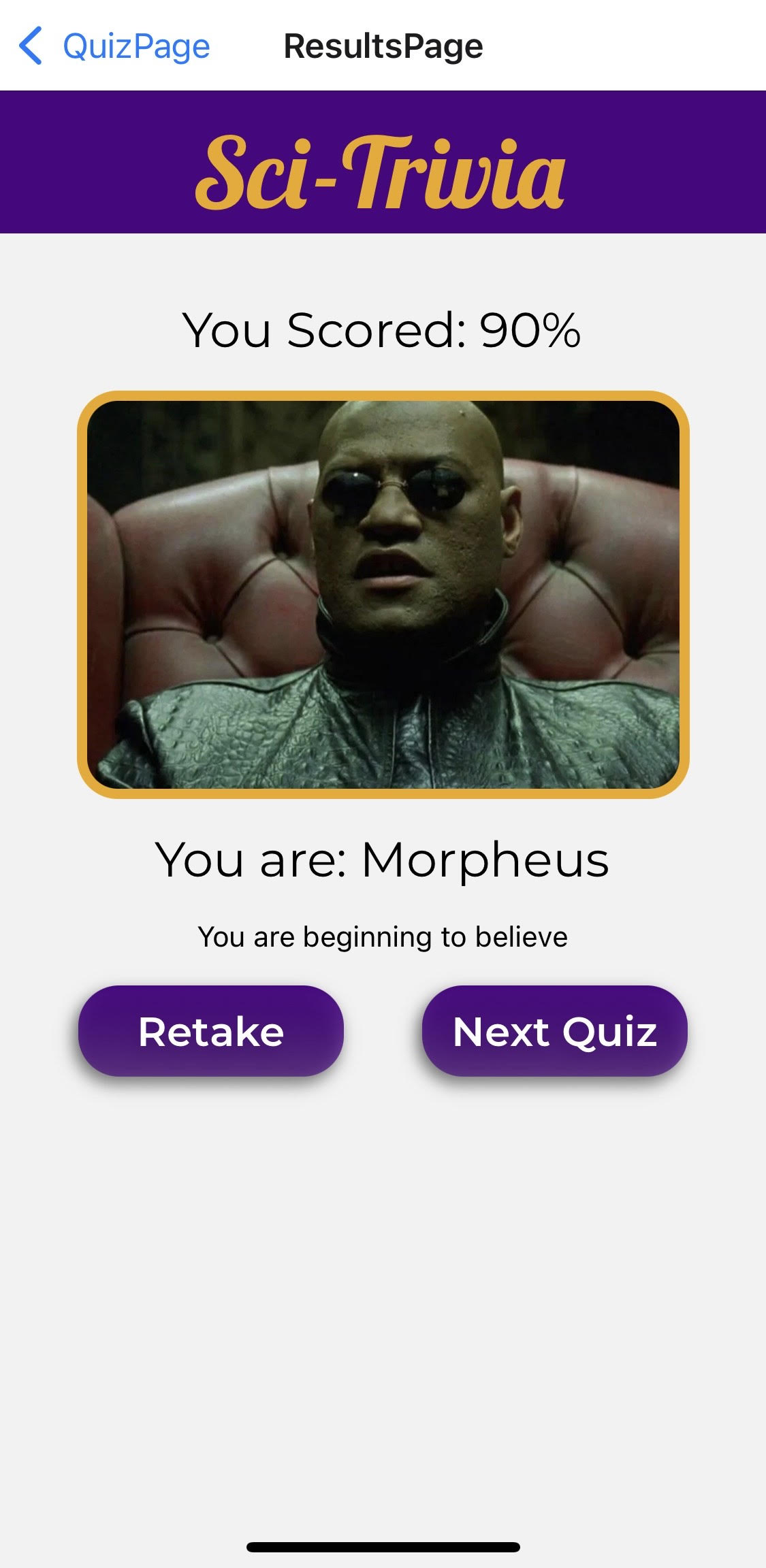
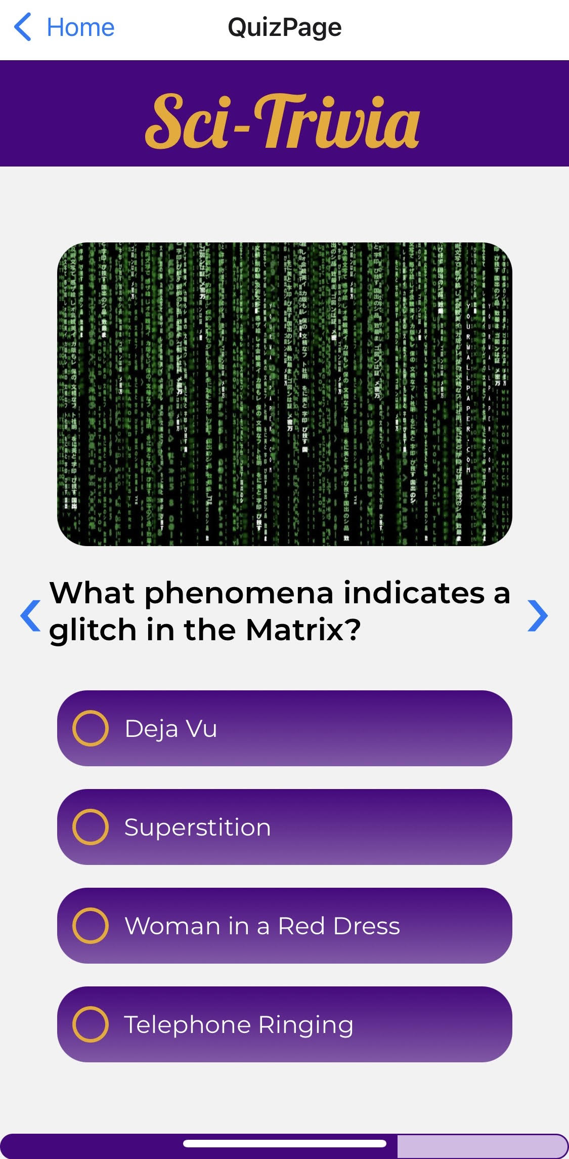
Welcome to Sci-Trivia! This is a science fiction themed quiz app developed by 3 School of Code graduates branching out to learn new technologies which, in this case, include React Native and TypeScript.
The project was built using expo-cli. You will need to install it in your system.
Clone the project, cd in to the folder and run:
  git clone https://github.com/anastasia-starostina/React_Native_SciFi_App
  cd React_Native_SciFi_App
  npm install
To start the app run:
  npm start
  # or
  expo start
Windows users run:
expo start --tunnelWe changed node modules in our project. See Optimisation section for more details.
- The choice of 2 Sci-Fi quizzes.
- Score Tracker.
- Users can use the device camera to take a picture and preview it on the profile page.
- Swippable quiz screen.
- Template to put your own quiz data in.
Client:
- ReactNative
- TypeScript
- Expo
Click on the link below to see the demo of the app:
We kept track of the tasks using Trello ticketing system and followed Agile Scrum Methodology. We finished each day with a retro & took notes about what went well, what didn't go well and what we learned on that day.
When we did our research on Quiz User Interfaces, we noticed how prevalent shades of purple were for association with wisdow and mystery. Follow this link to find out more about color psychology.
We used yellow as a complementory colour for texts/highlights as according to some research it stimluates mental activity.
| Color | Hex |
|---|---|
| Main Colour |  #4b0082 #4b0082 |
| Highlight Colour |  #EFA80C #EFA80C |
| Text Colour |  #ffffff #ffffff |
| Shadow Colour |  #000000 #000000 |
| Gradient Colour |  #4b0082a3 #4b0082a3 |
- Learned how React Native works & its syntax.
- Significance of having the right node modules in React Native due to its minimal & unopinionated design.
- Stuck to DRY principles by modularising our codebase into Components.
- Effectively used TypeScript throughout the project and gained experience that highlighted the importance of planning out TypeScript interfaces and types.
- Integration of Expo Camera for taking a user avatar picture and previewing it.
- More Quizzes
- Build a backend and a database
- Persistent profile image
- Saving a picture that saves on an internal phone system
- Having access to internal camera system
- Multiplayer (Leader boards with friends)
- Authorisation
MIT License, see License.txt
This project was made for purely educational purposes, with no intention to monetise it in its current state
This app currently uses images from the Star Wars films, the Matrix films and Firefly tv series
We do not claim ownership of these properties
Star Wars and all of its intellectual properties belong to Disney
The Matrix and all of its intellectual properties belong to Warner Brothers
Firefly and all of its intellectual properties belong to 20th Century Studios
In node modules/react-native-radio-buttons-group/lib/RadioButton.tsx we integrated Expo Linear Gradient Component within this file.
Replace the code in this file with:
import React from 'react';
import { PixelRatio, Pressable, StyleSheet, Text, View} from 'react-native';
import { LinearGradient } from "expo-linear-gradient";
import { RadioButtonProps } from './types';

export default function RadioButton({
  borderColor,
  color = '#444',
  containerStyle,
  description,
  descriptionStyle,
  disabled = false,
  id,
  label,
  labelStyle,
  layout = 'row',
  onPress,
  selected = false,
  size = 24,
}: RadioButtonProps) {
  const borderWidth = PixelRatio.roundToNearestPixel(size * 0.1);
  const sizeHalf = PixelRatio.roundToNearestPixel(size * 0.5);
  const sizeFull = PixelRatio.roundToNearestPixel(size);

  let orientation: any = { flexDirection: 'row' };
  let margin: any = { marginLeft: 10 };

  if (layout === 'column') {
    orientation = { alignItems: 'center' };
    margin = { marginTop: 10 };
  }

  function handlePress() {
    if (disabled) {
      return null;
    }
    if (onPress) {
      onPress(id);
    }
  }

  return (
    <>
      <Pressable
        onPress={handlePress}
        style={[
          styles.container,
          orientation,
          { opacity: disabled ? 0.2 : 1 },
          containerStyle,
        ]}>
          <LinearGradient  colors={[
        "rgba(75,0,130,1)",
        "rgba(75,0,130,0.64)",
      ]} style = {styles.radioButtons}>
        <View
          style={[
            styles.border,
            {
              borderColor: borderColor || color,
              borderWidth,
              width: sizeFull,
              height: sizeFull,
              borderRadius: sizeHalf,
            },
          ]}>
          {selected && (
            <View
              style={{
                backgroundColor: color,
                width: sizeHalf,
                height: sizeHalf,
                borderRadius: sizeHalf,
              }}
            />
          )}
        </View>
        {Boolean(label) && <Text style={[margin, labelStyle]}>{label}</Text>}
        </LinearGradient>
      </Pressable>
      {Boolean(description) && <Text style={[margin, descriptionStyle]}>{description}</Text>}
    </>
  );
}

const styles = StyleSheet.create({
  container: {
    alignItems: 'center',
    marginHorizontal: 10,
    marginVertical: 5,
  },
  border: {
    justifyContent: 'center',
    alignItems: 'center',
  },
  radioButtons: {
    height: 50,
    width: 300,
    borderRadius: 20,
    paddingLeft: 10,
    display: 'flex',
    flexDirection: 'row',
    alignItems: 'center',
  }
});


