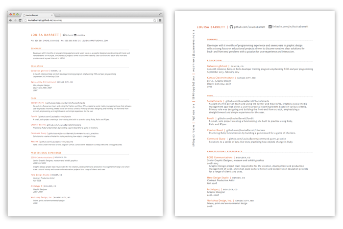
A few notes on the design decisions behind the adaptation of my print resume to a static HTML/CSS page.
###Typography
I'm a sucker for typefaces that are highly legible at a small point size, have a serif and sans serif version, and -- this always makes my designerd heart happy -- have a small caps option. My print resume is set in Scala Sans, a nice little number that fills all of the above qualifications. Problem? It's not a web font.
No trouble, after trying out a few typefaces that I thought were similar to Scala but then in layout looked suspiciously like Helvetica, I tracked down a suitable substitute on Google Fonts: Gudea. It has a lot in common with Scala Sans, but it is missing lovely small caps for my subheads. Again, no trouble, I used an ol' standby workaround: bump the point-size down a point or two, make the line of text uppercase, and open up the kerning. Ta-da! Faux-small caps.
###Layout
On my print resume, I ran my name and links to GitHub and LinkedIn across the top of the page and my contact information up the lefthand side. This was to give the body content a more structured place to live on the page, but isn't something I felt would translate well to a screen-based format. I didn't want someone reading it in a browser to have to scroll down to find that information, so I moved the contact details up into a header just below my name, GitHub, and LinkedIn information.
###Before and After
Web (on left) and Print (on right)
