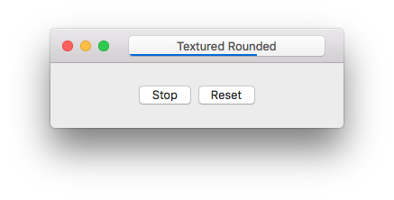
A Cocoa component that provides a similar progress bar to Xcode or Safari inside the bezel of a textured rounded button.
- Xcode 8 or newer
- OS X 10.9 or newer (for the library)
Add the following line to your project's Cartfile:
github "notronik/BezelProgressButton" "master"
Run carthage update after adding and then reference the BezelProgressButton.framework in your own project.
Open BezelProgressButton.xcodeproj, select the framework scheme if it's not selected already, build like normal. Once built, locate the framework and add it to your project.
Alternatively you could also just copy BezelProgressButton.swift into your project's source code. This isn't recommended, but if you want to keep down the number of frameworks that you're using, or you want to make modifications without forking, that's the only file that you will need.
Instantiate a BezelProgressButton like you would create any other Cocoa component, be that using a Storyboard, Nib file, or in code. To change the progress value, set the progress property on BezelProgressButton. This will take care of updating the internal value, as well as displaying the new progress. It also animates like Safari's or Xcode's progress bars because that animation ships right with CoreAnimation. If you want to hide and/or reset the progress bar, do not set the progress value to 0.0. Instead, call resetProgress. This sets progress = 0.0, but also hides the core animation layers. Setting progress to any other value or calling updateProgress will unhide the progress layers again.
You can also change the color of the progress bar by setting progressColor. If you want to revert to the default blue color, set this value to nil.
Both the progress and progressColor properties are marked @IBInspectable, so it should be easy to set default values from interface builder.
MIT License. See LICENSE.


