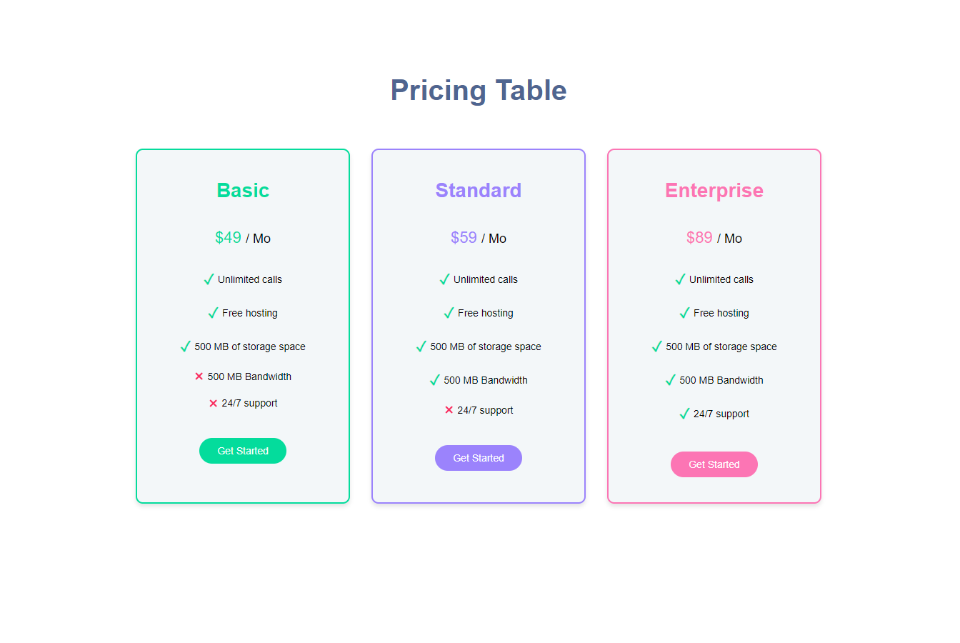
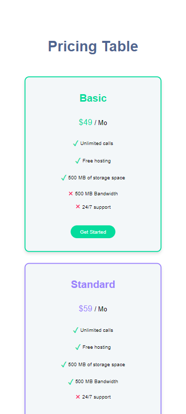
This project showcases a responsive pricing table built using React, Vite, TypeScript, and Sass. The table includes three pricing cards (Basic, Standard, and Enterprise) with different features and prices, as well as Get Started buttons.
There are two versions of the app, each with a different implementation of the PricingCard component.
In the master branch, the PricingCard component is a regular React component that includes the Title, Price, a list of Feature components and a Button components directly inside it. The parent App component imports the PricingCard component and uses it without passing any children to it.
In the compound-components branch, the PricingCard component adheres to the compound components design pattern. By accepting child components, it offers increased flexibility in terms of composition. In this version, the App component imports the PricingTable component, which contains the PricingCard, Title, Price, FeaturesList, Feature, and Button components. These components are then utilized as children of the PricingCard component.
To switch between the two versions, you can check out the corresponding branch in your Git repository.
- Responsive design
- Clean, modern look
- Utilizes variables, mixins, and nesting in Sass
Experience the Pricing Table in action by visiting the live demo:
To run the app locally, follow these steps:
- Clone the repository and navigate to the project folder.
- Run
npm installto install the required dependencies. - Run
npm run devto start the development server. - Open your browser and visit http://localhost:5173 to view the app.
For any questions, concerns, or support, feel free to reach me out via email: obrm770@gmail.com.

