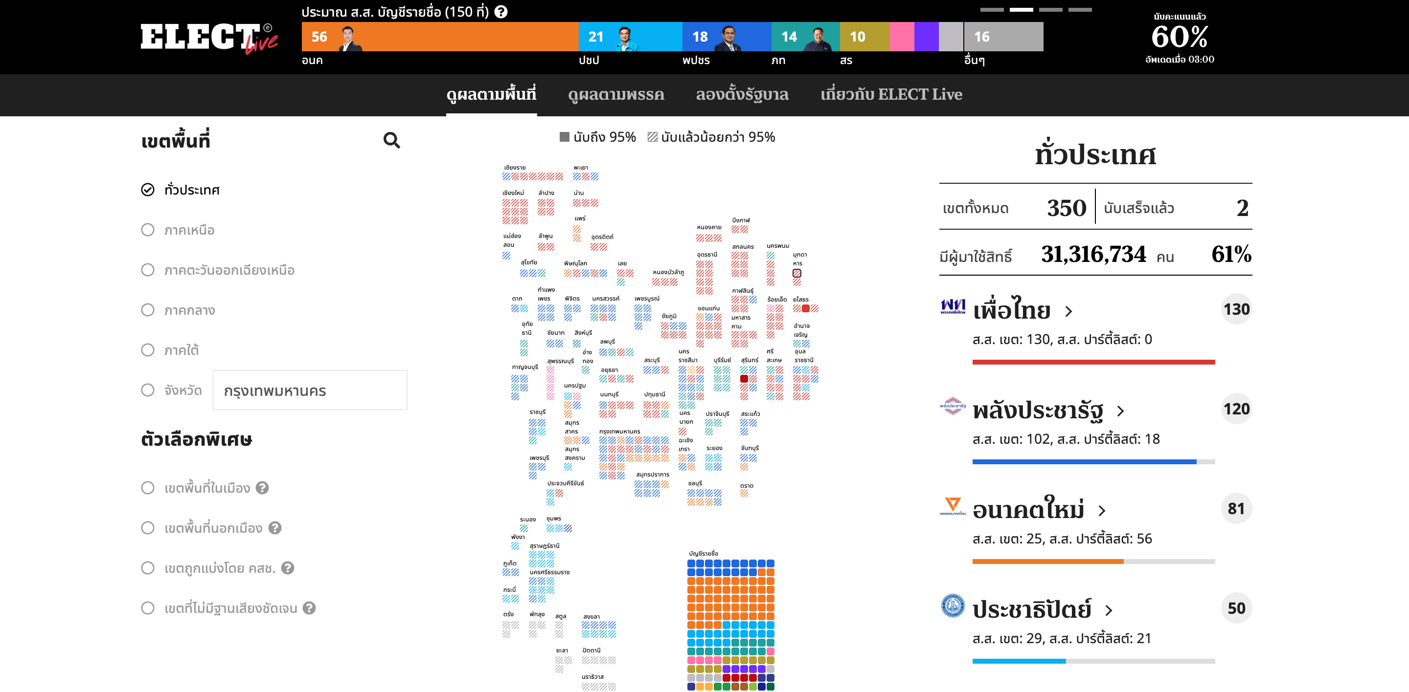
Live Scoreboard for Thailand General Election 2562 (2019).
- Development
- @todo comments *
- Prerequisites
- Install dependencies
- Running development server
- Disable the curtain
- Resources for developers
- How to add new pages
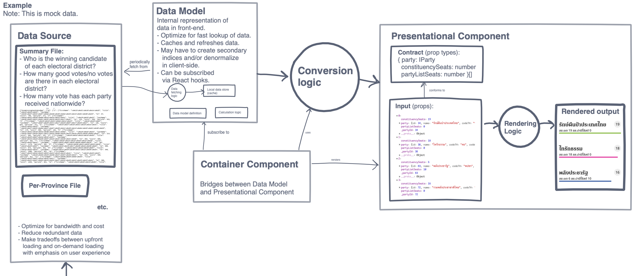
- Client-side data architecture
- Folder structure
- Component naming
- Styling
- Responsive Design
- Use JSDoc instead of
propTypes - How we handled 100,000 active users on a single $10/mo server
- Build the project into a static web page
- Releasing new version
- Contributors
This web application is built using Gatsby. We chose to use Gatsby because:
- It sets up the required tooling, such as webpack, Babel, routing (etc.) for us.
- We can add new pages by adding a file in
src/pages. No need to fiddle with router. - It has a comprehensive documentation, including a lot of recipes.
- A lot of things can be done just by installing Gatsby plugins, such as adding Google Fonts, Google Analytics.
- Though plugins, it can also generate web server config files (like
.htaccess) to set up caching best practices.
0pdd helps us keep track of TODOs by converting @todo markers in source code into GitHub issue. The created issue will be closed automatically when the corresponding @todo marker is removed from the source code.
To add a todo, put a comment in the source code beginning with @todo, followed by issue number. If there’s no associated issue, just use the catch-all issue #1. Example:
// @todo #1 Add Analytics, e.g. Google Analytics.
//  Check out Gatsby docs for how to add analytics
//  - Main Guide: https://www.gatsbyjs.org/docs/adding-analytics/
//  - Google Analytics: https://www.gatsbyjs.org/docs/adding-analytics/#using-gatsby-plugin-google-analytics
//  - Google Tag Manager: https://www.gatsbyjs.org/packages/gatsby-plugin-google-tagmanager/
Note that if the @todo spans multiple lines, subsequent lines must be indented with 1 extra space. See @todo formatting rules.
You need to install these tools first in order to develop this project:
- Node.js (10.x)
- Yarn
Before you can start the development server, you have to install the dependencies first.
yarn install
yarn develop
When you run the app for the first time, if it’s not yet time to count the election results, the application will be disabled and you will see a curtain with a countdown. To develop this website, you have to disable the curtain first.
- Go to
/dev, e.g. http://localhost:8000/dev - Toggle the flag
ELECT_DISABLE_CURTAIN
Just add a new file in src/pages — each .js file becomes a new page automatically.
The goals to achieve:
-
Strike a good trade-off between loading things upfront and loading things on-demand (reducing time-to-interactive and reducing time it takes to switch between page).
For example, while our app displays information in a per-zone basis, we download the data per province.
- Downloading everything at once means that users have to wait longer, and most of the data will be unused.
- On the contrary, having a separate file to download for every zone means that user have to wait for data to load while switching between zones in the same province, something we expect users will do often.
- Sometimes data structure must be designed with user experience in mind!
-
Allows UI components and data model to be developed in parallel and tested on its own.
-
We use two approaches to allow the data motel and the UI components to be developed in parallel:
-
Separated approach. Develop the UI and data model separately, then integrate them together.
-
Pre-integrated approach. Create an integrated skeleton first (e.g. UI that simply displays data without styling, or even a placeholder; and a data model that returns a mocked data) and have people work separately from there.
The separated approach allows parts to be developed right away (especially useful when interaction between components isn’t clear yet and needs more experimentation), and integrated later but may result in integration problems.
On the other hand, the pre-integrated approach takes more time upfront, but eliminates integration problem, and allows more complex problems to be tackled with less hacky code.
For example:
-
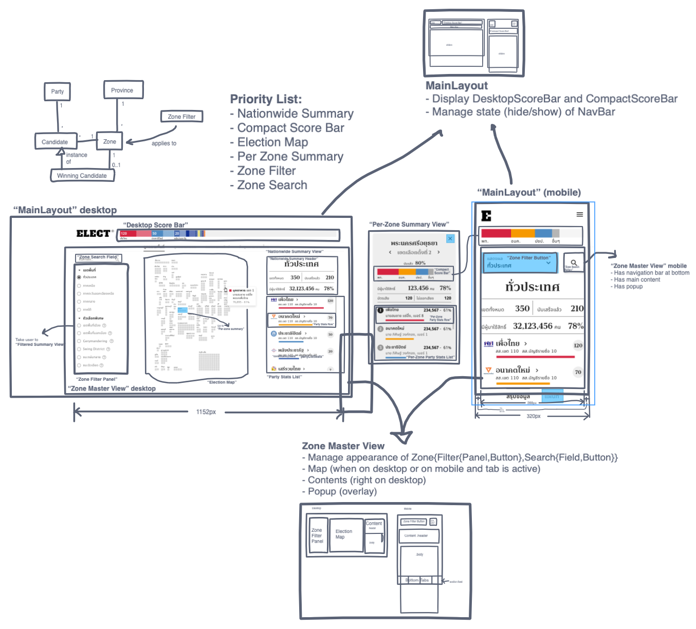
The ElectionMap used the Separated approach. First, the map is created and the developer can experiment with what to show on the map. Meanwhile, the data model is built separately (using Pre-integrated approach, but with other components). Finally, an ElectionMapContainer is built to bridge the two parts.
-
The ZoneMasterView used the Pre-integrated approach. First, responsibilities are assigned (displays 5 things: map, contents, filters, search, and popup; must work on mobile and desktop and must be able to pre-render the important contents). The ZoneMasterView is developed, with placeholder elements in place of 5 things. One done, 5 things can be separately developed.
-
While the React Community these days tends to recommend structuring your project around features (map, search, filter, chart) rather than types (components, pages, models), this project uses types-based folder structure.
Since some developers may not be too familiar with React, it is therefore more useful to break the apps into logical parts (components, models, pages, styles, utils) to make them more obvious to new developers, rather than functional parts, which is easier to grasp if there are not too many.
When we set up a skeleton and implement a design, before we start coding, it’s useful to step back a bit, and look at the design and try to name each component in a consistent way first.
After we have made the conscious effort to have the core components named in a consistent manner, most components created after that are named ad-hoc.
We use emotion to style the website. It allows us to keep the CSS code close to the component that uses it.
-
Instead of using inline
styleor CSS file, use thecssprop with object styles. Example:function Component() { return ( <div css={{ fontSize: 18, [media(600)]: { fontSize: 20, }, }} /> ) }
Object styles are preferred over string styles because:
- VS Code can help autocomplete CSS properties and values.
- Doesn’t require importing the CSS helper (
import { css } from '@emotion/core'). - Can be automatically formatted using Prettier.
Development of the UI is done using mobile-first approach. The main benefit is that it allows many component to be reused easily. Most components for mobile can be use as-is on the desktop (just position it in a way that makes sense), while usually components for desktop must be re-implemented for mobile from scratch.
This results in one simple rule: @media (max-width) should not be used. Instead, put in the mobile styling first, then use @media (min-width) to enhance the component for desktop.
When it come to pre-rendered React applications, there are two main approaches to responsive design: CSS-based and React-based. Each approach has its own pros and cons. We use both approaches in this project, its trade-offs are discussed below:
-
CSS-based. We render the same HTML, but use CSS to apply styling.
- Pro: The same markup can be shared.
- Pro: Can be pre-rendered. This makes the component appear immediately while page is loading.
- Con: Usually results in a more complex code, especially when a component looks very different on different screen sizes.
Usage:
import { media } from "../styles"

function Thing() {
  return (
    <div
      css={{
        // Mobile-first:
        display: "block",
        // then enhance to desktop:
        [media(600)]: { display: "inline-block" },
      }}
    >
      ...
    </div>
  )
}
-
React-based. Different markup is rendered based on window size.
- Pro: Can use different markup for different screen sizes. This usually results in simpler code.
- Con: Cannot be pre-rendered, because the server cannot send different HTML code based on screen size. Our
<Responsive />component will only be mounted after JavaScript is loaded.
Usage:
import { Responsive } from "../styles"

function Thing() {
  return (
    <Responsive
      breakpoint={600}
      narrow={<ComponentForMobile />}
      wide={<ComponentForDesktop />}
    />
  )
}
Note that
<Responsive />will not be pre-rendered. This means that sometimes you might need to use both approaches together to prevent layout jumping. For example, if a component is 50 pixels high on mobile and 100 pixels high on desktop:import { Responsive } from "../styles" function Thing() { const breakpoint = 600 return ( <div css={{ // Reserve the space for component to be mounted. height: 50, [media(breakpoint)]: { height: 100 }, }} > <Responsive breakpoint={breakpoint} narrow={<ComponentForMobile />} wide={<ComponentForDesktop />} /> </div> ) }
Using JSDoc allows us to specify types of component props more expressively, and allows enhanced integration (and refactoring capability) with Visual Studio Code.
You can define all props in one line:
/**
 * @param {{ party: IParty, hidden: boolean }} props
 */
export default function Unimplemented(props) {
...or you can also spell out each prop as a @param (where some props needs extra elaboration):
/**
 * @param {object} props
 * @param {IParty} props.party
 * @param {number} props.changeRate - The rate of change in score
 */
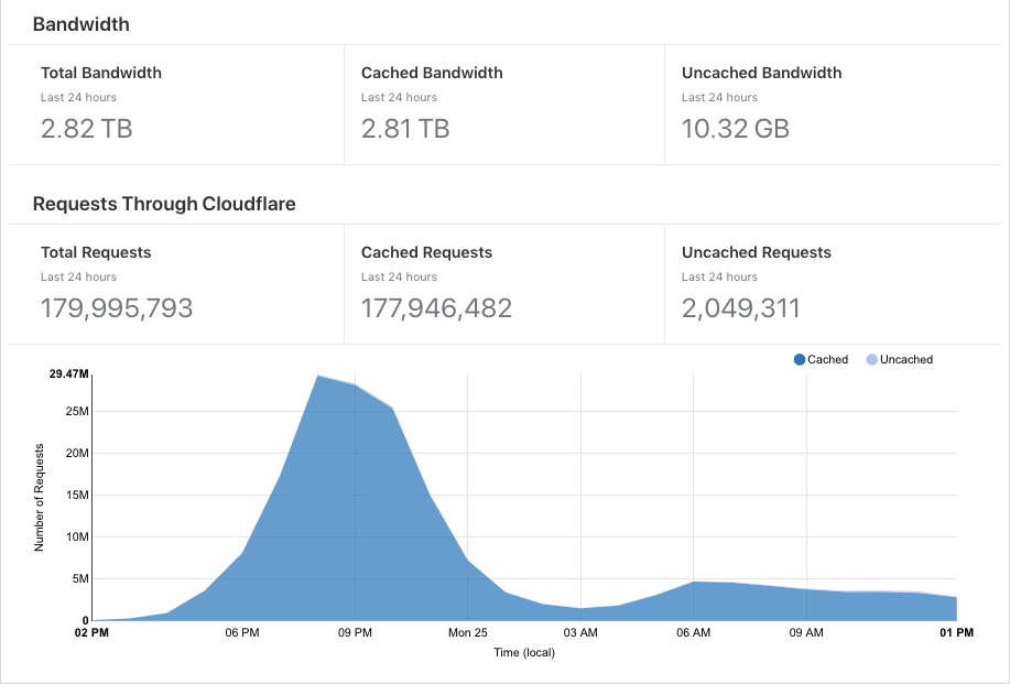
export default function MyComponent(props) {After the election, we have more than 100,000 simultaneous active users watching the counting progress live (updated every 1 minute). In total, 1.5 million users visited the website on the election day.
The website runs on a single DigitalOcean machine which costs $10/mo, serving static files on Apache Web Server, with Cloudflare in front. With a good Cache-Control setting, we were able to have 99% cache rate.
-
We generated a static site (using Gatsby), so, there’s no need to run server-side code, as everything is pre-built by the CI.
We follow Gatsby’s caching guide (they have it documented and so we didn’t have to figure it out on our own. In fact, we didn’t even have to implement it as gatsby-plugin-htaccess will automatically generate an
.htaccessfile that follows this best practice already.)One deviation we made is that instead of setting
max-age=0, we set it to 30 seconds in order to better utilize Cloudflare’s caching. -
For live data, there’s no API either. We use an ETL process to put data files on the web server.
-
/data/latest.jsonis a very small file (< 1kb) that has references to larger “data files”. This file is updated in-place and has a very short cache time.Cache-Control: public, max-age=30, stale-while-revalidate=30, stale-if-error=300, must-revalidate -
The actual data files. These files are immutable. Each time a data file is generated, it is written to a new location. So, there’s no need to do cache invalidation.
Cache-Control: public, max-age=31536000, stale-while-revalidate=30, stale-if-error=300, immutableDue to immutability and keeping old data files around, this also allows us to time travel and see what our webpage would look like using data at different point in time, simply by loading up a past data file.
-
yarn build
To release a new version, run /updateelectliveversion 1.0.0-beta.5 slash command in our development Slack channel (only available to collaborators). This will update package.json file and deploy to the live website, and will also cause an update bar to display on user’s screen, asking them to refresh.
We developed this website just 8 days before the election date. It wouldn’t be possible without a lot of help from our volunteer contributors!
Also, thanks to Cleverse for Thailand party list calculation algorithm implementation in JavaScript. It saved us a lot of time.


