Original Paper: Using Animation to Alleviate Overdraw in Multiclass Scatterplot Matrices
Paper Website: link
Presentation Slides: [pdf] [keynotes]
Chien-Yu (Brian) Sung
Hi everyone, my name is Brian, a second year Computer Science Master Student. Today, I am going to talk about “Approach To Deal With Overdraw”.
Here is today’s agenda. Before we jump into the topic, I would like to show you some examples of overdraw.
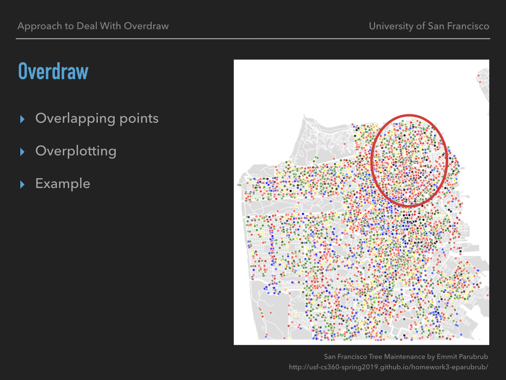
Overdraw refers to overlapping points or overplotting. Here is an example of overdraw from our previous homework. You would be able to tell from the picture that there are tons of data points on the map but. Now, if I ask you which part of the map contains more data, you may assume that there might be more records in the upper-right corner.
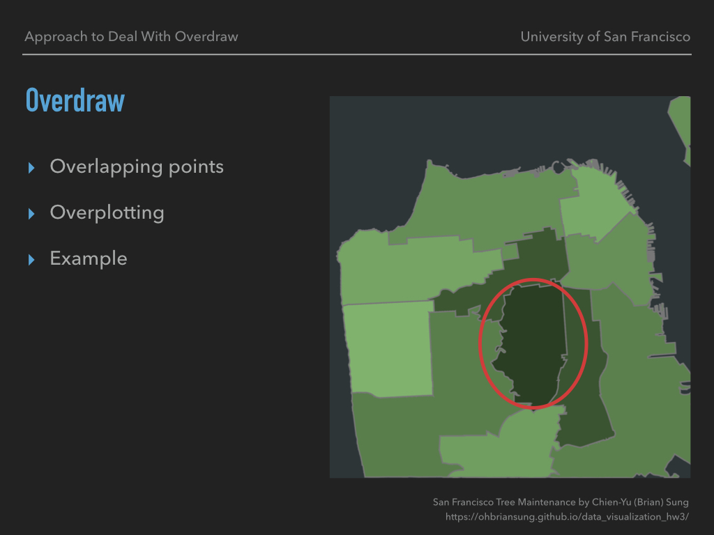
However, there are actually more records in the middle. You can hardly tell until I show you a visualization with different encoding.
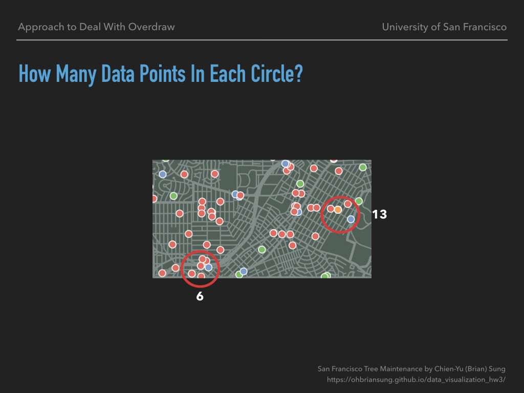
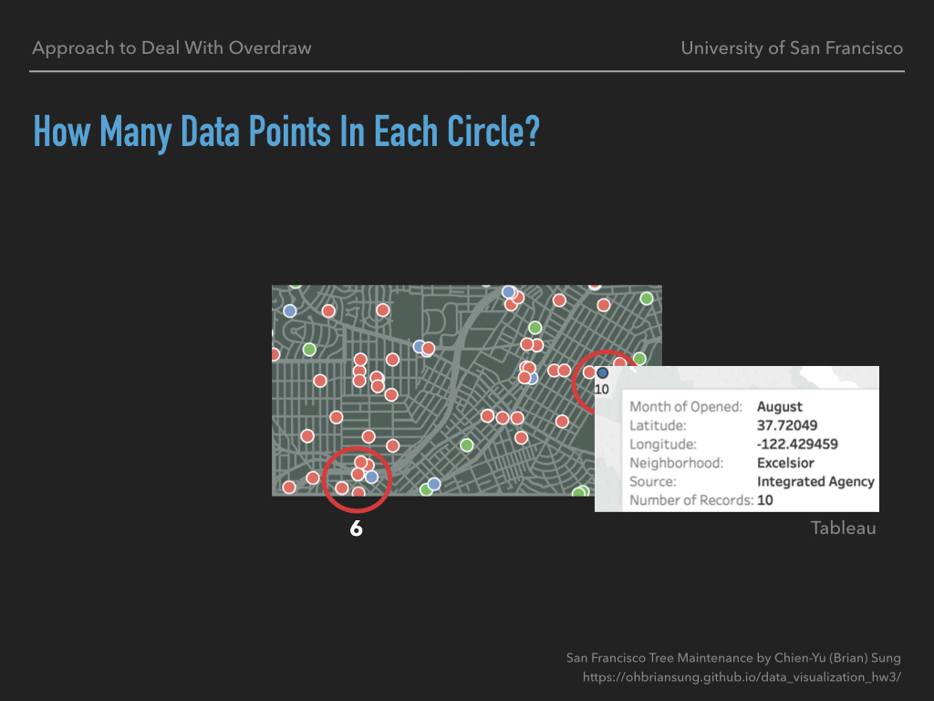
Here is another example. Can you tell me how many data points in both circles? It’s actually more than what you think.
You would be able to see the reason in Tableau. There were actually 10 orange points overlapping with each other.
So, the first motivation of this talk is that scatterplots or scatterplot matrices are commonly used and overdraw is one of the major problems in those techniques. Although the examples I showed you were not scatterplots, they do have some similarities. Furthermore, overdraw did happen in our previous homework. Which is why I think you would be benefited from this talk to reduce the lie factor in your visualizations.
My topic was built on the paper “Using Animation to Alleviate Overdraw in Multiclass Scatterplot Matrices”, which I am going to refer as SPLOMs during this talk. The paper was written by our Professor Sophie Engle last year. It explores whether animation using flickering points is an effective way to alleviate overdraw.
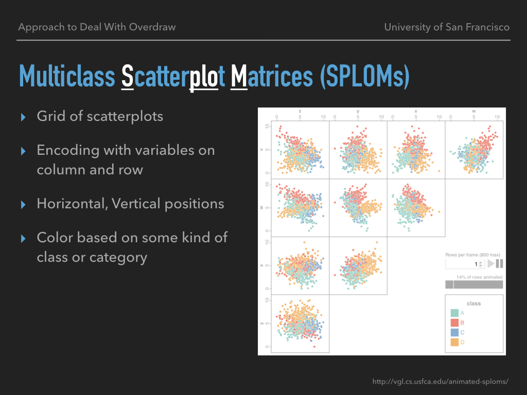
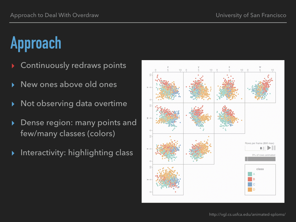
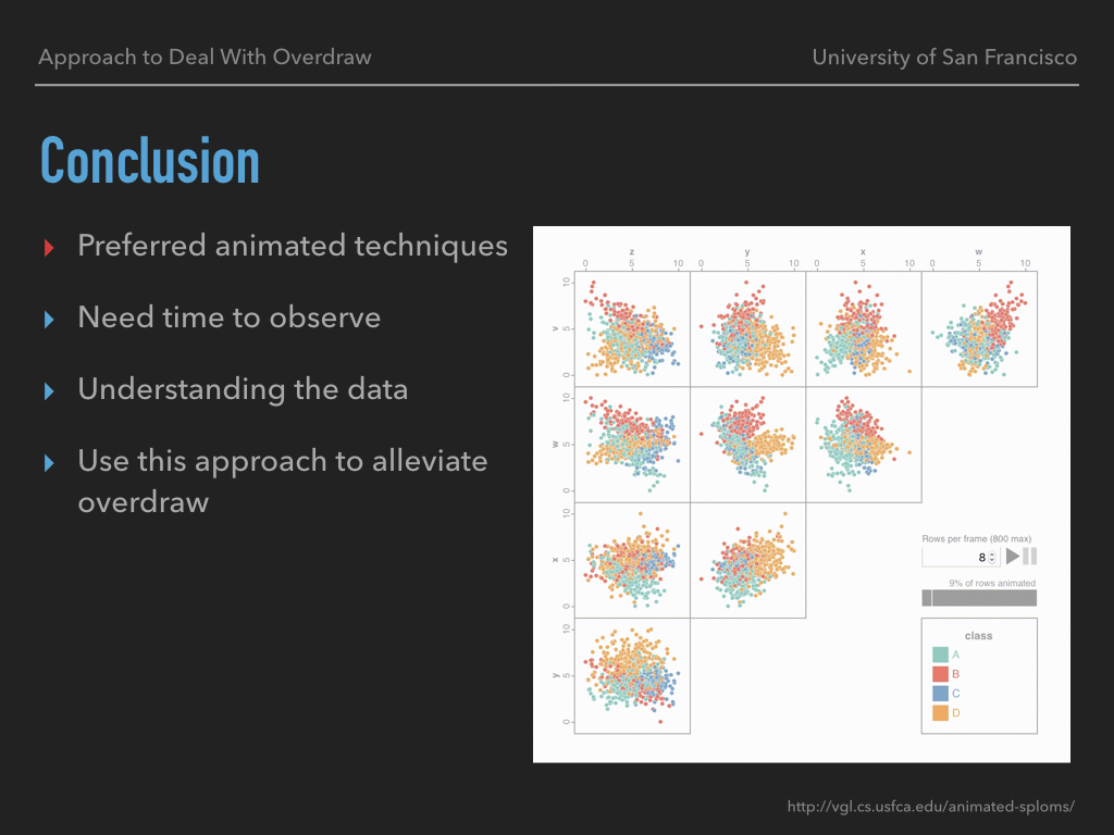
For the background of Multiclass SPLOM, it’s basically a grid of scatterplots. Each scatterplot is encoding with two variables based on its column and row positions. For example, this one in the upper-left corner is a scatterplot in column Z and row V. In this particular plot, it is encoding Z values with horizontal position and V values with vertical position. The color encoding is based on some kind of class or category.
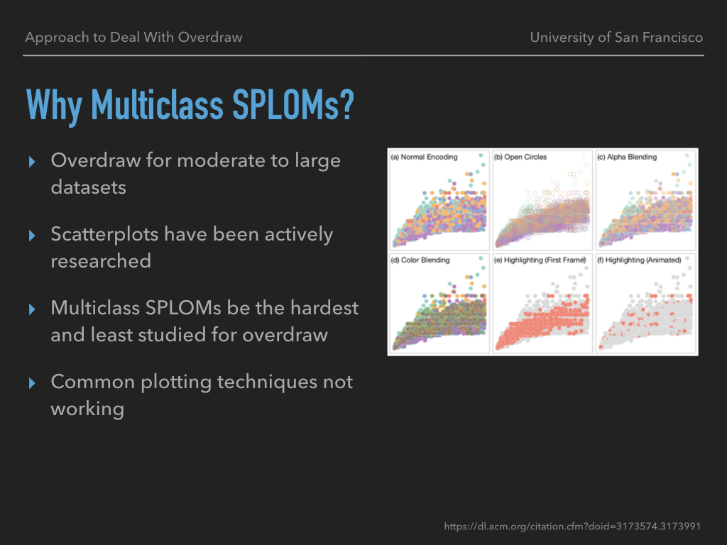
So why did the paper focus on Multiclass SPLOMs? As I mentioned before, one of the major problems with visualizing scatterplots or SPLOMs is with overdraw for moderate to large datasets. On the other hand, scatterplots have been actively researched while multiclass SPLOM is one of the hardest and least studied setting for alleviating overdraw. Moreover, common plotting techniques like those in the picture don’t really work on this specific setting. You can see how badly they perform when there is significant overdraw.
Now that’s talk about the approach. The approach in the paper continuously redraws data points. So new data would be above the old ones which allows us to see every data point throughout the time. I do want to point out that this is not presenting the changing of data overtime.
The approach works the best in the dense regions. For example, Here you can see a lot of movements but not too many colors, which indicates there are a lot of data points but not too many classes. Here you can see a lot of movements and a lot of colors, which indicates there are a lot of data points and a lot of classes in that region. Those are what we call, dense region.
One of the nice things with this approach is that it supports interactivity like highlighting. You can unselect the classes you don’t want to observe and it will turn to gray.
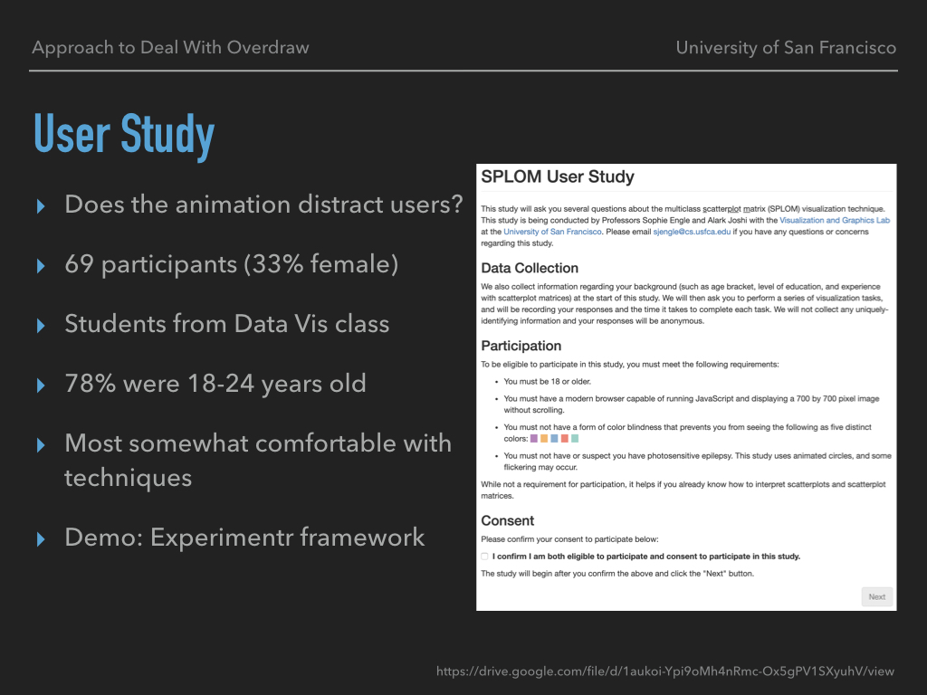
One question came up during the research: does this kind of animation actually distract the audience? So they did a user study with 69 participants and 33% of them were females. The study recruited students from Data Visualizations class directly. Therefore, 78% of them were between 18 and 24 years old. And due to the fact, most of them were at least somewhat comfortable with the SPLOMs techniques. Here I am going to do a live demo.
I’ve installed the Experimentr framework which is the exact framework they used to do the user study. The framework first collects the demographic data from the user and it shows the instructions regarding how to interact with it. Then the study split into two tasks, one is targeted density, that the framework will ask the user to drag a rectangle into a very specific plot that has the most data points. The other one is diverse density, which the framework won’t indicate a specific plot. The framework uses both static and animated SPLOMs. Therefore, they can compare the performance between those techniques.
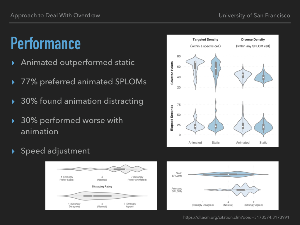
It turns out that the animated SPLOMs did outperform static for both targeted and diverse density tasks. About 77% of the participants preferred animated SPLOMs. On the other hand, 30% of the participants found animation was distracting. And surprisingly, there were also 30% of the participants performed worse with animation. So this is not for everyone. Which is why the framework does allow the user to disable the animation or adjust the speed.
For the conclusion, I’ve completed the test and I found myself preferred the animated techniques. But with one condition: I needed more time to observe the animated SPLOMs compare to the static ones. In average, I used about 4 to 5 seconds to observe each animation region while it only took about 2 to 3 seconds for me to go through each region in the static ones. Nevertheless, I would choose to spend more time on actually understanding the data instead of being lied by the overdraw. And I hope we would adopt a similar approach to deal with the overdraw problem in the further.
Thank you very much! Is there any question?
- Why don’t we do something like sampling or filtering?
Those approaches might make the dataset less representative and you might lose some outliers. Sometimes, those outliers make the whole story more attractive.
- How much worse did those 30% of participants do?
Let's go back to the Performance slide. You can see the graph in the upper-right corner. For example, the animated targeted density, most of them (77%) selected the regions with about 70 points, and the rest of them (30%) selected between 30 to 50 potins. That's about half or two third of the performance.
I do want to encourage you to play with the website and here is the link. If you need to review the content of this presentation, you can find the slides on my website.

