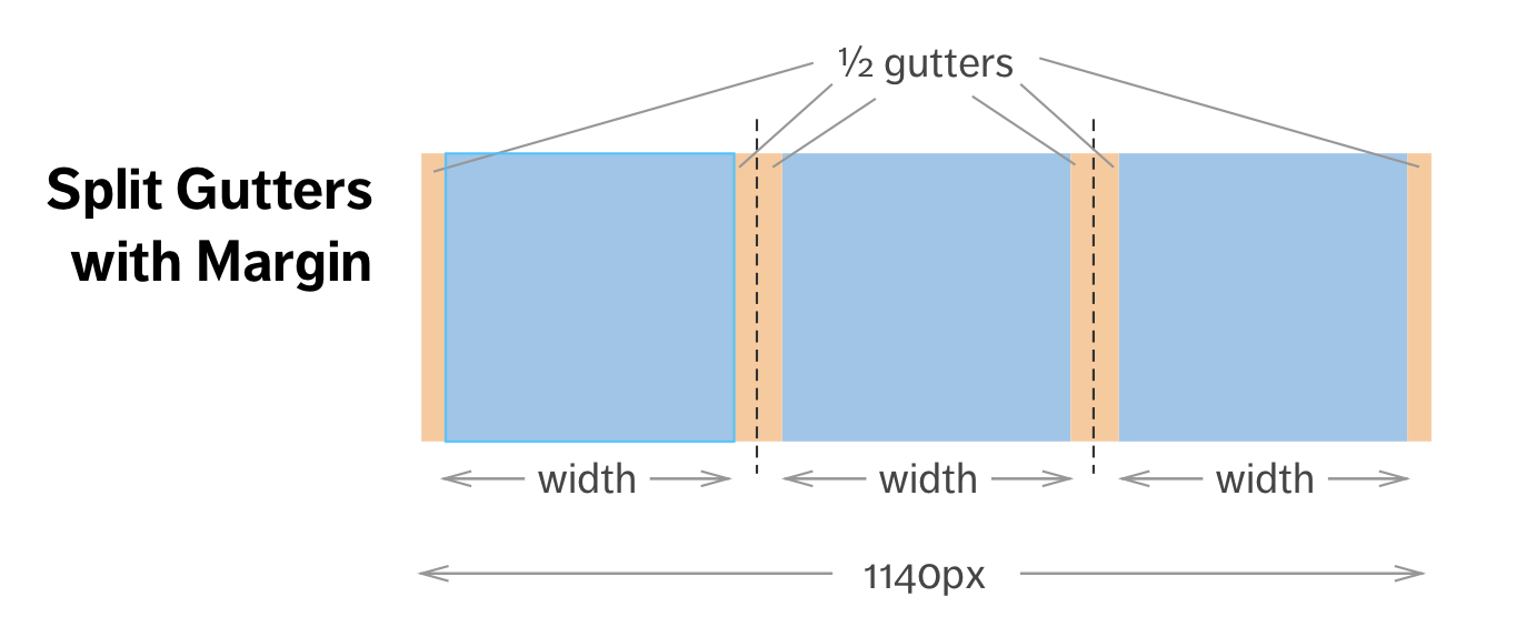
Our grid system uses a split gutters and margins.
We use 6 breakpoints:
- XS (4) : <= 640px
- SM (8) : > 640.01px <= 1023px
- MD (12) : > 1023.01px <= 1239px
- LG (1+16+1) : > 1239.01px <= 1599px
- XL (1+20+1) : > 1599.01px <= 2339px
- XXL (1+24+1) : > 2339.01px
The column's sizes are in percentage. The gutters (margins) are set in px. (10px for XS and 20px for SM+).
You need to wrap in a .col in a .row in a main parent .grid-container.
You can take a look at our sample grid.
- Settings can be customized using the file _variables.scss:
- Customize the number of breakoints and their sizes,
- Customize the number of columns for each breakpoints,
- Adjust the gutter's sizes,
- Ability to set a left navigation,
- The full-width is used without the column classes.
- Our grid is not mobile-first. It allows us to limit the browser's layout rendering.
- Offsets are enabled.
- Show-hide depending on breakpoints enabled.
- Bottom margins and half-margins are set to take the same size as the column-gutter using the classes trailer-column-gutter and trailer-column-gutter-half.
- Row nesting is allowed for 2 levels.
- This is not a mobile-first grid.
The full docs can be found here
- Sass - Language
- Olivier Fortin - Initial work - @olivierfortin
- Marjorie Lazaro - Helped out a lot
- Mathieu Corriveau - Used some of the previous grid
