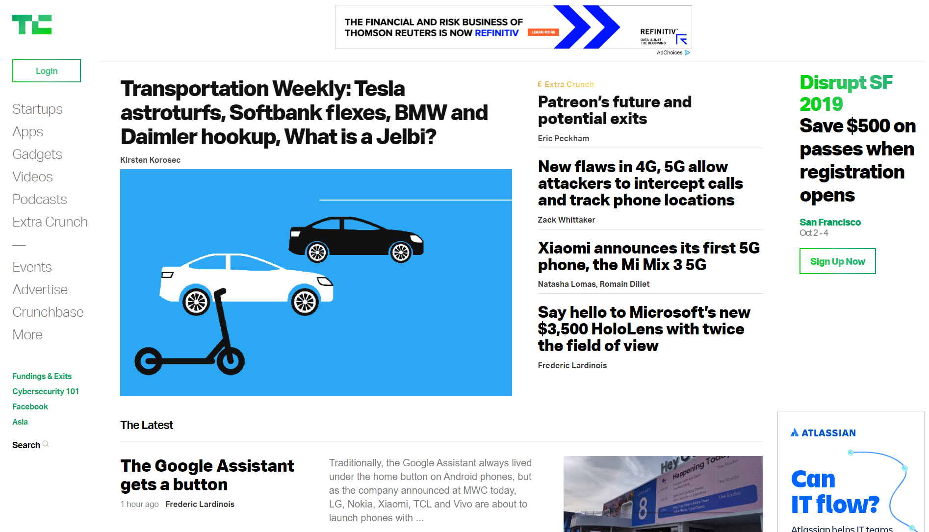
Introduction
Here's just a quick refresher on how Grid Layout works. I had to create something (The best way to learn).
Single page not responsive for mobile. Viewport Stopped at max-width : 1440px
Differences
Crunchy Clone (Grid Layout) Font: Roboto (Free)
TechCrunch (Flex Layout)
Font: Aktiv-grotesk (Commercial)
Resources
Here are some resources to learn more about Flex Layout and Grid Layout https://learncssgrid.com/ https://gridbyexample.com/examples/ https://css-tricks.com/snippets/css/a-guide-to-flexbox/ https://developer.mozilla.org/en-US/docs/Web/CSS/CSS_Flexible_Box_Layout/Basic_Concepts_of_Flexbox

