Package authors and contributors:
- Philip D. Waggoner (pkg maintainer), University of Chicago
- Fong Chun Chan, Achilles Therapeutics
- Lu Zhang, Emory University
In collaboration with Fong Chan (Achilles Therapeutics) and Lu Zhang (Emory University), we have developed plotmm for tidy visualization of mixture models. This package is a substantial update to the plotGMM package.
plotmm has five functions:
-
plot_mm(): The main function of the package,plot_mmallows the user to simply input the name of the fit mixture model object, as well as an optional argument to pass the number of componentskthat were used in the original fit. Note: the function will automatically detect the number of components ifkis not supplied. The result is a tidyggplot()of the density of the data with overlaid mixture weight component curves (or ellipses in the 2-D , bivariate cases). Importantly, as the grammar of graphics is the basis of visualization in this package, most other tidyverse packages and functions work with any of theplotmm's functions (e.g., customizing withggplot2'slabs()ortheme_*(); or withpatchwork'splot_annotation()). -
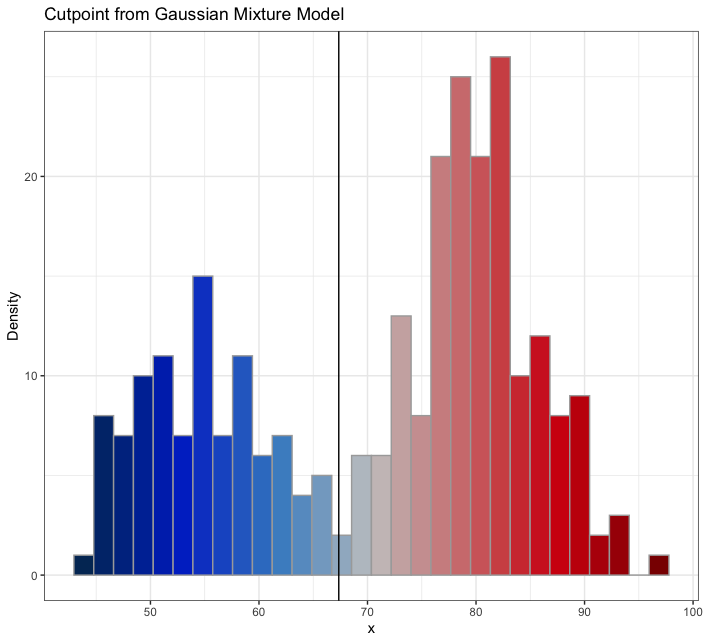
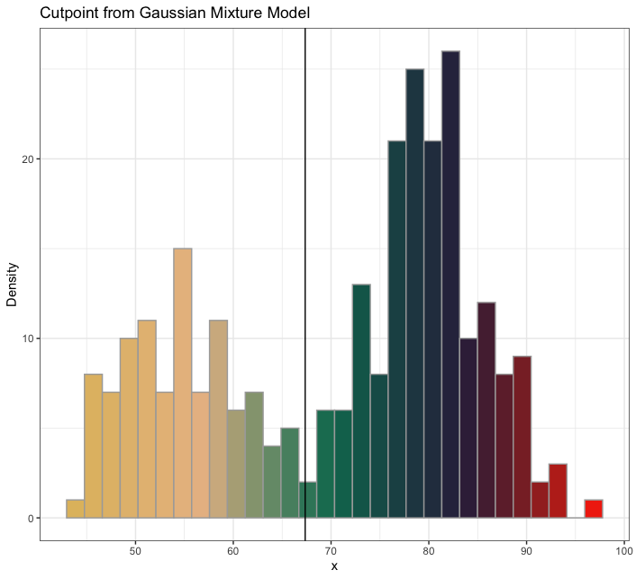
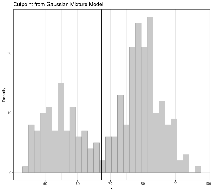
plot_cut_point(): Mixture models can also be used to derive cut points of separation between groups in feature space.plot_cut_point()plots the data density with the overlaid cut point (point of greatest separation between component class means) from the fit mixture model. This function also allows for returning the cut point calculation with no plot, if so desired (i.e.,(... plot = FALSE)). -
plot_mix_comps(): A helper function used internally inplot_mm(). Can be adapted for expanded customization of mixture model plots by allowing for superimposing of components' shape curves over aggplot()of the raw data. -
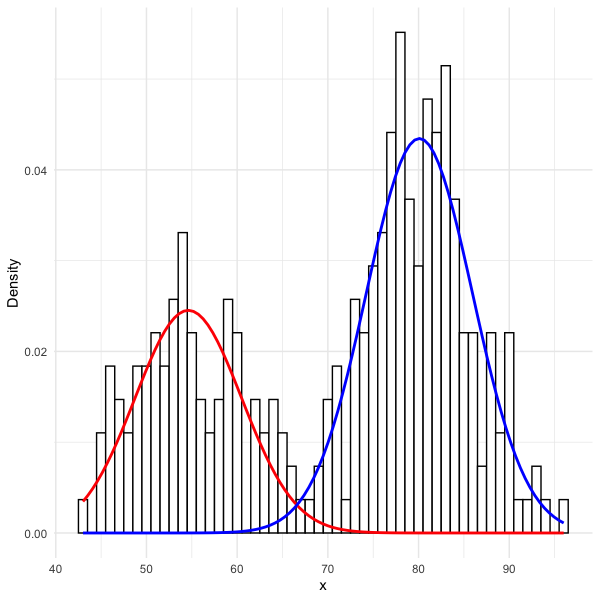
plot_gmm(): The original function upon which the package was expanded. It is included inplotmmfor quicker access to a common mixture model form (univariate Gaussian), as well as to bridge between the originalplotGMMpackage. -
plot_mix_comps_normal(): Likeplot_mix_comps(), this is a helper function serving as the basis of the expandedplot_mix_comps(), but for Gaussian mixture models only. It is included inplotmmfor bridging between the originalplotGMMpackage.
The package supports several model objects (from 'mixtools', 'EMCluster', and 'flexmix'), as well as many mixture model specifications, including mixtures of:
- Univariate Gaussians
- Bivariate Gaussians
- Gammas
- Logistic regressions
- Linear regressions
- Poisson regressions
See the complementary R-Bloggers post here.
We welcome PRs or any form of contribution to the plotmm package, as it's still very much in it's infancy. For example (thanks to @DominiqueMakowski for the language ideas below):
-
Create or check existing
 issues to report, replicate, or debug.
 -
Create or check existing
 issues to suggest or discuss a new feature for the package.
 -
Check existing
 issues to see things that we'd like to implement, but where we need some extra help.
If you decide to contribute, please review and abide by our Code of Conduct.
Dev version: devtools::install_github("pdwaggoner/plotmm")
Stable release (v0.1.0) on CRAN: install.packages("plotmm"); library(plotmm)
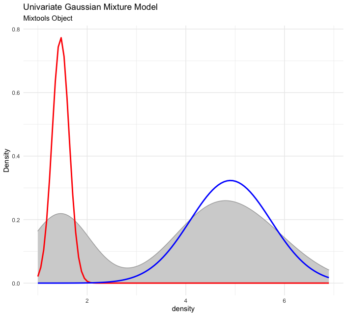
First, here is an example for univariate normal mixture model:
set.seed(123)
out <- mixtools::normalmixEM(iris$Petal.Length, k = 2)

# visualize
plot_mm(out, 2) +
  ggplot2::labs(title = "Univariate Gaussian Mixture Model",
                subtitle = "Mixtools Object")
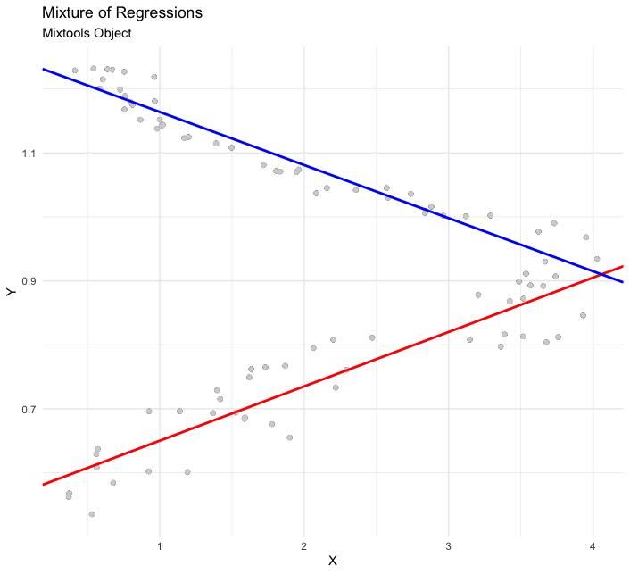
Next is an example of a mixture of linear regressions:
# set up the data (replication of mixtools example for comparability)
data(NOdata); attach(NOdata)

set.seed(123)
out <- regmixEM(Equivalence, NO, verb = TRUE, epsilon = 1e-04)

# visualize
plot_mm(out) +
  ggplot2::labs(title = "Mixture of Regressions",
                subtitle = "Mixtools Object")
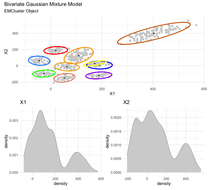
Next is a bivariate Gaussian mixture model (via EMCluster). Note, you have a few options here. If you simply plot via plot_mm() without storing the plot as an object, each ellipsis for each found cluster/mixture will plot as individual plots, followed by the final and full plot. On the other hand, by storing your plot as in the example below (e.g., plot <- plot_mm(model, data = x)), then calling the saved plot object will render only the final and full plot, which can be annotated accordingly via patchwork.
library(EMCluster)

set.seed(123)
x <- da1$da
out <- init.EM(x, nclass = 10, method = "em.EM")

# visualize and annotate
plot <- plot_mm(out, data = x)

plot + patchwork::plot_annotation(title = "Bivariate Gaussian Mixture Model",
                                  subtitle = "EMCluster Object")
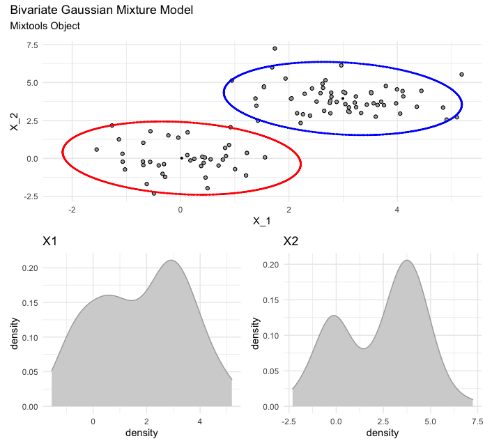
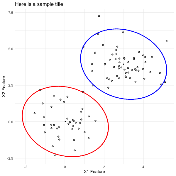
Here is a bivariate Gaussian mixture model (via mixtools). As with the previous case of visualizing a bivariate Gaussian mixture model, but with EMCluster, so too here you have the same options for calling the final and full plot versus the individual ellipses plots.
# set up the data (replication of mixtools example for comparability)
set.seed(123)
x.1 <- rmvnorm(40, c(0, 0))
x.2 <- rmvnorm(60, c(3, 4))
X.1 <- rbind(x.1, x.2)
mu <- list(c(0, 0), c(3, 4))
out <- mixtools::mvnormalmixEM(X.1, arbvar = FALSE, mu = mu,epsilon = 1e-02)

# visualize and annotate
plot <- plot_mm(out)

plot + patchwork::plot_annotation(title = "Bivariate Gaussian Mixture Model",
                                  subtitle = "Mixtools Object")
Further, for the bivariate cases (with EMCluster and mixtools objects), which include multiple plots patchworked together, users can "unattach" the plots comprising the full plot with simple indexing (e.g., for the scatterplot with two ellipses, call plot[[1]], or for the two density plots, call plot[[2]]). Once stored, proceed with customization. For example, we can pull out the ellipsis plot from the mixtools version of the bivariate mixture model, and update the plot labels accordingly.
ellipsis_plot <- plot[[1]] +
  ggplot2::labs(title = "Here is a sample title",
                x = "X1 Feature",
                y = "X2 Feature")
ellipsis_plot
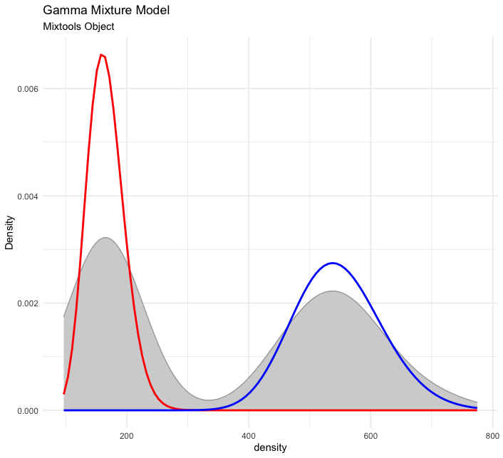
Finally, here is a mixture of Gammas.
# set up the data (replication of mixtools example for comparability)
set.seed(123)
x <- c(rgamma(200, shape =50, scale = 11), rgamma(200, shape = 28, scale = 6))
out <- gammamixEM(x, lambda = c(1, 1)/2)

# visualize
plot_mm(out) +
  ggplot2::labs(title = "Gamma Mixture Model",
                subtitle = "Mixtools Object")
...with the amerika color palette, the wesanderson color palette, or the default grayscale color palette
mixmdl <- mixtools::normalmixEM(faithful$waiting, k = 2)

plot_cut_point(mixmdl, plot = TRUE, color = "amerika") # produces plot

plot_cut_point(mixmdl, plot = TRUE, color = "wesanderson") # produces plot

plot_cut_point(mixmdl, plot = TRUE, color = "grayscale") # produces plot
plot_cut_point(mixmdl, plot = FALSE)

# [1] 67.35299
mixmdl <- mixtools::normalmixEM(faithful$waiting, k = 2)

x <- mixmdl$x
x <- data.frame(x)

ggplot2::ggplot(data.frame(x)) +
  ggplot2::geom_histogram(ggplot2::aes(x, ..density..), binwidth = 1, colour = "black", fill = "white") +
  ggplot2::stat_function(geom = "line", fun = plotmm::plot_mix_comps_normal,
                         args = list(mu = mixmdl$mu[1], sigma = mixmdl$sigma[1], lam = mixmdl$lambda[1]),
                         colour = "red", lwd = 1) +
  ggplot2::stat_function(geom = "line", fun = plotmm::plot_mix_comps_normal,
                         args = list(mu = mixmdl$mu[2], sigma = mixmdl$sigma[2], lam = mixmdl$lambda[2]),
                         colour = "blue", lwd = 1) +
  ggplot2::ylab("Density") +
  ggplot2::theme_minimal()


