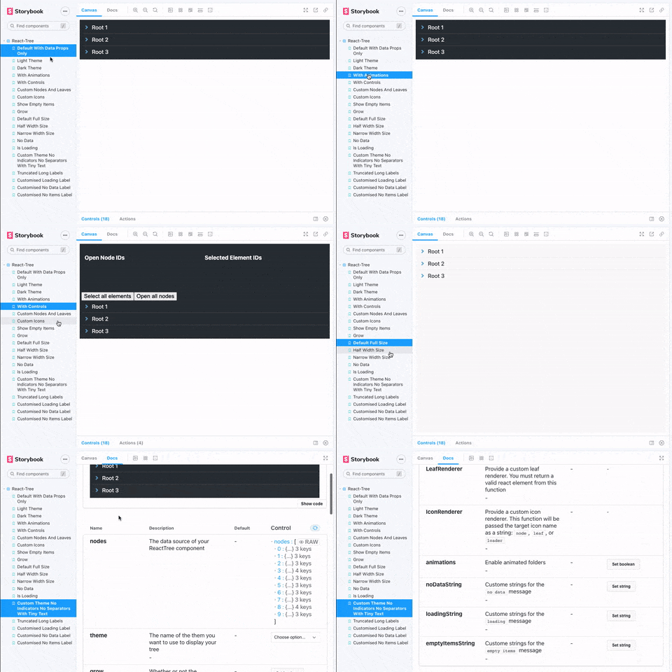
a hierarchical tree component for React in Typescript
- NEW v2 rebuilt in typescript
- NEW extensible/customisable state controls via render props (see Adding controls below)
- supports dark (default), light theme, and custom themeing (see Theming below)
- NEW redesigned theming object for easier customization
- supports three sizes: full width, half width and narrow (33%)
- supports full-height or content-height vertical sizing (flex-box based)
- optimized UX to clearly indicate open/closed folders, selected items and feedback on user input
- optimized for long object labels: ellipsis when labels become too large for container
- NEW title attributes on hover for truncated labels that are too long for container
- optimized for deeply nested structures: container becomes scrollable when nested items might become hidden outside of container
- empty indicator: if no data is provided, display a message to the user
- loading indicator: indicate that the component is not ready
- no data indicator: if no data is provided or the Node list is empty, displays a default message
- NEW all messages fulling customisable
- NEW user-specifiable render methods for Nodes, Leaves, and Icons, see Custom renderers below)
- NEW opt-in animated micro-interactions for opening/closing folders
- NEW multi-select API! hold your OS's
metakey orctrlkey to be able to select/deselect multiple-nodes (see Adding controls => Programatically selecting multiple elements below)
yarn add @naisutech/react-tree or npm install @naisutech/react-tree
There is only one required prop: nodes (see Data format)
import Tree from '@naisutech/react-tree'

// component code

const data = ... // fetch data

<Tree nodes={data} />- data should be a flat list of node
objectswith required properties:label,id,parentId
- optional properties:
items
- root nodes should have
parentIdproperty set tonull - files/leaf items should be a flat list of node objects on
itemsproperty inside a node. - files do not require an
itemsproperty (this should be obvious) - example:
[
  {
    "id": 12345678,
    "parentId": null,
    "label": "My parent node",
    "items": [
      {
        "id": 87654321,
        "label": "My file",
        "parentId": 12345678
      }
    ]
  },
  {
    "id": 56789012,
    "parentId": 12345678,
    "label": "My child node"
  }
]There are a number of optional properties which can be used to customise the UX of your React Tree component. You can explore the full interactive docs here or you can refer to the sample code below:
<Tree
  nodes={Node[]}
  isLoading={boolean}
  onSelect={(nodeIds: string[]) => void}
  onOpenClose={(nodeIds: string[]) => void}
  size={string}
  grow={boolean}
  noIcons={boolean}
  showEmptyItems={boolean}
  animations={boolean}
  theme={string}
  customTheme={[key:string] : ReactTreeTheme}
  NodeRenderer={}
  LeafRenderer={}
  IconRenderer={}
  noDataString={string}
  loadingString={string}
  emptyItemsString={string}
  containerStyle={CSSProperties}
/>| Prop name | Prop type | Default | Required | Description |
|---|---|---|---|---|
nodes |
Node[] |
[] |
Y | The data set for react tree to render |
onSelect |
(nodeIds: string[]) => void |
null |
N | Event listener called on every select/deselect action |
onOpenClose |
(nodeIds: string[]) => void |
null |
N | Event listener called on every open/close action |
theme |
string |
dark |
N | The currently selected theme |
customTheme |
[key:string] : ReactTreeTheme |
null |
N | Specify a custom theme |
size |
full, half, narrow |
full |
N | Specify a pre-defined size |
grow |
boolean |
false |
N | Whether or not the tree will attempt to fill its container |
showEmptyItems |
boolean |
false |
N | Whether or not to display an indicator for empty folders |
isLoading |
boolean |
false |
N | Display a loader instead of the rendered tree |
noIcons |
boolean |
false |
N | Disable the icon display |
containerStyle |
CSSProperties |
null |
N | Style the React Tree container |
NodeRenderer |
({ data: Node; isOpen: boolean; isRoot: boolean; selected: boolean; level: number }) => ReactNode |
null |
N | A custom renderer for Node elements |
LeafRenderer |
({ data: Node; selected: boolean; level: number }) => ReactNode |
null |
N | A custom renderer for Leaf elements |
IconRenderer |
({ type: 'node' | 'leaf' | 'loader', data: Node }) => ReactElement |
null |
N | A custom renderer for Icon elements |
animations |
boolean |
false |
N | Enable animated micro-interactions |
noDataString |
string |
null |
N | Replace the default message shown when there is no data to render |
loadingString |
string |
null |
N | Replace the default message shown when isLoading is active |
emptyItemsString |
string |
null |
N | Replace the default message shown when the showEmptyItems setting is active |
React Tree is written in typescript and is fully typescript compatible. All type definitions are exported directly from the library. See src/types in the repo for extensive definitions
React Tree uses the render props pattern to provide extensibility options and publish internal data & callbacks which developers can use to add extra functionality. Using the render props pattern, you could add a control bar to the tree, or display information about the selected / open nodes. The render prop function is called when you pass children to the ReactTree component. The render prop function is passed an render props object:
API:
{
  toggleNodeSelection: ToggleFunction,
  toggleSelectAllNodes: ToggleFunction,
  toggleOpenCloseNode: ToggleFunction,
  toggleOpenCloseAllNodes: ToggleFunction,
  selectedNodeIds: Node[],
  openNodeIds: Node[]
}
Usage:
// example using toggle open/close all nodes
<Tree nodes={[...]}>
  {(controls) => {
    return <button onClick={() => controls.toggleOpenCloseAllNodes()}>Open/close all nodes</button>
  }}
</Tree>You can use multi-select out of the box by holding a modifier key (meta or ctrl) to select multiple elements (leaves or nodes), but there is an additional API for selecting elements available via the render props pattern:
Usage:
/*
* Example using toggleNodeSelection
*/
<Tree nodes={[...]}>
  {(controls) => {
    const multiSelect = true // selected node will APPEND to list of already selected nodes, not replace
    return <button onClick={() => controls.toggleNodeSelection(nodeId, multiSelect)}>Open/close all nodes</button>
  }}
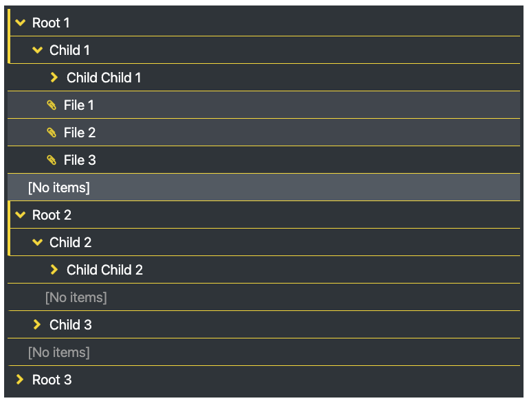
</Tree>react-tree supports custom theming. All values are CSS colours or hexes (.e.g. #000, hotpink, or even transparent). Provide the theme object to the customTheme prop (with a property matching your theme name) and provide your theme name to the theme prop. You can also specify a change in overall text size via a custom theme, which accepts one of 5 values: 'xsmall' (10px) | 'small' (13px) | 'default' (17px) | 'large' (20px) | 'xlarge' (34px)
const myThemes = {
  modifiedDarkLarge: {
    text: '#fafafa', // text color
    bg: '#2d3439', // background color of whole tree
    indicator: 'gold', // open folder indicator color
    separator: 'gold', // row seperator color
    icon: 'gold', // fill & stroke color of default icons - has no effect when using custom icons
    selectedBg: '#3f464e', // background of selected element
    selectedText: '#fafafa', // text color of selected element
    hoverBg: '#505a63', // background of hovered element
    hoverText: '#fafafa', // text color of hovered element
    accentBg: '#2d3439', // background of empty folder element
    accentText: '#999', // text color of empty folder element
    textSize: 'large' // preferred text size
  }
}<Tree nodes={data} theme="modifiedDarkLarge" customTheme={myThemes} />Result
react-tree comes with a pretty solid set of default icons for showing node elements, leaf elements, and a loading indicator. However, if you want to hide the icons, pass the noIcons prop
If you want to customize the icons, you can! Some conditions:
- the icons are set to a default square dimensions and will force whatever icons you provide into a
20pxsquare container using theobject-fit: containmethod - overflow out of the box is hidden
You can customize the icons by providing a render function to the props IconRenderer which must return a valid react element/component. The icon renderer will be passed two props:
type : 'node' | 'leaf' | 'loader': use to conditionally render the correct icon.data: Node: the content of the node/leaf
IconRender={({type}) => {
  return type === 'leaf | node' ? <...> : ...
}}- add drag and drop support
- any other requested features..
- open issues and PRs and we'll work together!

