ROC Curves and AUC - Lab
Introduction
In this lab, you'll practice drawing ROC graphs, calculating AUC, and interpreting these results. In doing so, you will also further review logistic regression, by briefly fitting a model as in a standard data science pipeline.
Objectives
You will be able to:
- Evaluate classification models using various metrics
- Define and understand ROC and AUC
Training the Model
Start by repeating the previous modelling steps we have discussed. For this problem, you are given a dataset mushrooms.csv. Your first job is to train a LogisticRegression classifier on the dataset to determine whether the mushroom is edible or poisonous. The first column of the dataset class indicates whether or not the mushroom is poisonous or edible.
** For consistency use random_state=0**
#Your code hereROC Metrics
Next, calculate the false positive rate and true positive rate (you can use the built-in metrics from sci-kit learn) of your classifier.
# Your code hereDrawing the ROC Graph
Next, use the false positive rate and true positive rate to plot the Receiver Operating Characteristic Curve for both the train and test sets.
# Your code hereInterpretation:
What do you notice about these ROC curves?
Your answer here
Interpretation
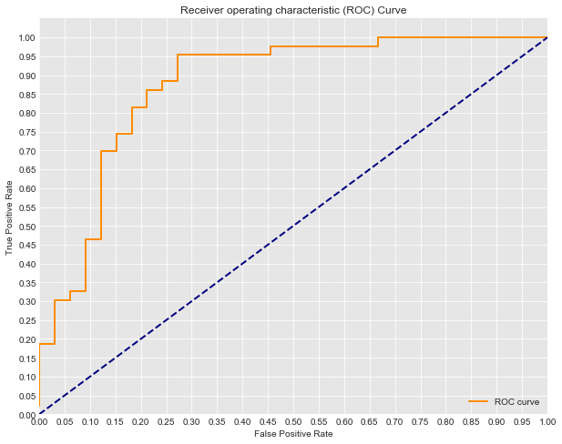
Look at the ROC curve graph from the lesson:
Think about the scenario of this model: predicting heart disease. If you tune the current model to have an 82% True Positive Rate, (you've still missed 20% of those with heart disease), what is the False positive rate?
fpr = #write the approximate fpr when tpr=.8Interpretation 2
If you instead tune the model to have a 95.2% True Postive Rate, what will the False Postive Rate be?
fpr = #write the approximate fpr when tpr=.95Opinion
In the case of heart disease dataset that we've been talking about, do you find any of the above cases acceptable? How would you tune the model? Describe what this would mean in terms of the number of patients falsely scared of having heart disease and the risk of missing the warning signs for those who do actually have heart disease.
Your answer here
Summary
In this lab you further explored ROC curves and AUC, drawing graphs and then interpreting these results to lead to a more detailed and contextualized understanding of your model's accuracy.
