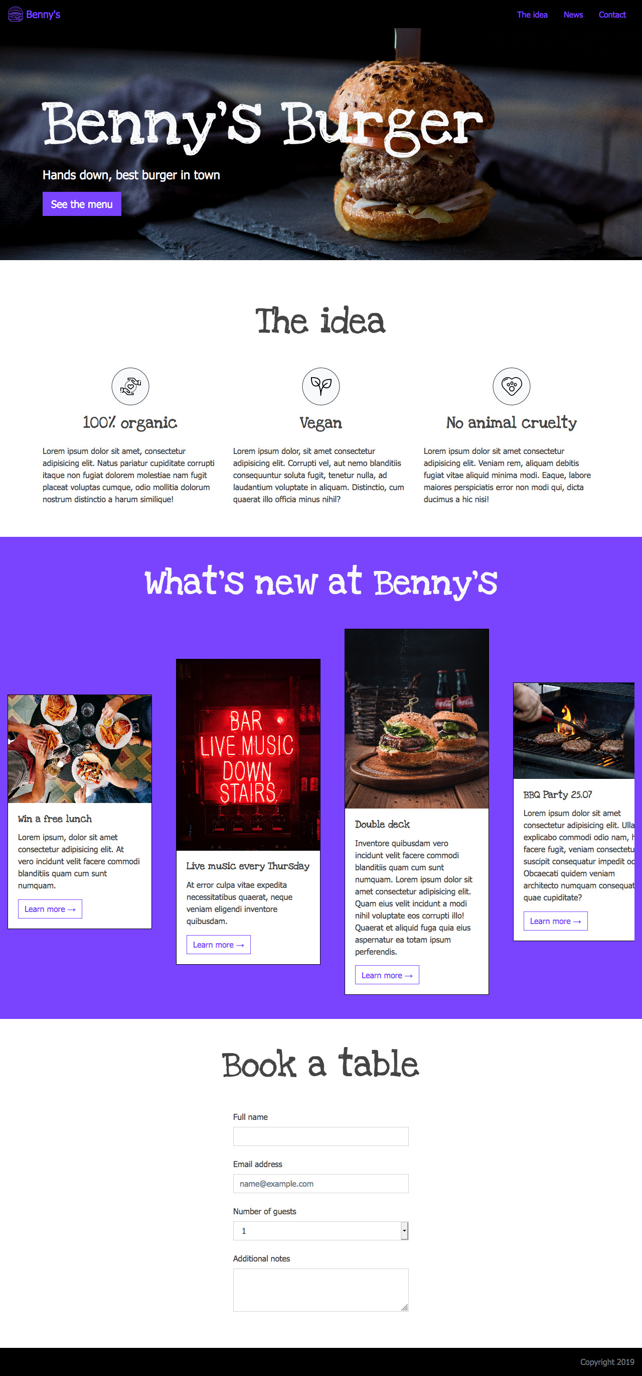
Let's use Bootstrap to create a restaurant page!
Check out the layout images below.
- Use sass to style the page. It is already added as a devDependency to the project. Work in the file
src/scss/main.scss - Work in the file
src/index.html - Add bootstrap to the project via
npm - Use bootstrab to make your page responsive
- The appropriate semantic HTML tag should be used to crate the navigation bar.
- The navigation bar should have a logo image and use list items as navigation items
- The navigation bar should stick in place at the top of the screen while scrolling.
- The banner section that contains the 'Benny's burger' headline, should have ID
#banner - The banner element should have the background image provided in the
src/imagesfolder - The banner should have a title
<h1>with custom font "Love Ya Like A Sister".
- The container of the 'The idea' section should have ID
#about-us. - inside the container create a title
<h2>with custom font "Love Ya Like A Sister". - Use bootstrap to arrange the content in the section into three columns on large screens(desktop)
- The container of the section should have ID '#team'
- The section should contain a title
<h2>with custom font "Love Ya Like A Sister". - Use bootstraps Card component to create the content items with image and text
- Use the appropriate bootstrap class to center the columns on the page
- The container should have ID
#contact. - The container should contain a title
<h2>with custom font "Love Ya Like A Sister".
- You have already created three navigation items inside the
navelement. by clicking on one nav item, the page should scroll down to the respective section, e.g. by clicking 'contact' in the navigation bar, the page should scroll down to the book a table section.
Note: have a look into the node_modules/scss/bootstrap/_variables.scss file to see what variables you need to target to set your custom values.


