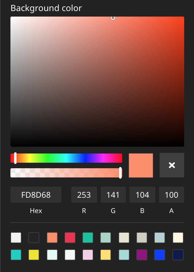
This package provides a Color Picker Editor which can be used in Neos CMS with the Neos.Ui 2+.
This editor is based on the example in https://github.com/neos/neos-ui-extensibility-examples but has some modifications in regards to styling, supports the alpha channel and has a reset button to unset a value.
See it in action.
Run this in your site package
composer require --no-update shel/neos-colorpickerThen run composer update in your project directory.
Add a property of type string and configure the editor as seen in this example:
"My.Site:Content.Text":
  superTypes:
    "Neos.Neos:Content": true
  ui:
    label: 'My text content'
  properties:
    textColor:
      type: string
      ui:
        label: 'Text color'
        reloadIfChanged: true
        inspector:
          group: 'text'
          editor: 'Shel.Neos.ColorPicker/ColorPickerEditor'
          editorOptions:
            # `mode` can be one of "rgba", "hsla", "hex"
            mode: 'rgba'
            # Show saturation/hue/alpha (optional), boolean, default: true
            picker: true
            # Show hex/rgba fields (optional), boolean, default: true
            fields: true
            # Show preset colors (optional), array of colors or boolean (to disable)
            presetColors: ['#ff0000', '#0000ff', '#ffff00', ...]
            # Hides the reset button if set to false
allowEmpty: trueThe editor allows some customization options via your Settings.yaml file:
Neos:
 Neos:
  Ui:
   frontendConfiguration:
    "Shel.Neos:ColorPickerEditor":
     # `mode` can be one of "rgba", "hsla", "hex"
     mode: "rgba"
     # Colors which are available for quick selection
     presetColors: ["#D0021B", "#F5A623", ...]
mode allows you to store the selected color values in a different format if needed.
This can be helpful, when the hsl format is needed to get the individual components.
presetColors lets you customize the list of color squares that are available for quick selection.
Contributions are very welcome!
Please create detailed issues and PRs.
