This github repository contains the materials and slides that I prepared for the 2-hour workshop on data visualization with R and ggplot2 organized by the NYU Politics Data Lab in October 2013.
The purpose of the workshop was to introduce ggplot2 as a tool that allows researchers in the social sciences to easily create elegant and effective graphs.
It was structured in two parts. First, the R scripts 01_ggplot_basics.R and 02_scales_axes_legends.R introduce the grammar of graphics using an analysis of public Facebook posts about the government shutdown (captured using my Rfacebook package for R) as a running example.
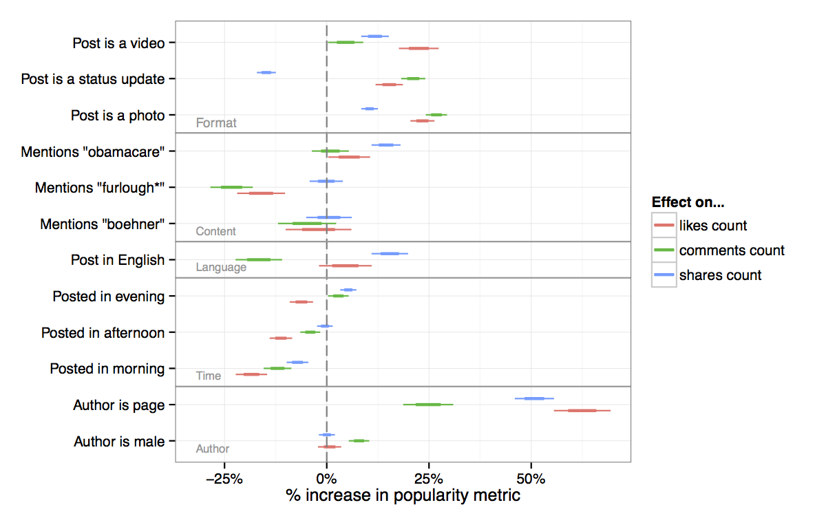
The second part of the workshop focused on specific applications on the social sciences. 03_line_plots.R, for example, generates a figure showing the evolution of the unemployment rate in the U.S., similar to the plot on pages 85-97 of the ggplot2 book. 04_coefficients_plots.R shows how to produce regression coefficient plots with confidence intervals, on ggplot2. The resulting figure, shown below, analyzes the effects of different variables about the author and content of public Facebook posts about the shutdown on their popularity.
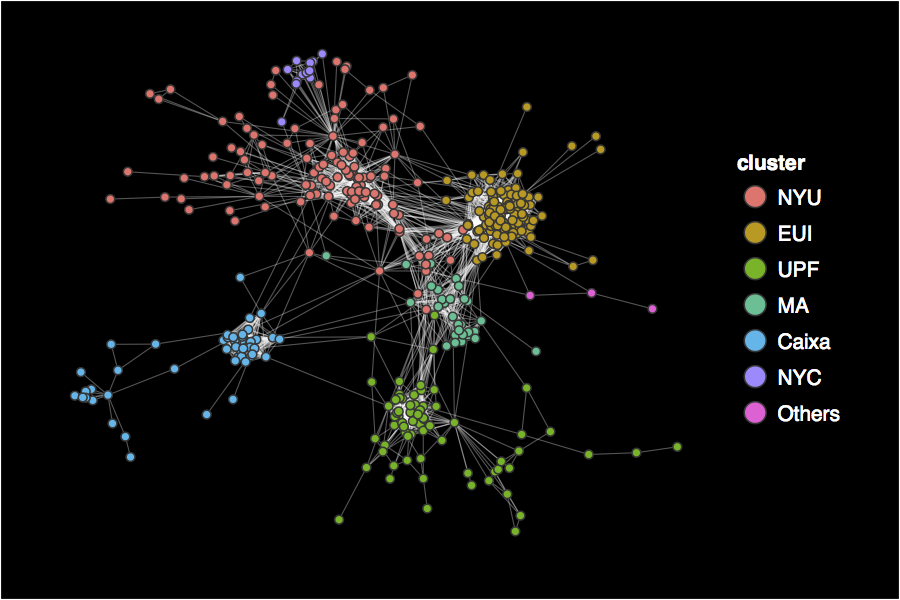
ggplot2 can also an excellent tool to visualize networks. Using another function from my Rfacebook package, it's easy to show how personal networks on Facebook are clustered on communities that overlap with offline behavior (see 05_networks.R).
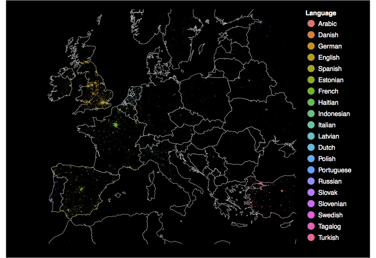
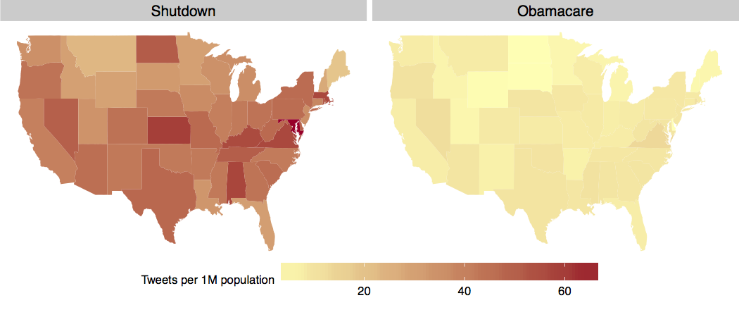
Many research articles on the social science rely on maps to visualize geographical information. These maps can also be easily created with ggplot2. Below are two examples that I covered on the workshop: one is a map of Europe with geolocated tweets captured using streamR and colored by language; the other is a map of the U.S. comparing the number of tweets mentioning 'shutdown' and 'obamacare' on October 1st, normalized by population. The code to create these plots can be found on 06_maps.R.
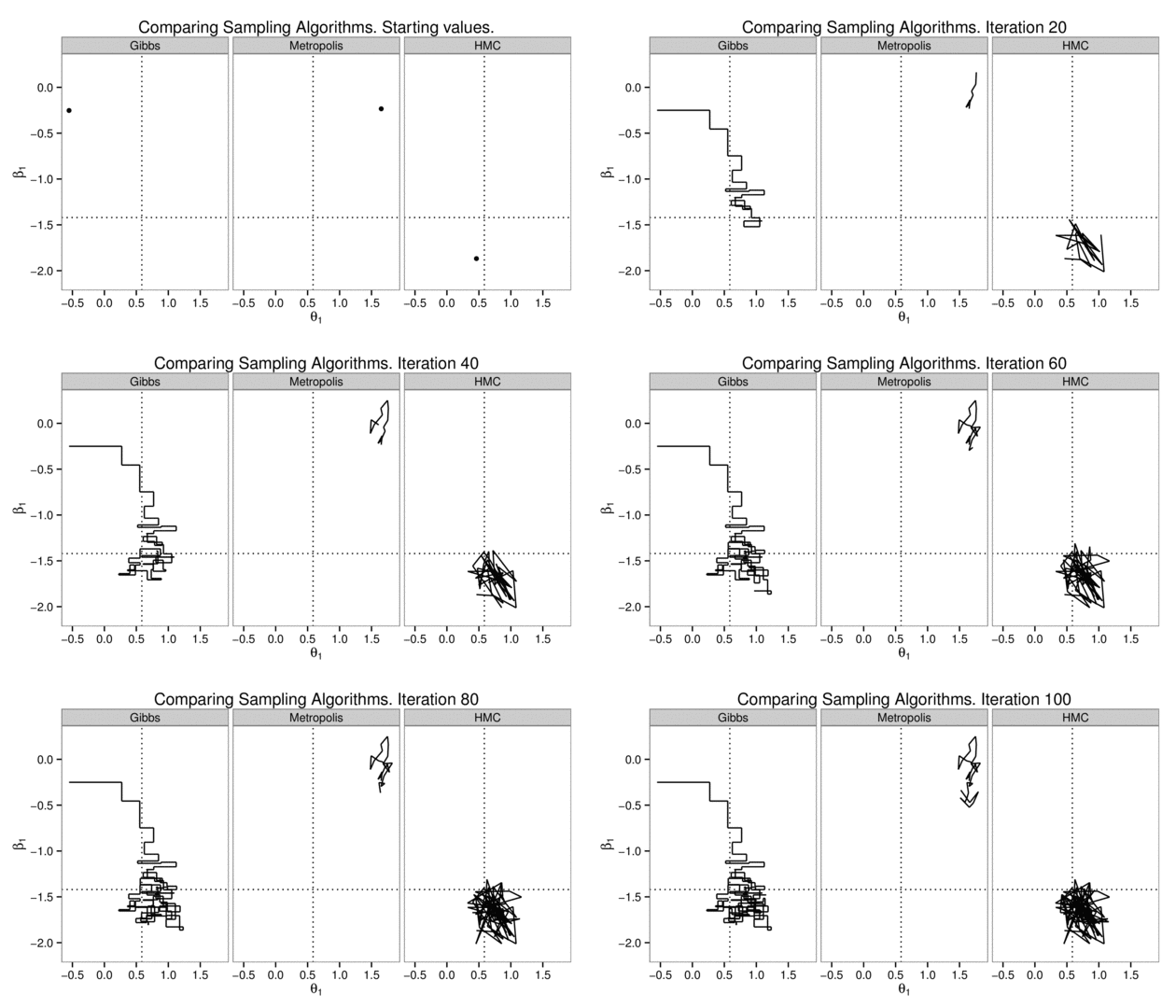
A final example (07_animated_plots.R) features a comparison of different Bayesian sampling algorithms applied to an item-response theory model (see sampling_algorithms.R for the code that I prepared to implement them). Using ImageMagick or ffmpeg, it's possible to create animated plots that illustrate the different speeds of convergence.
