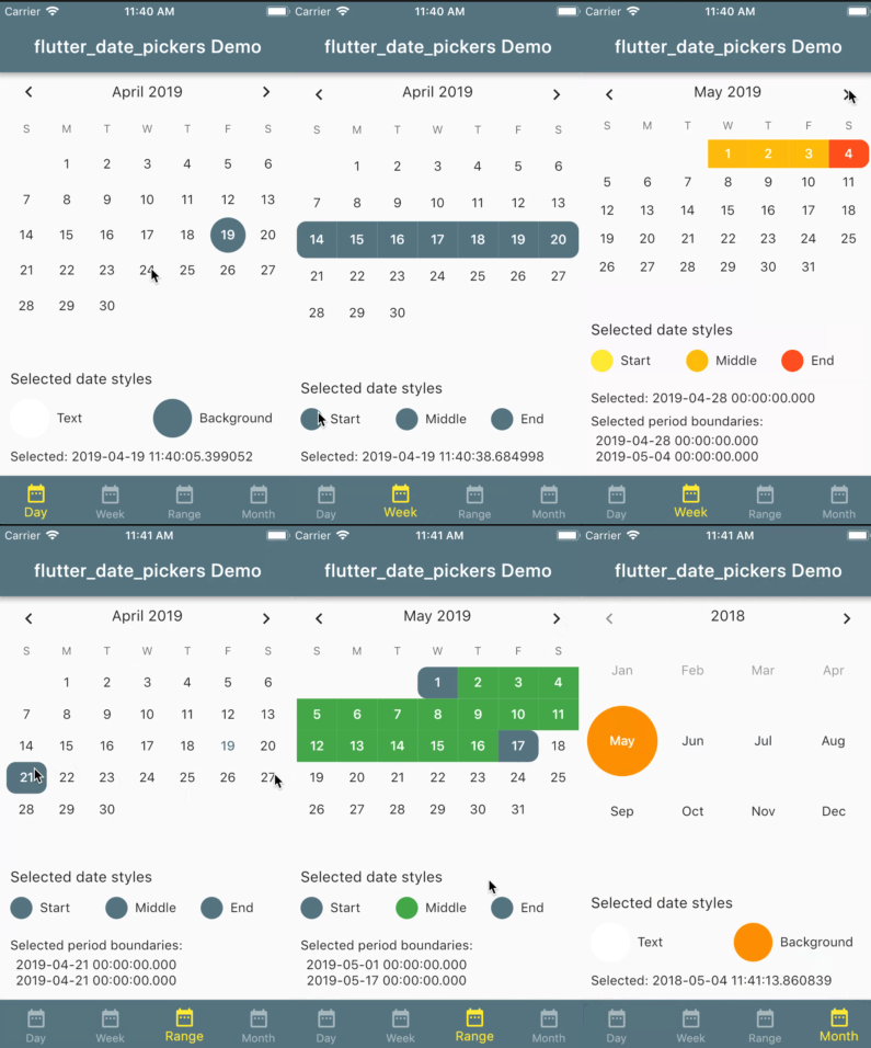
Allows to use date pickers without dialog. Provides some customizable styles for date pickers.
A set of date pickers:
DayPickerfor one dayWeekPickerfor whole weekRangePickerfor random rangeMonthPickerfor month
Every date picker constructor take a style object as a parameter (if no styles passed - defaults will be used).
For single value pickers (DayPicker, MonthPicker) it is DatePickerStyles object;
For range pickers (WeekPicker, RangePickers) it is DatePickerRangeStyles object;
Customizable styles: for all date pickers
| Property | Description |
|---|---|
| TextStyle displayedPeriodTitle | title of the date picker |
| TextStyle currentDateStyle | style for current date |
| TextStyle disabledDateStyle | style for disabled dates (before first and after last date user can pick) |
| TextStyle selectedDateStyle | style for selected date |
| BoxDecoration selectedSingleDateDecoration | decoration for selected date in case single value is selected |
| TextStyle defaultDateTextStyle | style for date which is neither current nor disabled nor selected |
only for range date pickers (WeekPicker, RangePicker)
| Property | Description |
|---|---|
| BoxDecoration selectedPeriodStartDecoration | decoration for the first date of the selected range |
| BoxDecoration selectedPeriodLastDecoration | decoration for the first date of the selected range |
| BoxDecoration selectedPeriodMiddleDecoration | Decoration for the date of the selected range which is not first date and not end date of this range |
// Create week date picker with passed parameters
Widget buildWeekDatePicker (DateTime selectedDate, DateTime firstAllowedDate, DateTime lastAllowedDate, ValueChanged<DatePeriod> onNewSelected) {

 // add some colors to default settings
    DatePickerRangeStyles styles = DatePickerRangeStyles(
      selectedPeriodLastDecoration: BoxDecoration(
          color: Colors.red,
          borderRadius: BorderRadius.only(
              topRight: Radius.circular(10.0),
              bottomRight: Radius.circular(10.0))),
      selectedPeriodStartDecoration: BoxDecoration(
        color: Colors.green,
        borderRadius: BorderRadius.only(
            topLeft: Radius.circular(10.0), bottomLeft: Radius.circular(10.0)),
      ),
      selectedPeriodMiddleDecoration: BoxDecoration(
          color: Colors.yellow, shape: BoxShape.rectangle),
    );

  return WeekPicker(
      selectedDate: selectedDate,
      onChanged: onNewSelected,
      firstDate: firstAllowedDate,
      lastDate: lastAllowedDate,
      datePickerStyles: styles
  );
}Please checkout example.
For help getting started with Flutter, view our online documentation, which offers tutorials, samples, guidance on mobile development, and a full API reference.
