-
vis4.net ( https://www.vis4.net/blog/ )
-
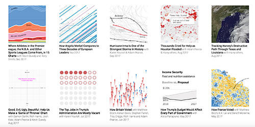
The Pudding ( https://pudding.cool/ )
-
driven by data url by Gregor Aisch ( newyork times / data wrapper )
-
Amy Cesal ( http://www.amycesal.com/day-doh-viz-all/ ) G2扩展到3D可以考虑这种形式
-
Interactive recreation of an 1821 color guidebook ( https://www.c82.net/werner/#intro )
-
style.org ( http://style.org/ ) information designer from newyork times, scientific visualization
-
exolorable explanations ( https://explorabl.es/ ) like nicky case
-
Complexity Explorables ( http://www.complexity-explorables.org/ )
-
hurricane tracker ( https://www.axios.com/hurricane-florence-north-south-carolina-catastrophic-848f2414-50e1-49b8-9f2d-24ce59b0b78d.html )
-
how you visualize hurricanes ( http://www.storytellingwithdata.com/blog/2017/10/1/how-youd-visualize-hurricanes )
-
number universe ( https://johnhw.github.io/umap_primes/index.md.html )
-
xeno graphics ( https://xeno.graphics/ )
-
Mprph creating designs, animations and interactive visualizations from data url
-
bird sound visualization ( https://experiments.withgoogle.com/ai/bird-sounds/view/ )
-
how to choose a right chart type ( http://extremepresentation.typepad.com/.shared/image.html?/photos/uncategorized/choosing_a_good_chart.jpg )
-
Coral Cities: An Ito Design Lab Concept ( https://towardsdatascience.com/coral-cities-an-ito-design-lab-concept-c01a3f4a2722 )
-
grow.paris (https://www.instagram.com/grow.paris/)
-
microsoft charticulator ( https://charticulator.com/index.html ) 图表智能布局,database和色板也不错
-
Federica Fragapane ( https://www.behance.net/FedericaFragapane )
-
Multiplicity - A collective photographic city portrait ( http://truth-and-beauty.net/projects/multiplicity )
-
Truth & Beauty ( http://truth-and-beauty.net/projects ) 原来,之前看到的那么多project都是他家的,包括multiplicity
-
How to build a dataviz in Augmented Reality ( https://medium.com/google-news-lab/how-to-build-a-dataviz-in-augmented-reality-46333794eed8 )
-
The Tree of Life ( https://www.evogeneao.com/learn/tree-of-life )
-
Peak Spotting-Data on rails ( http://truth-and-beauty.net/projects/peakspotting )
-
TheWorld ( https://public.flourish.studio/visualisation/112968/ ) 讲真,这么多地图,这是我见过的最美的
-
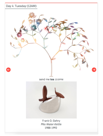
send me love-SFMOMA ( https://lab.sfmoma.org/send-me-love/#/sendme/love/3 ) L system
( https://www.sfmoma.org/read/send-me-love/ ) ( http://www.datasketch.es/february/ )
-
How a meme grew into a campaign slogan ( https://flowingdata.com/2018/11/05/how-a-meme-grew-into-a-campaign-slogan/ ) 对瓷器数据可视化的布局有借鉴意义
-
Government Structure ( http://govmaps.cid.hks.harvard.edu/ ) 关系数据可视化
-
Coins - A Journey Through a Rich Cultural Collection ( https://uclab.fh-potsdam.de/coins/ ) 很久没有看到这样的神作了,将博物馆珍藏的每颗coin的图像和经典图表结合起来。
-
Google Arts & culture ( https://artsexperiments.withgoogle.com/tsnemap )
-
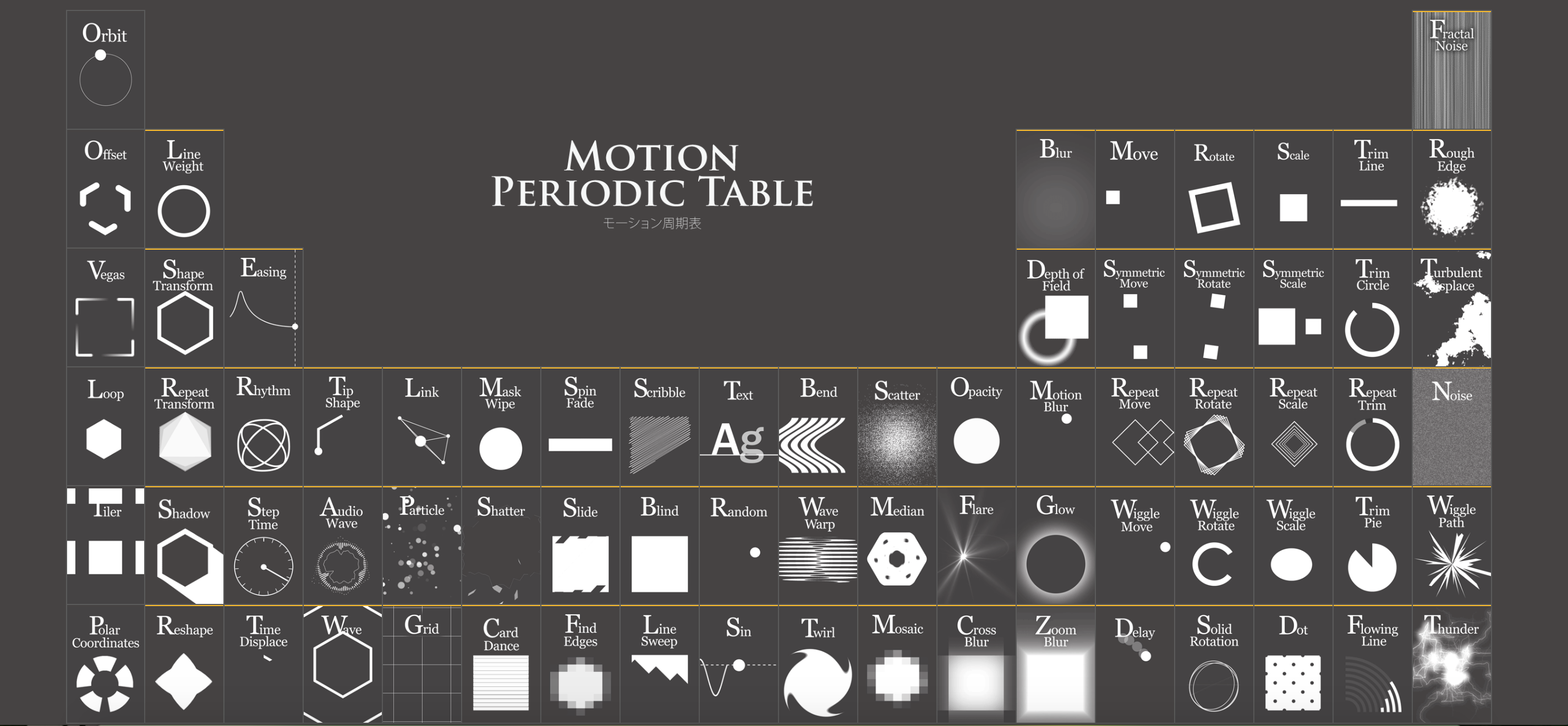
motiontable ( http://foxcodex.html.xdomain.jp/index.html )
-
poly-area chart ( https://alexkatona.blogspot.com/2018/09/polyarea-chart-using-d3js.html https://www.informationisbeautifulawards.com/showcase/2996-polyarea-chart ) 一种新型的表示percentage change over time的图表
-
multi-views:Visualization research for non-researchers ( https://medium.com/multiple-views-visualization-research-explained )
-
UW Interactive Data Lab ( https://medium.com/@uwdata )
-
Urban Sensing ( http://urban-sensing.eu/ ) 地理空间数据及可视化
-
Years of life lost due to breathing bad air ( https://www.washingtonpost.com/graphics/2018/national/health-science/lost-years/?utm_term=.9aa75a659977 )
-
NASA HS3 Hurricane Animation Paints Colors of the Wind ( https://www.nasa.gov/content/goddard/nasa-hs3-hurricane-animation-paints-colors-of-the-wind )
-
visualization and installation ( https://www.behance.net/gallery/45282029/Border-City-London-Biennale-Mexico-Pavilion )
-
Making a Whimsical Data Visualization ( https://medium.com/@KristinHenry/visualizing-videos-ea26bdf7d009 )
-
A biased tour of theuncertainty visualization zoo ( http://www.mjskay.com/presentations/tapestry2018-uncertainty.pdf )
-
Visualizing Ocean Shipping ( http://sappingattention.blogspot.com/2012/04/visualizing-ocean-shipping.html )
-
时序数据,《物种起源的数次增删》 ( https://fathom.info/traces/ )
-
resourcetrade.earth 地图配色,线的形状 ( https://resourcetrade.earth/data?year=2016&exporter=8&units=value )
-
3D故事版拿破仑东征图 ( https://1812.tass.ru/en#chapter2 )
-
Reuters Graphics ( http://graphics.reuters.com/ )
-
Bloomberg Graphics ( https://www.bloomberg.com/graphics )
-
stroytelling 工具化 ( https://parametric.press/ )
-
A new dawnin inter-Korean relations 非常新颖的时序数据解决方案 ( http://graphics.reuters.com/INTERKOREA-RELATIONS/010041MD3JB/index.html )
-
surprise map 地图场景上的异常值展示 ( https://medium.com/@uwdata/surprise-maps-showing-the-unexpected-e92b67398865 ) ( http://idl.cs.washington.edu/files/2017-SurpriseMaps-InfoVis.pdf )
-
THE FIRST SIX BOOKS OF THE ELEMENTS OF EUCLID ( https://www.c82.net/euclid/ )
-
casting shakespare ( https://ericwilliamlin.com/shakespeare_production_data/ )
-
StoryFlow: Tracking the Evolution of Stories ( http://www.shixialiu.com/publications/storyflow/index.html )
-
Shifted Maps ( https://shifted-maps.com/static/downloads/ShiftedMaps_Paper_IEEE_2018_VISAP.pdf )
-
The Lifespan of News Stories ( https://www.newslifespan.com/ )
-
佛像面部表情分析 ( https://www.newslifespan.com/ )
-
on time everytime ( http://tulpinteractive.com/on-time-every-time/ )
-
Data Visualization in Music ( https://towardsdatascience.com/data-visualization-in-music-11fcd702c893 )
-
A Closer Look at the Polar Vortex’s Dangerously Cold Winds ( https://www.nytimes.com/interactive/2019/01/30/science/polar-vortex-extreme-cold.html )
-
American segregation, mapped at day and night ( https://www.vox.com/policy-and-politics/2019/2/18/18217346/work-home-segregation-map )
-
How Trump keeps losing money for his wall ( https://www.washingtonpost.com/video/politics/how-trump-keeps-losing-money-for-his-wall/2019/02/14/4c1b5678-9b32-47aa-bc87-a7b0aa77e9b5_video.html?utm_term=.2a5902254bd5 ) 视频与图表结合,大师之作
-
Medieval fantasy city generator by Oleg Dolya ( https://watabou.itch.io/medieval-fantasy-city-generator )
-
procedural generation reddit ( https://www.reddit.com/r/proceduralgeneration/ ) 非常活跃的社区哦
-
from text to shape from Leslie Robert ( https://leslierobertsart.com/section/425019-Paintings-2016-18.html )
-
非常美丽的热力图 ( https://adventuresinmapping.com/2016/07/12/five-years-of-drought/ )
-
migration · trail ( https://migrationtrail.com/david ) ( https://blog.mapbox.com/visualizing-stories-of-migration-dbcbccd76dd9 )
-
The Shape of Speech ( https://www.brainpickings.org/2013/08/28/nancy-duarte-mlk-speech/ )
-
How to use open source satellite data for your investigative reporting ( https://towardsdatascience.com/how-to-use-open-source-satellite-data-for-your-investigative-reporting-d662cb1f9f90 )
-
The Shape Of Cities - a tale of five cities and how they grow ( https://www.nationalgeographic.com/magazine/2019/04/maps-show-how-public-transit-and-geography-shape-cities/ )
-
TULP interactive ( http://tulpinteractive.com/ ) 非常不错的作品集,station小哥就是其中之一哦
-
Visualize your data with Facets ( https://towardsdatascience.com/visualize-your-data-with-facets-d11b085409bc )
-
CHARTABLE - a blog by data wrapper ( https://blog.datawrapper.de/ )
-
Visualizing nonlinear stories ( https://flowingdata.com/2017/10/09/visualizing-nonlinear-stories/ )
-
visualization tool for city exploring ( https://morphocode.com/morphocode-explorer-preview/ )
-
BRENDAN DAWES ( http://brendandawes.com/ ) 数据雕塑
-
Nations in Bloom ( http://romercreative.com/bloom/ )
-
The World of Small Countries ( https://drawingdata.net/wgs2019/ )线性叙事和交互式探索的合体
-
物理理论交互地图 ( https://www.quantamagazine.org/frontier-of-physics-interactive-map-20150803 )
-
why do cats and dogs ? ( https://whydocatsanddogs.com/ https://www.visualcinnamon.com/2019/04/designing-google-cats-and-dogs) with Google Trends
-
Mistakes, we’ve drawn a few ( https://medium.economist.com/mistakes-weve-drawn-a-few-8cdd8a42d368 )
-
story explorer ( http://storyexplorer.namwkim.org/ ) ( https://flowingdata.com/2017/10/09/visualizing-nonlinear-stories/ )
-
Story Maps ( https://storymaps.arcgis.com/zh-cn/ )
-
Techniques for Data Visualization on both Mobile & Desktop ( https://www.visualcinnamon.com/2019/04/mobile-vs-desktop-dataviz )
-
The Beginner's Guide to Dimensionality Reduction ( https://idyll.pub/post/dimensionality-reduction-293e465c2a3443e8941b016d/ )
-
数据库本身成为视觉故事 ( http://r.mailpusher.eu/mk/mr/qjGwQ0Ypnwko2IF0onwxBwOUeRhBuB3nwactMisei9HFDuewFCKfL3AbFDSJOkQ8pQQFmf0HdVbD9TgwIHluNUOp1Va3BsBgGvo )
-
the functional art ( http://www.thefunctionalart.com/ ) 《how charts lie》作者的网站
-
2019 vote EU ( http://2019vote.eu/ ) 实用又有趣的交互可视化
-
TRAILS OF WIND - The architecture of airport runways ( https://trailsofwind.figures.cc/ )
-
Visualization Design Lab - Utha Univesity ( https://vdl.sci.utah.edu/ )
-
Data-Driven Storytelling 微软的一系列可视化叙事工具集,非常有趣(https://www.microsoft.com/en-us/research/project/data-driven-storytelling/ )
-
https://infowetrust.com/ 非常有趣的可视化站子
-
Mapping The Solar System ( https://github.com/eleanorlutz/asteroids_atlas_of_space )
-
FoamTree ( https://carrotsearch.com/foamtree/ )
-
Learning Synths ( https://learningsynths.ableton.com/get-started/get-started-making-sounds )
-
How to Profit in Space: A Visual Guide ( https://www.wsj.com/graphics/new-space-race/ )
-
Visualized Collision Detection ( http://jeffreythompson.org/collision-detection/table_of_contents.php )
-
Coloring London ( https://beta.colouring.london/ )
-
the Illustrations of the Natural Orders of Plants ( https://www.c82.net/twining/plants/ )
-
the atlas of moons ( https://www.nationalgeographic.com/science/2019/07/the-atlas-of-moons/ )
-
An Animated Map of the Earth ( http://tabletopwhale.com/2019/07/08/an-animated-map-of-earth.html )
-
Explore Adventure ( http://explore-adventure.com/ )
-
Hierarchical Bar Chart ( https://observablehq.com/@d3/hierarchical-bar-chart )
-
Circle of Nations ( https://circle-of-nations.interactivethings.io/ )
-
Nodes ( http://nodes.io/story/ )
-
SAP Fiori ( https://experience.sap.com/fiori-design-web/ ) 一套GUI设计规则,可以看看interface和图表融合这一块
-
Material.io ( https://material.io/ ) interface和图表融合
-
What if your area had the same deforestation rate as the Amazon Forest? ( https://amazondeforestation.io/ )
-
codex atlanticus ( https://codex-atlanticus.it/#/Overview ) 关于书本的可视化
-
Nomadic tribe ( https://2019.makemepulse.com/ ) 可以玩的漫画
-
How Illinois Bet on Video Gambling and Lost ( https://features.propublica.org/the-bad-bet/how-illinois-bet-on-video-gambling-and-lost/ ) 数据新闻直接用了deck.gl,以及图表和组件的状态驱动
-
CARTO VL ( https://carto.com/developers/carto-vl/guides/animated-visualizations/ ) a JavaScript library to create custom Location Intelligence applications over vector rendering.
-
Drowning in plastic ( https://graphics.reuters.com/ENVIRONMENT-PLASTIC/0100B275155/index.html ) Visualising the world’s addiction to plastic bottles
-
How we went from individual styles to a consistent look-and-feel in the NZZ Graphics Team ( https://medium.com/nzz-open/how-we-went-from-individual-styles-to-a-consistent-look-and-feel-in-the-nzz-graphics-team-89fd560d6632 )
-
How far is too far? An analysis of driving times to abortion clinics in the US. ( https://pudding.cool/2017/09/clinics/ ) 简洁且优雅的交互
-
Kernel Density Estimation ( https://mathisonian.github.io/kde/ )
-
Learning from Toronto ( https://www.andreagiambelli.com/portfolio/lft-app/ )
-
Technology Garden ( http://variable.io/ibm-technology-garden/ )
-
The history of the Forbidden City — A visual explainer — ( https://multimedia.scmp.com/infographics/culture/article/3016607/history-of-the-forbidden-city/index.html?src=social )
-
laniakea ( http://laniakea.fathom.info/ ) 新闻文本可视化
-
A network of science: 150 years of Nature papers ( https://www.youtube.com/watch?v=GW4s58u8PZo&feature=youtu.be )
-
Foursquare Visualization on City Activities ( https://experiments.cleverfranke.com/experiment/virtual-activity-of-cities )
-
Runway Palette ( https://experiments.withgoogle.com/business-of-fashion https://artsexperiments.withgoogle.com/runwaypalette )
-
首里城デジタル復元マップ ( https://sw1227.github.io/shuri-reconstruction/ )
-
scicom lab ( http://www.scicom-lab.com/ ) scientific visualization & interactive poster
-
See How the World’s Most Polluted Air Compares With Your City’s ( https://www.nytimes.com/interactive/2019/12/02/climate/air-pollution-compare-ar-ul.html )
-
plot parade plot as art ( https://plotparade.com/index.html https://www.informationisbeautifulawards.com/showcase/3922 )
-
perspective Streaming pivot visualization via WebAssembly ( https://github.com/finos/perspective/ )
-
Statistical Mapping (Enumeration, Normalization, Classification) ( https://gistbok.ucgis.org/bok-topics/2019-quarter-02/statistical-mapping-enumeration-normalization-classification )
-
新冠肺炎地图 http://rocs.hu-berlin.de/viz/sgb/ https://multimedia.scmp.com/infographics/news/china/article/3047038/wuhan-virus/index.html https://graphics.reuters.com/CHINA-HEALTH-SOUTHKOREA-CLUSTERS/0100B5G33SB/index.html
-
Neural Network 3D Simulation https://www.youtube.com/watch?v=3JQ3hYko51Y
-
Google Arts & Culture: Living Jiagu https://vimeo.com/385018700
-
Shirley Wu 的作品 https://sxywu.com/
-
PhotoViz the intersection of photography and visualization. ( https://photoviz.tumblr.com/ )
-
ChartIO: a visual version of SQL ( https://chartio.com/product/visual-sql/ )
-
transformed verctor map ( https://www.themarshallproject.org/2020/03/31/why-jails-are-so-important-in-the-fight-against-coronavirus )
-
happy data dear data 升级版 (https://happy-data.co/)
-
Charting new territory - How The Economist designs charts for Instagram ( https://medium.economist.com/charting-new-territory-7f5afb293270 )
-
A million dollars vs. a billion visualized with a road trip ( https://flowingdata.com/2020/07/16/a-million-dollars-vs-a-billion-visualized-with-a-road-trip/ )
-
Variable io: Case study: IBM Technology Garden ( https://notes.variable.io/case-study-ibm-technology-garden-3a4f0b274de5 )
-
mapzilla ( https://mapzilla.co.uk/ )
-
Perfume 给小姐姐们跪了 ( https://perfume-global.com/ )
-
**Ancient Family Tree: Am I a Descendant of a Royal Family? ** ( https://www.zeelab.xyz/Ancient-Family-Tree-Am-I-a-Descendant-of-a-Royal-Family-Best-Paper )( https://www.youtube.com/watch?v=nEovLXTSNGg )
-
Symbol Chart ( https://flowingdata.com/2014/01/21/movie-quotes-as-charts-poster-edition/ ) (https://flowingdata.com/2018/01/16/back-to-the-future-abridged-chart/)
-
The Battleground States Biden and Trump Need to Win 270 by NewYork Times ( https://www.nytimes.com/interactive/2020/us/elections/election-states-biden-trump.html ) 非常精彩的作品
-
refikanadol: immersive visualization (http://refikanadol.com/ )
-
Why time feels so weird in 2020 ( https://graphics.reuters.com/HEALTH-CORONAVIRUS/TIME/gjnvwwjegvw/ )
-
Visual Cinnamon ( https://www.visualcinnamon.com/portfolio/ )
-
Financial Times Graphics ( https://www.ft.com/graphics )
-
Financial Times Visualization ( https://www.ft.com/data-visualisation )
-
visualising data ( https://www.visualisingdata.com/resources/ )
-
Static and dynamic network visualization ( https://kateto.net/network-visualization )
-
The Colors of Jean Giraud aka Mœbius ( https://moebius.colortheft.com/#comics/ ) 神作!
-
Reconstructing seven days of protests in Minneapolis after George Floyd’s death( https://www.washingtonpost.com/graphics/2020/national/live-stream-george-floyd-protests/ )
-
The Swamp That Trump Built (https://www.nytimes.com/interactive/2020/10/10/us/trump-properties-swamp.html ) photo,figure,visualization
-
CDV: computational & visualization lab ( https://cdv.dei.uc.pt/ )
-
artificial nature (https://artificialnature.net/ )
-
THE ROOTS OF INNOVATION ( https://www.kirellbenzi.com/art/roots-of-innovation )
-
Color Trends In Automotive 1910 - 2019 ( https://www.vizualism.nl/automotive-color-trends/ )
-
Simulation of a Nuclear Blast in a Major City ( https://www.youtube.com/watch?v=Z3RzNEzJyzo )
-
Simulating Natural Selection ( https://www.youtube.com/watch?v=0ZGbIKd0XrM )
-
The Shape of Dreams ( http://the-shape-of-dreams.com/#/ )
-
The Electoral College, explained ( https://www.youtube.com/watch?v=ajavsMbCapY )
-
A look at the 98 ice cream flavors available around the world ( https://benjerry.heshlindsdataviz.com/#countriesSection )
-
POMPEII by nature ( https://www.alhadaqa.com/pompeii/ )
-
FABFUNGUS:art installation inspired by questions of digital life and cellular growth ( https://szymonkaliski.com/projects/fabfungus/ )
-
The new Republican center of gravity ( https://www.theguardian.com/us-news/ng-interactive/2016/may/14/who-supports-donald-trump-the-new-republican-center-of-gravity )
-
How we watched the election at Stamen: our favorite maps and charts of 2020 ( https://hi.stamen.com/how-we-watched-the-election-at-stamen-fd3cedae7ed9 )
-
Open source building blocks for computational design. Est.2006 ( https://thi.ng/ )
-
Tudor Networks ( http://tudornetworks.net/ )
-
The 40 Weirdest (And Best) Charts ( https://fivethirtyeight.com/features/the-40-weirdest-and-best-charts-we-made-in-2020/ )
-
Pollution exposure plotted, a comparison between two kids’ day ( https://www.nytimes.com/interactive/2020/12/17/world/asia/india-pollution-inequality.html )
-
cnn-explainer ( https://poloclub.github.io/cnn-explainer/ ) ( https://poloclub.github.io/ )
-
Blockchain explained by reuters graphic ( http://graphics.reuters.com/TECHNOLOGY-BLOCKCHAIN/010070P11GN/index.html )
-
2020: The Year in Visual Stories and Graphics ( https://www.nytimes.com/interactive/2020/12/30/us/2020-year-in-graphics.html )
-
Creative Machine Learning Experiments Showcase ( https://medium.com/runwayml/creative-machine-learning-experiments-showcase-4cbdafa0ce42 )
-
Stopping the spread ( https://graphics.reuters.com/HEALTH-CORONAVIRUS/HERD%20IMMUNITY%20(EXPLAINER)/gjnvwayydvw/index.html )
-
tudor networks ( http://tudornetworks.net/ )
-
The Glorious Data Visualisations of Kohei Sugiur ( http://www.paperposts.me/posts/2018/3/17/glorious-japanese-data-visualisation )
-
A.I. love story ( https://pudding.cool/2021/03/love-and-ai/ )
-
sound shader sound visualization & glsl ( https://soundshader.github.io/ https://github.com/soundshader/soundshader.github.io )
-
Designing the interact Data Explorer url
-
使用L系统可视化TWITTER数据:Visualizing Toxicity in Twitter Conversations url
-
tsne - layout ( https://towardsdatascience.com/xkcd-com-artificial-intelligence-a4cbf6303b1e )
-
How the BBC Visual and Data Journalism team works with graphics in R ( https://medium.com/bbc-visual-and-data-journalism/how-the-bbc-visual-and-data-journalism-team-works-with-graphics-in-r-ed0b35693535 )
-
BEAUTY BRAWL (How inclusive are beauty brands around the world?)数据分析、故事讲述和图表的结合非常有趣
-
Amber Thomas ( https://pudding.cool/author/amber-thomas/ ) 制作上面那则故事的小姐姐
-
Public Health in the USA: How Dataviz Moves Government Toward Equity ( https://medium.com/data-visualization-society/public-health-in-the-usa-how-data-viz-noves-government-toward-equity-fd096e109845 )
-
TheyDrawIt!: An Authoring Tool for Belief-Driven Visualization ( https://medium.com/multiple-views-visualization-research-explained/theydrawit-an-authoring-tool-for-belief-driven-visualization-b3267a001480 )
-
ancestry-connect ( https://www.jennifert.me/ancestry-connect )
-
**古典文学研究的几种可视化途径——以汤显祖研究为例 ( http://www.zjujournals.com/soc/article/2018/1008-942X-48-2-164.html#close )
-
When Data visualization and Art Collide With the Humble Org Chart ( https://medium.com/nightingale/when-data-visualization-and-art-collide-with-the-humble-org-chart-647a2df46c5c )
-
Finally We May Have a Path to the Fundamental Theory of Physics and It’s Beautiful ( https://writings.stephenwolfram.com/2020/04/finally-we-may-have-a-path-to-the-fundamental-theory-of-physics-and-its-beautiful/ )
-
NASA Scientific Visualization Studio ( https://svs.gsfc.nasa.gov/ )
-
ScienceDaily - Scientific visualization ( https://www.sciencedaily.com/terms/scientific_visualization.htm )
-
Wine & Math ( https://pudding.cool/2021/03/wine-model/ )
-
BATS and the ORIGIN of OUTBREAKS ( https://graphics.reuters.com/HEALTH-CORONAVIRUS/BATS/qzjpqglbxpx/ )
-
用houdini做CNN visualizer ( overview: http://visuality.at/vis2/index.html detail: http://visuality.at/vis2/detail.html )
-
biocinematics - 一个用houdini做科学可视化的博主 ( 之前的blog: https://biocinematics.blogspot.com/ , 现在的blog: https://www.biocinematics.com/ , 一个非常amazing的作品: https://www.biocinematics.com/blog/2019/6/25/are-you-really-a-carbon-based-life-form )
-
Raft visualization - Understandable Distributed Consensus ( http://thesecretlivesofdata.com/raft/ )
-
Video game news ( https://dataveyes.com/en/projects/cite-des-sciences-jeu-video/ )
-
UEFA 2020 chart gallery ( https://plotparade.com/gallery_UEFA.html )
-
one amongst many 把数据转成手制装置 ( https://www.datasketch.es/project/one-amongst-many )
-
Dressel vs. Phelps. McLaughlin vs. Muhammad. Visualizing Olympic Champions, Present vs. Past 大师之作,非常有创意的奥运图表 ( https://www.nytimes.com/interactive/2021/08/07/sports/olympics/olympic-races.html )
-
All the Biomass of Earth, in One Graphic 很久没看到这么棒的infographics了( https://www.visualcapitalist.com/all-the-biomass-of-earth-in-one-graphic/ )
-
Unfolded Studio 类似 kepler 的地理可视化工具 ( https://studio.unfolded.ai/home )
-
The Unified hour 可交互的 3D 可视化 ( https://the-unified-hour.interactivethings.io/#/?_k=yfvrt7 )
-
被生长的航线照亮的地图 ( https://twitter.com/geo_spatialist/status/1440737849632968708 )
-
3D地球版边绑定 ( https://twitter.com/tylermorganwall/status/1440669533157556227 )
-
Master Piece: 将泰晤士河做成堆叠条形图 ( https://twitter.com/helenmakesmaps/status/1458463391664771072 )
-
同一位作者的mater piece: 横截面height field ( https://twitter.com/helenmakesmaps/status/1461290605015937028 )
-
fry-universe ( https://www.chris-williams.me/fry-universe )
-
evolution simulation ( https://labs.minutelabs.io/evolution-simulator/ )
-
GEOSPATIAL NETWORK VISUALIZATION ( https://geonetworks.github.io/ )
-
很多 visualization analysis 的 paper 可以看看 ( https://www.aviz.fr/Research/Publications )
-
brilliant unit visualization across view ( https://twitter.com/JeanRemiKing/status/1533720262344073218 )
-
From Abstraction to Realism and Back ( http://marcinignac.com/blog/from-abstraction-to-realism-and-back/ )
-
brilliant A Visual Guide to the Aztec Pantheon ( https://pudding.cool/2022/06/aztec-gods/ )
-
Tools to Design or Visualize Architecture of Neural Network ( https://github.com/ashishpatel26/Tools-to-Design-or-Visualize-Architecture-of-Neural-Network )
-
2d图表的风格化 url
-
风格化2 ( https://github.com/pshihn/rough )
-
Mathesia ( https://www.mathesia.com/home/ ) 科学可视化
-
VIDA (Visualization and Interactive Data Analysis) Group ( https://www.microsoft.com/en-us/research/group/vida/ )
-
Design Inspiration for Unique Visualization with Diatoms ( https://engineering.tableau.com/design-inspiration-for-unique-visualization-with-diatoms-97a03361e9 )
-
** generative art studio ( https://rarevolume.com/work/ )
-
Scott Reinhard ( https://scottreinhard.com/Mapping-and-Visualization )
-
Felipe Bedoya ( https://felipebedoya.work/ ) 超喜欢他的风格
-
Stefan Sietzen ( https://vimeo.com/stefsietz ) 用 houdini 做可视化的大神
- enso ( https://enso.org/ ) 一个依赖 node-based workflow 来制作可视化产物的工具
-
A Review of Temporal Visualizations based on Generalized Space-Time Cube Operations ( https://aviz.fr/~bbach/spacetimecubes/ )
-
Multivariate Time Series Forecasting with Transformers ( https://towardsdatascience.com/multivariate-time-series-forecasting-with-transformers-384dc6ce989b )
-
A Survey of Multi-Space Techniques in Spatio-Temporal Simulation Data Visualization ( https://www.sciencedirect.com/science/article/pii/S2468502X19300452 )


