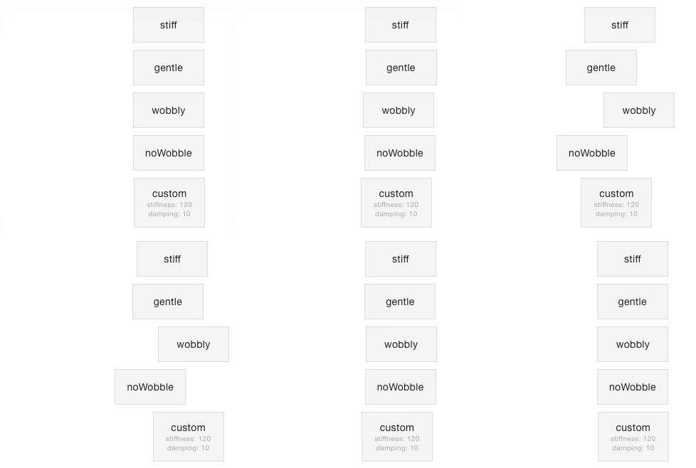
Generate physics based css keyframe animation objects or strings for the css-in-js solution of your choice.
Works with simple numeric css properties (with units or without), combined properties such as padding and rgb hex colors. Eliminates duplicate values and unused keyframes to optimize animation size.
This library was inspired heavily by react-motion, which allows you to create spring-based animations by repeatedly updating an elements inline styles. When animating lots of elements at the same time, this can be a burden on performance. Also, based on my own experience, integrating with some css-in-js libraries is hard.
This is where css-spring enters the stage. Enter the desired starting properties and target properties of your animation, optionally adjust the spring settings and css-spring generates a keyframe object or keyframe animation css for your spring-based animation of choice.
The library is small and easy to work with. Nevertheless, it is in the early stages of development. There is a lot of improvements to be made - read the Contributing section if you want to know how you can help.
This section lists some examples of popular css-in-js libraries such as styled-components and glamor. If you have additional examples, feel free to add them!
When used with the styled-components keyframes helper, generated keyframe animations can be applied to a styled component like this:
import spring, { toString } from 'css-spring'
import styled, { keyframes } from 'styled-components'

const springLeft = toString(spring(
  { left: '50px' }, { left: '250px' }, { preset: 'gentle' }
))

const StyledDiv = styled.div`
  animation: ${keyframes`${springLeft}`} 1s linear infinite;
`When used with the keyframes method of glamor, the keyframe object can be used as-is and there is no need to convert it to a string:
import { css } from 'glamor';
import spring from 'css-spring';

const springLeft = css.keyframes('springLeft', spring(
  { left: '50px' }, { left: '250px' }, { preset: 'gentle' }
));

const MyComponent = () => (
  <div {...css({ animation: `${springLeft} 1s linear infinite` })}>
    gentle
  </div>
)This method creates spring-based keyframes. Called with startProp and targetProp arguments
reflecting the starting and ending properties of the animation, it returns an object with the
interpolated animation values.
-
startProps(Object): The start properties for the animation.// `startProps` example { 'margin-left': '0px', opacity: 0, background: '#f00' }
-
endProps(Object): The end properties for the animation.// `endProps` example { 'margin-left': '250px', opacity: 1, background: '#bada55' }
-
options(Object, optional): Animation options with these properties:precision(Number, optional, defaults to3) Specifies the number of decimals in the rounding of interpolated values.preset(String, optional): Presets forstiffnessanddamping, overriding any stiffness and damping values given. Available presets:stiffstiffness 210, damping 20gentlestiffness 120, damping 14wobblystiffness 180, damping 12noWobblestiffness 170, damping 26
stiffness(Number, optional, default: 170): The stiffness of your spring-based animation.damping(Number, optional, default: 26): The damping of your spring-based animation.
An object with keyframes between 0% and 100%, having the interpolated values for each step of the animation, e.g.:
{
  '0%': { 'margin-left': '5px', opacity: 0.02, background: '#fe0402' },
  '1%': { 'margin-left': '13px', opacity: 0.05, background: '#fb0b04' },
  '2%': { 'margin-left': '25px', opacity: 0.1, background: '#f81508' },
  // meaningful frames between 2% and 88%
  '88%': { 'margin-left': '250px' },
  '100%': { 'margin-left': '250px', opacity: 1, background: '#bada55' }
}
Redundant values and empty keyframes are removed to optimize the size of the resulting css. There is simply no point in having a margin-left value of '250px' in every keyframe ranging from 88% to 100%.
This method takes the return value of spring and converts it to a css string.
-
keyframes(Object): The interpolated animation values object given byspring. -
formatter(Function, optional): The formatter function that is invoked for every property/value combination.// default formatter (property, value) => `${property}:${value};`
A css keyframe string.
A keyframes object based on startValues = { rotate: '0deg', left: '10px' } and targetValues = { rotate: '180deg', left: '20px' } will be converted to this css string:
0%{rotate:0deg;left:10px}
/* ... */
100%{rotate:180deg;left:20px;}
In order to have this formatted to a valid css transform, you could use a custom formatter like this one:
const keyframeCss = toString(keyframes, (property, value) =>
  property === 'rotate'
    ? `transform:${property}(${value});`
    : `${property}:${value};`
)
This would net you the following css:
0%{transform:rotate(0deg);left:10px}
/* ... */
100%{transform:rotate(180deg);left:20px;}There's a lot of ideas floating in my head that could make working with css-spring easier. Some of these are:
- adding a plugin system to use things such as autoprefixer or cssnano minification (#8)
- a commandline to generate spring keyframe animations for usage in your css files (#4)
Feel free to contribute with your own issues and ideas, your thoughts on the ones listed above, example documentation for usage with other css-in-js frameworks or pull requests for features/improvements you'd like to see.


