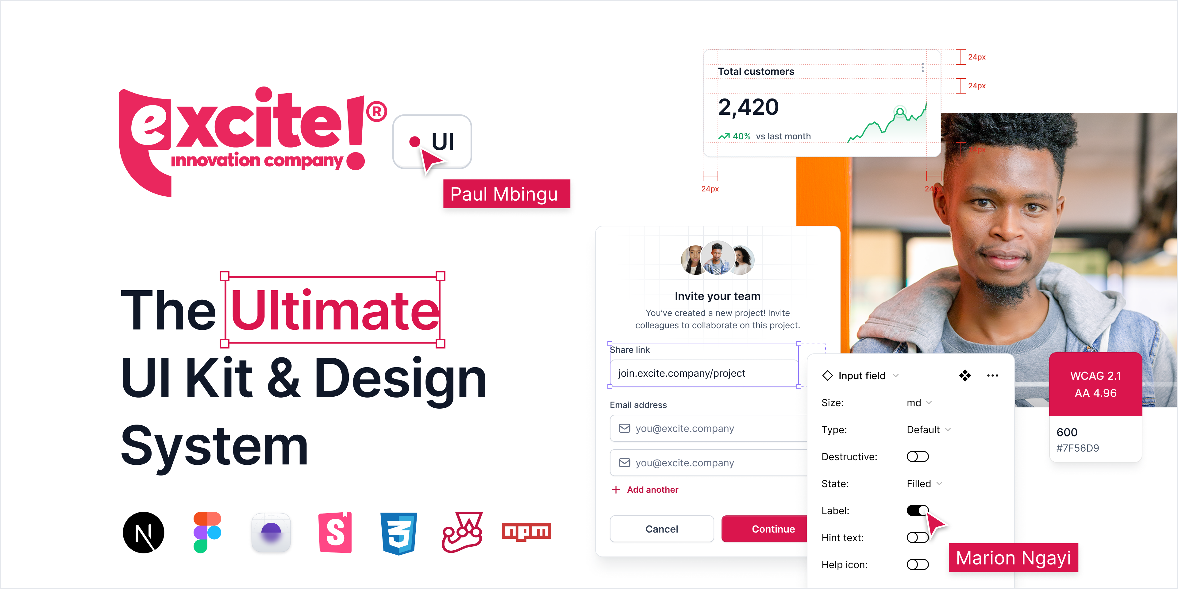
A vibrant, modern design system that empowers developers and designers to create dynamic and intuitive user interfaces for Excite! Innovation Company products. It offers a comprehensive set of components, guidelines, and tools designed for flexibility and consistency across projects.
-
Install and update Node.js & Node Package Manager [LTS ONLY]
-
Clone this repository to your local machine using:
git clone https://github.com/paulXmbingu/Excite-UI -
Install the required dependencies:
npm i
-
Start the development server:
npm run dev -- --host -
Start the Storybook js server:
npm run storybook -
Ctrl or Cmd click the links on the terminal to view the app or storybook eg. http://localhost:3000
- Comprehensive Component Library: Pre-built, customizable UI components like buttons, forms, and modals.
- Atomic Structure: Uses atomic design principles to create scalable, maintainable UIs with reusable components.
- Theming Support: Easily customizable themes to ensure your application aligns with your brand's look and feel.
- Responsive Design: Built-in responsiveness ensures components work seamlessly across devices of all sizes.
- Accessibility: Designed with accessibility in mind, including ARIA support and keyboard navigation.
- Consistency: Adheres to a set of design principles and guidelines to maintain visual and functional consistency across projects.
- Interactive Documentation: Provides examples to help developers and designers implement and customize components effectively.
- Modern Tooling: Integration with modern development tools like Storybook for component-driven development and testing.
- Performance Optimization: Lightweight components optimized for fast loading and efficient performance.
- Next.js: Frontend Framework
- Figma: Design & Prototyping
- UntitledUI: UI Kit
- CSS Modules: Styling
- Storybook.js: Component Development & Testing
- Jest: Unit testing
- npm: Package management
- Special Contributions: Marion Ngayi & The Senjes Cuisine Team
- UI Design: Paul Mbingu
- Frontend Engineering: Paul Mbingu
