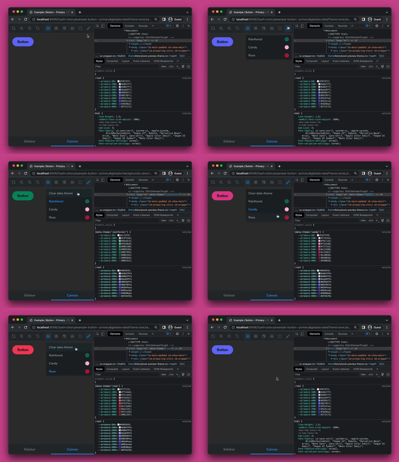
A lightweight Storybook addon to switch data-theme attribute
This Addon lets you switch the data-theme attribute in your Storybook, by
selecting a defined theme from a toolbar dropdown and adding the selected theme
to the data-theme attribute of storybooks iframe html element.
This comes in handy if you want to test your components with different themes.
This addon is compatible with storybook version ^7.0.x | ^8.0.x.
npm install storybook-addon-data-theme-switcher --save-devThen activate the addon by adding it to the storybook main.js file
(located in the Storybook config directory):
module.exports = {
  addons: [
    // other addons here
    "storybook-addon-data-theme-switcher",
  ],
};The addon makes use of storybooks globalTypes to define and load the themes.
To define a selection of themes alongside other configuration options, you can
add the following to your global storybook configuration file preview.js:
import type { ThemeConfig } from "storybook-addon-data-theme-switcher";

export const globalTypes = {
  dataThemes: {
    defaultValue: {
      list: [
        { name: "Rainforest", dataTheme: "rainforest", color: "#00755e" },
        { name: "Candy", dataTheme: "candy", color: "#ffb7d5" },
        { name: "Rose", dataTheme: "rose", color: "#ff007f" },
      ],
      dataAttribute: "data-theme",            // optional (default: "data-theme")
      clearable: true,                        // optional (default: true)
      toolbar: {
        title: "Change data-theme attribute", // optional
        icon: "paintbrush",                   // optional
      },
    } satisfies ThemeConfig,
  },
};
To set a default data-theme value, which will be used in the initial load of
the storybook, you can add the following to your preview.js file:
export const globalTypes = {
  dataTheme: {
    defaultValue: "rainforest",
  },
  dataThemes: {
    ...
  },
};
Note: Make sure to match the
dataThemedefault value with one of the defined themes in thelistarray.
This project is licensed under the MIT License


