San Francisco Park Reading by Juan Salamanca | Free License
Harold's company has just started a new Real Estate Investment division to provide customers with a broader range of portfolio options. Harold was tasked with building a prototype dashboard and he needs your help. The real estate team wants to trial this initial offering with investment opportunities for the San Francisco market. If the new service is popular, then they can start to expand to other markets.
The goal of this dashboard is to provide charts, maps, and interactive visualizations that help customers explore the data and determine if they want to invest in rental properties in San Francisco.
In this homework assignment, you will help Harold accomplish the following tasks:
Note: If you encounter technical difficulties using PyViz, refer to the troubleshooting section of the PyViz Installation Guide.
- sfo_neighborhoods_census_data.csv
- neighborhoods_coordinates.csv
- Rental Analysis Starter Jupyter Notebook
- Dashboard Starter Jupyter Notebook
The first step to building the dashboard is to work out all of the calculations and visualizations in an analysis notebook. Once the code is worked out here, it can be copied over to a dashboard code and used with Panel to create the final layout. Use the rental_analysis.ipynb to complete the following:
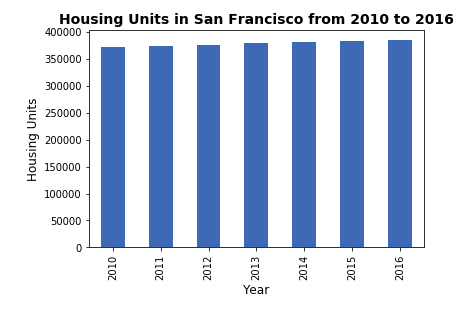
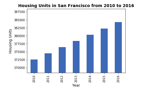
In this section, you will calculate the number of housing units per year and visualize the results as a bar chart using the Pandas plot function.
Note: By default, the limits auto-scale to the data. However, it is hard to see the difference between the yearly data. In the optional challenge, you can use the min, max, and standard deviation of the data to manually scale the y limits of the plot.
Default Bar Chart
Bar Chart with y-axis limits adjusted
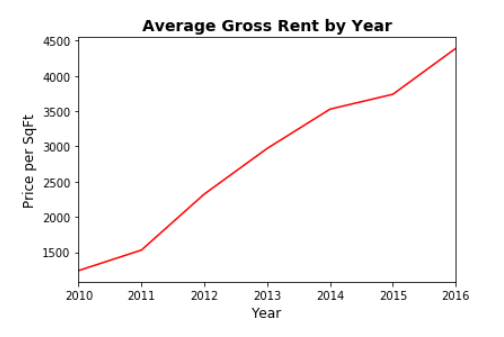
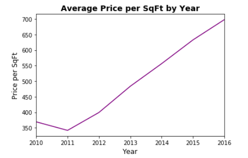
In this section, you want to determine the average sales price per year and the average gross rent per year to better understand housing costs over time. For example, a customer will want to know if they should expect an increase or decrease in the property value or rent over time so they can determine how long to hold the rental property. You will visualize the average (mean) gross rent and average price per square foot per year and visualize it as a bar chart.
- Calculate the mean
gross_rentandsale_price_sqr_footfor each year. - Visualize the mean
gross_rentandsale_price_sqr_footfor each year as two line charts.
In this section, you will use hvplot to create two interactive visulizations of average prices with a dropdown selector for the neighborhood. The first visualization will be a line plot showing the trend of average price per square foot over time for each neighborhood. The second will be a line plot showing the trend of average montly rent over time for each neighborhood.
Hint: It will be easier to create a new DataFrame from grouping the data and calculating the mean prices for each year and neighborhood.
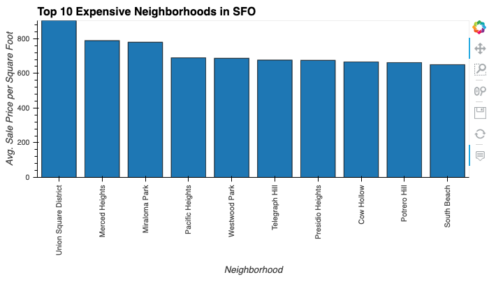
In this section, you want to figure out which neighborhoods are the most expensive. You will need to calculate the mean sale price for each neighborhood and then sort the values to obtain the top 10 most expensive neighborhoods on average. Plot the results as a bar chart.
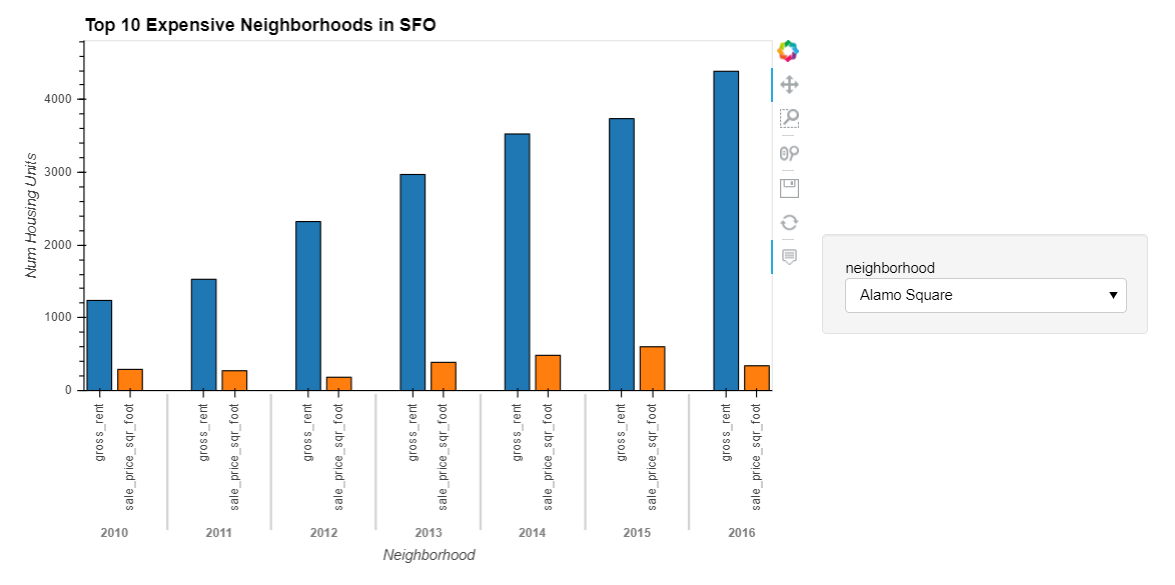
In this section, you will use hvplot to create an interactive visualization with a dropdown selector for the neighborhood. This visualization will feature a side-by-side comparison of average price per square foot versus average monthly rent by year.
Hint: Use the hvplot parameter, groupby, to create a dropdown selector for the neighborhood.
In this final section, you will read in neighborhood location data and build an interactive map with the average prices per neighborhood. Use a scatter mapbox object from plotly express to create the visualization. Remember, you will need your mapbox API key for this.
Remember that in order to create maps visualizations using Plotly Express, you will need to create an account at mapbox and create an access token.
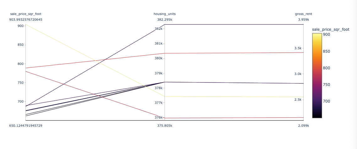
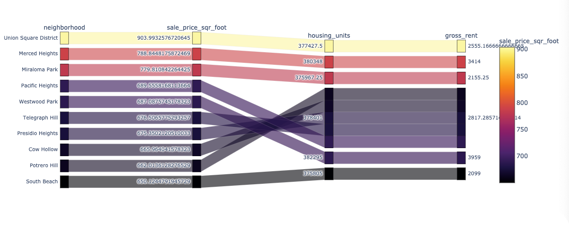
In this optional challenge section, you will use plotly express to create a Parallel Coordinates plot, Parallel Categories plot, and a Sunburst plot so that investors can interactively filter and explore various factors related to the sales price of the neighborhoods.
Using the provided DataFrame to create the following visualizations:
- Create a Parallel Coordinates Plot.
- Create a Parallel Categories Plot.
-
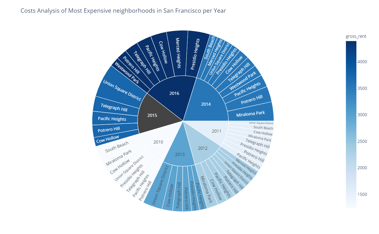
Create a Sunburst plot to show the most expensive neighborhoods in San Francisco per year.
Hint: You can learn more about sunburst charts in Plotly Express in this link.
Now that you have worked out all of the code and analysis, you will use the Panel library to build an interactive dashboard for all of the visualizations. There are no hard requirements for the layout of this dashboard, so use your own imagination and creativity!
Use the provided starter notebook, dashboard.ipynb, for your dashboard code. Copy the code for each visualization rom the analysis notebook and place it into separate functions (1 function per visualization). This will make it easier to build and modify the layout later. Each function should return the plot figure in a format that Panel can use to plot the visualization.
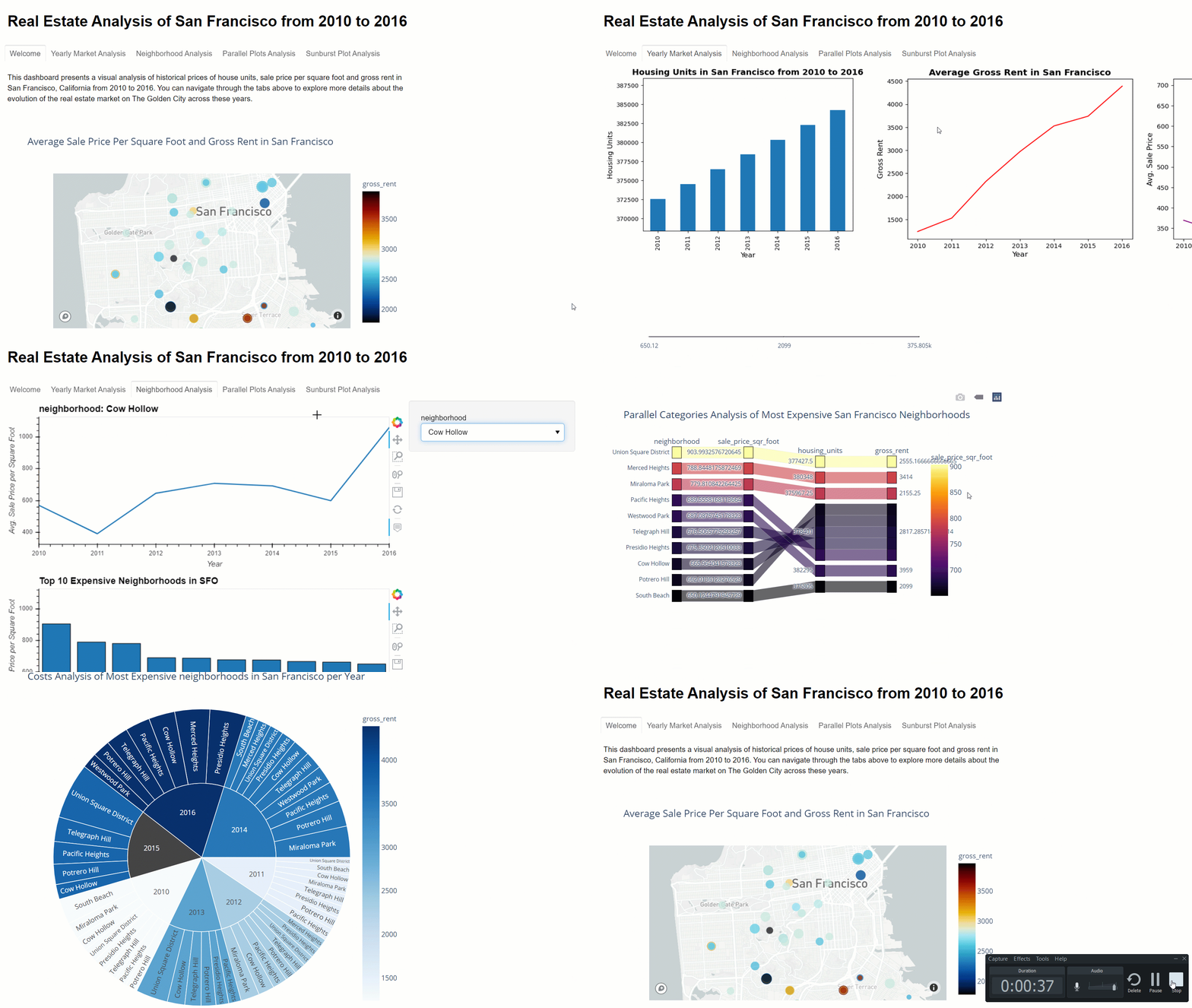
Sample Dashboard:
-
Use the starter notebooks for the analysis and dashboard and upload these to Github.
-
Complete your README to explain how to run and use your dashboard.
-
Note: You should not submit your
mapboxaccess token to Github! -
Submit the Github URL repository to Bootcampspot.
© 2020 Trilogy Education Services, a 2U, Inc. brand. All Rights Reserved.

