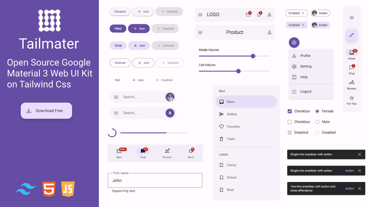
Tailmater UI Kit
Tailmater is an open source Modern Web Material 3 UI Kit based on Tailwind css framework. Built with Material Design 3 the latest version of Google's open-source design system. Tailmater use the MIT license so you can use it included in a commercial project. Credit to the Github page will always be appreciated. Development by @ari_budin
Demo Preview
Demo: https://aribudin.github.io/tailmater/
Installation
- Clone the repository with the following command:
git clone https://github.com/aribudin/tailmater.git
- Run in terminal this command:
npx tailwindcss -i ./src/tailwindcss/tailwind.css -o ./src/css/style.css --watch
- Open html file in browser and start editing
Download file
Download .zip file in here
Tailmater JavaScript
We provide examples of vanilla javascript functions for all Tailmater components. There are several components that require triggers to run such as snackbars, dialogs, range sliders and others.
Put the script in the last line before close body
<script src="src/js/tailmater.js"></script>
Toggles
| Type | Call | Target | Class |
|---|---|---|---|
| data-type="toggle" | data-target="#value" | id="value" | .show |
Accordion
| Type | Call | Target | Role | Class |
|---|---|---|---|---|
| data-type="collapse" | data-target="#value" | id="value" | role="collapsed" | .active |
Sheets
| Type | Call | Target | Close | Class |
|---|---|---|---|---|
| data-type="sheets" | data-target="#value" | id="value" | data-close="#value" | .show |
Dialogs
| Type | Call | Target | Close | Class |
|---|---|---|---|---|
| data-type="dialogs" | data-target="#value" | id="value" | data-close="#value" | .show |
Menus
| Type | Call | Target | Role | Class |
|---|---|---|---|---|
| data-type="dropdown" | data-target="#value" | id="value" | role="dropdownmenu" | .show |
Snackbar
| Type | Cal | Target | Close | Class |
|---|---|---|---|---|
| data-type="snackbar" | data-target="#value" | id="value" | data-close="#value" | .show |
Tabs
| Type | Call | Target | Role | Role 2 | Class |
|---|---|---|---|---|---|
| data-type="tabs" | data-target="#value" | id="value" | role="tabpanel" | role="indicator" | .active |
Circle Progress
| Role | Role 2 | Value(0-100) |
|---|---|---|
| role="progress_bg" | role="progress_fill" | data-percent="value" |
Dark Mode
| Type | Target | Storage | Class |
|---|---|---|---|
| data-type="theme" | html | localStorage.theme | .dark |
Range slider
| Type | Target |
|---|---|
| data-type="slider" | nextElement |
Navbar Scroll Up
| Target | Offset | Class Visible | Class Fixed |
|---|---|---|---|
| role="navtop" | header | .is-visible | .is-fixed |
Segmented Button
| Target | Status active |
|---|---|
| .segmented-item > input | checked |
Sources
Authors & Sponsors
- Ari Budin @ari_budin
- Tailwind Dashboard Taildash
- Tailwind Templates Tailnet
