The Barbershop Website is a site for Successful Barbershop Business.
The website provides users with information about barbershop services and their cost. It's targeted toward people who are looking for a high quality haircut, beard trim or shave. Using a special form, the user can book a date and time for a haircut and/or other available service. After booking the service, user also can find the location of the Barbershop itself on the Google Map.
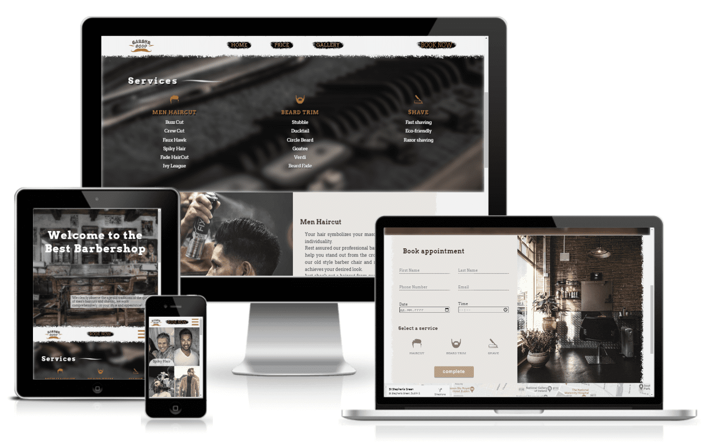
- Provide essential info about the business and services to customers.
- Automate the booking process by allowing customers to independently book the date and time of visiting the barbershop.
- Expand the client base and increase the credibility of the business, making it more and more popular.
- Promote business and increase the number of customers.
- Attract the attention of potential visitors.
- Find out information about the services provided and their prices.
- Find out the work schedule, contacts and the location of the barbershop itself.
- The ability to book an appointment through the site on their own.
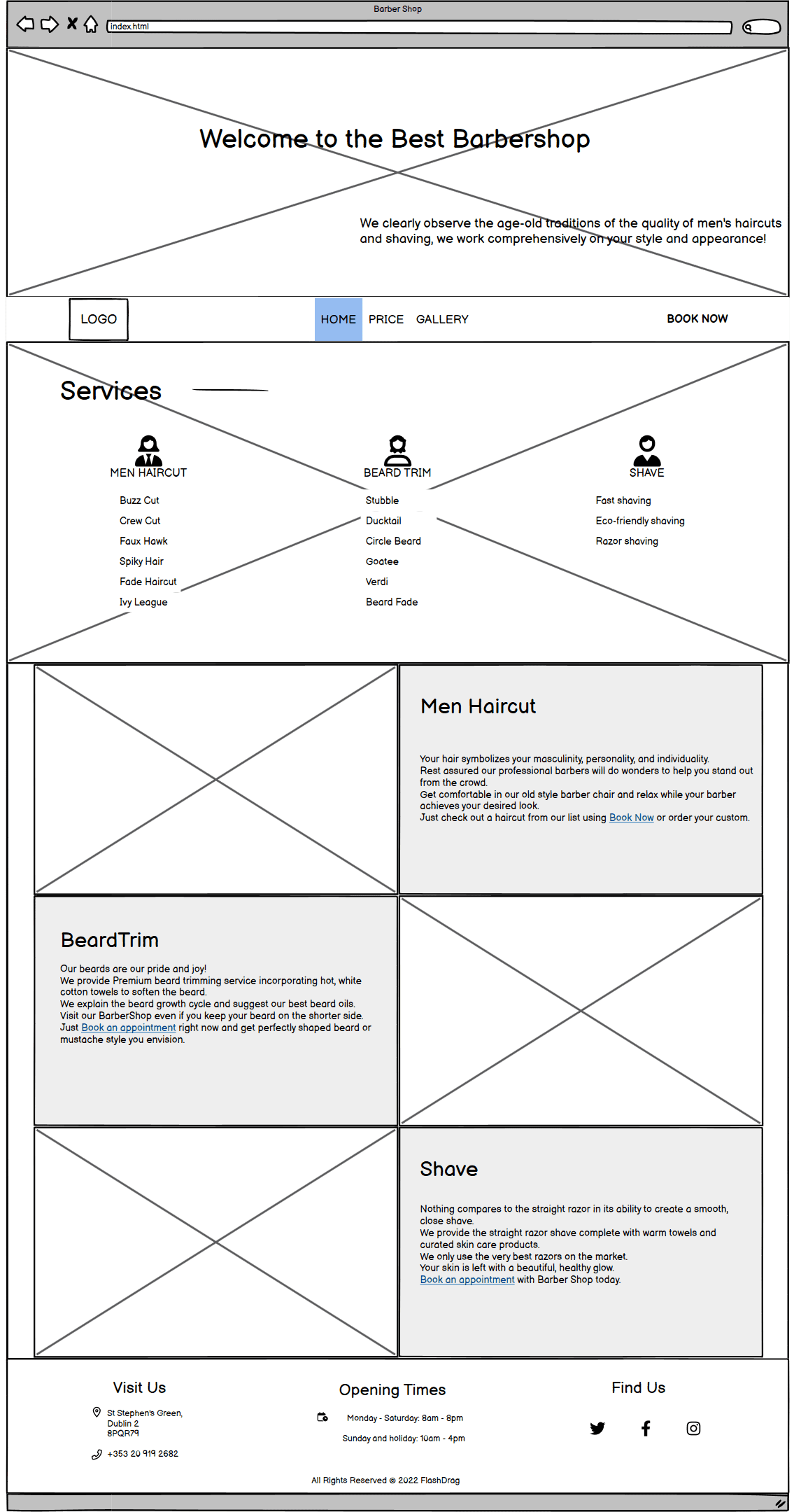
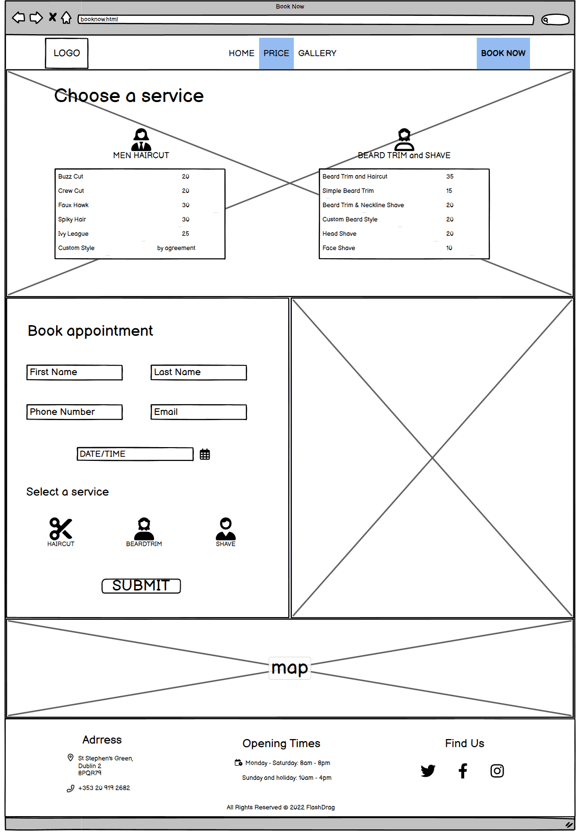
The Barbershop Website was designed based on wireframes produced in Balsamiq. All design features were implemented.
| Index | Book Now |
|---|---|
 |
 |
The website is designed in such a way as to interest the user, give useful information about the services and increase the chances of visiting the Barbershop. The appearance and UI design is quite user-friendly, stylish and responsive. The website design meets accessibility requirements including sufficient contrast between background and foreground colours, non-text elements have planned alt text equivalents to cater for the visually impaired. The site is designed to be familiar and intuitive to the user. The design was chosen to evoke warm emotion in the user. When a user chooses a good barbershop, he is looking not only for a service, but also for an establishment where he will feel safe and comfortable.
-
The Barbershop site has three pages with a clear and semantic structure, the information is well organized, every element is easy to find. The consistency and similarity of the structure is manifested on all pages and sections of the site and covers interactivity. The main menu is designed with intuitive and familiar navigation which includes the barbershop logo on the left side, the navigation links in the center and the book now link on the right side.
-
The main website font is a geometric slab-serif typeface family Arvo and it's fallback font is Serif. The flavour of the font is rather mixed, being nearly monolinear to increase legibility. The font implemented on the website using Google Fonts API. Heading weights are bold(700) and body text is regular(400).
-
The colour scheme based on whitesmoke, warm yellow and brown tones and matches the images on the page. Warm colors have long wavelengths and radiate a considerable amount of energy. That's why they are chosed as accent colors. The site must inspire confidence in the user who is going to put his style in other hands.The warm colors blend perfectly with the light moody style of the images and were chosen to evoke that sense of calm and comfort in the guest.
- Grunge borders, brush-stroke, Logo and Favicon were designed in Adobe Photoshop using paint brushes and other tools. All photos used in the project were downloaded from sources with a free license and do not require attribution. The images were colored and resized in Adobe Lightroom for a light moody style. All images were compressed using IloveIMG online service to optimize site loading. Favicon was designed in Adobe Photoshop using Uxwing icons and than it was resized and converted to .ico format using Online Favicon Generator.
The Barbershop website is designed to strictly adhere to accessibility guidelines across all pages/sections and all interactive elements. Any interaction causes a positive response to the user through the semantic structured information, colors, clear and unambiguous navigation structures. All external links open in another tab and use the noopener attributes to prevent external pages from being manipulated.
- The navbar was implemented so that the user had the opportunity to go to the booking form at any time. The BookNow link differs in color from the main menu links to be in focus and on the right side because Website users instinctively have greater trust for content on the right-hand side. Also it includes logo on the left side, the navigation links(home, price and gallery) in the center. The background of each menu link is a brush stroke designed in Adobe Photoshop using a painting brush. The navbar is sticky for mobile devices since there the page becomes much larger vertically, so that the user always has a Main menu and BookNow links in sight. The navbar is fully responsive and changes to a toggler (hamburger menu) on smaller screens. Only the central part of the menu is hidden in the toggle at lower screen resolutions. The sticky menu is implemented in such a way that the "Book now" button is always visible to users, and they can make an appointment at any time without returning to the very top of the page. The hamburger menu button is stylized with a linear gradient and changes when you click or hover over it. On small screens the hamburger menu button is placed on the right side and the BookNow link in the center for comfortable access to the user.
| Full NavBar | Mobile Navbar |
|---|---|
 |
 |
| Sticky NavBar | Dropdown NavBar |
 |
 |
- The footer is valuable to the user as it includes three blocks of useful info. This is address and phone number of the barbershop, opening times and links to the relevant social media sites. The footer section is also fully responsive and on smaller devices the info blocks stack one on top of the other.
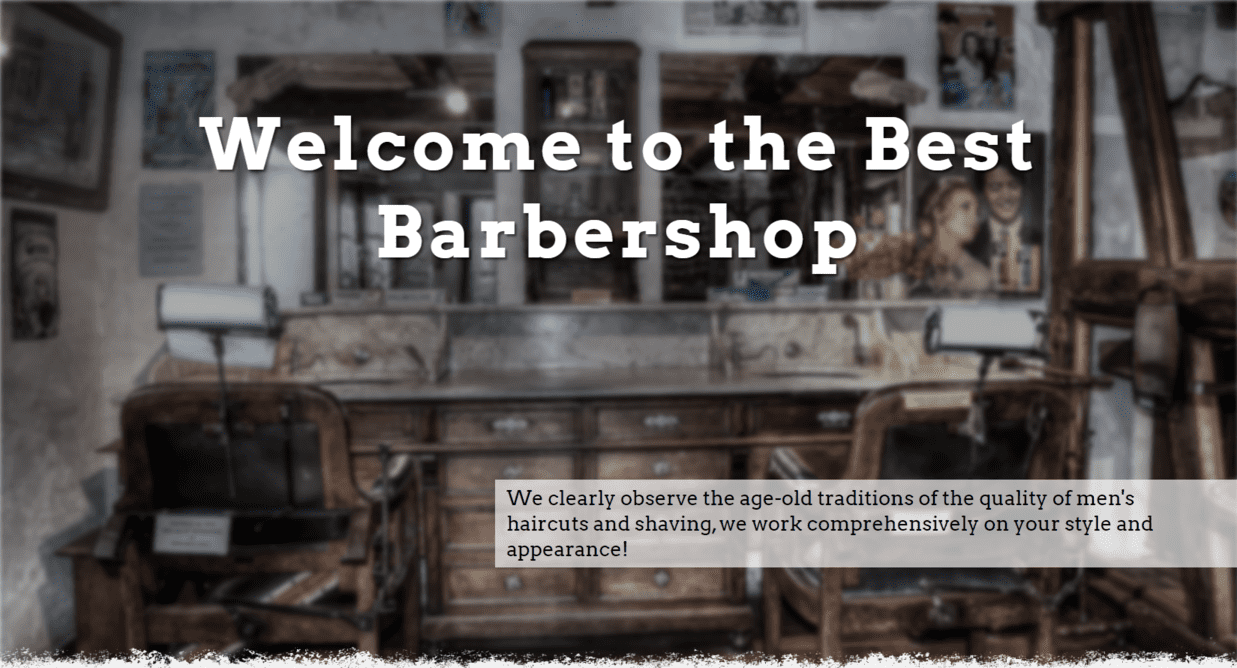
- The page header welcomes users, introduces barbershop and gives a brief overview of how it can be useful. The section is responsive for each screen size and occupies 70% of available browser space vertically.
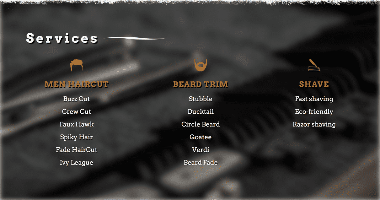
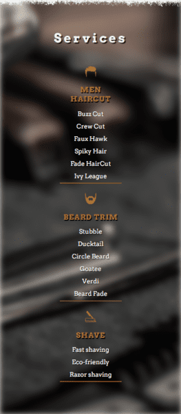
- This section presents three lists of services provided by the barbershop. Icons were used to attract the users eyes and allow them to quickly understand what type of service was being offered. On the big screen, the lists are arranged horizontally in 3 columns. On smaller devices, the services stack one on top of the other.
| Desktop | Mobile |
|---|---|
 |
 |
-
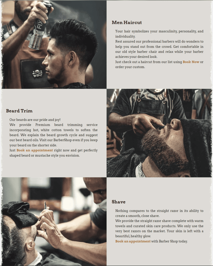
The section is implemented in the form of a chessboard on which pictures alternate with blocks of text. Each text block is supported by a picture and succinctly describes the main services to assure the user of what the company does and what is available. Also each block contains a link to the service booking page.
On large screens, the section has a maximum horizontal limit size and is framed in a grunge border on the sides. The Grunge border was designed in Adobe Photoshop using a painting brush. using painting brushes.
| Desktop | Mobile |
|---|---|
 |
 |
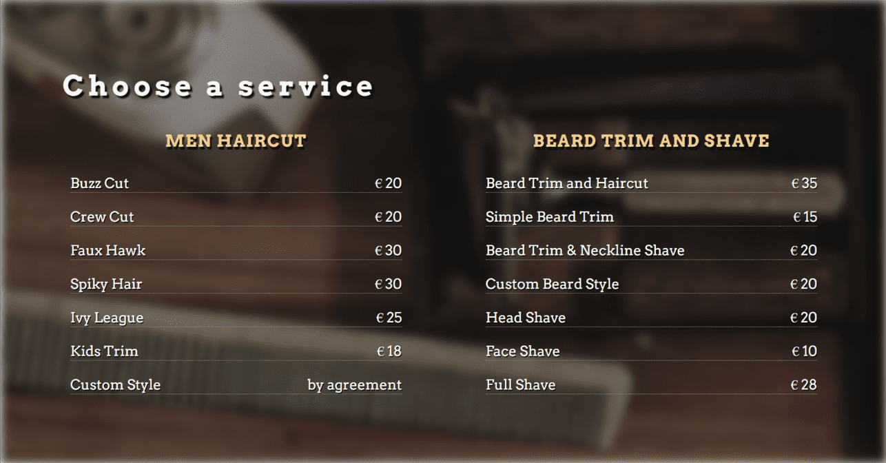
- The Price List section consists of two columns containing the services provided and their cost. The user can access this page using the Price link on the navigation bar.
-
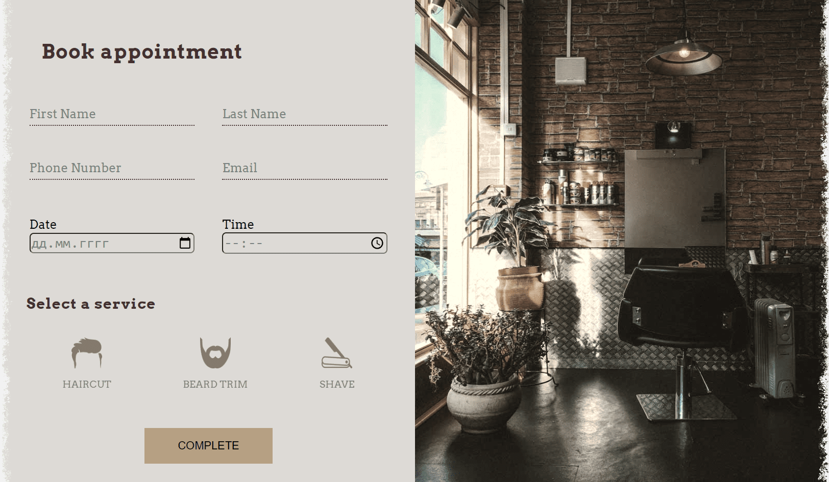
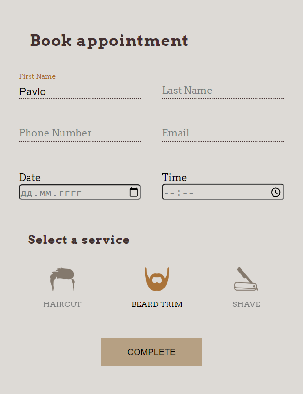
The booking section horizontally divided on two blocks: booking form and image. On small devices the booking form occupies all available horizontal space. The booking form allows the user to select the desired service by simply clicking on one of the three icons. Also they can choose the date and time of visiting the barbershop. First Name, Last Name, Email, Date and Time are required.
On large screens, the section has a maximum horizontal limit size and is framed in a grunge border on the sides. The Grunge border was designed in Adobe Photoshop using a painting brush. using painting brushes.
| Desktop | Mobile |
|---|---|
 |
 |
- The map is interactive and uses google api. The map is directly beneath the booking form and provides the user with the barbershop location. The map itself is embedded interactive Google Map that allows the users to save the location to their navigation or get direction to the barbershop. The current map location was choosen for example.
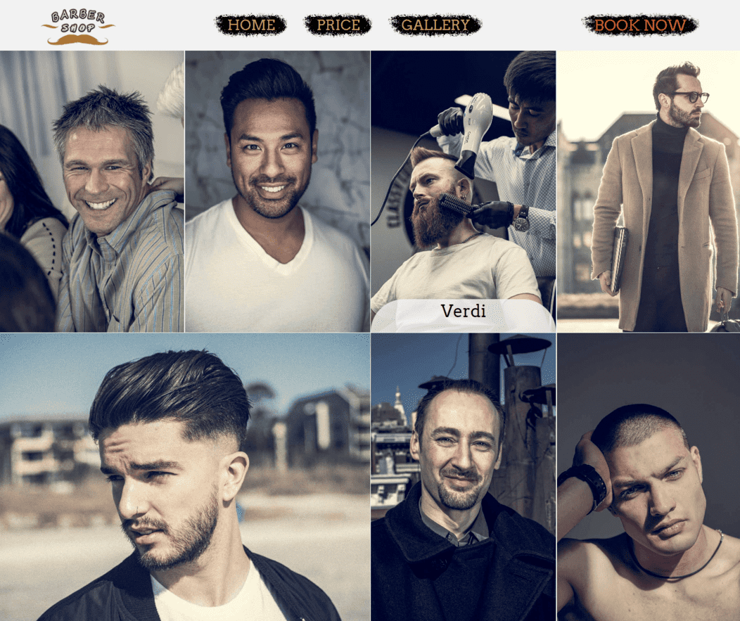
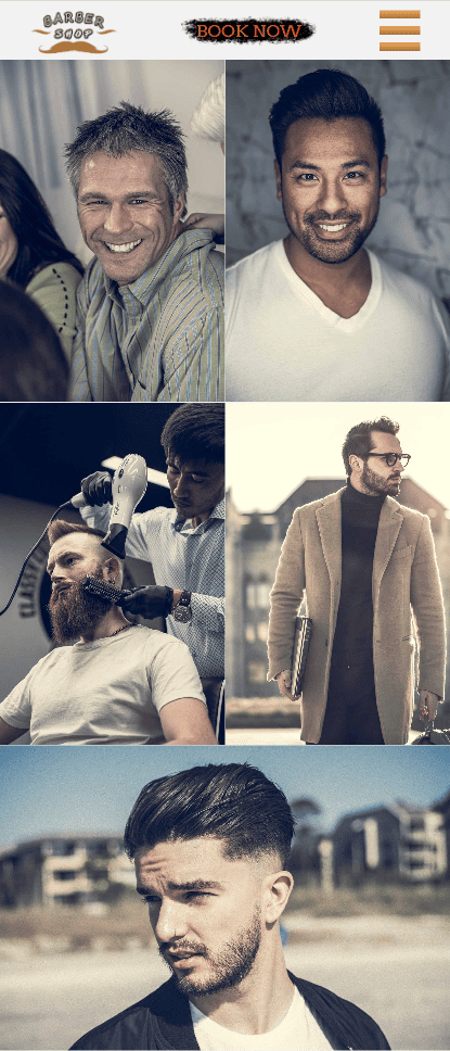
The gallery allows the user to look at different styles of services provided. Imagery of the barbershop arranged a responsively styled grid. As the screen resolution decreases, the number of columns in the grid decreases, allowing to keep images large enough for comfortable viewing. Also hovering the mouse over any photo provides it's style name displayed at the bottom of the image.
| Desktop | Mobile |
|---|---|
 |
 |
- HTML5 - building, structuring and presenting project
- CSS3 - website styling
- Balsamiq - wireframes
- Adobe Photoshop - grunge border, brush stroke, logo
- Adobe Lightroom - color grading, resizing
- iloveIMG - image compressing and resizing
- XConvert - image compressing and WebP converting
- VScode - code editing
- GIT, GitHub - tracking, storing, hosting project
- Chrome DevTools - inspecting and debugging code
See TESTING.md for an overview of website testing and debugging.
The Live link is https://flashdrag.github.io/barber-shop
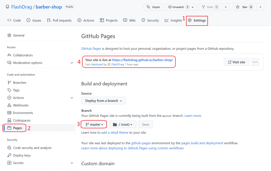
- In the GitHub repository, navigate to the Settings tab.
- Once in Settings, navigate to the Pages tab on the left hand side.
- In the Build and deployment section under Branch, select the master branch and click Save.
- Once the master branch has been selected, the page will be automatically refreshed and a display indicates the successful deployment and the link to the address.
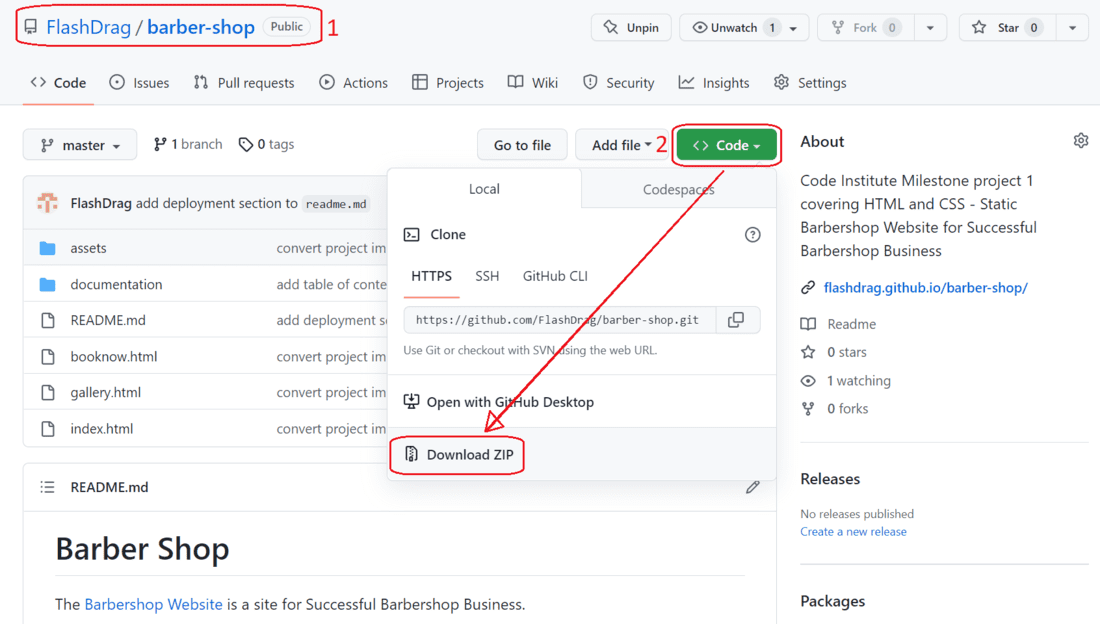
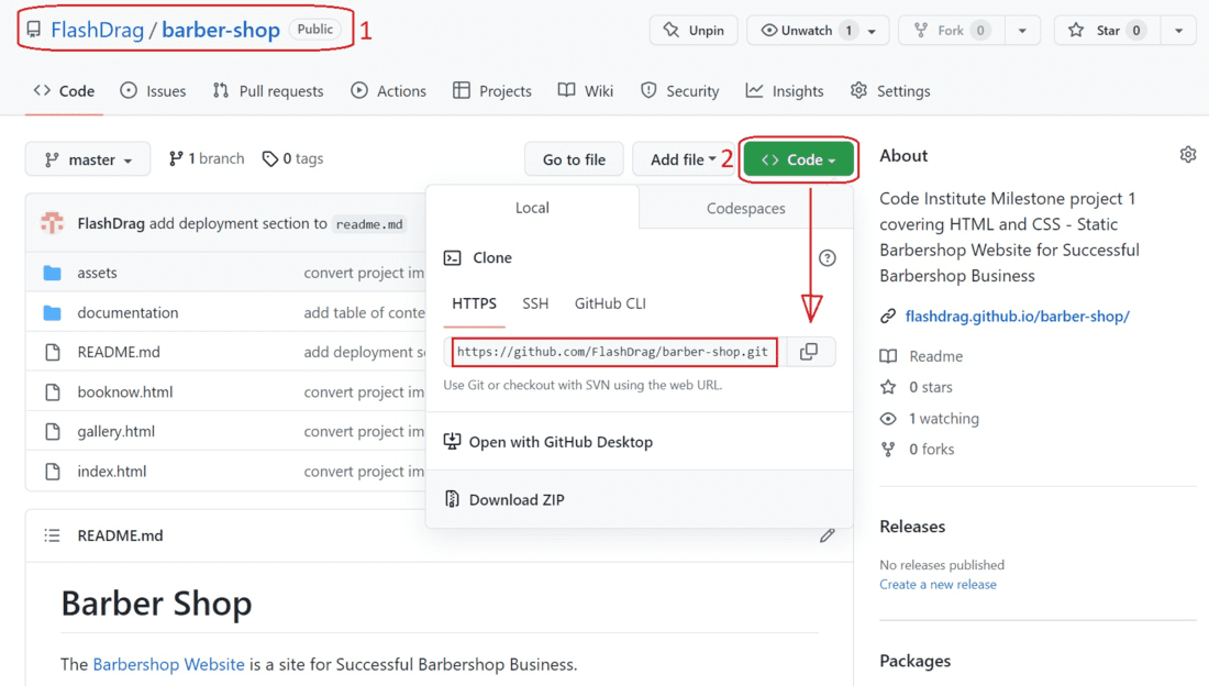
- Go to the Barbershop Github Repo
- Click on the green Code button and Download ZIP
- Extract the ZIP file on your local machine
- Run the index.html file in a browser
- Go to the Barbershop Github Repo
- Click the Code button to the right of the screen and copy the HTTPs link there
- Open a GitBash terminal and navigate to the directory where you want to locate the clone
- Type
git cloneand paste the copied HTTPs link, press the Enter key to begin the clone process
The Barbershop site based on my own implementation of code, applying what I've learned from CodeInstitute Full Stack Developer Course and other tutorials.
- CSS Input Field Style was implemented based on the code examples from FreeFrontend
- Hamburger Menu was implemented based on the code tutorials from the Alvarotrigo posts How To Make a Responsive Hamburger Menu and 10+ Hamburger Menu Examples [CSS Only]
- Google Map - map
- Google Fonts - fonts
- FontAwesome, Uxwing - icons
- Pexels, Pixabay, StockSnap - Free Stock Images


