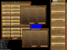
A GUI Library for jMonkeyEngine based on a heavily modified version of Tonegod's 'Tonegodgui'.
It started life as an extension to TonegodGUI adding Swing-like layout managers, in particular 'Mig Layout'. However, TonegodGUI seems no longer maintained, and maintaining 100% compatibility with it seemed pointless.
Now Mavenized, Icetone greatly expands on the features and abilities provided by TonegodGUI with a more concise API. Also added are a number of additional components such as Split Pane, Table, and an XHTML renderer based on Flying Saucer.
Many thanks to Tonegod for releasing her GUI under a permissive license, and all the authors of extra components such as the TTF Renderer too!
And just in case you wondered, I pronounce Icetone as ice-eh-tone.
- Demo
- Library Installation
- HelloWorld
- Differences Between Icetone and TonegodGUI
- Concepts And Terminology
- CSS Support And Themes
- Controls
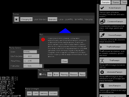
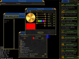
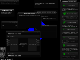
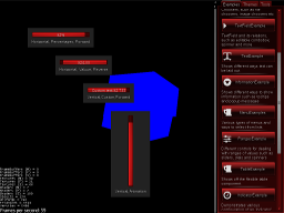
To dive right in and explore what Icetone can do, see the demo JME application ExampleRunner. Once installed, it is self updating.
The easiest way is to use the Maven artifacts. They are hosted on Bintray, so add configuration appropriate for your build system.
Add the repository and all of the Icetone modules you require as dependencies. At a minimum, you will need icetone-core and one of the themes, such as icetone-theme-default
...

	<repositories>
        <repository>
            <snapshots>
                <enabled>false</enabled>
            </snapshots>
            <id>bintray-rockfireredmoon-ice</id>
            <name>bintray</name>
            <url>https://dl.bintray.com/rockfireredmoon/ice</url>
        </repository>
    </repositories>

...

	<dependencies>
		<dependency>
			<groupId>io.github.rockfireredmoon</groupId>
			<artifactId>icetone-core</artifactId>
			<version>0.9.0</version>
		</dependency>
		<dependency>
			<groupId>io.github.rockfireredmoon</groupId>
			<artifactId>icetone-theme-default</artifactId>
			<version>0.9.0</version>
		</dependency>
	</dependencies>
repositories {
	maven {
		url  "https://dl.bintray.com/rockfireredmoon/ice"
	}
}

...

compile 'io.github.rockfireredmoon:icetone-core:0.9.0'
compile 'io.github.rockfireredmoon:icetone-theme-default:0.9.0'
<dependency org='io.github.rockfireredmoon' name='icetone-core' rev='0.9.0'>
	<artifact name='icetone-core' ext='jar' />
</dependency>
<dependency org='io.github.rockfireredmoon' name='icetone-theme-default' rev='0.9.0'>
	<artifact name='icetone-theme-default' ext='jar' />
</dependency>Development versions of Icetone are available in a separate repository.
	<repositories>
        <repository>
        	 <snapshots/>
            <releases>
                <enabled>false</enabled>
            </releases>
            <id>taw-snapshots</id>
            <name>TAW Snapshots</name>
			 <url>http://files.theanubianwar.com/maven/snapshots</url>
        </repository>
</repositories>For the impatient, here is the ubiquitous HelloWorld example for Icetone. It simply displays a a text label on an immovable panel at the top left of the screen.
import com.jme3.app.SimpleApplication;

import icetone.controls.containers.Panel;
import icetone.controls.text.Label;
import icetone.core.Screen;

public class HelloWorld extends SimpleApplication {

	public static void main(String[] args) {
		new HelloWorld().start();
	}

	@Override
	public void simpleInitApp() {
		Screen.init(this).addElement(new Panel().addElement(new Label("Hello World!")));
	}

}- Different namespace (tonegod.gui vs icetone).
- TonegodGUI was Java 6 and above, Icetone is Java 8 and above only.
- Icetone makes use of generics for many of the components.
- File based layout and styling in TonegodGUI was a restricted XML format. Icetone uses CSS for styling of all element attributes and YAML based component and screen layouts.
- TonegodGUI used sub-classing for event handling, Icetone uses listeners (configured using Lamda syntax)
- TonegodGUI's 'Docking and Borders' (and the new Layout interface) layout system has been completely removed and replaced entirely with my Layout implementation. Lots of ready made layout managers are provided.
- Icetone contains a more refined control suite with additional controls, bug fixes and features.
- TonegodGUI had a two ways of rendering text, Icetone has a pluggable system that provides 4 different methods depending on yours, including TTF support provided by JMETTF.
A brief overview of the terminology used in this document and Icetone itself.
- ToolKit A singleton that provides services such as OS integration, stylesheet and theme loading and more.
- Container Generally, a container of child Element objects. A container may or may not take up a node in the 3D scene. A container has a Layout Manager that is responsible for laying out it's children within its allocated space. It has a minimum, maximum and preferred size that may either be set or calculated by the layout manager. All containers implements
ElementContainer. - Screen The top level Container. Generally you only need one of these, which must be initialised at the start of your application. If you take this approach, you do not need to pass the
Screeninstance to every child element you construct. If you create multipleScreeninstances, you will need to pass the reference to it to each control. - Element The base of all discrete controls. If you were to create a new control, you would probably want to extend either this, or
BaseElement(which has no CSS capabilities). An element is also a Container, but they are not obliged to actually support child elements in a meaningful way. - Control A specialized Element that provides some kind of UI widget, e.g. a
PushButton,CheckBoxand so on. This is different to the JME3 meaning of Control, and may be changed in the future to avoid confusion. - Stylesheet A CSS file describing the appearance of a
StyledElement. - Theme A collection of CSS files, images and meta-data providing an either entire theme for the toolkit, or a pseudo-theme for a specific controls.
- Layout Manager Provides layout and preferred size calculations for a Container. Several different layout managers are provided, including
BorderLayout,FillLayout,GridLayout,FixedLayoutand the very powerfulMigLayout. You may create your own by implementingLayout.
Icetone has incredibly powerful CSS support, allowing GUI elements to be styled, sized and positioned entirely using CSS.
As with CSS as it is used in HTML, in Icetone, you generally select elements based on :-
- Their element name (which maps to the base Java class name of the control). For example,
icetone.controls.text.Labelwould be expressed asLabelin CSS. - Their element ID. When not supplied in code, this is auto-generated. To set in code, use
yourElement.setStyleId("myId"). This would then be referenced in CSS as#myId. - Their element class(es). An element may have multiple classes which may be set using
yourElement.addStyleClass("aClass")andyourElement.setStyleClass("aClass bClass").
As with HTML CSS, you can specify a path to your element(s) to style. Taking the HelloWorld above as an example, you could style label and make it red with following :-
Frame Panel Label {
	color: red;
}
Many other selector and pseudo expressions are supported including :focus, :hover, :nth-child(n) and more.
Many styles such as font styling support inheritance, and relative sizes are supported too.
There are a number of different ways CSS may actually be applied to elements.
-
Themes. The CSS contained within a theme is automatically applied to all elements in a component hierarchy. See below for more on Themes.
-
You can set arbitrary CSS on any control or container. If set on a container, and the style is inherited by children (e.g. font), then all children will receive that style too.
yourElement.setCss("color: red;"); -
Add a an entire stylesheet to a control or container.
yourElement.addStylesheet(Screen.get().getApplication().getAssetManager().loadAsset(new AssetKey<Stylesheet>("mystyles.css")));
CSS Stylesheets may be grouped together in Themes, and along with some meta-data may be deployed as self contained Jar files that can be automatically discovered by Icetone at runtime.
You can either set a global theme, or even different themes on certain parts of your GUI. Theme changes can be requested 'live', with the new style being applied immediately without restarting the application.
If you want to create a reusable custom component and share it with others, you may wish to supply some default CSS along with this component. A special theme type, a Pseudo Theme, fills this role. Such themes are always loaded along with the main theme (or it can be configured to only work with certain themes using a regular expression pattern).
There are several themes included in the Icetone source tree, although you probably can't legally use most of them in a commercial application. They are included for educational and testing purposes.
| Key | Type | Description |
|---|---|---|
| icetone-theme-antique | Full (WIP) | Based on Antique GTK2 theme (https://www.gnome-look.org/p/1079047/). |
| icetone-theme-default | Full | Default basic theme, good starting point for your own |
| icetone-theme-fontawesome | Pseudo theme | Adds FontAwesome icons and a Java helper to add them to buttons and other elements |
| icetone-theme-gold | Full (WIP) | For my own project, based on abandoned MMORPG Earth Eternal |
| icetone-theme-paranoid | Full | Based on paranoid GTK2 theme (http://monkeymagico.deviantart.com/art/Paranoid-188858834). |
| icetone-theme-slickness-ruby | Full | Based on Slickness Ruby GTK2 theme (https://www.gnome-look.org/p/1014503/). |
| icetone-theme-steampunk | Full (WIP) | Based on SteamPunk WindowBlinds theme (http://www.wincustomize.com/explore/windowblinds/6961/). |
Themes can be installed either by just adding them to the applications CLASSPATH, or you can add them using JMonkey's asset system.
ToolKit.get().getStyleManager().addTheme("/path/to/your.theme");
// or
ToolKit.get().getStyleManager().addTheme(new AssetKey<Theme>("/path/to/your.theme")));This will set the theme globally.
StyleManager mgr = ToolKit.get().getStyleManager();
mgr.setTheme(mgr.getTheme("MyThemeName"));Icetone comes with a suite of common controls that should cover most if not all of your needs. All controls are fully styleable with CSS using methods described above.
Below is an overview of all of the standard controls included with Icetone. Most controls will have many other configurable attributes and actions, see the source for each control for details.
Button control types provide a way for the user to interact with clicks to perform an action. Some maintain state, and / or may be grouped (e.g. RadioButton).
Buttons support an icon (any image) and / or text.
The most basic button type, provides a control for the user to click. A MouseUIButtonEvent event is fired upon click which may be listened for and acted upon.
import com.jme3.app.SimpleApplication;

import icetone.controls.buttons.PushButton;
import icetone.controls.containers.Panel;
import icetone.core.Screen;

public class PushButtonExample extends SimpleApplication {

	public static void main(String[] args) {
		new PushButtonExample().start();
	}

	@Override
	public void simpleInitApp() {
		Screen.init(this).addElement(new Panel()
				.addElement(new PushButton("Press Me!").onMouseReleased((evt) -> System.out.println("Button pressed!")))
				.centerToParent());
	}

}Similar to PushButton, but maintains a boolean state that once the button is pressed, remains active until the button is pressed again. Like RadioButton it may be added to a ButtonGroup. A UIChangeEvent event is fired upon click which may be listened for and acted upon.
import com.jme3.app.SimpleApplication;

import icetone.controls.buttons.ToggleButton;
import icetone.controls.containers.Panel;
import icetone.core.Screen;

public class PushButtonExample extends SimpleApplication {

	public static void main(String[] args) {
		new PushButtonExample().start();
	}

	@Override
	public void simpleInitApp() {
		Screen.init(this)
				.addElement(new Panel().addElement(new ToggleButton("Press Me!").onChange(
						(evt) -> System.out.println("Armed = " + evt.getNewValue())))
						.centerToParent());
	}

}A simply dual state button that may be true or false. A UIChangeEvent is fired when this state changes.
import com.jme3.app.SimpleApplication;

import icetone.controls.buttons.CheckBox;
import icetone.controls.containers.Panel;
import icetone.core.Screen;

public class CheckBoxExample extends SimpleApplication {

	public static void main(String[] args) {
		new CheckBoxExample().start();
	}

	@Override
	public void simpleInitApp() {
		Screen.init(this).addElement(new Panel()
				.addElement(new CheckBox("Toggle Me!").onChange((evt) -> System.out.println("I've been toggled!")))
				.centerToParent());
	}

}Radio Buttons allow toggling between more than two states, allowing buttons to be grouped. When arranged this way, clicking on one button to select it will deselect the current button.
import com.jme3.app.SimpleApplication;

import icetone.controls.buttons.RadioButton;
import icetone.controls.buttons.ButtonGroup;
import icetone.controls.containers.Panel;
import icetone.core.Screen;
import icetone.core.layout.MigLayout;

public class RadioButtonExample extends SimpleApplication {

	public static void main(String[] args) {
		new RadioButtonExample().start();
	}

	@Override
	public void simpleInitApp() {
		BaseScreen screen = Screen.init(this);
		ButtonGroup<RadioButton<Integer>> grp = new ButtonGroup<>();

		RadioButton<Integer> one = new RadioButton<>("One");
		RadioButton<Integer> two = new RadioButton<>("Two");
		RadioButton<Integer> three = new RadioButton<>("Three");

		grp.addButton(one).addButton(two).addButton(three);
		grp.onChange((evt) -> System.out.print("Value: " + grp.getSelected().getValue()));

		Panel panel = new Panel(new MigLayout("wrap 1"));
		panel.addElement(one);
		panel.addElement(two);
		panel.addElement(three);

		screen.addElement(panel.centerToParent());
	}

}A Dial is a circular control, allowing choice of a value within a range of values. Values may be chosen by either clicking on the appropriate position along the circumference of the dial or dragging in a circular motion. It basically mimics a Volume Dial.
import com.jme3.app.SimpleApplication;

import icetone.controls.lists.Dial;
import icetone.controls.containers.Panel;
import icetone.core.Screen;

public class DialExample extends SimpleApplication {

	public static void main(String[] args) {
		new DialExample().start();
	}

	@Override
	public void simpleInitApp() {
		Screen.init(this).addElement(
				new Panel().addElement(new Dial<Integer>().addStepValue(1).addStepValue(2).addStepValue(3)).centerToParent());
	}

}Sliders are horizontal and vertically arranged controls that allow choice of a value within a range of values. Values may be chosen by either clicking on the appropriate position along the width or height of the slider or dragging in a horizontal or vertical motion.
import com.jme3.app.SimpleApplication;

import icetone.controls.lists.Slider;
import icetone.controls.lists.IntegerRangeSliderModel;
import icetone.controls.containers.Panel;
import icetone.core.Screen;

public class SliderExample extends SimpleApplication {

	public static void main(String[] args) {
		new SliderExample().start();
	}

	@Override
	public void simpleInitApp() {
		Screen.init(this)
				.addElement(new Panel().addElement(
						new Slider<Integer>()
							.onChanged((evt) -> System.out.println("New value " + evt.getSource().getSelectedValue()))
							.setSliderModel(new IntegerRangeSliderModel(0, 100, 50)))
							.centerToParent());
	}

}
You can use different models to select different types using this control. Two models are provided, IntegerRangeSliderModel and FloatRangeSliderModel, and you can add your own custom models by implementing SliderRangeModel.
A Select List contains vertically stacked values of any type. It may be configured for no, single or multiple selection modes. A UIChangeEvent is fired when this state changes.
import com.jme3.app.SimpleApplication;

import icetone.controls.containers.Panel;
import icetone.controls.lists.SelectList;
import icetone.core.Screen;

public class SelectListExample extends SimpleApplication {

	public static void main(String[] args) {
		new SelectListExample().start();
	}

	@Override
	public void simpleInitApp() {
		Screen.init(this).addElement(new Panel().addElement(new SelectList<String>().onChanged((evt) -> {
			System.out.print("Selected " + evt.getSource().getSelectedValue());
		}).addListItem("Value 1").addListItem("Value 2").addListItem("Value 3").addListItem("Value 4")));
	}

}
A drop down menu is activated by click on the button, allowing choice of the current value which is then displayed. A UIChangeEvent is fired when this state changes.
import com.jme3.app.SimpleApplication;

import icetone.controls.containers.Panel;
import icetone.controls.lists.ComboBox;
import icetone.core.Screen;

public class ComboBoxExample extends SimpleApplication {

	public static void main(String[] args) {
		new ComboBoxExample().start();
	}

	@Override
	public void simpleInitApp() {
		Screen.init(this)
				.addElement(new Panel().addElement(
						new ComboBox<String>("Value 1", "Value 2", "Value 3", "Value 4")
							.onChange((evt) -> System.out.println("New value " + evt.getSource().getSelectedValue())))
							.centerToParent());
	}

}
You may also set the control as editable using comboBox.setEditable(true). The editable text field may then be accessed using comboBox.getTextField() allowing you to attach to it's events and otherwise configure it.
Spinners are horizontal and vertically arranged controls that allow choice of a value within a range of values. Values may be chosen by either editing the text field, or clicking on the range increase / decrease buttons.
import com.jme3.app.SimpleApplication;

import icetone.controls.containers.Panel;
import icetone.controls.lists.IntegerRangeSpinnerModel;
import icetone.controls.lists.Spinner;
import icetone.core.Screen;

public class SpinnerExample extends SimpleApplication {

	public static void main(String[] args) {
		new SpinnerExample().start();
	}

	@Override
	public void simpleInitApp() {
		Screen.init(this)
				.addElement(new Panel().addElement(
						new Spinner<Integer>(new IntegerRangeSpinnerModel(0, 10, 1, 5))
							.onChange((evt) -> System.out.println("New value " + evt.getSource().getSelectedValue())))
							.centerToParent());
	}

}
You can use different models to select different types using this control. Three models are provided, StringRangeSpinnerModel, IntegerRangeSpinnerModel and FloatRangeSpinnerModel, and you can add your own custom models by implementing SpinnerModel.
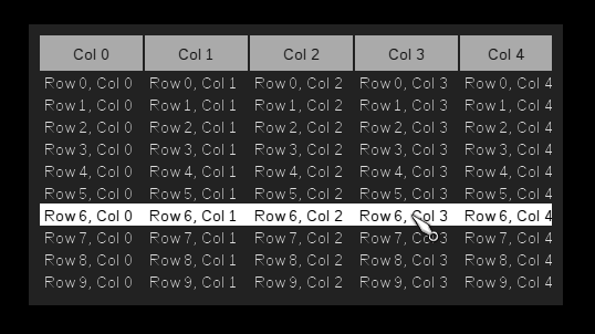
As you might expect, this control can be used to display tabular data. The table must first have it's column headers added to it using the table.addColumn() method. Then one or more TableRow child elements should be added with table.addRow(row), with each of these having the cell data for that row and column added with tableRow.addCell().
import com.jme3.app.SimpleApplication;

import icetone.controls.containers.Panel;
import icetone.controls.table.Table;
import icetone.controls.table.TableRow;
import icetone.core.Measurement.Unit;
import icetone.core.Screen;
import icetone.core.Size;
import icetone.core.layout.FillLayout;

public class TableExample extends SimpleApplication {

	public static void main(String[] args) {
		new TableExample().start();
	}

	@Override
	public void simpleInitApp() {
		Screen.init(this).showElement(new Panel(new FillLayout()) {
			{
				addElement(new Table() {
					{
						for (int i = 0; i < 5; i++)
							addColumn("Col " + i);
						for (int i = 0; i < 10; i++) {
							String r = "Row " + i;
							addRow(new TableRow(this) {
								{
									for (int j = 0; j < 5; j++)
										addCell(r + ", Col " + j, j);
								}
							});
						}
					}
				});
				setPreferredDimensions(new Size(480, 0, Unit.PX, Unit.AUTO));
				setPosition(100, 100);
			}
		});
	}
}May be oriented horizontally or vertically, a scroll bar allows a value (up to a configured maximum) to be chosen by either clicking on dragging the central area, or clicking on the increase / decrease buttons at either end. It is used by ScrollPanel, but you may also add it as a standalone control like any other.
import com.jme3.app.SimpleApplication;

import icetone.controls.containers.Panel;
import icetone.controls.scrolling.ScrollBar;
import icetone.core.Screen;
import icetone.core.Size;
import icetone.core.layout.FillLayout;

public class ScrollBarExample extends SimpleApplication {

	public static void main(String[] args) {
		new ScrollBarExample().start();
	}

	@Override
	public void simpleInitApp() {
		Screen.init(this).showElement(new Panel(new FillLayout()) {
			{
				addElement(new ScrollBar().onChanged(evt -> System.out.println(evt.getNewValue()))
						.setPreferredDimensions(new Size(300, 24)));
			}
		});
	}

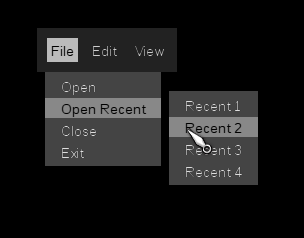
}A MenuBar provides a horizontal container that can contain one or more Menu controls. Each Menu contains one or more MenuItem controls. A Menu is also a MenuItem, allowing sub-menus to be added.
package icetone.examples;

import com.jme3.app.SimpleApplication;

import icetone.controls.containers.Panel;
import icetone.controls.menuing.Menu;
import icetone.controls.menuing.MenuBar;
import icetone.core.Screen;
import icetone.core.layout.FillLayout;

public class MenuBarExample extends SimpleApplication {

	public static void main(String[] args) {
		new MenuBarExample().start();
	}

	@Override
	public void simpleInitApp() {
		Screen.init(this).showElement(new Panel(new FillLayout()) {
			{
				setPosition(100, 100);
				addElement(new MenuBar() {
					{
						addMenu(new Menu<String>("File") {
							{
								addMenuItem("Open");
								addMenuItemElement(new Menu<String>("Open Recent") {
									{
										addMenuItem("Recent 1");
										addMenuItem("Recent 2");
										addMenuItem("Recent 3");
										addMenuItem("Recent 4");
									}
								});
								addMenuItem("Close");
								addMenuItem("Exit");
							}
						});
						addMenu(new Menu<String>("Edit") {
							{
								addMenuItem("Cut");
								addMenuItem("Copy");
								addMenuItem("Paste");
							}
						});
						addMenu(new Menu<String>("View") {
							{
								addMenuItem("Refresh");
							}
						});
					}
				});
			}
		});
	}

}This is the base class for all Icetone UI components, and can act as a non-styled generic container for any elements.
A BaseElement has a Layout (see Layout section below) to position it's child elements.
Extends BaseElement adding CSS capabilities, and can act as a styled generic container for any elements. All built in controls extend this.
An Element has a Layout (see Layout section below) to position it's child elements.
Very similar to BaseElement, but has no mesh added to the scene, so cannot have a background or any other visual elements itself. Its sole purpose is to save on one node in the scene graph.
Very similar to Element, but as wih Container has no mesh added to the scene, so cannot have a background or any other visual elements itself. Its sole purpose is to save on one node in the scene graph.
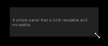
The simplest container that has a visual component, which by default is a simple background colour or image. Child elements are added directly to it.
This example also demonstrates a technique I have found useful using Icetone, using an 'instance initializer' to construct a component. The code between {{ and }} is run within the context of the Panel object. This (together with using MigLayout) makes it possible to arrange your Java code in a way that reflects the actual layout. If you prefer though, you can just construct the controls and invoke it's methods in the normal way through a variable or chaining.
import com.jme3.app.SimpleApplication;
import com.jme3.font.LineWrapMode;

import icetone.controls.containers.Panel;
import icetone.controls.text.Label;
import icetone.core.Screen;
import icetone.core.Size;
import icetone.core.layout.FillLayout;

public class PanelExample extends SimpleApplication {

	public static void main(String[] args) {
		new PanelExample().start();
	}

	@Override
	public void simpleInitApp() {
		Screen.init(this).showElement(new Panel(new FillLayout()) {
			{
				addElement(
						new Label("A simple panel that is both resizable and moveable").setTextWrap(LineWrapMode.Word));
				setPreferredDimensions(new Size(300, 100));
				setPosition(440, 0);
			}
		});
	}

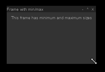
}A Frame is like a decorated Panel, i.e. it has a title bar, as well as optional window actions such as minimize, maximize, restore, close and menus.
It differs from Panel in that it has a Content Area where you add the actual children to the main area of the frame. This is where you would also normally set your required Layout.
FrameManagerAppState must be added for automatic handling of minimize, maximize etc
import com.jme3.app.SimpleApplication;

import icetone.controls.containers.Frame;
import icetone.controls.text.Label;
import icetone.core.BaseScreen;
import icetone.core.Screen;
import icetone.core.Size;
import icetone.extras.appstates.FrameManagerAppState;

public class FrameExample extends SimpleApplication {

	public static void main(String[] args) {
		new FrameExample().start();
	}

	@Override
	public void simpleInitApp() {
		BaseScreen screen = Screen.init(this);

		/* You need FrameManangerAppState to handle minimize, maximize and restore */
		getStateManager().attach(new FrameManagerAppState(screen));

		screen.showElement(new Frame() {
			{
				setTitle("Frame with min/max");
				setMovable(true);
				setResizable(true);
				setMinimizable(true);
				setMaximizable(true);
				setCloseable(true);
				setMinDimensions(new Size(200, 200));
				setMaxDimensions(new Size(400, 400));
				getContentArea().addElement(new Label("This frame has minimum and maximum sizes"));
			}
		});
	}

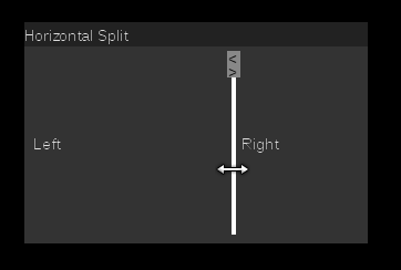
}A Split Panel contains exactly 2 child components, either positioned left-right (Orientation.HORIZONTAL) or top-bottom (Orientation.VERTICAL). The space allocated to either component can be adjusted by the user, by clicking and dragging on the divider bar.
import com.jme3.app.SimpleApplication;

import icetone.controls.containers.Frame;
import icetone.controls.containers.SplitPanel;
import icetone.controls.text.Label;
import icetone.core.Screen;
import icetone.core.Size;
import icetone.core.layout.FillLayout;

public class SplitPanelExample extends SimpleApplication {

	public static void main(String[] args) {
		new SplitPanelExample().start();
	}

	@Override
	public void simpleInitApp() {
		Screen.init(this).showElement(new Frame() {
			{
				setResizable(true);
				setTitle("Horizontal Split");
				getContentArea().setLayoutManager(new FillLayout());
				getContentArea().addElement(new SplitPanel() {
					{
						setLeftOrTop(new Label("Left"));
						setRightOrBottom(new Label("Right"));
					}
				});
				setPosition(20, 270);
				setPreferredDimensions(new Size(310, 200));
			}
		});
	}

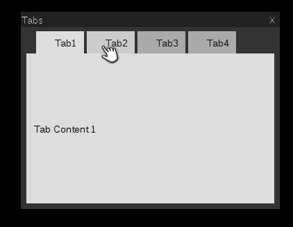
}A Tab Panel can contain one or more child elements, each of which may be made visible, one at a time by click on the tab header for that child. Tab headers may be place at any compass point surrounding the content. If the tab headers take up more space than is available, scroll arrows will appear.
import com.jme3.app.SimpleApplication;

import icetone.controls.containers.Frame;
import icetone.controls.containers.TabControl;
import icetone.controls.text.Label;
import icetone.core.Screen;
import icetone.core.Size;
import icetone.core.layout.FillLayout;

public class TabPanelExample extends SimpleApplication {

	public static void main(String[] args) {
		new TabPanelExample().start();
	}

	@Override
	public void simpleInitApp() {
		Screen.init(this).showElement(new Frame(new FillLayout()) {
			{
				setTitle("Tabs");
				setResizable(true);
				getContentArea().addElement(new TabControl() {
					{
						addTab("Tab1", new Label("Tab Content 1"));
						addTab("Tab2", new Label("Tab Content 2"));
						addTab("Tab3", new Label("Tab Content 3"));
						addTab("Tab4", new Label("Tab Content 4"));
					}
				});

				setPosition(20, 390);
				setPreferredDimensions(new Size(440, 340));
			}
		});
	}

}Can contain multiple child elements arrange in either or horizontal or vertical row. If children take up more space than is available, scroll buttons will be placed at either end of the container.
import com.jme3.app.SimpleApplication;

import icetone.controls.buttons.PushButton;
import icetone.controls.containers.Panel;
import icetone.controls.containers.SlideTray;
import icetone.core.Measurement.Unit;
import icetone.core.Screen;
import icetone.core.Size;
import icetone.core.layout.FillLayout;

public class SlideTrayExample extends SimpleApplication {

	public static void main(String[] args) {
		new SlideTrayExample().start();
	}

	@Override
	public void simpleInitApp() {
		Screen.init(this).showElement(new Panel(new FillLayout()) {
			{
				addElement(new SlideTray() {
					{
						addTrayElement(new PushButton("Button1"));
						addTrayElement(new PushButton("Button2"));
						addTrayElement(new PushButton("Button3"));
						addTrayElement(new PushButton("Button4"));
						addTrayElement(new PushButton("Button5"));
						addTrayElement(new PushButton("Button6"));
						addTrayElement(new PushButton("Button7"));
						addTrayElement(new PushButton("Button8"));
						addTrayElement(new PushButton("Button9"));
						addTrayElement(new PushButton("Button10"));
						addTrayElement(new PushButton("Button11"));
					}
				});
				setPreferredDimensions(new Size(250, 0, Unit.PX, Unit.AUTO));
				setPosition(100, 100);
			}
		});
	}

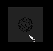
}Allows 3D scene elements (A JME Node) to be added to the 2D GUI.
import com.jme3.app.SimpleApplication;
import com.jme3.material.Material;
import com.jme3.math.ColorRGBA;
import com.jme3.renderer.RenderManager;
import com.jme3.renderer.ViewPort;
import com.jme3.scene.Geometry;
import com.jme3.scene.Node;
import com.jme3.scene.control.AbstractControl;
import com.jme3.scene.shape.Sphere;

import icetone.controls.containers.OSRViewPort;
import icetone.controls.containers.Panel;
import icetone.core.Screen;
import icetone.core.layout.FillLayout;

public class OSRViewportExample extends SimpleApplication {

	public static void main(String[] args) {
		new OSRViewportExample().start();
	}

	@Override
	public void simpleInitApp() {
		Screen.init(this).showElement(new Panel(new FillLayout()) {
			{
				Geometry geom = new Geometry("Sphere", new Sphere(8, 8, 1f));
				geom.addControl(new AbstractControl() {

					@Override
					protected void controlUpdate(float tpf) {
						spatial.rotate(0, tpf, 0);
					}

					@Override
					protected void controlRender(RenderManager rm, ViewPort vp) {
					}
				});

				Material mat = new Material(assetManager, "Common/MatDefs/Misc/Unshaded.j3md");
				mat.getAdditionalRenderState().setWireframe(true);
				geom.setMaterial(mat);

				Node n = new Node();
				n.attachChild(geom);

				addElement(new OSRViewPort(screen, 100, 100, n).setIgnoreMouse(true));
				setPosition(100, 100);
			}
		});
	}

}TODO
TODO
TODO
TODO
TODO
TODO
TODO
TODO
