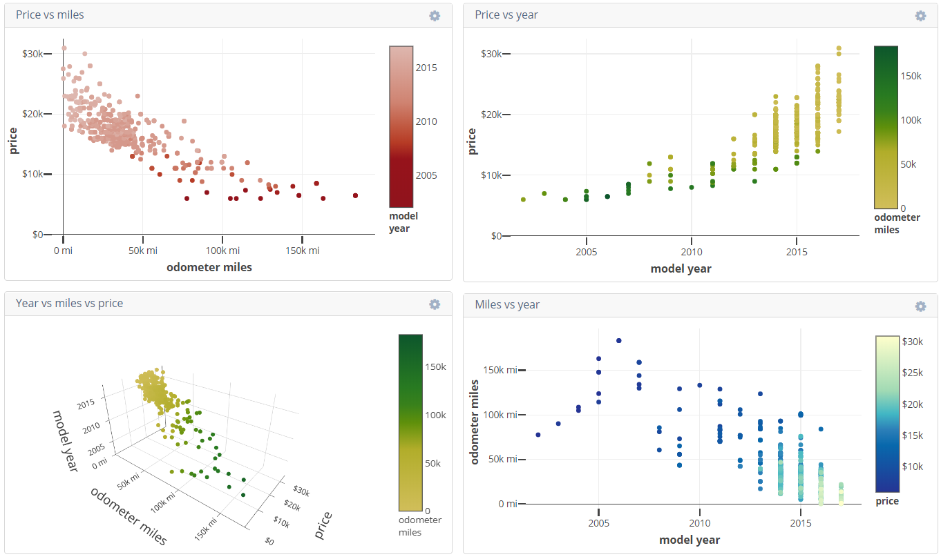
View results of 700+ cars at https://plot.ly/dashboard/pfroud0:4/present!
When shopping for a used car, how does model year and odometer mileage affect price? To find out, I wrote scripts to scrape data from the websites of car dealerships.
I was shopping for a midsize sedan. To minimize the number of variables, I only looked at Camrys from Toyota dealerships and Accords from Honda dealerships, both in the San Francisco Peninsula.
Here are the Toyota and Honda dealerships in the area. I scraped data from almost all of them.
|
AutoNation Toyota Hayward Capitol Toyota (San Jose) City Toyota (Daly City) Fremont Toyota Melody Toyota (San Bruno) Piercey Toyota (Milpitas) Putnam Toyota (Burlingame) San Francisco Toyota Toyota 101 (Redwood City) Toyota Sunnyvale | Anderson Honda (Palo Alto) AutoNation Honda Fremont Capitol Honda (San Jose) Honda Redwood City Honda of Hayward Honda of Serramonte (Colma, close to Daly City) Honda of Stevens Creek Larry Hopkins Honda (Sunnyvale) Ocean Honda of Burlingame San Francisco Honda South Bay Honda (Milpitas) Victory Honda of San Bruno |
* At the time this tool was written, Toyota of Palo Alto didn't list the mileage for each car when viewing search results. This was extremely stupid, so I didn't use data from that dealership.
** Stevens Creek Toyota loads data with an asynchronous request that uses cookies and a nonce. I couldn't be bothered to bypass it.
I tried Plotly for generating and hosting my plots. It works but the web-based backend is terrible. The plots are made from the July 30th 2017 dataset.
The data has three dimensions, so a 3D scatter plot seemed like an obvious choice. It turns out 3D plots are difficult to understand when viewed on a 2D screen.
I also made 2D scatter plots with for each combination of dimensions. These plots use two spacial dimensions and one color dimension, so they contain all the information but are much easier to digest.
- 2D scatter plot of price vs year
- 2D scatter plot of miles vs year
- 2D scatter plot of price vs miles
- 3D scatter plot of price vs miles vs year
I observed these trends:
- Odometer mileage is inversely proportional to price (view plot). This makes sense—lower miles demand high prices.
- Model year is directly proportial to price (view plot). This also makes sense—newer cars sell for more.
- For model years 2011 and newer, odometer mileage is inversely proportional to model year (view plot). This makes sense—newer models have less time to accumulate miles.
- For model years 2005 and older, odometer mileage is directly proportional to model year (view plot). This is unexpected—in some cases, newer cars have more odometer miles than older cars.
