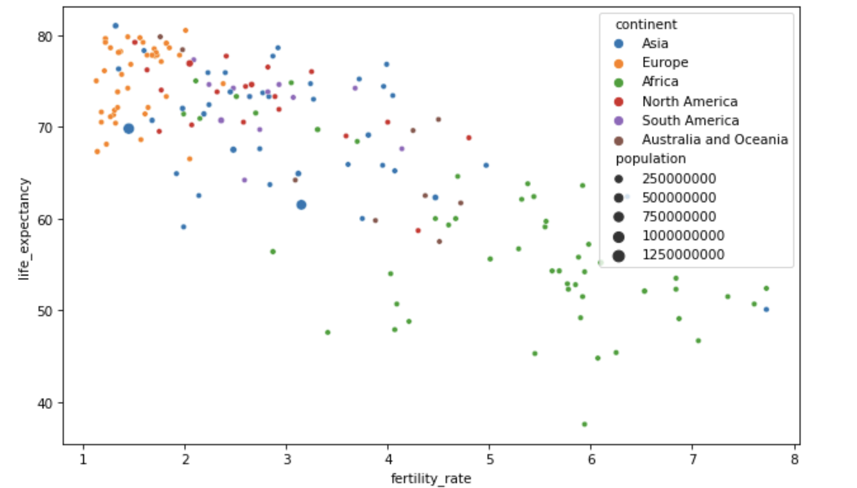
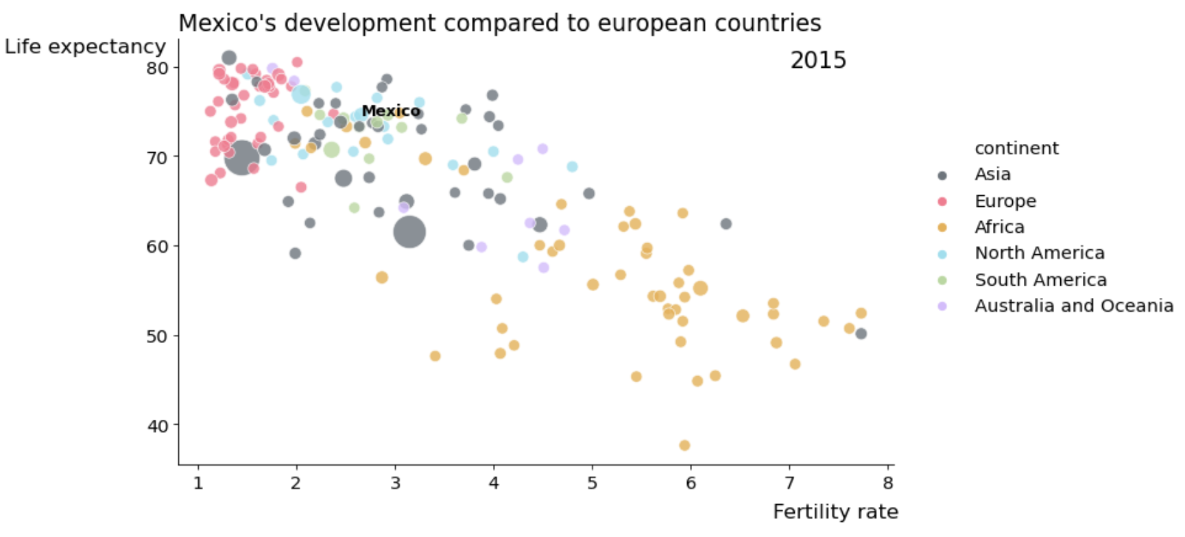
A step by step improvement of a standard seaborn plot following common explanatory data visualization best practices:
- SIMPLIFY
- DRAW ATTENTION to your message (and separate from background)
- USE COLOR WITH INTENTION
- ANNOTATE
- CHOOSE THE RIGHT CHART
All using seaborn and matplotlib.
The notebook is derived from content originally designed for a Data Science encounter at Spiced Academy
Licensed under CC BY-SA 4.0

