shiny-obAnalytics is an experimental tool/demo developed using the shiny web application framework for R. The tool demonstrates use of obAnalytics - an R package created to visualise and explore limit order book data.
The data is based on 8 days of limit order book events obtained from the bitstamp (bitcoin) exchange between 2015-08-18 and 2015-08-25 and has been preprocessed with obAnalytics.
The time period covers a substantial depreciation (-24% over 7 days) and a significant market crash (-12% in < 30 minutes.)
The purpose of the tool is to be able to zoom in to specific periods in time and explore/visualise various aspects of market microstructure.
The interface is divided into 2 sections: The left-hand-side, containing the time period, price and volume filters, and the right-hand-side containing a number of tabs, each of which are described briefly below.
More detailed information can be found in the obAnalytics repository.
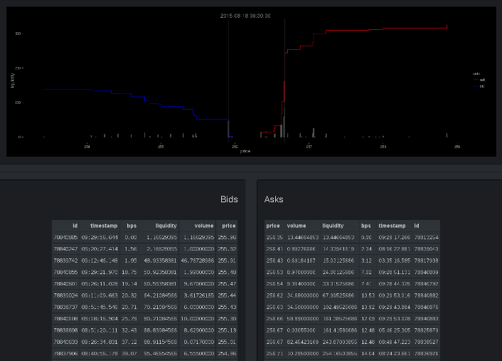
The first tab describes the limit order book for a specific point in time.
The graph in the top panel shows the cumulative volume on each side of the order book (blue = bid, red = ask) along with an indication of the largest 99% quantile orders. The actual limit order book is shown below the graph, limited to +-100 BPS in depth.
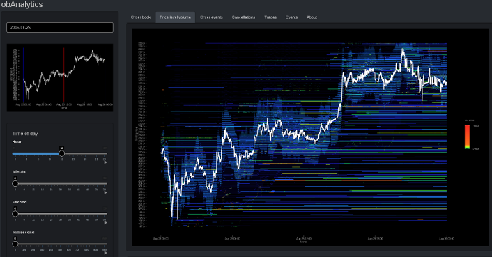
The price level volume graph shows the amount of volume available at each price level in the order book through time.
The graph has been colour coded such that lower quantities of volume appear in blue, whilst higher amounts of volume appear red. Since volume size is exponentially distributed, the interface provides an option to weight the colour coding or use a logarithmic scale.
The depth percentile plot is shown below the price level volume graph. It shows the amount of volume available in +- 25 BPS increments above and below the best bid and ask through time. It is intended to depict market liquidity.
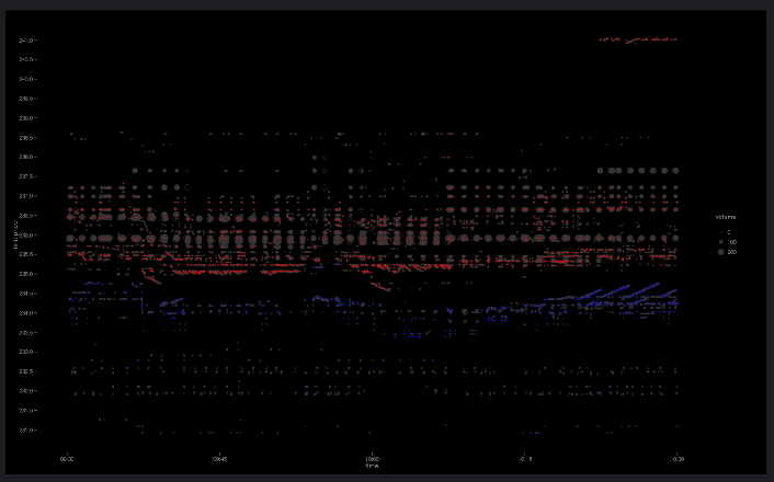
The order events tab shows the point in time at which limit orders are added or removed from the order book.
Here, red points correspond to ask side orders, whilst blue correspond to bids. An opaque circle corresponds to an add event, whilst transparent corresponds to an order cancellation. The size of the point is determined by the amount of volume. The graph is intended to show identifiable systematic activity.
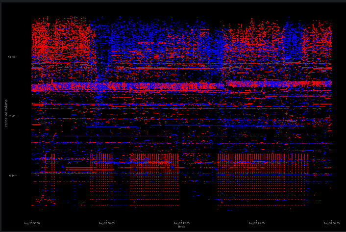
The cancellation tab shows volume cancellation through time.
Each point (red = ask, blue = bid) corresponds to a cancelled limit order (y-axis = volume). The intention of the graph is to identify the behaviour of individual market participants.
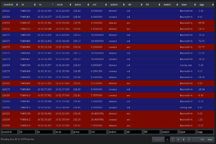
In addition to visualisation, the interface includes an interactive DataTables view of trade and individual limit order events (add, update, delete).
All of the above graphs and tables may be filtered by time, price and volume.
If not specified, the tool will try to automatically determine the price and volume range based on the distribution of events.
For convenience, price and volume histograms are shown to help determine the filtering range.
## clone repository
git clone https://github.com/phil8192/shiny-ob-analytics.git## R: install shiny and obAnalytics
install.packages(shiny)
install.packages(devtools)
library(devtools)
install_github("phil8192/ob-analytics")## set launch.browser=F to not launch a browser
cd shiny-ob-analytics
R --silent -e 'shiny::runApp(".", launch.browser=T)'install.packages(shiny)
library(shiny)
runGitHub("shiny-ob-analytics", "phil8192")install.packages(devtools)
library(devtools)
install_github("rstudio/shinyapps")
install_github("phil8192/ob-analytics")
library(shinyapps)
setAccountInfo(name="<account>", token="<token>", secret="<secret>")
deployApp("~/location/of/shiny-ob-analytics")A demo is available on shinyapps.io. Please allow a few seconds for the data to load: https://infrared.shinyapps.io/shiny-ob-analytics
GPL (>= 2)

