Summary: Font vectors are a form of transfer learning that can be used to create novel font combinations.
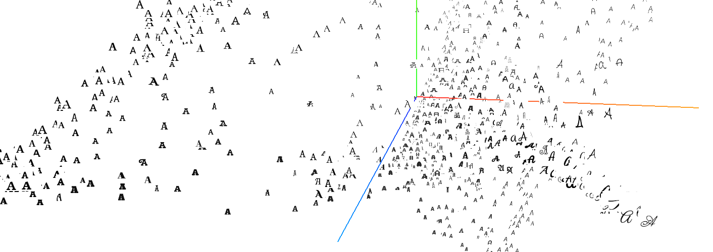
Try the font pairing tool at http://fontjoy.com or play with the tensorboard projector at http://fontjoy.com/projector/ - (try T-SNE with a perplexity value of 30)
Extracting feature vectors from images isn't an entirely new idea. You take an image, put it through a fixed feature extractor and get a representative vector on the other side. The basic idea behind this is covered in http://cs231n.github.io/transfer-learning/
If we use images of fonts, we get a vector that encodes the visual information of the font.
The font vector is an abstract representation of what the font looks like. Because it's just a vector we can use vector arithmetic to compare different fonts.
You can create feature vectors with a couple of lines in keras:
img_path = 'elephant.jpg'
img = image.load_img(img_path, target_size=(224, 224))
x = image.img_to_array(img)
x = np.expand_dims(x, axis=0)
x = preprocess_input(x)

features = model.predict(x)

# then use PCA to reduce dimensionality
For font comparison, designers often use words like "Handgloves" which contain typographically distinguishing letters like e, a and n. Since a mnemonic word isn't necessary for a machine learning algo, I used a grid of important letters:
I treated each variant as a separate font, so the weights can be included in the font vector. There are 1883 different fonts in the dataset (from Google webfonts)
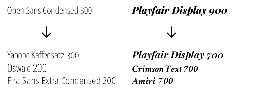
what can you use font vectors for? The simplest case is a visual similarity search:
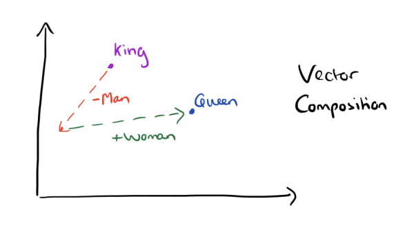
if you've heard of word vectors, you've probably seen something like this:
it turns out you can do something similar with font vectors:
Through vector arithmetic we can isolate the features that represent visual concepts like serifs, obliqueness, and weight - or even more abstract concepts like legibility, kerning and color.
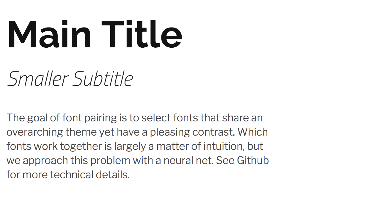
One of the more interesting things we can do with font vectors is font pairing, or the problem of selecting fonts that work together in a design.
Contrasting fonts can be used to emphasize a message
Or to guide the eye and create visual interest.
The core process behind font pairing is somewhat paradoxical - we want fonts that contrast with each other, yet share certain similarities. Fonts that resemble each other create an uncomfortable discord, but wildly contrasting fonts look haphazard and unintentional.
Striking the right balance comes down to intuition, but we could try to narrow down the field with font vectors.
Here we reach a small issue - the metrics that are commonly used for vector comparison don't convey this concept of balance very well:
-
cosine distance (do the vectors point in the same direction?)
-
Euclidean distance (are the vectors similar in direction and magnitude?)
-
Hamming distance (are the vectors roughly similar?)
All these are great for finding similar or contrasting fonts, but our ideal match has similarities and contrasts in equal measure. So we have to make up our own similarity metric:
This is just the cosine distance split into two halves - the positive bits and the negative bits. By doing this our similarity measure will reward both similarities and dissimilarities - ie. we'll get fonts that are very similar in some respects but very different in other respects.
The contrasting pairings that are produced in this fashion don't always work together (clearly not all axis of contrast are visually pleasing), but the hit rate is surprisingly high.
Another consideration for body text is legibility - many fonts that are suitable for titles aren't very readable at small sizes. To get the best balance between the 3 fonts we can try to optimize for best overall contrast, while weighing the legibility of the body font as a secondary factor.
See http://fontjoy.com for a demo of this system. The raw data can be viewed through the tensorflow embedding projector at http://fontjoy.com/projector/


