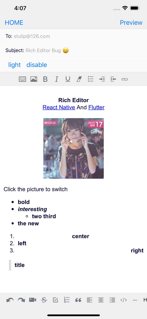
! Specific change to generate a image from the html and return the base64 on "onChange" callback
A fully functional Rich Text Editor for both Android and iOS (macOS and windows)?
If you want to use flutter, you can check here to add flutter_rich_editor
yarn add react-native-pell-rich-editor
or
npm i react-native-pell-rich-editor
Also, follow instructions here to add the native react-native-webview dependency.
- Online Preview (Some functions)
- Example
The editor component. Simply place this component in your view hierarchy to receive a fully functional Rich text Editor.
RichEditor takes the following optional props:
-
placeholderWrap the editor content placeholder
-
initialContentHTMLHTML that will be rendered in the content section on load.
-
initialFocus -
Boolean value to Initial content request focus. The default value is
false. -
disabled -
Boolean value to disable editor. The default value is
false. -
editorInitializedCallbackA function that will be called when the editor has been initialized.
-
editorStyleStyling for container or for Rich Editor more dark or light settings. Object containing the following options:
backgroundColor: Editor background colorcolor: Editor text colorplaceholderColor: Editor placeholder text colorcontentCSSText: editor content css text(initial valid)cssText: editor global css text(initial valid)
-
onChangeCallback after editor data modification -
onHeightChangeCallback after height change -
onMessageCallback outside postMessage internal type processing<img src="" onclick="_.sendEvent('ImgClick')" contenteditable="false"/> -
commandExecute JS in the editor// $ = document this.richText.current?.commandDOM('$.execCommand('insertHTML', false, "<br/>")'); -
commandDOMManipulate the DOM in the editor// $ = document.querySelector this.richText.current?.commandDOM(`$('#title').style.color='${color}'`); -
useContainerA boolean value that determines if a View container is wrapped around the WebView. The default value is true. If you are using your own View to wrap this library around, set this value to false. -
initialHeightuseContainer is false by inline view of initial height -
pasteAsPlainTextA boolean value (false as default) that determines if the clipboard paste will keep its format or it will be done as plain text -
onPasteCallback clipboard paste value -
onKeyUpCallback Keyup event -
onKeyDownCallback Keydown event -
onFocusCallback editor focus -
onBlurCallback editor blur
RichEditor also has methods that can be used on its ref to set:
setContentHTML(html: string)insertImage(url: string, style?: string)insertLink(title: string, url: string)insertText(text: string)insertHTML(html: string)insertVideo(url: string, style?: string)setContentFocusHandler(handler: Function)blurContentEditor()focusContentEditor()
This method registers a function that will get called whenver the cursor position changes or a change is made to the styling of the editor at the cursor's position., The callback will be called with an array of actions that are active at the cusor position, allowing a toolbar to respond to changes.
registerToolbar(listener: Function)
<RichEditor
  ref={(r) => this.richtext = r}
  initialContentHTML={'Hello <b>World</b> <p>this is a new paragraph</p> <p>this is another new paragraph</p>'}
  editorInitializedCallback={() => this.onEditorInitialized()}
/>This is a Component that provides a toolbar for easily controlling an editor. It is designed to be used together with a RichEditor component.
The RichToolbar has one required property:
getEditor()
Which must provide a function that returns a ref to a RichEditor component.
This is because the ref is not created until after the first render, before which the toolbar is rendered. This means that any ref passed directly will inevitably be passed as undefined.
Other props supported by the RichToolbar component are:
-
actionsAn
arrayofactionsto be provided by this toolbar. The default actions are:actions.insertImageactions.setBoldactions.setItalicactions.insertBulletsListactions.insertOrderedListactions.insertLinkactions.keyboardactions.setStrikethroughactions.setUnderlineactions.removeFormatactions.insertVideoactions.checkboxListactions.undoactions.redo
-
onPressAddImageFunctions called when theaddImageactions are tapped. -
onInsertLinkLogic for what happens when you press on the add insert link button -
disabled -
Boolean value to disable editor. The default value is
false. -
iconTint -
unselectedButtonStyle -
selectedIconTint -
selectedButtonStyle -
disabledIconTint -
disabledButtonStyleThese provide options for styling action buttons.
-
iconSizeDefines the size of the icon in pixels. Default is 50.
-
renderActionAltenatively, you can provide a render function that will be used instead of the default, so you can fully control the tollbar design.
-
iconMapRichTextToolbarcomes with default icons for the default actions it renders. To override those, or to add icons for non-default actions, provide them in a dictionary to this prop.
const richText = React.createRef() || useRef();
<RichToolbar editor={that.richText}/>To define your own custom action:
- Send your action name as string in the
actionsarray. - Include an icon for it with the
iconMap - Add a function prop with the same action name to be called on tap
<RichToolbar
    editor={that.richText}
	actions={[
		actions.setBold,
		actions.setItalic,
		actions.insertBulletsList,
		actions.insertOrderedList,
		actions.insertImage,
		'customAction',
	]}
	iconMap={{
		customAction: customIcon,
	}}
	customAction={this.handleCustomAction}
/>
