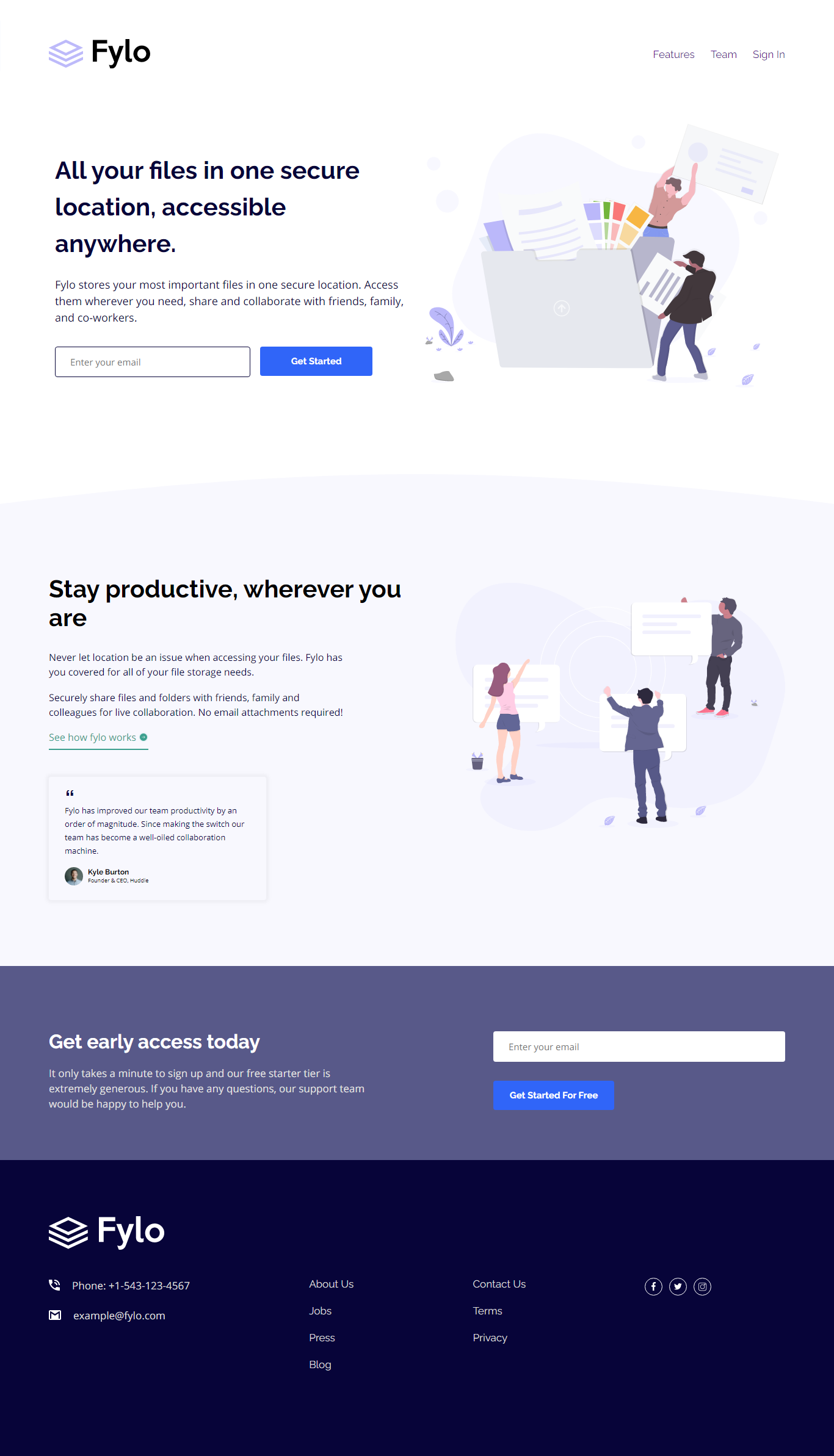
This is a solution to the Fylo landing page with two column layout challenge on Frontend Mentor. Frontend Mentor challenges help you improve your coding skills by building realistic projects.
Note: Delete this note and update the table of contents based on what sections you keep.
Users should be able to:
- View the optimal layout for the site depending on their device's screen size
- See hover states for all interactive elements on the page
This is my website's desktop view
 I did not include the mobile preview since it is long
- Live Site URL: Live site of the challenge hosted here
Hello, this is my 19th solution in frontend mentor. I did this challenge as my first mobile first workflow solution. Using mobile first for me is really new but I can see why many use this. Some parts are more easy to manage and do unlike to the traditional desktop first. This is really great for me since this will be my first step to further enhance mobile first workflow.
- Semantic HTML5 markup
- CSS custom properties
- Flexbox
- CSS Grid
- Mobile-first workflow
What I learned the most in here is the mobile first workflow, since this is my first mobile first challenge.
I will now continue developing more sites using mobile first workflow^^
- Website - Well I haven't made my profile portfolio, gonna make it sooon when I know a lot of stuffs
- Frontend Mentor - @pikamart
- Twitter - @RaymartPamplona